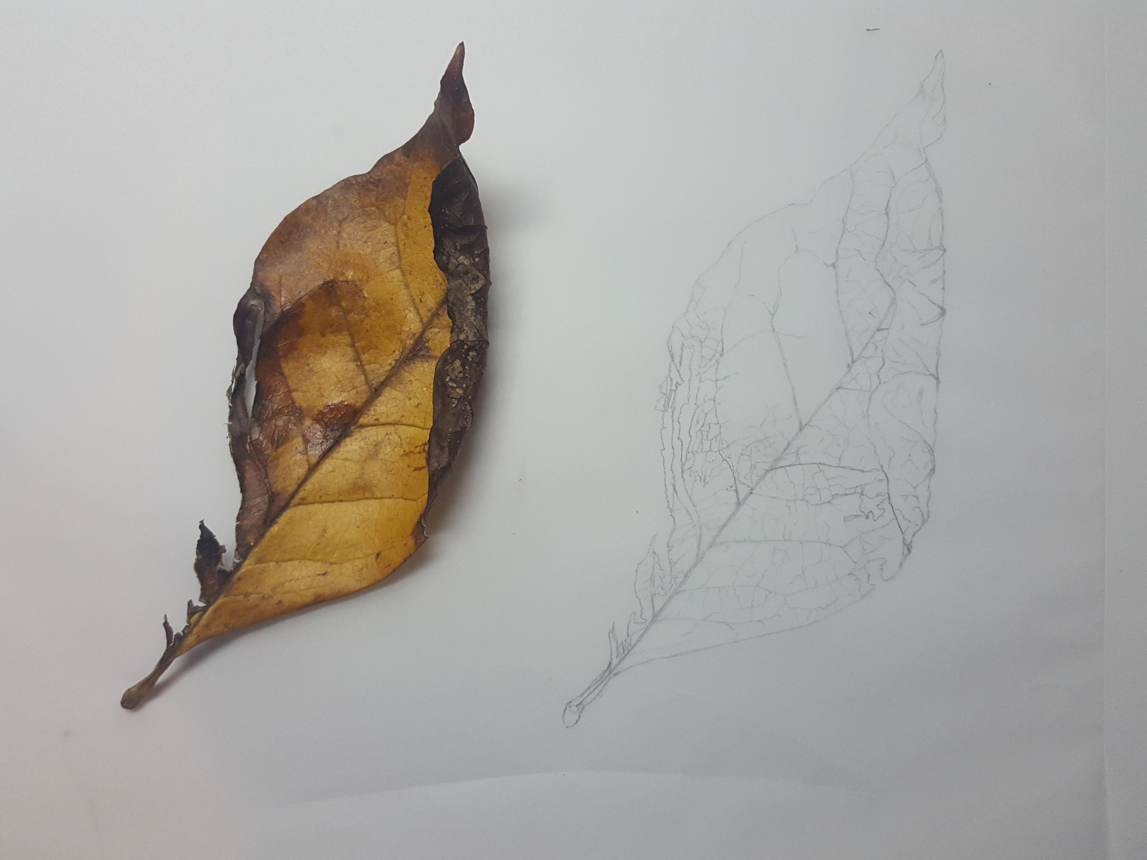
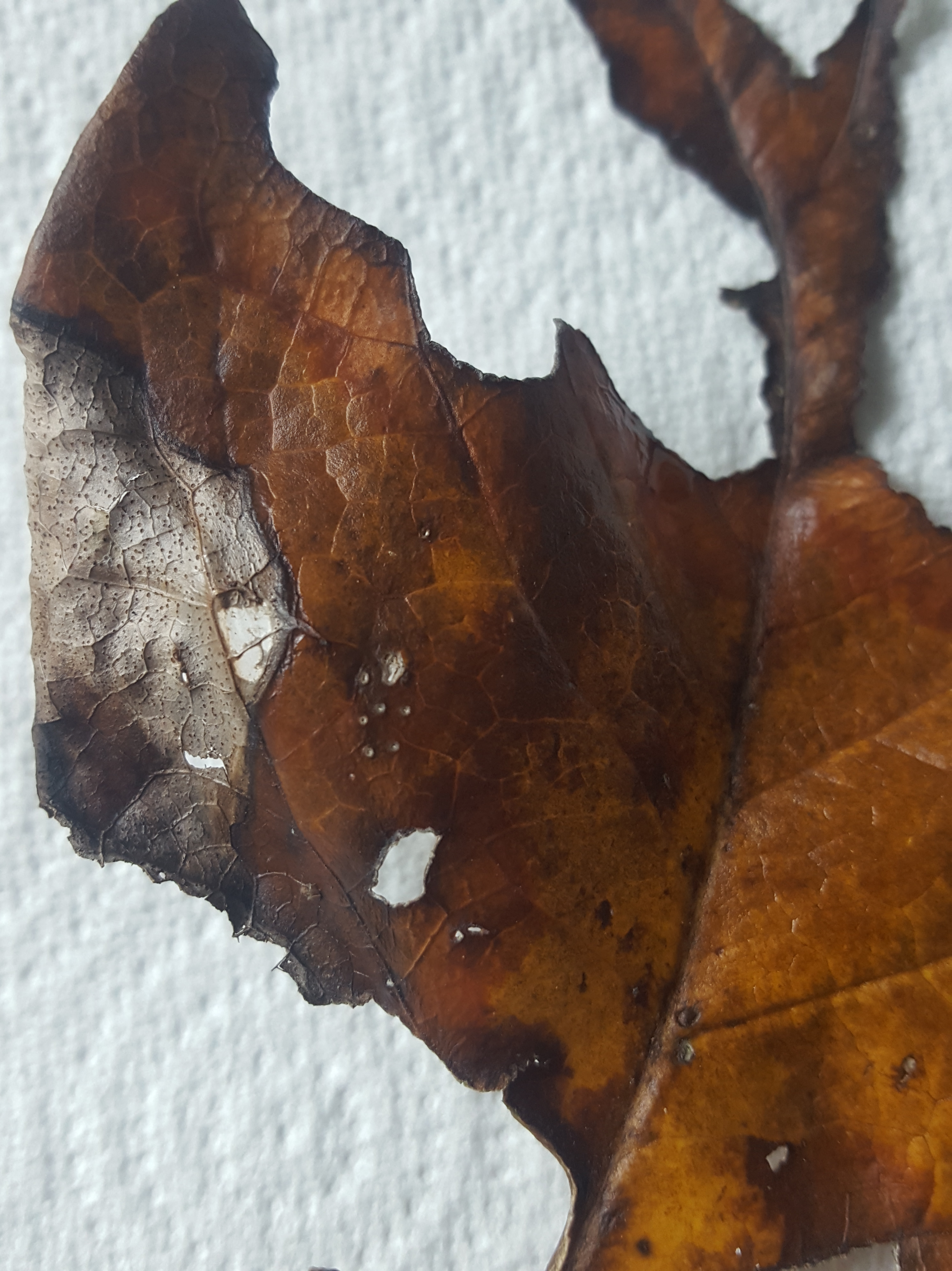
Whilst wandering around the garden in late autumn I discovered some rather gorgeous looking Magnolia leaves still hanging onto our tree. There was a golden carpet beneath too which caught my eye. I collected 3 leaves and decided to paint them. Thankfully there were still some on the tree if these ones started to fade.
The first thing to do was to try and protect them from drying up. I took reference photos and then into the fridge they went in a plastic bag! Sadly, overnight they had gone very brown and the lovely gold hues I wanted to paint had disappeared. Thank goodness there will still some on the tree for colour reference.
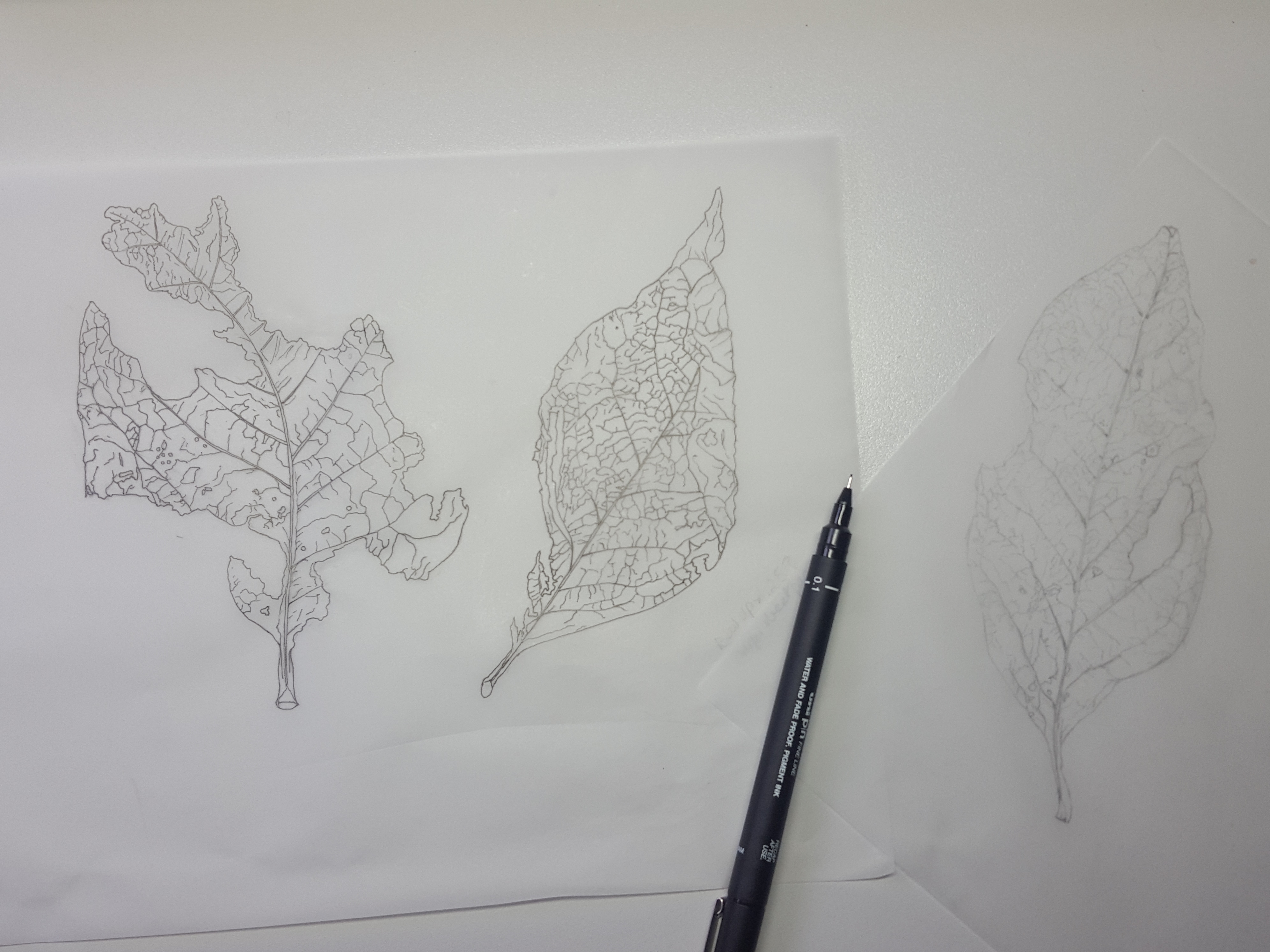
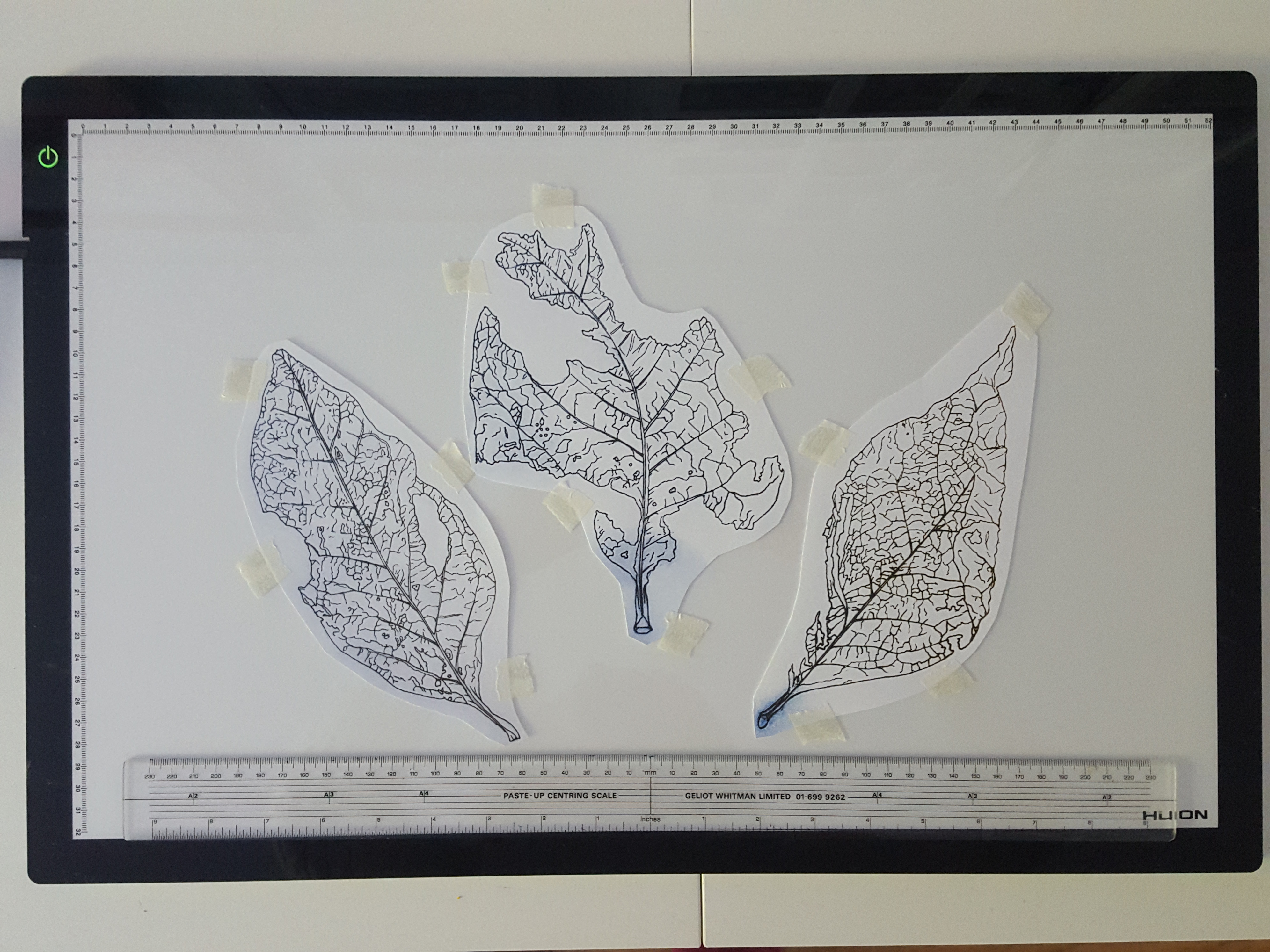
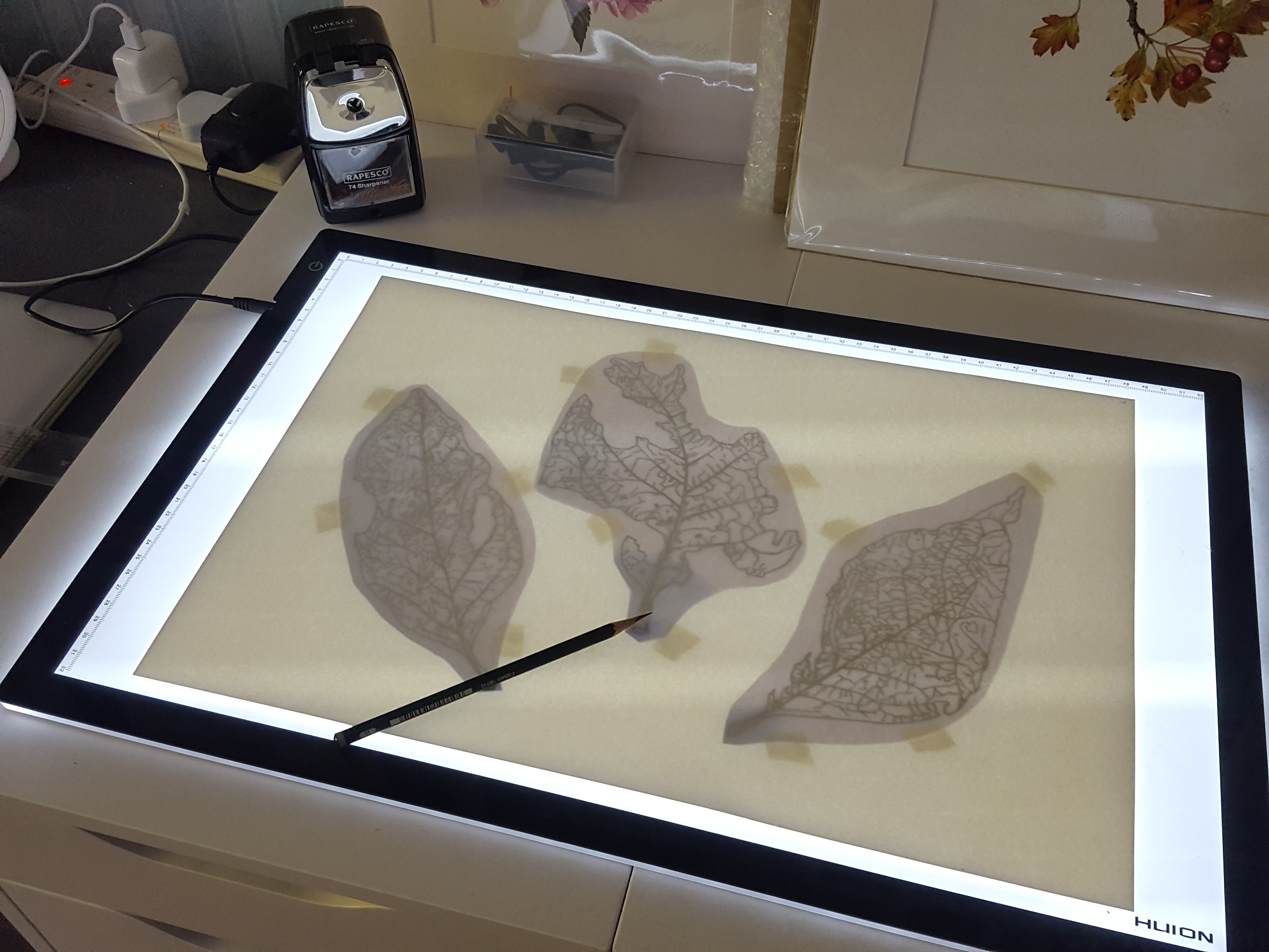
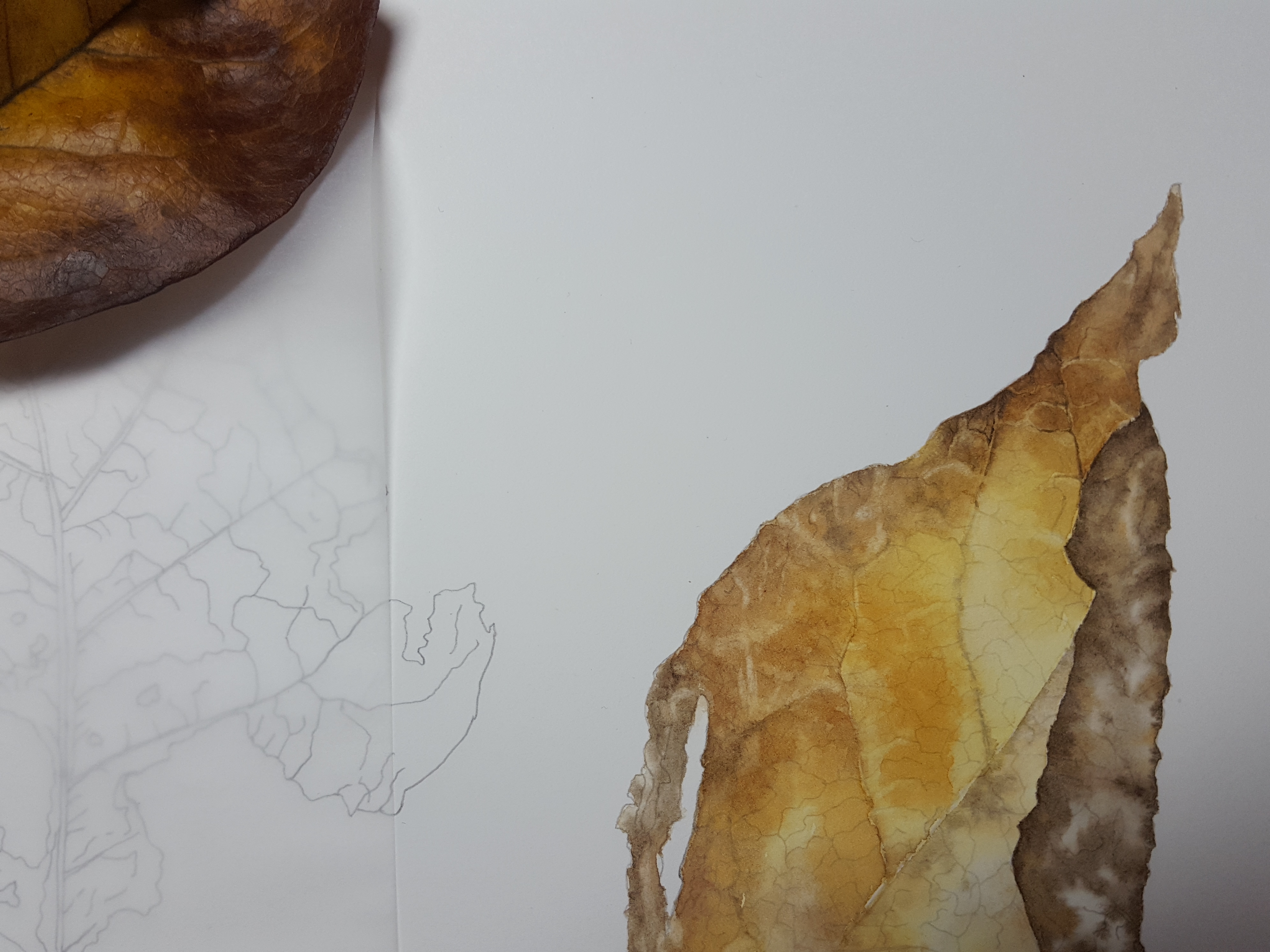
I started by drawing up my three leaves onto tracing paper then used a black fine liner to outline my drawings. From here I could then put them on my light pad in position and trace them off carefully with an H pencil onto my watercolour paper.
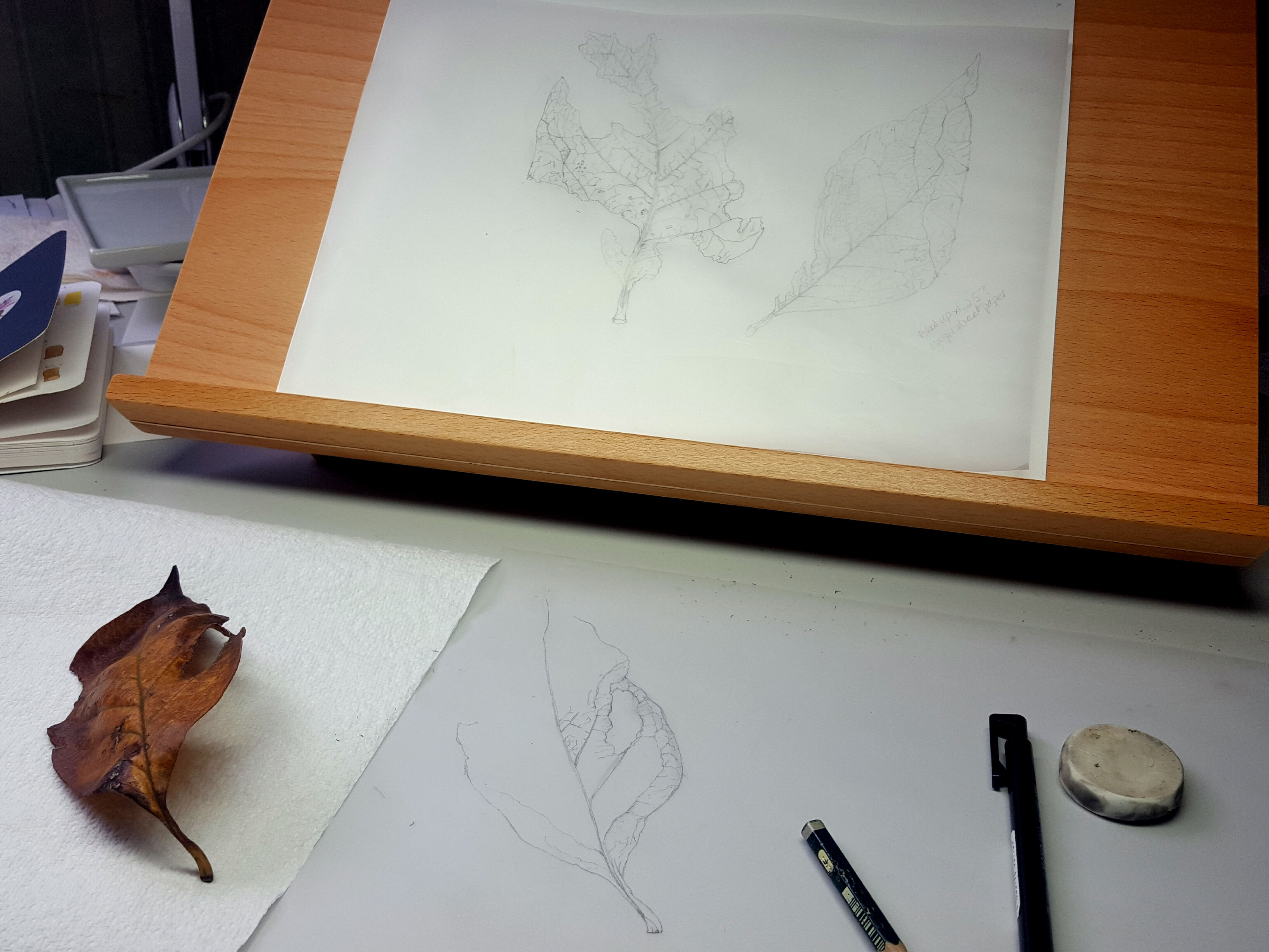
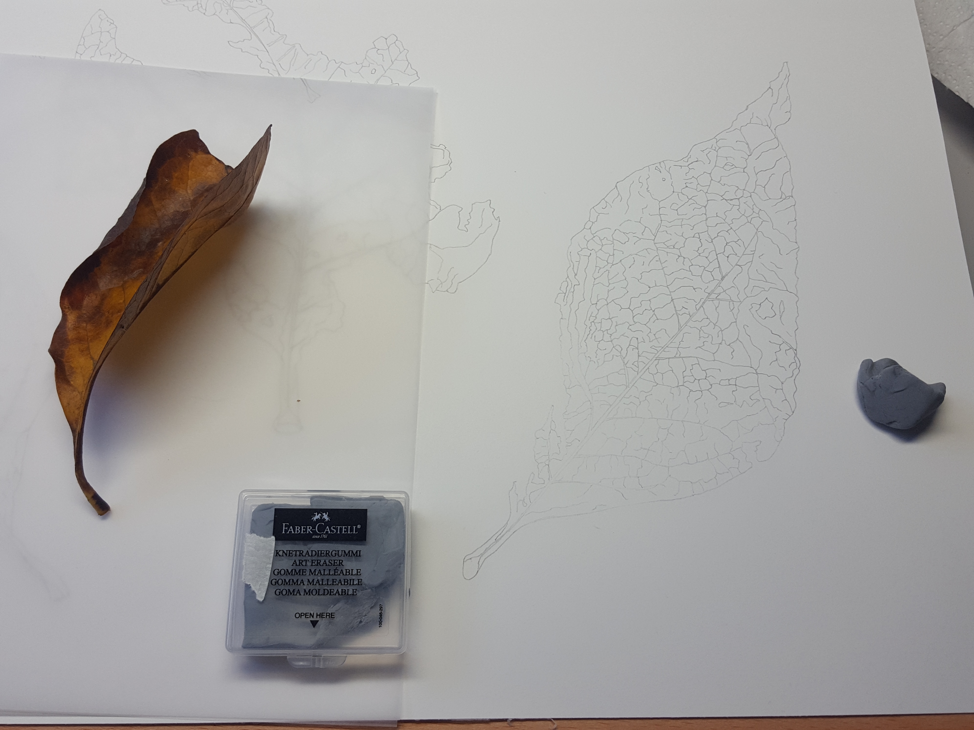
Once transferred onto my watercolour paper I very carefully used a Faber Castell kneadable rubber to remove excess graphite. Take care not to rub, just press it onto the graphite and then lift it up as you go. If you rub you’ll ruin the surface of the paper. You can use Bluetac to do this too but beware some papers have less sizing than others. Bluetac may damage some of the paper surface. A Faber Castell kneadable rubber is far softer.
Mixing the colours
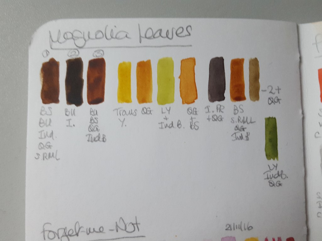
The next stage was to mix up my colours, the lovely golden hues and browns. For your reference all are W&N professional watercolours unless specified: Burnt Sienna (BS), Burnt Umber (BU), Indanthrene Blue (Ind), Quinacridone Gold (QG), Indigo (I), Transparent Yellow (Trans Y), Winsor Lemon (LY or WL), Permanent Rose (PR), Sennelier Rose Madder Lake (SRML). Also, 2 + QG (see below swatch top row far right) equals brown no. 2 plus QG. More recently (2020), since writing this blog, I would not use Indigo as this is an opaque pigment. I use Indanthrene Blue to achieve darker mixes. Sennelier Rose Madder Lake is also very close to Permanent Rose in tone, it has the same index number, PV19.

You may notice in the photos below that I have cut out the shape of my leaves on some tracing paper and laid it over the top of my painting. This is to protect it from splashes. It is better to use layout paper as tracing paper curls up a little with the heat of your hand against it. I have also found you can catch your paintbrush on the curled edge!
The first wet-in-wet wash!
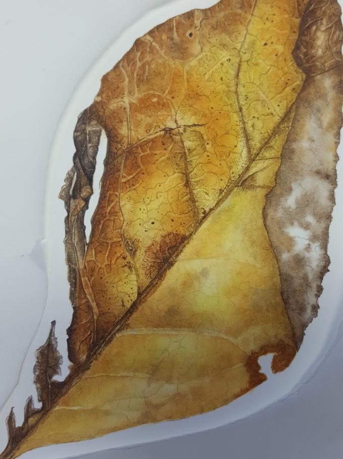
To begin with, I added a pale transparent yellow underlayer wash all over to enhance the brightness. This was allowed to dry thoroughly. On the next layer, I used wet-in-wet technique and started to introduce some of the mixes from my palette. I did one side of the leaf at a time. This ensures the water doesn’t dry out before you get to the next part. On the second layer, I painted each section of the leaf individually and added more colour to strengthen it. After this, a little of the shadowing was added on the vein ridges. This highlighted the veins. There are some more videos later in this blog explaining these techniques. You can scroll down now if you want to know now!
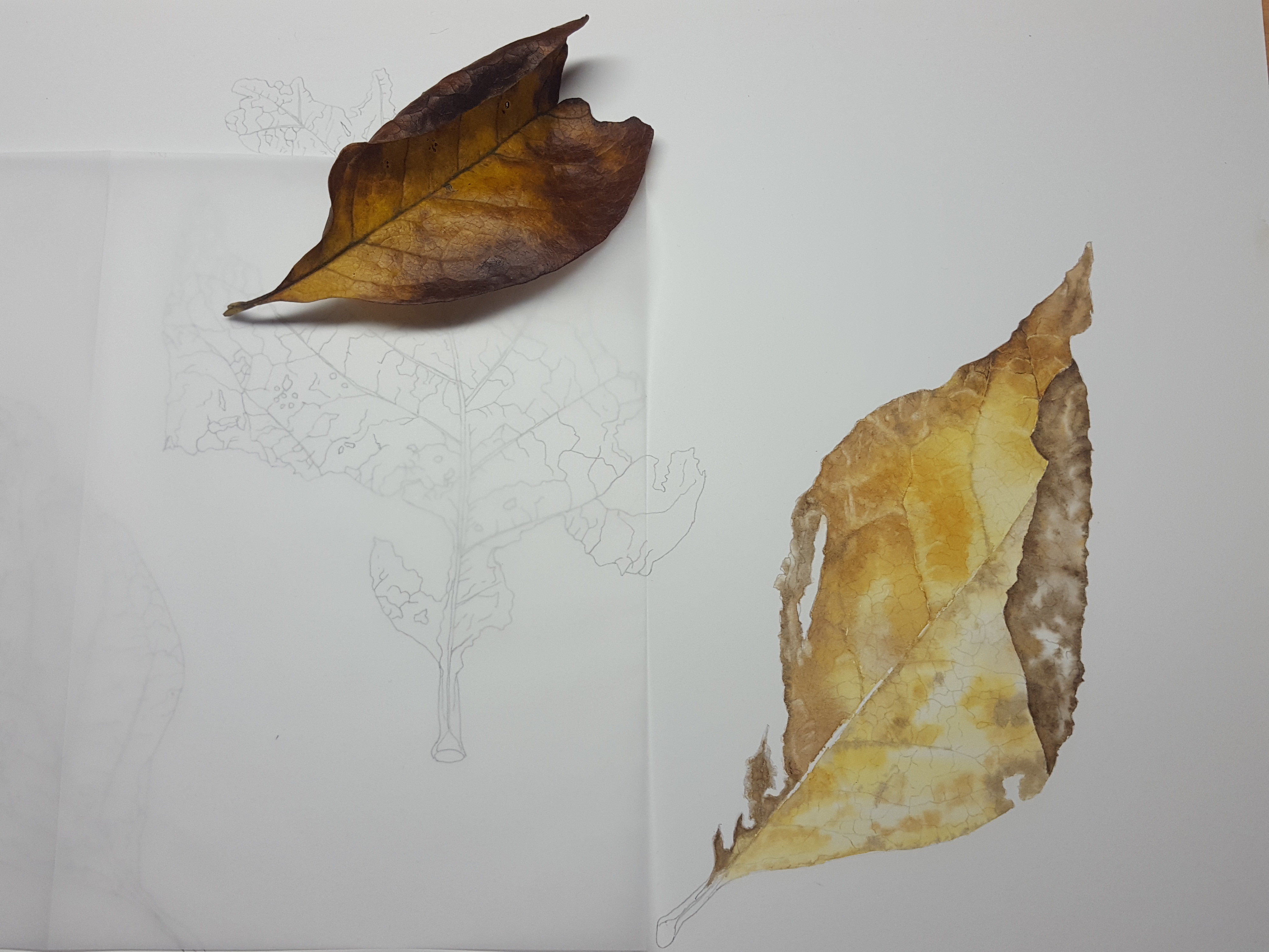

Once I was happy with the intensity of the gold and tan tones over the leaf, I again worked to enhance the veining and add in small details; the smaller veins and dots. I gradually worked my way across the leaf up to the curled edge. I added more of my gold/burnt sienna mix to strengthen up the background layers in places. These washes were softened out at the edges of the painted area with a slightly damp brush to ensure no hard edge lines.


I then used my Eraser brush (Billy Showell Eradicator) to enhance the light veins. Here is a little video that explains how I did this. Once this is done the whole thing starts to appear more 3D. I used to use 2 types of eraser brush, a Jacksons Icon 1/8th inch series 702 and a stiffer one which is white synthetic – ProArte sterling 201 oil acrylic short flat size 0 (this is a long-handled brush so I cut the end off!). On reflection, the Pro Arte brush is far too abrasive for the surface of the paper. Now, (2020), I use a Billy Showell Eradicator brush which is perfect for everything. It has a nice small stiff tip and is slightly tapered so you can erase really fine veins as well as bring out highlights. The image here shows a Jacksons Icon to the left and a ProArte sterling 201 to the right. There is also a Rosemary & Co. Eradicator but it is much wider than the Billy Showell Eradicator.


Next I started to work on the twisted broken part of the leaf. This was a challenge as I needed to show the curves and twists to clearly get a good effect. Accurate shading and highlights ensure this looks realistic. I painted the brown in first leaving a nice highlight of paler colour where the light hit the subject. Other colours were also added, a grey/brown, warm golden brown and a beige mix. Finally, I carefully used the tip of the eradicator brush to lift out lighter parts to create the veined areas. You need to look carefully for the deepest shadows and darken the colour more in those areas.
To make the papery effect on the little bit sticking out at the base of the leaf I used a very pale beige tone and dotted a grey mix into it. I also painted a darker grey very occasionally along the very edge on the smaller bits. It is best not to paint the whole edge or it will look too heavy.
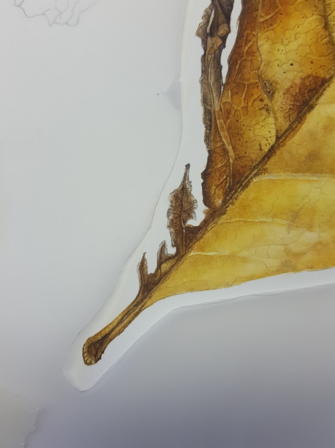
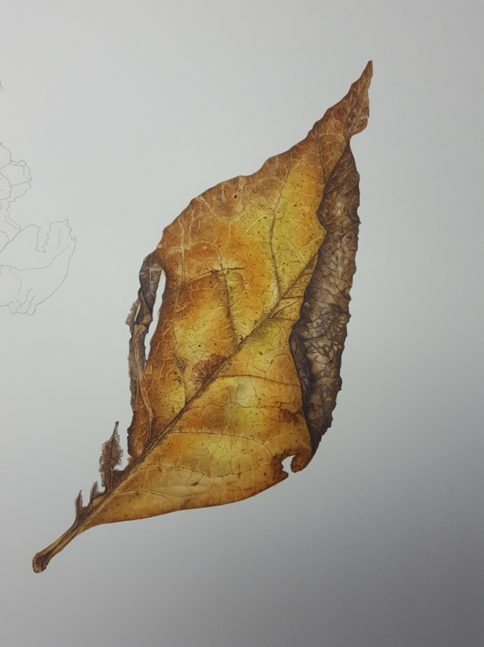
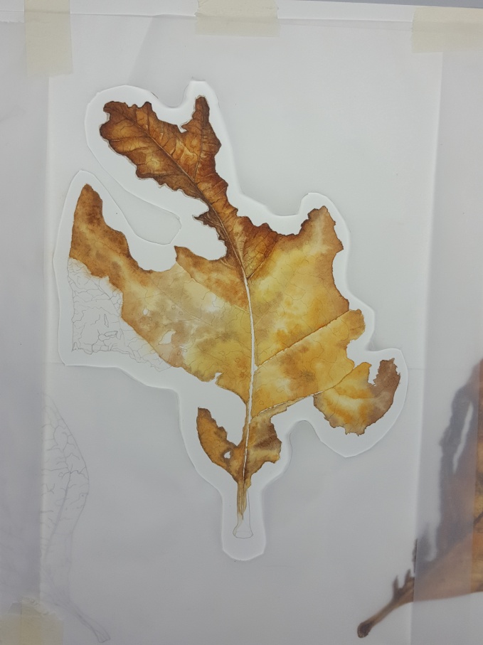
Lastly, I strengthened up the golden areas of the leaf with a thin glaze of my gold mix. Once both sides were done, I noticed little green tinges over some of the leaf. I added a pale green mix in a glaze to those areas. Leaf no. 1 is now finished!
Leaf no. 2 – lots of videos here!
As this leaf was quite large I used wet-in-wet technique on each section between the side veins rather than paint the whole thing at once. A smaller area would allow me to work longer and get more done on the first wet layer. Painting each section alternately also ensures that they do not bleed into one another. Firstly, I laid a thin layer of Transparent yellow down to keep the subsequent layers nice a bright. This was left to dry thoroughly. Here’s a video to explain the process.


Once I’d completed three sections I continued into the bottom right part of the leaf. Here’s a little video explaining how I did this part.
Now for the top part, an area that thins and is very intricate. You need to be very careful not to go over the edges when wetting the paper. Very small areas are best painted in the normal way rather than wet-in-wet. At this stage, once the painting was thoroughly dry, I erased some of the graphite drawing with a soft rubber. The graphite will erase at this stage but may be a problem later in the painting. If you use too much pressure when drawing these lines will be harder to erase. An H pencil used lightly is enough to give you a map to follow and will erase out easily. Softer lead pencils will appear very dark and leave graphite dust on the paper. This will interfere with your painting. Here’s a video explaining.
Below shows both sides of the wet-in-wet layers completed and dry. Now I just need to apply all the veining detail and shadow tones. Notice on the picture below I have left out a very small area halfway down on the left. This part of the leaf is far too small and intricate for wet-in-wet so I will fill this in later with glazing and dry brush.
I got carried away and started doing some of the dry brushwork at the top of the leaf, my favourite part! It’s starting to come to life. The papery grey area will be challenging and be very interesting to paint! I will approach it in the same way as the papery bit on the first leaf.

Well, that’s it for now. I hope this blog and videos have helped you. Feel free to message me if you have any questions.
Until next time happy painting!
*All photos, content, text and videos are subject to copyright – Jackie Isard Botanicals 2017

Thank you, thank you, thank you Jackie for sharing your process and knowledge. I cannot begin to tell you how much I learn from you. I love the point on the brush. What make and size of brush are you using please? Sandy Allen, Canada
LikeLike
My pleasure Sandy! So pleased you enjoyed it. The brush is a Billy Showell brush. I use a size 6 for wet in wet and a size 2 to paint with. They have perfect tips😊🐝🌱
LikeLike
Wonderful post, Jackie! Thank you so much for sharing. I was curious about the pencil lines and veining under the paint. You leave most of them as the veining? I know that once you paint with yellow that they don’t erase anymore, and it makes sense to leave them, but I just wanted to clarify it? I love, love, love your palette. Beautiful work!
LikeLike
Thanks so much Linda! I rubbed out the pencil lines after the first wet in wet layer, that’s after the very pale transparent yellow I laid down first of all. They rub out ok at this stage. I wanted most of them to stay anyway as I was painting over them with a greyish/beige. I used the eraser brush to erase out alongside some of these pencil veins too, to make it look more 3D. Hope this helps! xx
LikeLike
Great, great post! I would like to ask about how you draw the leaf, it sounds so easy, but isn’t! Can you elaborate?
LikeLike
Thank you! Well now drawing the leaf….. I tend to look very carefully at the edges of the leaf and following my way round as I draw. It’s experience really for me. You could start by drawing a rough outline on rough paper then put in the main veins, could even make a grid over it so you can do it section by section. Hard to explain in here! Hour this helps a bit though 😊
LikeLike
Thanks! Would love to sit on your shoulder sometime and watch you draw 😉 I realize you have many years of experience…I find it very difficult to transfer the 3d object to a 2D plane. Working from photos, no problem, its the 3d to 2d transfer gets me. How did you learn back when you began?
LikeLike
Hi again. I guess I have natural talent but the more you do it the easier it comes. I was a graphic designer for 22 years and that helps as it’s given me a very keen eye., especially when painting. There are online drawing courses which may help to get the basics from, then it’s practice, practice! Hope this helps a little 😊
LikeLike
Brilliantly clear ways to build deep depth of colour, whilst keeping transparency – superb tuition Jackie!
LikeLike
Thank you Susan! 😊😊
LikeLike