Autumn leaves can be difficult! …but with all of those wonderful colours, such a delight to paint.
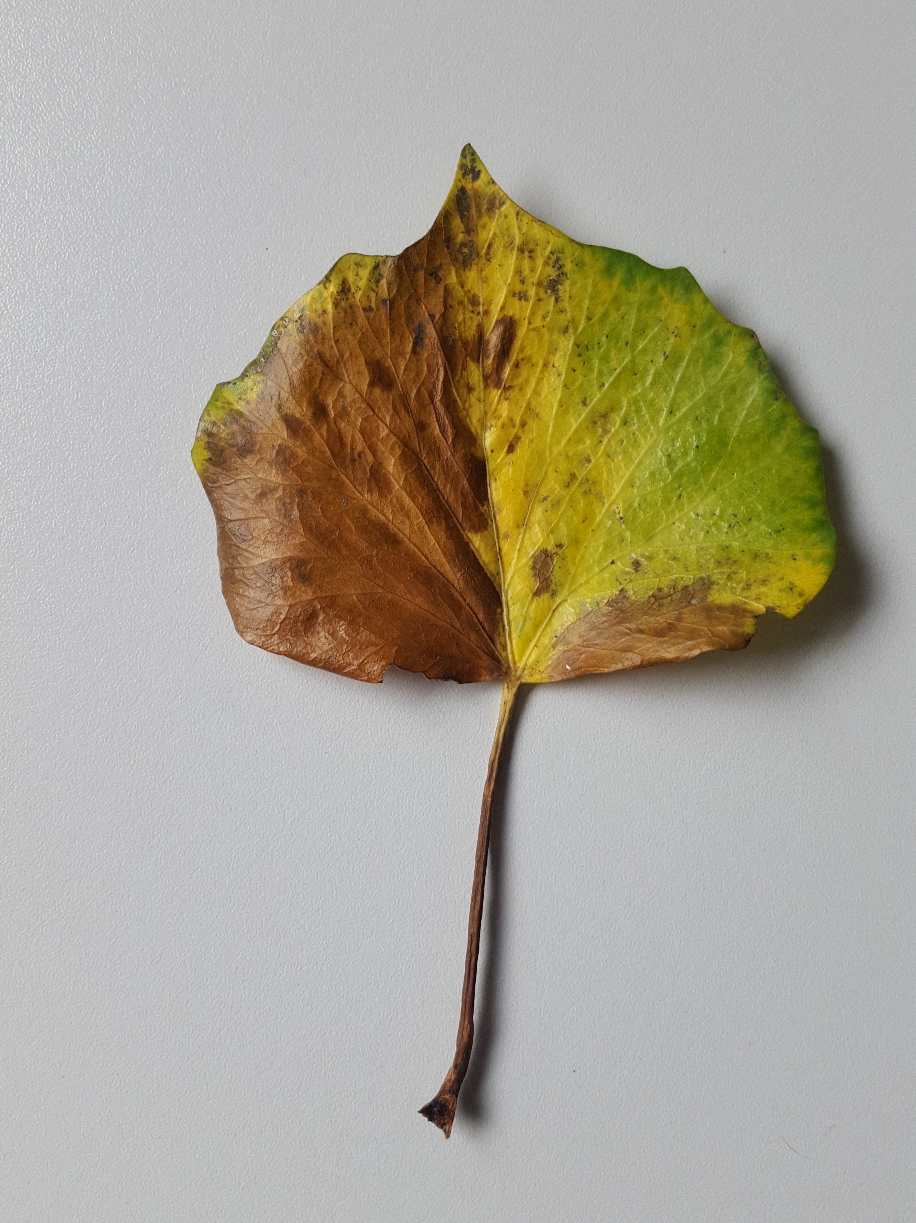
In this blog I hope to help you understand the method more clearly. I found this Hedera (Ivy) leaf in my garden and decided to paint it as it was so colourful. It sang out to me with those colours of Autumn as they just begin to show.
When I start a painting a subject of any type, I first study it carefully. I look at texture, colour, pattern, form, growing habit, shape and how the light falls on it before I start to draw. The drawing will be more accurate if you take time to study your subject carefully. Look at every little detail and blemish. Fall in love with it!
I loved this Hedera leaf with its wonderful colours and the first stage was to mix my colours. When I do this I look for all the tones and shades. There will be many more than you imagine!
All about the colours…
My swatch included the greens, yellows and browns – quite a few of these. I added to this palette as I went along, with some darker shades for the stalk and blemishes on the leaf.
This is my leaf along side my final swatch. If you look you can see two different shades of green, a darker one at the edges which is more blue in tone and the lighter one across the leaf which is a more yellow/green. There are many browns too! Here’s how my swatch works: The X signs on the swatch are colours I didn’t use after testing.

The green mixes (1&2) are made with Winsor Blue Green Shade (WB), Transparent yellow (TY) and a tiny bit of Permanent Rose (PR). The PR rounds the green to make it less stark and more natural looking. Green No. 1 has a little more WB added than the No. 2 mix. Green no. 1 is used around the edge of the leaf, on blemishes within the lighter green area and to define the shadows in between the small veins at the fine detail stage. The yellow/green no. 2 is for the main area of the leaf. The yellow area is purely TY (3) and sometimes TY plus water (H20).
There are many shades of brown, six to be exact. These all vary slightly. The darkest ones are for blemishes and the stalk, 7, 8 and 9. No.s 4, 5, 6 and 10 are the ones used on the brown areas of the leaf. No. 11 (top right on swatch) is the green/yellow used at the top of the stalk only. Here are the mixes for 4-11:
4 – Burnt Sienna (BS), Quinacridone Gold (QG) and Winsor Violet (WV) = (= means a little bit!). In addition I have added a little more QG to make a slightly yellower version of no. 4.
5 – BS, QG and Indathrine Blue (IB) = (=a little bit). Again I have mixed a slightly darker version of this tone by adding a little more IB.
6 – BS, IB and QG=
7 – IB, QG and PR (Permanent Rose) making a very dark brown
8 – IB, QG and PR with extra PR and QG making a reddish brown
9 – IB, QG and PR with extra PR and QG plus a little extra IB making a dark mahogany brown
10 – BS, QG and IB= making a conker rusty brown
11 – TY (Transparent yellow) and WB= making a pale greeny/yellow
Let’s start painting the wet-in-wet layer!
For the first layer, I used wet-in-wet technique on one side of leaf at a time. Always do one side at a time because if you try to do both sides at once, one side will dry up on you before you reach the other side! Let each side dry thoroughly before attempting the second side.
You will need to use good quality Hot Pressed watercolour paper for this technique. I am using my ever dwindling old stock Fabriano paper which is perfect but the quality has changed completely over the last two years. An alternative paper, which I tested recently, is St. Cuthbert’s Mill Bockingford Traditional Watercolour HP white. This paper I find as good as the old Fabriano for wet-in-wet although for colour not so vibrant. Saunders Waterford 425gsm is also a good paper.
Firstly, the whole area needs to be wet, this must be done carefully and evenly. When doing this technique take care not to leave pockets of water but aim for a smooth all over effect. You’ll need a No. 6 full bodied pointed tip sable brush. Fill your brush with water and make a puddle in the middle of the area first. Use the tip of the brush to pull the water up to the edges for a neat outline. The following photos show an example of wet-in-wet I photographed for a Pear painting.
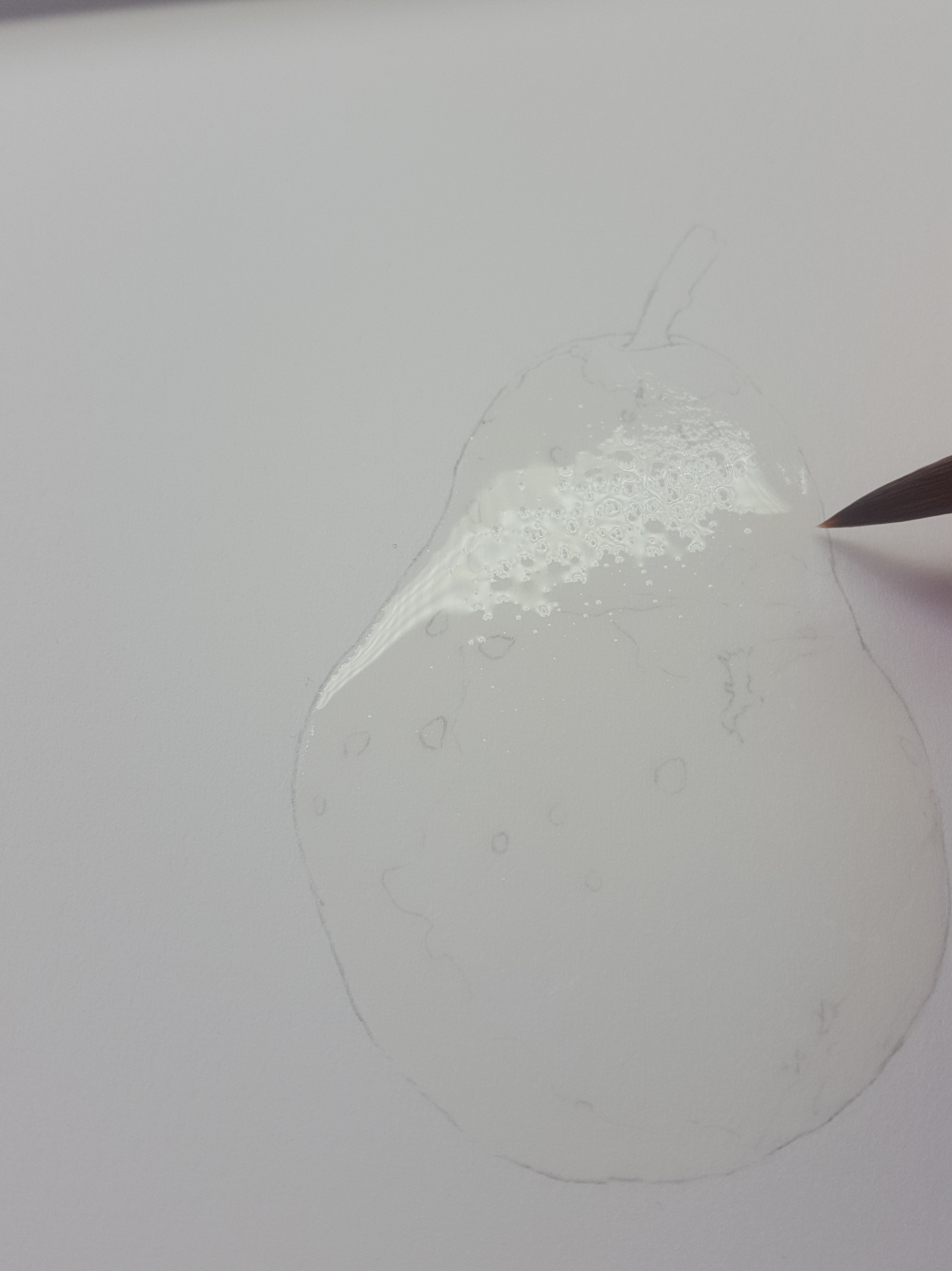
Carefully move the water with the tip of the brush into the uncovered areas, dragging the water from the central puddle. Along the edges use the very tip to move the water very slowly around the edge of your drawing. The brush tip will help you to move the water accurately up to the line for a nice neat edge.
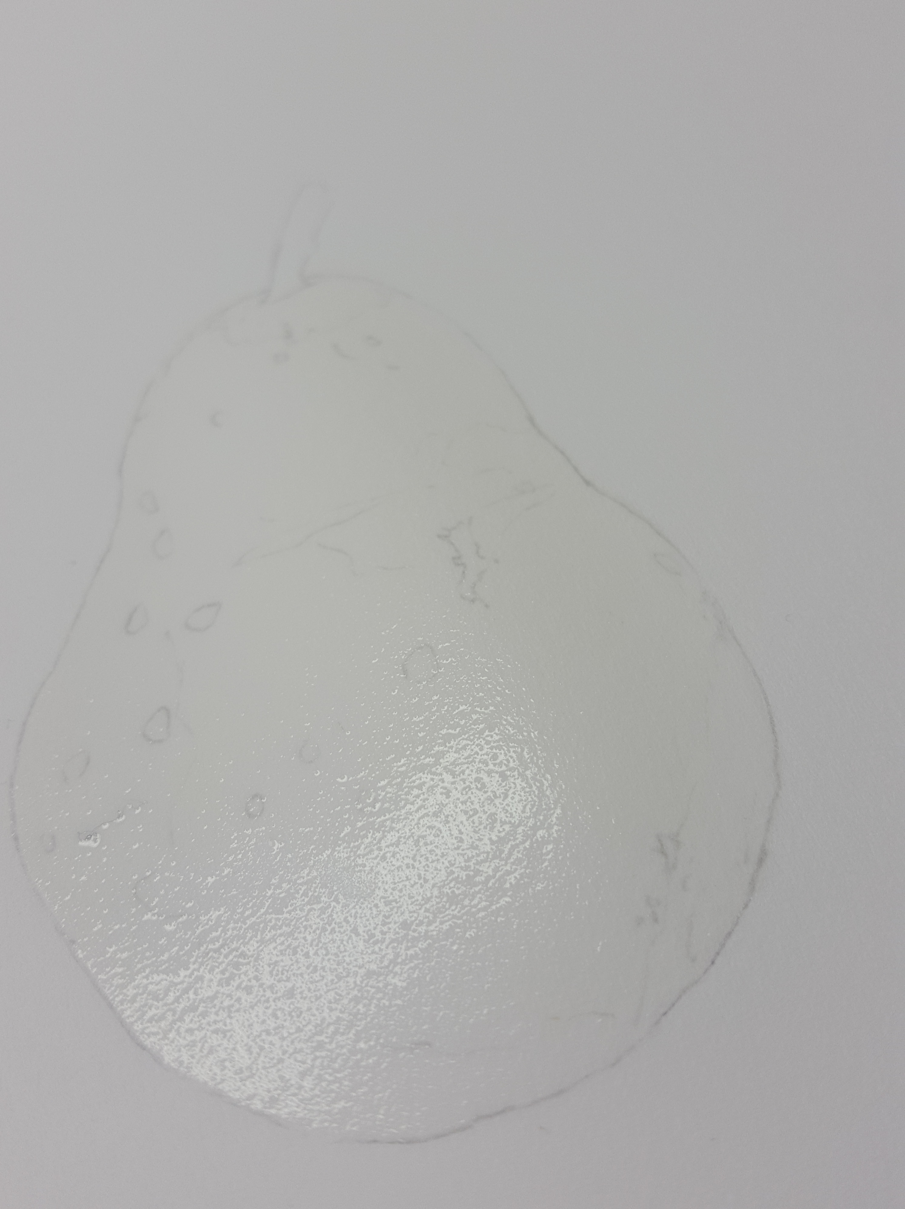
Now check for puddles and gently sweep off some of the water as needed with a damp, not wet, brush. Don’t sweep too much off or you’ll end up with a dry bit!
Once the area is even all over, turn the paper sideways to check you have covered every little bit evenly. Now wait until the water is at a ‘glistening’ stage. When it is ready it will look shiny (glistening) but not really shiny. It’s important to catch it just at the right time. If you wait too long it will start to dry on you. Once the whole are is covered and glistening it is ready to apply colour.

For this part I use my no.2 full bodied pointed sable brush. Drop your colour mix (a lighter-medium thickness of pigment to water, not very thick!) into the areas where it you see it, taking care to leave highlights clear of paint to start with. Some areas will need a lighter mix of pigment added. Make sure you wipe the excess off your brush before adding this or you will flood the area. Rinse and dry your brush off quickly before adding other colours to the painting. The paint will spread out and blur naturally. I have dotted the green and yellow paint in on the right side and this gives the impression of smaller light veins where the paper shows through. You can move the paint around a little and wipe it out with a dry brush if you make a mistake. After this I have added in a little stronger mix of the blue/green mix to areas like the edges where the green is stronger. You need to move quickly and if any area starts to dry out on you, STOP! and leave it all to dry thoroughly. DON’T attempt to keep going or you will ruin the layer. Once it’s dry you can repeat the whole process again and add more to this layer. The other side is done in a similar way once the first side has dried completely!
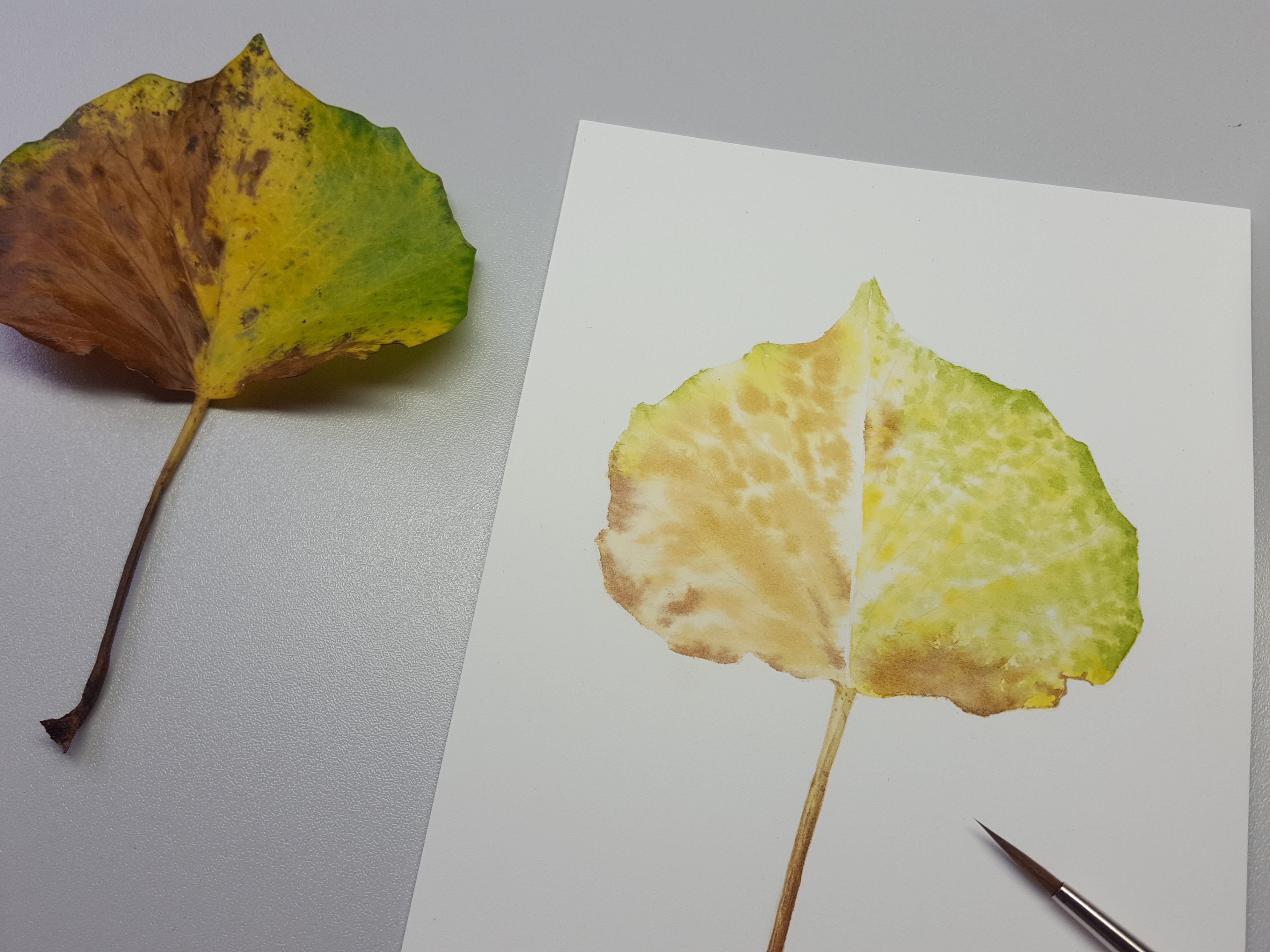
Your first layer should look like this, a bit wishy washy, but it is best to work with a lighter mix to start with or your paint will smudge on subsequent layers. Notice here I have left the strong highlights clear of paint. When the first layer is done, make sure it is completely dry before you attempt the second layer.
Painting the second layer…
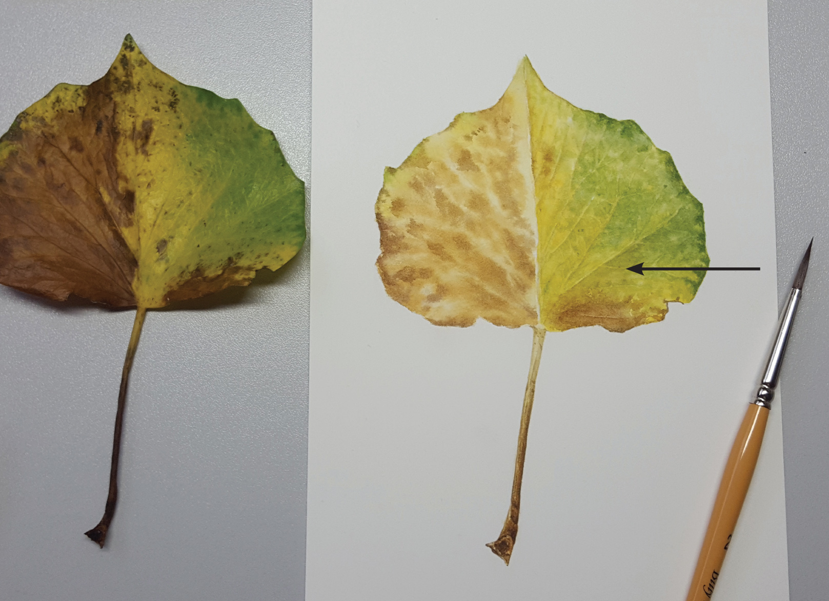


The second layer is the layer where you will add more colour in glazes to enhance the first layer. In this photo the left side looks more colourful now. On the right side I have started the 3rd layer which involves graduated washes and a little subtle shadowing has been added under some of the larger veins. I have added a thin glaze of the yellow and yellow/green to the dry paper. This smoothes out the leaf making the appearance more solid, but without losing the highlights below. Where the arrow is on the photo above, I have already started to add a little of my shadow mix to create form and depth. My shadow mix is a very watered down version mix of no. 6 on my swatch. It creates just the right tone for shadows on this area. On some areas I will use mix no.4 for shadowing depending how pale the shading appears on the subject. Towards the top part of my leaf (right side) I have used no. 4 rather than no.6. Little slightly darker pigment fine lines have then been added to make the veins appear more obvious. These have been softened in places, to blur their edges, with a damp brush. To do the softening apply a damp brush along the edge of the paint so that it fades away smoothly rather than leaving a definite line. These washes line the edge of the veins as well as giving form to the undulations. In areas between the main veins I have made shapes to define the smaller veins more using this same method. Fiddly work! The veins are more subtle on the lighter areas of the leaf.
I added some of my darker blue/green mix along the edges of the leaf to enhance it. After this layer I added a shadow tone, grey/brown, to the very edge of this leaf. This enhanced the tight edge curl.
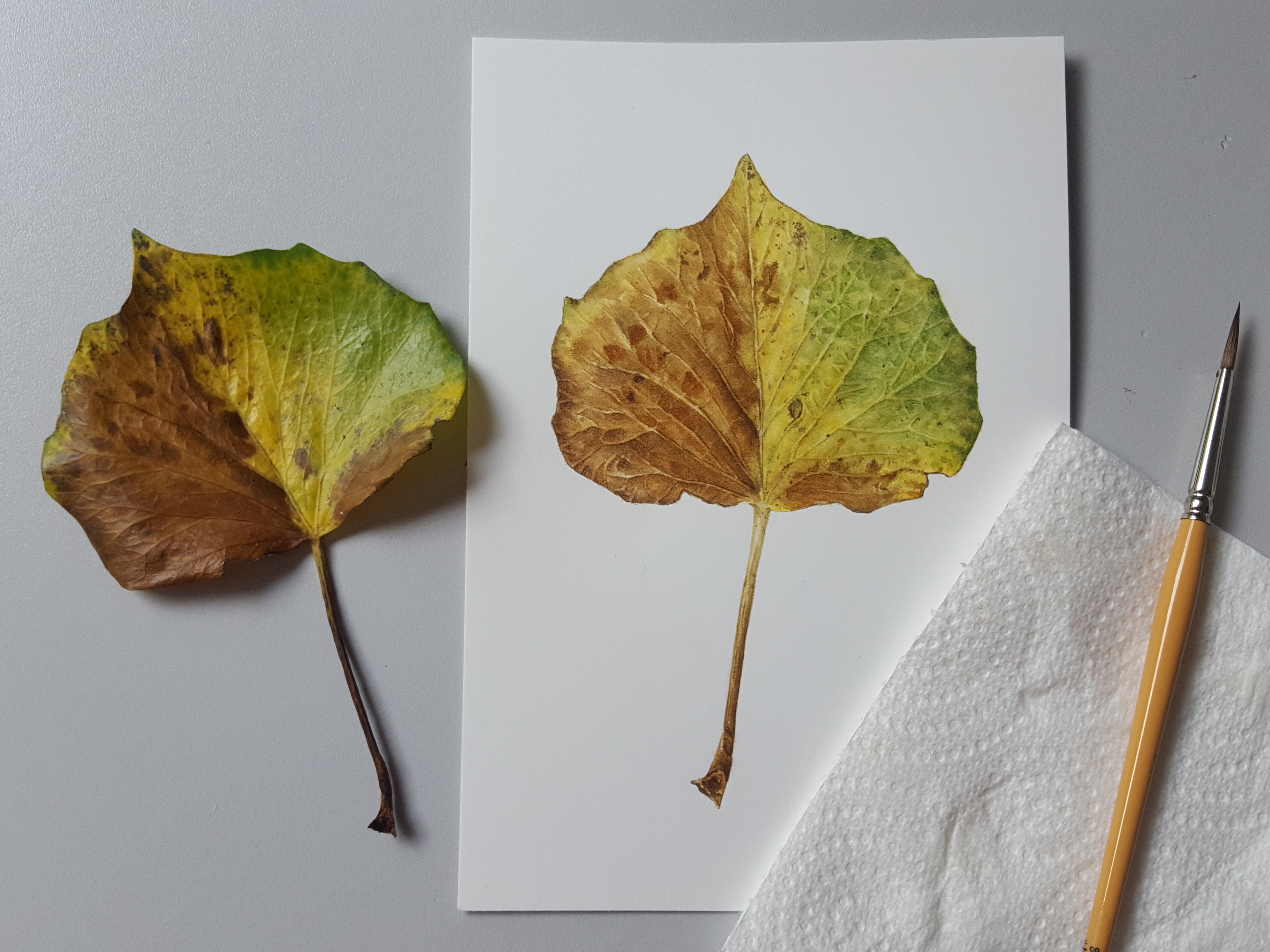
The same technique is applied to the left hand side of the leaf using various brown mixes, enhancing veins, shadows and creating depth. Firstly, I used the different brown mixes to create the mottled pattern. Once this was totally dry, I applied graduated washes along the bottom sides of the larger veins to create the shadows. Next I worked into the areas in between the side veins to define the undulations and finer veins using the same method. You can see how it’s starting to take shape now. Lastly, I added a thin wash of BS and QG mixed to enhance and warm up the browns.
I couldn’t resist painting the stalk earlier in the painting! I just love fine detail work. For the stalk I began by putting a thin wash of no. 11 all the way down the stem. Then I added the brown details using 4, 5 (darker one) and 9 using dry brush method. Lastly, I added thin washes of my shadow colour no. 6 along the left and right side edges to create the curve of the stalk. This is more obvious at the top of the stalk where the leaf begins.
The final details…
To finish up the left side I applied more shades of brown, to create the patterning, using no. 4, 5 (darker version) and 6. I also enhanced the shadowing under the larger veins a little more. Finally, I added in the rusty parts (no. 10) and fine detail using 7 & 8. I then added a fine thin wash of grey/brown along the left side of the middle vein to give it depth. This enhances the dip where the leaf bends.
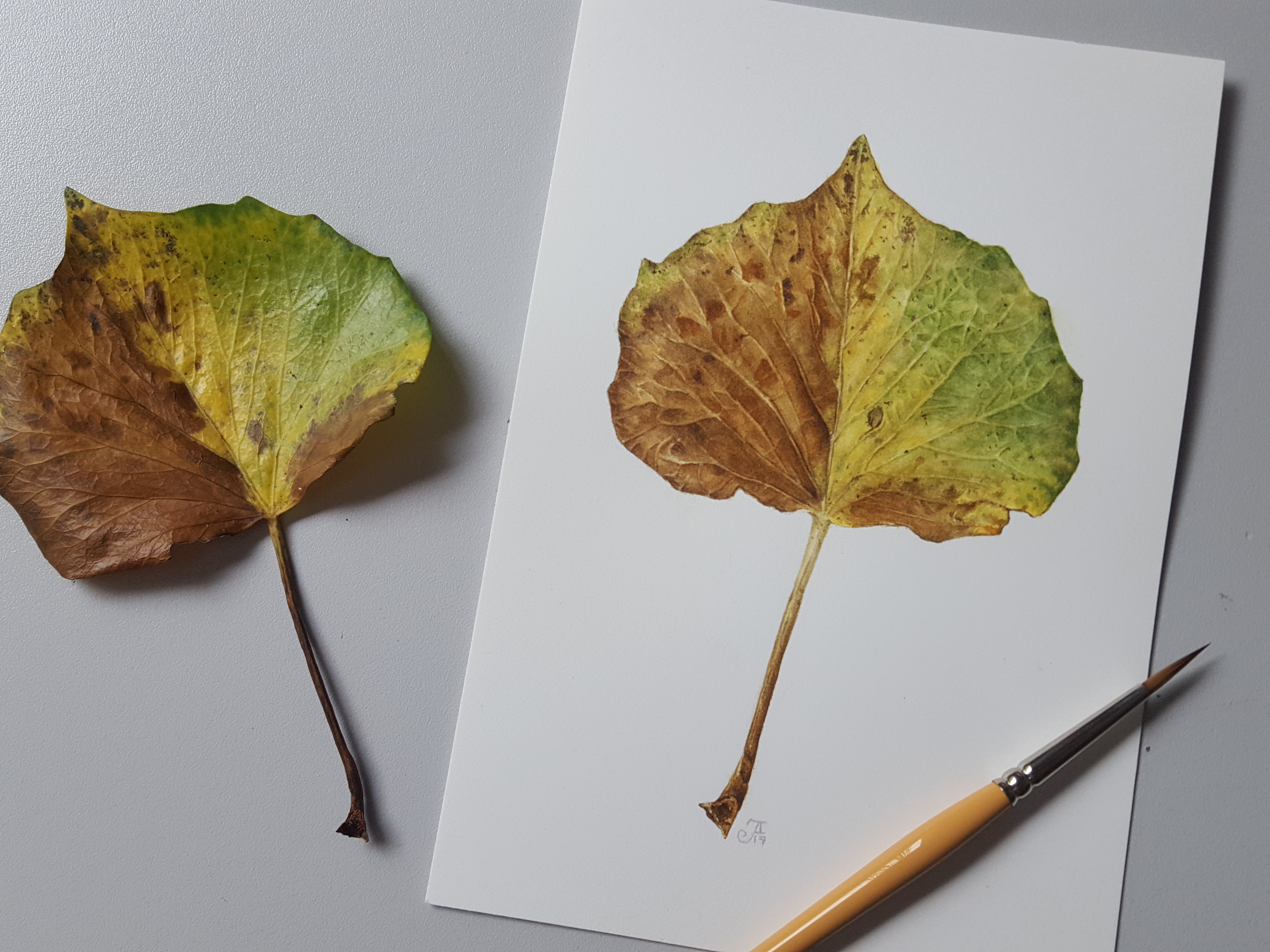
The finished painting…
So that’s it, all done! I would like to have kept more light on the right side of the leaf but with all the working into the small veins it disappeared a little. We learn something from everything we paint!
Any question please feel free to contact me via here or private message me on facebook!
https://www.facebook.com/jackieisardbotanicalnaturepainting/
Hedera hibernica – copyright Jackie Isard Botanicals 2017. All rights reserved.

Thank you for sharing this very informative.
LikeLiked by 1 person
So pleased it was helpful!
LikeLiked by 1 person
This was wonderful! Your explanation was really detailed, and showed the exact colors, mixes, etc. I’m so inspired now to try something like this. Thank you so much!
LikeLiked by 1 person
My pleasure!
LikeLiked by 1 person
I’m not a painter, but I just have to leave this comment at your lovely site. Since you are interested in painting ivy, please look up and find the short story by author O. Henry titled, “The Last Leaf”. It takes only a few minutes to read. It is my most favorite short story of all time and brings tears to my eyes every time I read it. Thank you and best wishes.
LikeLike
I am not a painter, but I just have to add the following to your lovely Blog. As you clearly love painting leaves – and in this case ivy leaves – may I suggest you look up and read a short story by author O. Henry titled, “The Last Leaf”. It is my most favorite story of all. It takes only a few minutes to read, but have some Kleenex tissues nearby when you do read it. Thank you and best wishes.
LikeLike