
Blue hues…
Welcome to the second ‘Colour matters’ blog, The topic this month is about my favourite Winsor and Newton blues and a select few that I use as an underlay colour. Laying down a pale blue underlay is a great way to cool a colour mix placed above and enhance strong highlights when added thinly along the edges of them. Just as yellow will warm from underneath and violet will darken shadows. You may have come across this method when painting richly coloured subjects like Holly and Conkers. Let’s find out a bit more about the blues Many blues are granulating and some are semi-opaque or opaque. It is useful to know what’s what! When painting in layers, transparent and semi-transparent pigments are best to achieve translucence and depth. Opaque pigments will make your work look dense on watercolour paper. The symbols on your tubes and pans will advise you of this. Those bearing the marks ‘A”, ‘AA’, ‘I’ and ‘II’ are ratings which are best for lightfastness and permanency. Transparency symbols look like this: Here I have split some of the W&N blues into categories. The permanency, lightfastness and transparency ratings are under each colour:
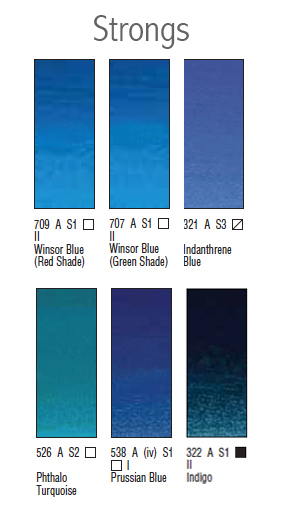 Strongs – those which have greater intensity of pigment, you’ll need less when mixing!
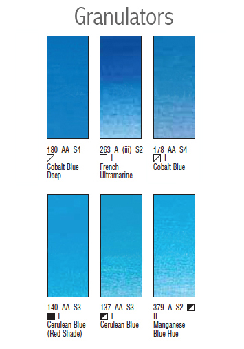 Granulators – those which granulate, not good for smooth rendering! Some of them will granulate more than others. Cobalt Blue isn’t as grainy as French Ultramarine. However, Ultramarine Green Shade shows very little granulation, but it does have a very slight green bias compared to French Ultramarine. I like the intensity of this pigment compared to French Ultramarine though.
Cerulean is a particularly granulating pigment and semi-opaque. If used as an underlayer, you will not achieve a smooth see-through effect with it. It is good for textured style painting though. See the image below for a comparison. Hopefully you can see it as this was quite hard to photograph! The difference is more obvious in real life. Try it out and see for yourself.
Granulators – those which granulate, not good for smooth rendering! Some of them will granulate more than others. Cobalt Blue isn’t as grainy as French Ultramarine. However, Ultramarine Green Shade shows very little granulation, but it does have a very slight green bias compared to French Ultramarine. I like the intensity of this pigment compared to French Ultramarine though.
Cerulean is a particularly granulating pigment and semi-opaque. If used as an underlayer, you will not achieve a smooth see-through effect with it. It is good for textured style painting though. See the image below for a comparison. Hopefully you can see it as this was quite hard to photograph! The difference is more obvious in real life. Try it out and see for yourself.
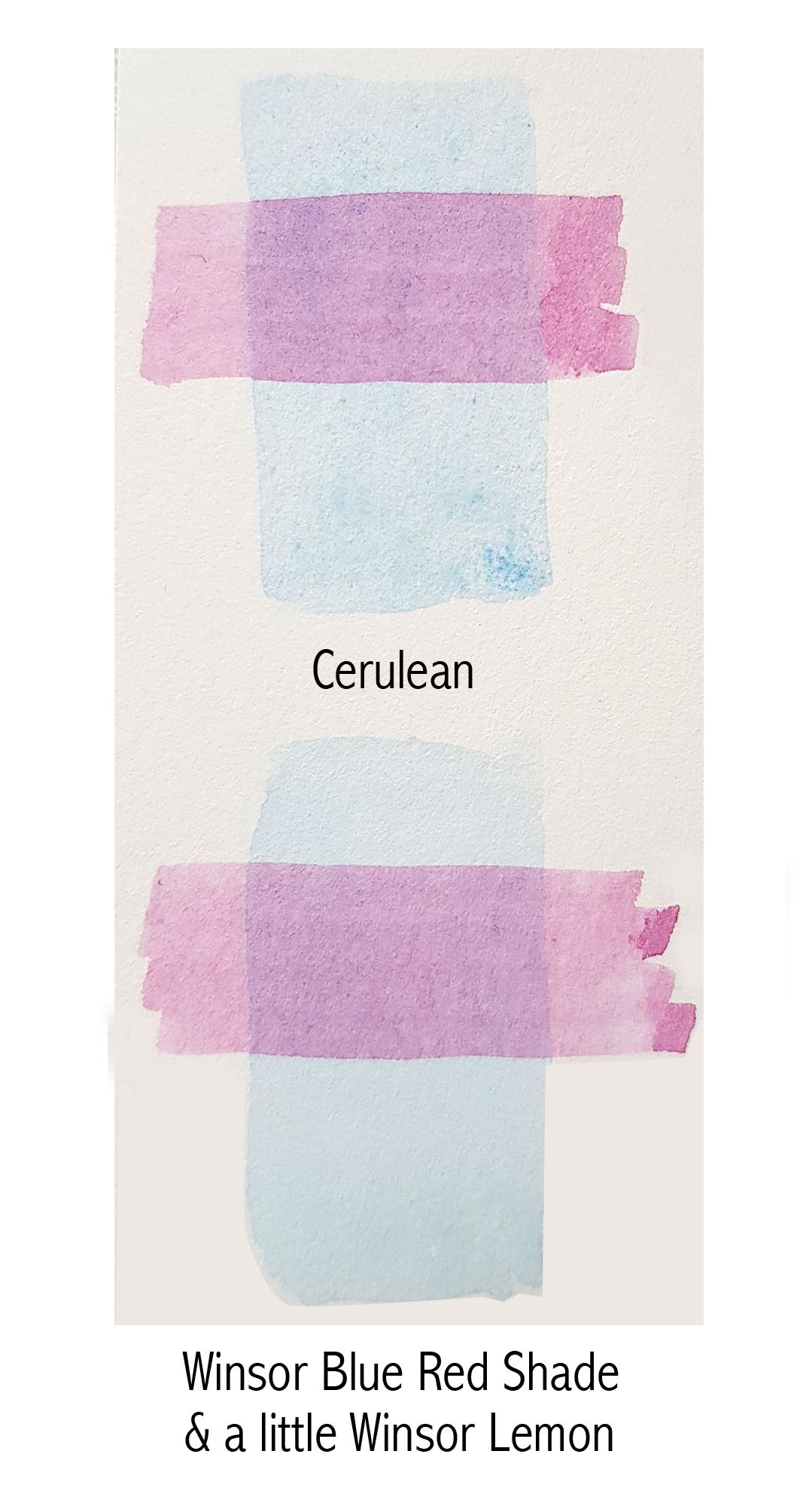 As seen above, a purple overlay was painted over base layers of Cerulean and Winsor Blue (Red Shade). The purple mix overlaid is a transparent mix. As you will see in the Cerulean example, it appears less crisp and quite mottled by the granulation. It also looks a little flatter where transparency is concerned. The Winsor Blue (Red Shade) underlay appears crisper and more see-through. So, if you are looking for a lighter blue underlay but with a slight yellow bias, just add a teensy bit of Winsor Lemon to Winsor Blue (Red Shade) and you will have a lovely smooth Cerulean look-alike!
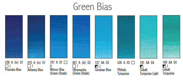 Green bias – those which will cool a mix or are more green in appearance. Further along the image above are the very green bias blues, turquoise. The greener a blue is, the more vivid it will be when mixing greens. It will need to be tamed by adding a tiny bit of red to make a more natural mix. Add Quinacridone Red (QR) to Phthalo Turquoise (PT) and you will make a muted purple/mauve/burgundy because of the green bias. Add QR to Ultramarine Green Shade (UGS), a less green biased blue, and you will make brighter purple and mauve. This is because the green bias adds more yellow to the mix muting it down. Yellow and blue make green (green/blue), plus red makes brown!
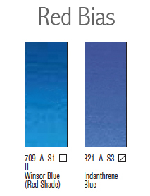 Red bias – those which will add warmth a mix. Add Transparent Yellow to a red bias blue and you will make more natural greens. Add it to Winsor Blue (Green Shade), a green bias blue, and you will make vibrant but less natural emerald greens. Red will need to be added to tame these mixes.
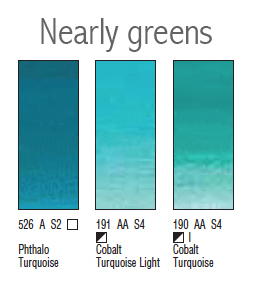 Nearly greens – those which have a definite green bias. You will notice above that Cobalt Turquoise and Cobalt Turquoise Light are semi-opaque. They also granulate. I would only use these for textured, looser style painting.
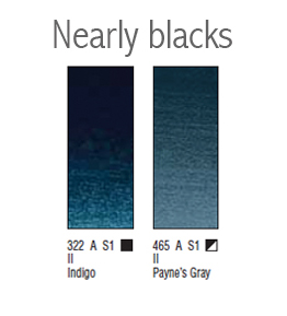 Nearly blacks – those blues which are very dark pigments with a blue bias. Notice also that both Indigo and Payne’s Grey are opaque and semi-opaque. These pigments contain black which gives them their opacity. Both have the same colour index numbers – PB15 • PBk6 • PV19 but in different proportions. The black colour index will make a mix dense and flat looking. These pigments are only useful in extremely dark areas although darkening a mix is much better using transparent or semi-transparent primaries. If done this way, it will still have a see-through feel despite being almost black.
My underlay blue choices
My favourite blues for underlaying are Winsor Blue (Red Shade), French Ultramarine and Cobalt Blue. Winsor Blue (Red Shade) is particularly good when watered down as it is really smooth. It is a lovely bright red biased blue. Make sure you paint it on very pale though as it is one of the stronger pigments. It is also one of my favourite blues to mix with. French Ultramarine, although it granulates, when used very thinly it adds a nice coolness. It is a blue with little to no bias. It is great for edging highlights on dark coloured leaves like holly. Cobalt is a lighter blue which also granulates a little. Again, used thinly, it adds a nice coolness to the layers above.
Well that’s it for this month! If you like, please do message me with any suggestions of which colours you’d like to discuss next.
Until the 24th of next month, I hope you all have a great August. Maybe even have a break and be able to spend a few days away from home!
Nearly blacks – those blues which are very dark pigments with a blue bias. Notice also that both Indigo and Payne’s Grey are opaque and semi-opaque. These pigments contain black which gives them their opacity. Both have the same colour index numbers – PB15 • PBk6 • PV19 but in different proportions. The black colour index will make a mix dense and flat looking. These pigments are only useful in extremely dark areas although darkening a mix is much better using transparent or semi-transparent primaries. If done this way, it will still have a see-through feel despite being almost black.
My underlay blue choices
My favourite blues for underlaying are Winsor Blue (Red Shade), French Ultramarine and Cobalt Blue. Winsor Blue (Red Shade) is particularly good when watered down as it is really smooth. It is a lovely bright red biased blue. Make sure you paint it on very pale though as it is one of the stronger pigments. It is also one of my favourite blues to mix with. French Ultramarine, although it granulates, when used very thinly it adds a nice coolness. It is a blue with little to no bias. It is great for edging highlights on dark coloured leaves like holly. Cobalt is a lighter blue which also granulates a little. Again, used thinly, it adds a nice coolness to the layers above.
Well that’s it for this month! If you like, please do message me with any suggestions of which colours you’d like to discuss next.
Until the 24th of next month, I hope you all have a great August. Maybe even have a break and be able to spend a few days away from home!


