Blog 25 : Colour matters

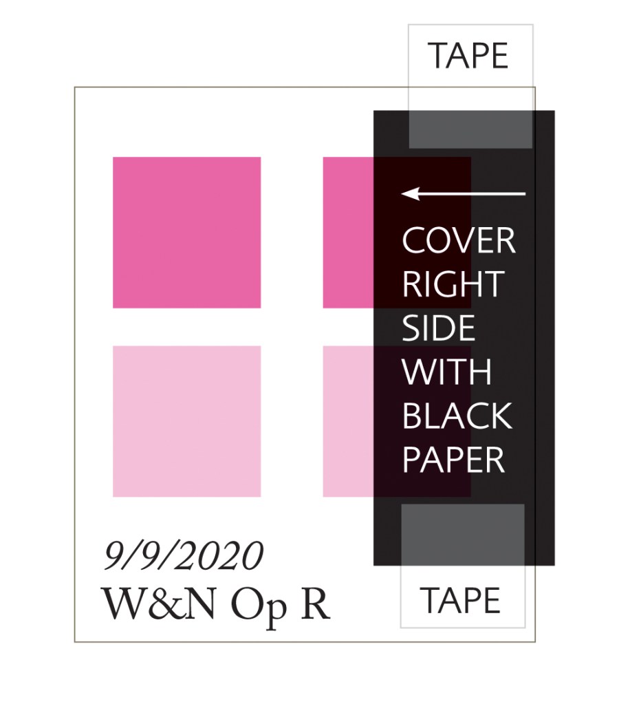
Colours with the same name – don’t be fooled!

A little bit of advice today. Never rely on one manufacturers pigment being exactly the same as another brand, even if it has the same name.

Quinacridone Gold is one example of this anomaly. Winsor & Newton Quinacridone Gold is made with index numbers PY150, PR206 and PV19 but the Sennelier version uses PY150, PR206 and PR101 and Daniel Smith, to further confuse, is made with PY150 and PO48. All three brands will look different when painted due to this.

Quin Golds by Sennelier, Winsor & Newton and Daniel Smith

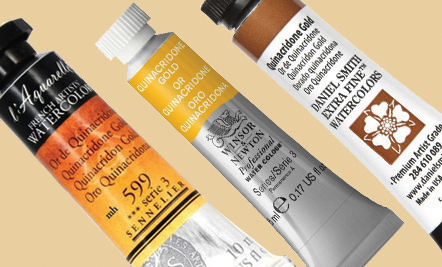
All brands have the bright PY150  yellow pigment. This is the same pigment used in Transparent Yellow. The Winsor & Newton version is definitely a more muted colour than the Sennelier version and the Daniel Smith one is quite different again. 

Let’s look at the colour index numbers first. These are the index numbers for all three brands. Winsor & Newton: PY150 is a bright yellow, PV19 is a cool magenta, PR206 is a red/brown. Sennelier: PY150 and PR101 a reddish terracotta, a little like Burnt Sienna. Daniel Smith: PY150 and PO48 a burnt orange. 

Here is an analogy of the index numbers within these three pigments.

Winsor & Newton: PY150 (yellow) + PR206 (red/brown) + PV19 (cool magenta like Permanent Rose and Permanent Magenta) – the spike of magenta makes this version more muted because PV19 is cool and very near to the violet/blue spectrum. When red/brown, yellow and the violet biased magenta are mixed we get a golden beige/brown. The magenta makes this mix a more muted gold with a slight brown bias.

Sennelier: PY150 (yellow) + PR206 (red/brown) + PR101 (terracotta/burnt sienna) – the warmth of this mix is due to red index colours being of the same warmth and bias. It is only slightly muted and more golden than the Winsor & Newton version as there is no violet or cool bias.

Daniel Smith: This version of Quinacridone Gold is made with PO48 and PY150. PO48 is a burnt orange tone. This is a warm and brighter version due to no violet or red/brown influence. 

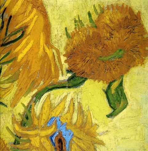
Quinacridone Gold is a colour which sings out in this autumn subjects like this magnolia leaf below!

So when you are selecting new pigments, always check the index numbers. Single index numbers are best for mixing but occasionally you will find a colour with two or even three, like Quinacridone Gold. When mixing with pigments of more than one index number, be aware not to add too many other pigments to it. A maximum of three index numbers mixed together are best for vibrance. Quinacridone Gold is already a muted colour by having three index numbers, so adding more index numbers to it will just mute it even further to brown.

For everything you need to know about colour mixing theory and application techniques see my book below which will be available to purchase next year in March 2021.

Until then, happy painting!


Watercolour Mixing Techniques for Botanical Artists

Published by The Crowood Press

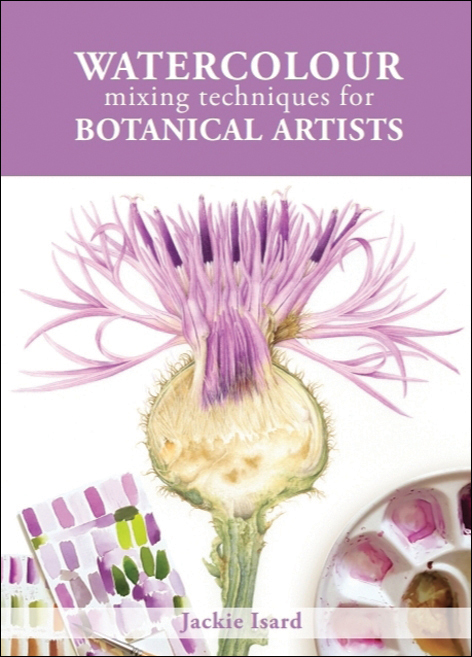
A practical guide to accurate watercolour mixing with primaries for botanical artists
Colour mixing is a key skill for the botanical artist. In this practical guide, Jackie Isard explains how to observe and use colour accurately. She shows artists how to make informed choices when selecting pigments, as well as how to learn about colour mixing and its application.
• Gives detailed instruction and advice on understanding colour and pigments
• Explains how to ‘see’ colour and tricky mixes, from greens and reds to the difficult botanical greys
• Includes advanced colour application techniques – colour enhancement, shadow colours and colour temperature transition
• Step-by-step guides illustrate how to paint with layers, how to use underlaying colours to enhance, and colour and fine detailing

Order online via book shops or Amazon. More information on how to buy is on my website www.jibotanicals.co.uk. Please note, preorders for USA and Canada are available online. Launch in the states is October 2021. E-books are also available.


Online courses for botanical artists:
•  Mixing Watercolour Accurately for Botanical
•  Fine Details and Finishing Techniques
For more information and course outlines see my website at:
www.jibotanicals.co.uk


NEW MINI-BOOK for beginner botanical artists being launched soon. Order from me direct when it is announced on Facebook or via email if you have joined my website mail-list www.jibotanicals.co.uk. Please note, no preorders are being taken at present.

The Little Book of Watercolour
for Beginner Botanical Artists

A very useful little guide for beginner botanical artists wishing to learn how to use watercolour and their painting materials.
• Water and pigment balance 
• Brush types and uses 
• Using a palette
• Exercises to improve brush skills 
• Useful painting techniques

This self published mini-book is available to purchase. See the preview flip through blog here on my blog. Please contact me personally to buy, jackieisard@jibotanicals


Email address:jackieisard@googlemail.com
Facebook:https://www.facebook.com/jackieisardbotanicalnaturepainting/
Instagram: @jackieisard
Blog: https://jibotanicals.com/
Web: https://www.jibotanicals.co.uk/
Etsy shop: https://www.etsy.com/uk/shop/jibotanicalsGifts

Blog 24 : Colour matters

An exercise in pink

I painted this Greater Knapweed flower head a couple of years ago and it truly was an exercise in pink even though the flower is purple. I cut it in half because I wanted to show the inner parts as well as the flower head. It also gave me the opportunity to use a technique called ‘painting in the negative’ in the area where the seeds are produced. I found this so intricate and interesting. The flower colour, in real life, is a bright purple/pink. Lighter areas are more pink in tone and darker areas more violet/purple. The whole inflorescence is exquisitely designed and beautiful to study up close. I just loved ensuring the colour mix was just right and painting in all those lovely fine details!

I have written the colour mixes next to the painting image below and highlighted where they were used. There is no sign of Opera Rose! Quinacridone Magenta was used to make the really bright pink and some Winsor Blue Red Shade added to make the purple tones. You’ll achieve a brighter effect by making sure the highlights are very light and by using good quality white hot pressed watercolour paper. So no need to go for Opera Rose which we know fades over time. Here’s the pigment list:

Transparent Yellow – TY
Quinacridone Gold – QG
Winsor Blue (Red Shade) – WBRS
Indanthrene Blue – IB
Cobalt Blue – COB
Quinacridone Magenta – QM
Permanent Rose – PR
Burnt Sienna – BS
Perylene Violet  – PV
Winsor Violet – WV

I added a thin glaze of Winsor Violet to some areas as a warm overlay towards the end of painting to enhance the violet/purple tones within the subject and occasionally a little thin cool pale blue glaze was added too. Generally, I would use French Ultramarine as a cool overlay. In areas where the pink tones appeared very slightly warmer a pale glaze of Permanent Rose was added. The creamy yellow mix for the bottom of each floret was made with Transparent Yellow and a tiny little bit of Permanent Rose. Some of this mix was also added to the central dissected area which also had many beautiful beige and golden tones.

Comparing pink pigments

Permanent Rose (PV19) is a slightly warmer pink with a violet bias whereas Quinacridone Magenta (PR122) is cooler and has a very strong violet bias. Sennelier Rose Madder Lake (PV19) has the same index number as Permanent Rose and they are indeed very similar. Although I definitely consider Sennelier Rose Madder Lake to be a tad warmer than Permanent Rose. Pinks come in many forms but all these pigments are definitely lightfast.

Many beautiful apricots and warm pink/orange tones can be made with these pigments. Quinacridone Magenta will make the mix more vibrant than Permanent Rose. Just add a warm or cool yellow like Transparent Yellow (cooler), New Gamboge (slightly warmer) or Indian Yellow (very warm). The warmer the yellow, the warmer the mix!

Opera Rose – a much loved colour

Opera Rose is loved by many but as we learned last month it is rated as fugitive. Fading would be much more obvious with certain brands. Winsor and Newton Opera Rose and Daniel Smith Opera Pink are the most reliable for this colour across brands. They will not fade as much as other brands but they will definitely both lose the added fluorescence. Both use colour index PR122. This is the same pigment colour index as Quinacridone Magenta. I personally favour Quinacridone Magenta as my brightest pink pigment purely because it doesn’t pretend to be more vibrant than it is! 

Opera Rose and Quinacridone Magenta test for lightfastness

I did a lightfast test for Winsor and Newton Opera Rose and Quinacridone Magenta over a two year period on my studio windowsill. This is quite a shaded room except for late afternoon sunshine. Testing will show more extreme results in direct sunlight. This is an example of what would happen in less intense sunlight conditions. The test was left on the windowsill from 2017 – 2019. It was hard to get an exact photo so you will just need to take my word for it! The Winsor and Newton Opera Rose (PR122) is still bright but all the fluorescent additive has disappeared making it look less vivid in colour. It now looks more like watered down Quinacridone Magenta. The Quinacridone Magenta (PR122) has not altered.

Making a swatch for testing

The swatch test in the previous image was made in a slightly different way to the example below. I painted fresh pigment onto another piece of paper in 2019 and compared it to the 2017 version. Here is another way to do it. Paint two swatches of the pigment in full colour and a weaker tint underneath on a piece of quality white watercolour paper. Cover one side with black paper. Tape this securely top and bottom so that light cannot get underneath it. Write the date onto the swatch. Leave on a very sunny winsdowsill for at least 3-6 months or longer. This is a good exercise for any colour pigments you are unsure of or that are classed as n.r (not rated).

Watch the Winsor and Newton video ‘Masterclass on Colour Permanence’ to see how a simulated 100 year lightfast test changes these fugitive colours; Rose Madder Genuine, Alizarin Crimson and Opera Rose. Here is the link: www.winsornewton.com/uk/masterclass/permanence-in-colour/

Until next month, happy painting!


Email address:jackieisard@googlemail.com
Facebook:https://www.facebook.com/jackieisardbotanicalnaturepainting/
Instagram: @jackieisard
Blog: https://jibotanicals.com/
Web: https://www.jibotanicals.co.uk/
Etsy shop: https://www.etsy.com/uk/shop/jibotanicalsGifts

Blog 23: Colour matters

Fugitives

We have all heard that dreaded word at some point in our painting career. But what does it mean? How do I know if I’m using a fugitive colour?  It always seems to be the unanswered question!

What is a fugitive and why do they exist?

In history the standards set for pigments was not as important as it is to us now. As time went on pigment manufacturers experimented with different chemicals and natural substances to make even better and more reliable pigments.

During the impressionist period the demand was for bright and vivid colours. However, many of these bright pigments were still fugitive, unreliable and faded badly. The most unreliable were red lakes, madders, carmines, purples, red leads and chrome yellows. A great deal of historic paintings look very different today than when they were first painted because of this. The few more reliable pigments that were made were much more expensive and some famous artists just couldn’t afford them. It was the same for oil colours.

Vincent van Gogh favoured a vivid palette of colours and most of his paintings have faded. His ‘Sunflowers’ painting is a prime example of a fugitive yellow pigment, chrome yellow, which fades to brown in sunlight. Today the flowers look brown. You can see his paintings on this link: www.vangoghmuseum.nl/en/vincent-van-gogh-sunflowers-best-photos-sunflower-close-up-vincent-van-gogh-paintings-wallpaper-image-sunflowers-1323376383
In Victorian times new chemistry developed synthetic prismatic and brighter colours but a lot of these were still fugitive. 

It wasn’t until 1984 that the standards became stricter with the introduction of testing. Nowadays, permanency and lightfast ratings are available for all pigments but there are still some to be aware of. Ratings for artists’ use are A, AA, I and II (companies who use asterisks or stars differ and are detailed in the company pigment lists further on). Anything less than this will not be as reliable for lightfastness. All this information can be found on watercolour company charts or online via their websites. See list of standards below:

I – Very lightfast
II – Good lightfast
III – Average lightfast

AA – Extremely permanent
A – Permanent
B – Moderately durable
C – Fugitive
V – well don’t go there!
n.r. – Not rated by ASTM

I, II ratings are given by the ASTM (American Society for Testing Materials). The society started testing pigments in 1984 to set standards for the performance of art materials, including lightfastness. Winsor & Newton use both ASTM and permanence ratings. In the ASTM system ‘I’ is the highest lightfastness available and ‘V’ is the lowest. Pigments that are not rated by ASTM or the companies who make them bear the symbol n.r.

A, AA – The Winsor & Newton permanence classifications measure not only lightfastness but also general stability of the pigment.

I have made a small A6 chart with all these rating symbols plus transparency symbols for you to download here. Watercolour-rating-symbols  Keep it handy!

Which pigments should I be wary of?

W& N professional 
Alizarin Crimson (B) – as we learned last month Permanent Alizarin Crimson is good, this is lightfast A 
Rose Madder Genuine (B)
Opera Rose (B, really a C!)
Aureolin (II – PY40 this fades to brown despite being rated II)

Daniel Smith
Opera Pink (IV)
Alizarin Crimson (IV)
Aureolin (II – PY40 this fades to brown despite being rated II)

Sennelier
Helios Purple (III)
Dioxazine purple (III)
Quite a few Sennelier pigments are not rated. It’s best to test them yourself to be sure. 

Schmincke
Symbols vary for Schmincke colours, they are as follows:
***** extremely lightfast, **** good lightfastness, *** lightfast, ** limited lightfastness, * less lightfast, – not lightfast
Alizarin crimson (*)
Madder lake deep (**)
Rose Madder (**)
Schmincke violet (**)
Indigo (**)
Olive green (**)
These Brilliant pigments are not rated, would avoid:
Brilliant red violet
Brilliant opera rose
Brilliant purple
Brilliant red violet
Brilliant blue violet

Daler Rowney 
Symbols vary for Daler Rowney, they are as follows:
**** Permanent, *** Normally permanent, ** Moderately permanent,
* Fugitive
Aureolin (** PY40)
21 colours offer **** 
56 colours are rated ***

White Nights
Symbols vary for White Nights colours, they are as follows:
*** high lightfast, ** medium lightfastness, * low lightfast
Hanza yellow (*)
Orange lake (*)
Scarlet (*)
Claret (*)
Rose (*)
Vermillion (*)
Violet rose (*)
Violet (*)
Blue lake (*)

M. Graham
Alizarin crimson (III)

Below is a lightfastness test I did for Opera Rose and Quinacridone Magenta over a two year period (2017 left side and 2019 right side). The Opera Rose is still bright but all the florescent additive has disappeared making it look less intense in colour. The Quinacridone Magenta (PR122) has not altered. The Winsor and Newton (Opera Rose) and Daniel Smith (Opera Pink) versions of this vivid pink are the most reliable across brands using PR122. Both have added fluorescence.
test swatch
If painting for an exhibition where your work will be for sale, always use lightfast pigments. If you have to use a pigment which is less permanent then ensure you put a label on the back of your framed painting stating not to hang it in direct sunlight.

I recommend watching the Winsor and Newton video ‘Masterclass on Colour Permanence’ to see how a simulated 100 year lightfast test changes these fugitive colours; Rose Madder Genuine, Alizarin Crimson and Opera Rose. Here is the link: www.winsornewton.com/uk/masterclass/permanence-in-colour/

So, the secret is to always check the watercolour company rating charts before you buy or look for the ratings on tubes or pans as you shop! If in doubt colour test the pigment by painting it onto watercolour paper and leaving it on a really sunny windowsill for at least 3-6 months.

I hope this blog has answered a few questions for you. Please share it to help others too! Thank you.

Happy painting and see you next month!


Email address:jackieisard@googlemail.com
Facebook:https://www.facebook.com/jackieisardbotanicalnaturepainting/
Instagram: @jackieisard
Blog: https://jibotanicals.com/
Web: https://www.jibotanicals.co.uk/
Etsy shop: https://www.etsy.com/uk/shop/jibotanicalsGifts