It’s been one long amazing adventure since I first wrote about my RHS Sketching Adventures in 2016 and it’s not over yet! This was the year I was accepted to exhibit with the RHS (Royal Horticultural Society). My journey has been of new learning and a great deal of research so far. This Blog is about my continuing journey and the progress I’ve made so far. Up to now it’s been hugely interesting and at times very intensive but most of all a rewarding and enjoyable journey!
You’re most likely wondering why this is Blog 12a. Well, I’m not usually superstitious but today I am. So it’s 12a, not 13!
My journey began by selecting a subject matter to paint for the RHS. A theme which would be interesting as well as something I was passionate about. After all, it involves 6 paintings which need to be absolutely spot on and perfect, so I had to be excited and inspired by my theme. Just before I was accepted, I had become very interested in the importance of meadows which have been declining rapidly from our countryside. This is affecting our very important pollinators and may eventually lead to food and fruit crops failing. I also became very interested in pollinating insects, bees and butterflies. So I had to include them somehow!
My garden, over this time, has become a haven for pollinators. I selected a few areas of my garden to grow wild and planted meadow wildflowers in the grass. I purchased solitary bee homes, planted bee friendly plants, painted butterflies and bees too…I was smitten!


")


Just a few real facts…
97% of our UK Meadows have been lost since the 1930s, taken away by intensive farming, affecting pollinators and wildlife in a staggering way. I became very interested in this subject matter and much to my pleasure I discovered a wealth of organisations all working hard to change things. A few are listed below:
Plantlife (campaigning, sharing knowledge and working with partners for the protection of meadows and introduction of wild road verges);
Magnificent Meadows (taking emergency action to prevent the disappearance of meadows and sharing knowledge);
Coronation Meadows (initiated by HRH The Prince of Wales to create meadow in every county to mark the anniversary of The Queen’s coronation) and of course The Wildlife Trusts, the National Plant Monitoring Scheme and so on… I joined the NPMS (National Plant Monitoring Scheme) to help with their research in my area, around the Severn valley. You can volunteer to record species growing in an area near you. Sadly, the fields they allocated to me for recording species had been ploughed over. Not what we like to see!
My journey took me to many meadows and open spaces where our beautiful native wildflowers still grow. Seeing again the many wildflowers I took for granted as a child, was like coming home after a long time away. I remember as a child sipping nectar from white nettle flowers. Everyone thought I was weird! The wildflower plants were there but I didn’t really pay attention to them much as a young adult, although I’ve always loved long nature walks. Now, I admire them each and every day and through learning recognise many species. I’m always in awe when I see one I recognise!


I even made friends along the way. Thank you Jeni Burton (pictured above) for taking me to Eades Meadow, a truly sacred place. I saw my first Bee orchid with Jeni, we were so excited! (it’s the first photo below).
I take a lot of photos of these wondrous wild flowers. Their beauty really comes to life in a close up. You could quite easily walk right past them!
")


The places I went to all had different habitats. Some were grassland, some damp meadows and some just road verges. I started to learn about which plants favoured particular habitats and decided that this would be my ‘theme’ for the RHS. To study a set of species which favour certain environments. Also included in my ‘theme’ would be relevant pollinators to these habitats and plants as I feel they are just as important. I went through many wildflower plant choices before I finally decided my final 6 earlier this year. I even started sketching some of them which I have now excluded. My final 6 are wet meadow plants.
My first choice was Cardamine pratensis (Cuckoo flower). It grows in the field behind my house. I like to call this field a ‘meadow’ as over the last two years more wildflower species have arrived. The local farmer looks after it. The area where I live is damp so the fields surrounding the house and garden favour wet meadow species. Nice bonus!


Here my research and preparations began. I have watched all of my chosen plants grow through their lifecycle. I decided to plant some Cardamine pratensis plants in my garden which grew beautifully. One day, I was studying the plants and discovered a butterfly egg on one of them. Soon there were more eggs. I was delighted as I knew it was most likely an Orange Tip Butterfly as they use this plant as their larval food plant. Of course, the pollinator I would link to this painting would be the Orange Tip! ….and guess what it’s latin name is? Anthocharis cardamines!


I watched the caterpillars grow over a few weeks until they were quite large. What I didn’t realise was that they would devour the whole plant all the way down to the basal leaves. Every little bit…. so to finish off my studies I went out into our back meadow and thankfully some of those plants were still intact! One cold night this year an Orange tip butterfly rested overnight on my garden plants near one of the eggs (photo above). It was there for 39 hours!
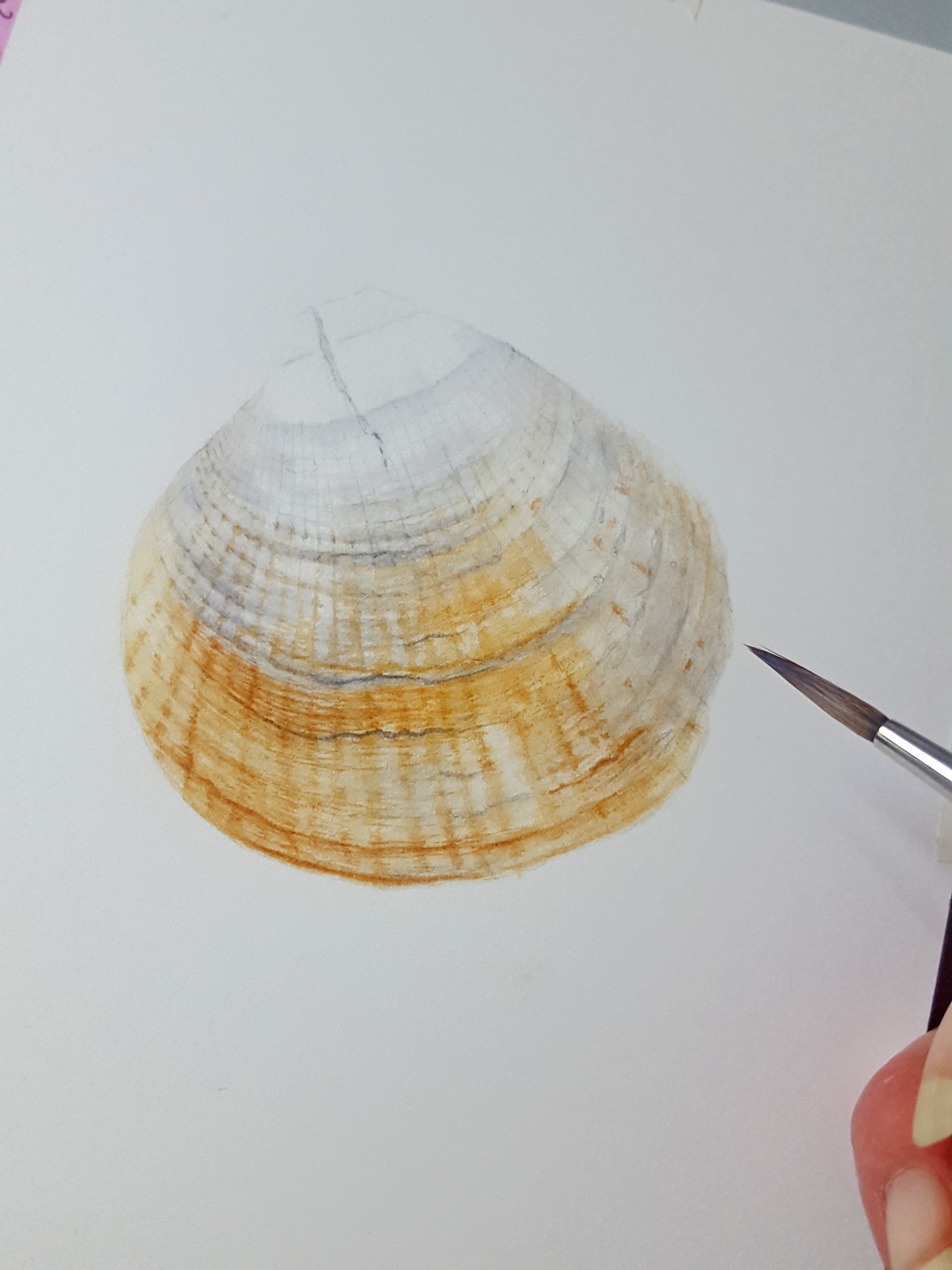
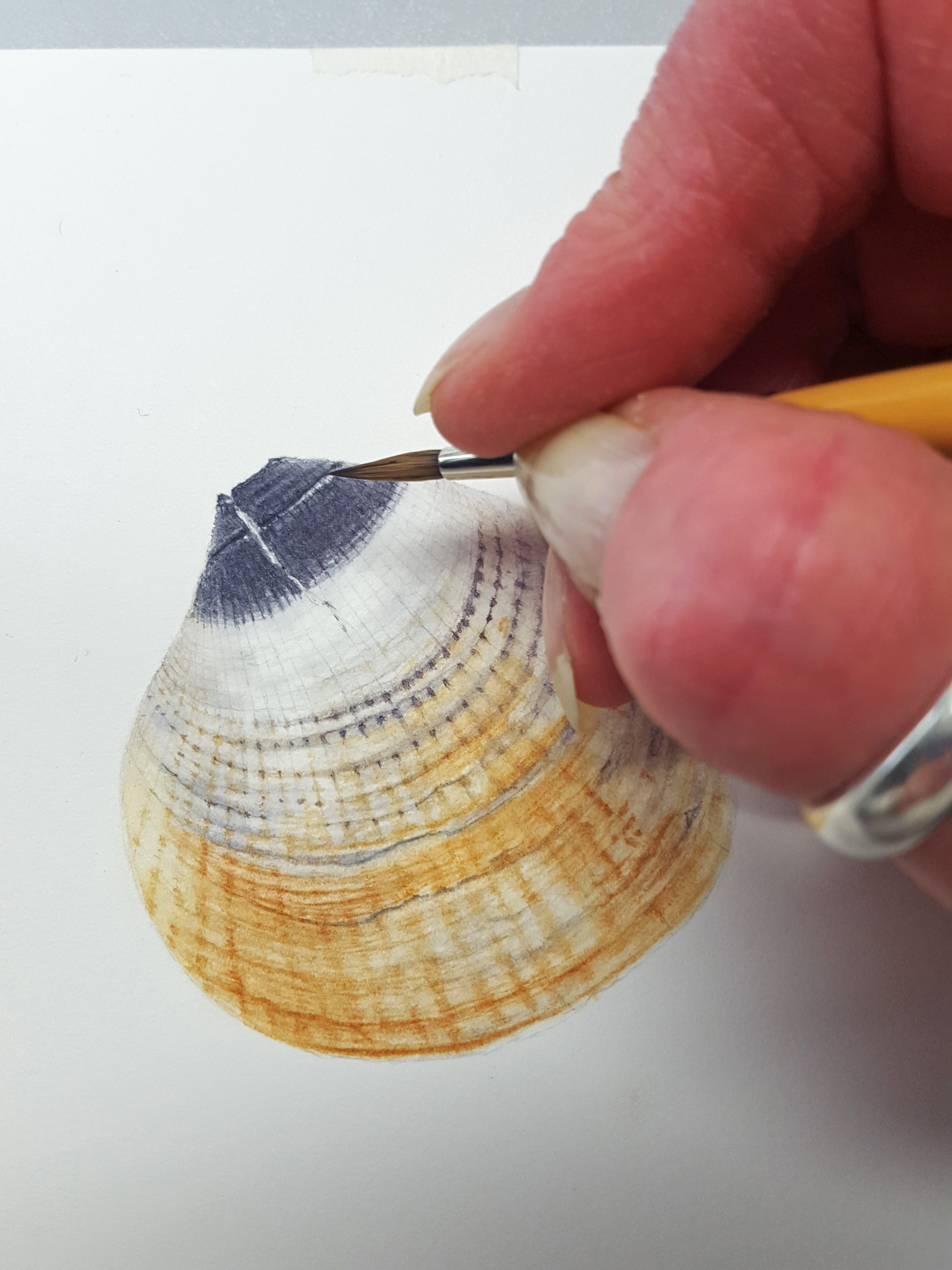
My studies continued and involved some dissection and learning a little botany. It was important to study the whole plant, including a little botany, so that I could understand all its details. Even a study under the microscope to see what’s inside the flowers and how its reproduction works. This would make it a lot easier to draw accurately. By happy accident along the way I discovered that reproduction was not only via seedpods but also from the plants basal leaves. Left in a dish of water for a few days, my basal leaf specimen started to sprout babies! The botanical term for this is viviparous (see photo below). My composition started to form but it changed again this year to the left side composition in the last photo. I felt the arrangement and story made more sense in the second composition idea.


I have started my final 6 this year and completed research and sketchbook notes for 3 of my choice wildflowers. I approached each one with the same detailed research. The ones I have finished researching and almost done compositions for are Cardamine pratensis, Lychnis flos-cuculi (Ragged Robin) and Lotus pedunculatus (Greater Bird’s-foot trefoil).
We’re having a really hot Summer this year which means everything is going over and seeding too early. This is the same in the meadows. The Greater bird’s-foot trefoil growing in my garden didn’t grow to full height and started to seed almost as soon as the flowers opened. This made measuring very tricky! A very kind friend, from a little further north than where I live, offered to pick a few pieces near her house and send it to me. The amazing thing was, she was going on holiday and just happened to be passing my house that day! The pieces of plant were quickly measured and placed in the fridge minutes after they were delivered. These wildflowers are very fragile and fade very quickly once picked. Thank you Paula Golding, you were a life saver!


I still have 3 more wildflowers to study and make compositions of this year and early next year. After that I’ll be painting my final compositions for the rest of the year when the plants are in flower. Here are my final sketchbook notes which will include some dried pieces of each plant on the right side page gap.


My advice to anyone thinking of applying to exhibit with the RHS is to look at Katherine Tyrell’s pages on the Botanical Art and Artists website. There she explains the procedure, rules and how to plan your exhibit. If you are accepted spend at least a couple of years watching and studying your subjects. Preparation and research for the final paintings is essential.
I will return with more about my journey next year. I plan to exhibit, if all goes well, in 2020.
I hope you enjoyed my Blog!