Blog 6 – Conquering the Conker!…

I’m sad to say that some of our native trees are being attacked and damaged by moths and beetles as well as the fungal diseases they already suffer from. For this reason I’ve chosen to keep a painted record of them. The first tree I’ve chosen is the Horse Chestnut (Aesculus hippocastanum).

The Horse Chestnut tree was introduced to the UK in the 1600s and gets it’s name from the horseshoe nail pattern left behind when a leaf falls of a twig. The conker fruits were also ground up and given to horses as a cure for a cough. Here is a diagram showing the details of the leaves.
horsehoe-diagram
This majestic tree is a rich source of pollen in the Spring when it it is covered in upright conical clusters of white, pink, or red flowers. The Horse Chestnut tree is a favourite of the Leaf Miner Moth (Cameraria ohridella) which lays it’s egg inside the leaves. The larva bore through the flesh of the leaves and eat it away from inside, creating brown streaks where parts of the leaf die. In recent years there have been huge numbers of them and our Horse Chestnut tree is now suffering and dropping it’s leaves early. You’ve most likely seen the effect which seems particularly bad this year. Incredible to think that such a small creature, only 5mm in size, can cause such devastation!

We all love and know the ‘Conker Tree’. I remember as a child making what I called fish bones out of the leaves too, by tearing out the green parts between the veins and of course, we all have fond memories of playing the game ‘conkers’ on a string!

I’ve spent the last week finishing my Horse Chestnut painting which has taken me over 4 weeks from start to finish. It’s been a real journey of extremely detailed painting. It really makes you look deeply at your subject matter discovering the world within!  Unfortunately, towards the end of my painting I came into paper problems and had to do some repairs at the last minute. I almost thought I would have to paint the last section all over again but in the end I managed to ‘conquer the conker’!

I started to play with composition and after a few hours decided to make this a 3 part study, triptych painting, of close up detailed parts of the leaves and fruits. The paintings are more or less actual size so it’s been a real challenge!

For the first painting I wanted to do the leaves. Due to the Leaf Miner moth, the leaves have browny golden patches all over them but this creates some very interesting and beautiful colours to paint, even though it’s not good for the Horse Chestnut Tree!

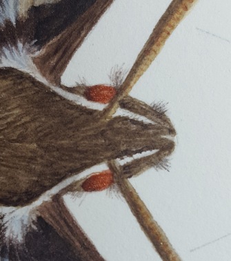
I went out to pick some horse chestnut leaves and fruits for the first two paintings. I left the fruits to one side and got on with drawing up the leaf section focussing on the part where the leaves fan out from the petiole. For the second drawing I decided to draw up some of the varying sized fruits and then cut one open to show the inside. The conkers inside were white and I realised then that I would have to go back in a few weeks to get ripe conkers for my last painting. Strangely after a few hours the white conkers started to turn brown in places, creating a patch effect. It seems exposure to the air makes them turn shiny and brown! By the next day the cut shell had started to dry out and developed a beautiful patterning which delighted me as it made it more interesting to paint.
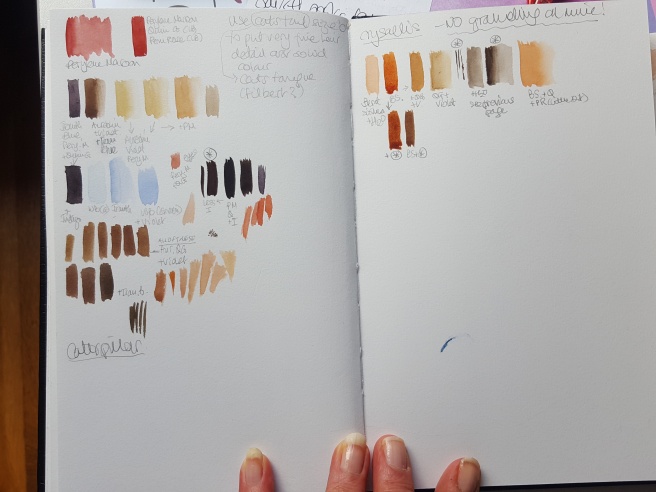
Mixing my colours…

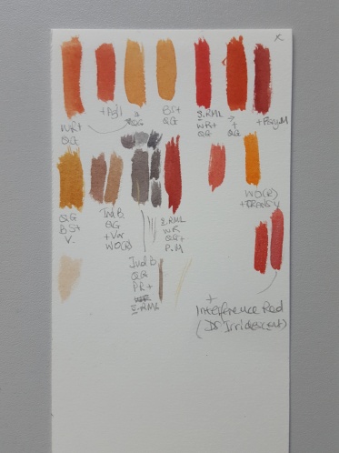
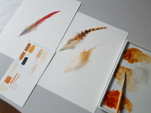
I began to mix my colours up ready to start painting the leaf. I’ve noted here my ‘short forms’ after each colour so that you can hopefully understand my swatch book photos below. I used Indanthrene Blue (Ind. B), Quinacridone Gold (QG), Winsor Lemon (WL), Permanent Rose(PR), Transparent Yellow (TY) for the green areas and Burnt Sienna (BS), Burnt Umber (BU), Quinacriodone Gold (QG), Winsor Violet (V), Trans Yellow (TY), Winsor Lemon (WL) and Indanthrene Blue (Ind.B) to mix the array of beige, golden, nutty brown colours on the damaged areas. The Transparent yellow was also used as an overlay to enhance the green and brown areas. A thinly mixed fine wash can really bring up the colour brightness. Quinacridone Gold can be used in the same way if you want a warmer more muting tone.

I used my usual brushes for this detailed work, a No.2 & 6 Billy Showell brushes, Renaissance Sable Rigger size 0 (for the finest veins), Jacksons’s Icon Flat 1/8” Series 702 (eraser brush) and the Blue handled brush is a cheaper synthetic brush which is used for mixing paint only. You should never use your painting brushes to mix paint as it ruins the tips!

20161027_111534
Painting the Leaves

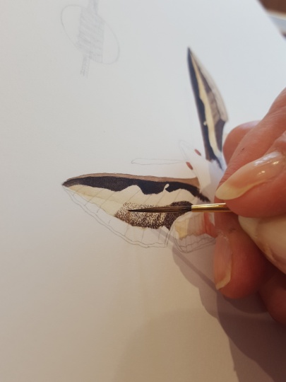
To paint the leaves I concentrated on each section between the lateral veins separately after laying down a couple of pale wash layers. I did not use wet-in-wet for the leaves as the green/brown areas were quite small. For the midrib and some of the lateral veins I managed to leave the white paper showing through without masking by carefully painting the washes alongside each of them. For the small tiny veins I use white gouache mixed with a little yellow or green depending on their appearance. To accentuate the highlights on the leaves and veins I carefully used my eraser brush at the end. This allows you to exaggerate the peaks and troughs of the leaf between the veins. If you’re unsure how to do this then please ask me. One of the videos later in this blog shows you how to do this. More recently (2019) I have discovered the Billy Showell Eradicator brush which is far better than the one I was using. It is a stiffer synthetic brush and has a tapered end which is excellent for erasing small areas. Scroll through the images below to see progress shots.

Painting the conker shells

For the second part of my painting I composed a drawing of the green conker shells and a cut one in half. The inside of shell had formed an intricate patterned and to represent this I used a lot of dots! I used the tip of the Billy Showell no. 2 brush to do this. Dots in various tones of colour and subtle shadows using a very pale shade of warm grey for the shadow area. On the large green shell I added two washes leaving areas free of paint where the small prickles were. Again I used fine dark dots to indicate the pattern on the surface of the shell. There were also hints of beige here and there on the surface. A little shading with a green/grey mix helped give the shells a rounder shape. Finally, I accentuated the tips of the prickles around the outer edge with very pale yellow fading it up to the tip from the green below. The tips of these spikes were painted a reddish brown merging into very dark brown at the point. This stage really finishes the job off! Scroll the images for progress shots.

Now with two paintings completed it was time to paint the conkers! Here is the painting so far.

20161008_171839
Painting the conkers

For the third painting I decided to paint dried conkers. I selected lots of conkers first and arranged them to fill this section but I wasn’t convinced by this composition so it was changed later on. Some time went by and my collection of conkers started to lose their shine and shrivel up. During the next week I noticed that the green fruits on my desk had dried naturally. Much to my pleasure they had turned a lovely deep reddish brown and split open to reveal shiny conkers! I decided to paint the conkers first before the lovely dried shells.  ….and this is why the last painting included the shells too, much more interesting to paint than just conkers!

20161006_122329
Once I had drawn these up I mixed up my colours. I used a vast array of tones and shades for this part of my painting. Winsor Violet was used as a first on the deeper shadows of the conkers to enhance the deep shadows. This is a great way to get richer deep tones on strongly coloured subjects. Again I painted a great deal of dots on the textured area of the outer shells using different colours and shades. To achieve the shading at the edges I used darker dots and a little wash of pale grey.

20161025_175559
Here are some pictures of the stages I went through to paint the conker shells and conkers. In the last three you can see how the Winsor Violet creates a dark shadow from under the conker red/brown mixes. Scroll to see seven images.

I’ve made a few videos which explain how I painted the final conker. I used an extra colour here, Sennelier Rose Madder Lake (S.RML – you could use Permanent Rose instead), to enhance the rich colour of the conkers. It works a treat when added to Burnt Sienna and Quinacridone Gold. My conker shades also include a tiny little extra Indanthrene Blue to darken them. My last conker went horribly wrong due to a paper problem and I spent a long time the next day trying to rectify it. I will explain how I did this after you’ve watched the videos.

20161027_111619

When it came to the last few layers of the conker on the bottom half of my painting, I found the wet-in-wet layers were merging into my highlights and the whole area looking messy instead of smooth and shiny! It’s not so obvious here in the photo as in real life but this part of my sheet must have been too porous or lacking sizing.

20161027_162325
I ran my finger across the paper and discovered it to be very rough. It seems the paper was inferior on just this section of the sheet! I burnished my paper for about half an hour that evening in the hope that I could paint on it the next day. I used a smooth pebble and kitchen roll to do this. To burnish paper put kitchen roll over the painting and rub over the area quite firmly in circles. Make sure you keep changing the place on the kitchen which you are rubbing or it may form a hole and you’ll ruin your painting! It took many hours the following day erasing with my brush and magic eraser followed by some dry brushing to achieve a half decent looking conker.

These are the tools I used to repair my conker

20161028_115101
Whilst waiting for each new area on the bad conker to dry, I carried on with the conker shell behind. This was tricky as it was not just convex but had a rise in it too.  It needed to be shaded carefully to achieve form. Once I had painted this, I used the eraser brush to bring out the highlight at the top  of the higher area and this made it work. I had the same situation with the two half shells on this painting two, shadows were important to make them look concave. Sometimes the eye see things differently. You can be looking at a concave object and it will look convex unless you keep staring at it. It’s crucial to get the shadows in the right places and having a very good light source helps with this. M C Esher made many paintings which confuse the eye, optical illusions! Anyway, I achieved the right look with careful shading and highlights.

domes
Finally I finished off the spikes around the edge by painting them in varying tones of brown, golden yellow and pale yellow at the tips. To the shadow side of each point I added a fine line of shadow grey/beige to accentuate each tip and give a more rounded effect.

Hey presto! ……conker painting finished. I hope you enjoyed this blog and if there is anything you’d like to ask please don’t hesitate to contact me here or on FB.

20161028_165824
Thank you for reading and I’ll be back soon!

*All photos, content, text and videos are subject to copyright – Jackie Isard Botanicals 2017

Blog 5 : Feathery pursuits…

A couple of weeks ago I took a little rest from my Horse Chestnut painting and decided to try and paint some colourful Cockerel/Rooster feathers. I had never painted a feather before and I admire the work of Elizabeth Romanini (https://www.facebook.com/elizabeth.romanini?fref=ts) and thought I would like to try it one day.

I chose three Cockerel/Rooster feathers from my collection, which are very colourful. I thought they would be easier to paint than my Owl feathers to start off with as they are not so pale in colour.

To begin with, I drew up the red feather on my watercolour paper. Making sure I drew it on very lightly so that it would be easy to erase on the paler areas. The colours of this feather really appealed to me. I decided to slant my drawing to the right rather than have it positioned straight up as this seemed a more interesting composition.

Next, I made my swatches mixing up my colours and painting them onto a piece of watercolour paper to keep as a reference should I need to mix more of the same colour. I also note down the colours I used to mix each shade. For the brightest red, I used Sennelier Rose Madder Lake, Winsor Red and a little Quinacridone Gold. This makes a really bright red and the S.Rose Madder Lake just knocks it back a little without losing the vibrance. I then mixed up a selection of warm orange/tan tones for the middle section and a darker red for the shadow areas by adding Perylene Maroon to my original bright red mix. I then mixed some beigey browns and greys for the bottom section of the feather. Now I was ready to start painting!

See my swatch sheet below for my colour mixes.

20160930_122750
For colours listed on all my swatches – the codes are as follows: QG – Quin Gold, WR – Winsor Red, Azil – Alizarin Red, BS – Burnt Sienna, S.RML – Sennelier Rose Madder Lake, Pery M or PM – Perylene Maroon, WO (R) – Winsor Orange (Red Shade), PR – Permanent Rose, Trans Y – Transparent Yellow, WL – Winsor Lemon (not Lemon yellow, V – Winsor Violet, Vi – Viridian, Ind B – Indanthrene Blue, H20 – added water,

One other colour I used was Daniel Smith Interference Red (an iridescent colour) and I used this on the red part of the feather at the end to make it glisten a little.

dot-card

Painting stage 
I began to lay down my first wash. I use a Billy Showell no. 2 brush and a Sable Rigger size 0 for the fine detail. Red can be a tricky colour to build up in layers and if you’re not careful it will go muddy and thick, laying on top of the paper rather than seeping in. For the first wash, I used the wet-in-wet method, this was to allow for more layers to be added safely allowing the colour to increase in density without becoming thick, you must make sure each layer is thoroughly dry before adding the next! Whilst adding the red I also added a little of the orangy/tan colour under the red area and a little pale grey to the bottom, being careful to keep the edges at the bottom very, very pale. Once this was dry I added another wet-in-wet layer of the colours to strengthen it all up. I was careful not to go over the rachis (stalk/vane through the centre) as I would paint this in last. There was, however, a small area of orange tone on the top half of the rachis which needed to blur into the red area.

20160920_170653
I don’t add the fine detail and ‘after feather’ (wispy bits towards the bottom of the feather), until the end.

Now my feather was starting to look nice and bright, I started to add in the pattern detail on the right-hand side orange/tan area with a watered-down grey and then a few of the ‘after feather’ parts – very pale to start with! There is a very pale hint of the orange/tan in the ‘after feather’ area too, so I used a little of that colour with the grey to build up this area.

20161001_114232
Some of the after feathers were a little thicker and you could see the pinnate appearance like the veins on a pinnate leaf. If you look closely you will see this. Use a magnifying glass if necessary. You can add some of this with a very fine brush and light pale strokes. Don’t worry about doing all of them, an indication on a few will suffice. This again needs to be done in layering as you’ll need to have different strengths of ‘after feathers’ to give it depth. The bottom of the feather is quite a dark grey so you will need a few layers to achieve this. Try not to go over all of the ‘after feathers’ and you’ll get a nice variation of shades. 

Now for the detail stage. On the red part, I needed to add some very fine darker red lines and some shadowing to the right side. This looked difficult to paint as the lines go straight up from the bottom to the top. If painting a fine line seems almost impossible you need to get the flow of pigment to water just right to achieve this. Use a number 2 pointed full-bodied sable brush, I use a Billy Showell brush for this as it is very versatile and holds water well. Unfortunately, you cannot buy them anymore but she does have a synthetic range. In fact, I use her no. 2 brush for almost everything! Wet your paint and brush. Another method is to make rough lines by spreading the tip of the brush into lots of points. To do this take a little paint into the brush and push it against the palette surface to make a fan shape. Remove excess from the base of the brush near the ferrule on a cloth or kitchen roll. Test it first! Angle the brush as flat as possible then run it across a scrap piece of paper. Hold the brush more upright for thinner lines. You should get multiple rough lines appearing. Here are two little videos to explain. You need to hold the brush almost upright to achieve fine lines!

Once this was done I started to build up the grey area at the bottom and add the finer details. Having finished the detailing I then painted the main rachis (stalk/vein through the centre) and was careful to retain the light on either side of it. Lastly, I ran a thin darker grey line along the right side of the rachis to give it depth.

20160921_130122

For the next feather, I chose a lovely fluffy one with a chevron design in beautiful tan colours. I applied the same principle as above to this feather but at the end I noticed the light catching the after feathers and they were glistening. To achieve this effect I mixed a little white gouache and used a little Daniel Smith Pearlescent White (iridescent paint) to highlight the shiny parts. It’s even good to add shiny areas to the feather strands. You don’t need to buy a whole tube of iridescent paint, you can buy a ‘Dot Card’ online which is enough. You need such a small amount so don’t waste your money on tubes unless you start using them all the time of course!

20160921_130524
dot-card

See below the iridescent treatment on the after feathers. This is the finished feather with a close up of the iridescent part.

Lastly, I chose a beautiful iridescent emerald green and tan feather. A very flamboyant one with a super curved shape to it. I used the same process to paint the feather and because of its beautiful iridescence, I used Daniel Smith Iridescent Jade and Topaz at the final stage. To achieve a strong emerald green colour I used Winsor Blue (Green Shade), a fabulously rich electric blue, mixed with a little Indanthene Blue, Winsor Lemon (not Lemon yellow) and a touch of Quinacridone Gold. I mixed a dark greyish green for the areas that were darker in shadow, taking great care not to lose my highlights. I build the green up in thin layers to avoid the thickening of the paint on the surface.

20160922_180031

Here is the finished feather and iridescent detail.

Well, that’s the end of my feathery pursuits for now. I’ll be painting some more owl and flamingo feathers next year, so look out for that blog too!

*All photos, content, text and videos are subject to copyright – Jackie Isard Botanicals 2017

Blog 4 – Sketching adventures continued…

Next in my sketch book are two more beautiful wild flowers, Devil’s-bit scabious (Succisa pratensis) and Greater Knapweed (Centaurea scabiosa). Devil’s-bit scabious is a cute little plant with leggy stems ending in a pretty little button shaped lilac/blue flowers. Greater Knapweed is a grander and more flamboyant version of Common Knapweed (Centaurea nigra). The flower head forms in a thistle-like fashion opening into a beautiful cluster of purple petals with flowing delicate petals beneath which float outwards like exaggerated  ladies’ fingers. (See header picture, taken at Box Farm Meadow)

I chose Devil’s-bit scabious as it is the food plant of the declining Marsh Fritillary butterfly and Greater Knapweed as it is particularly appealing to insect wildlife. Insects including bees and butterflies are very fond of this plant, notably the Marbled White butterfly.

In the spring I planted some of the plants I am studying in my garden with the intention of using them for botanical reference and colour studies. The slugs seemed to love it much to my displeasure! But they grew and I was able to study and dissect them as needed. Later in the Spring I also scattered some wildflower seeds which included Greater Knapweed and to my surprise one healthy plant grew tall and strong. This year I have sown seeds for all 8 plants I want to study for my RHS entry, so let’s hope they all grow for next years additions to my sketch book!

Devil’s-bit scabious Succisa pratensis

The flower head of the Devil’s-bit scabious if a perfect bundle of small flowers packed into a ball shape. The pattern formed by these florets is a fibonacci series, spiralled.

20160818_181142
As the flowers open into their beautiful lilac blossoms the pollen bearing anthers protrude further than the flower forming a little halo of darker pink around the flower head with puffs of yellow/white pollen at their tips. When the plant was young  and partly opened it reminded me of a baby in a pretty lace bonnet! As the flowers fade the petals fall and we are left with a green ball of empty sepals which will then develop and produce the seeds. At this stage I took colour references from my plant and painted them into my sketchbook for future reference.

In my studies I dissected the very small flowers and illustrated the parts of the plant. The seed head has not yet matured so I will need to add this at a later date. I wanted to show the plants structure by breaking it into sections as a memory aid. I selected sections of the plant to show how it changes up the stem as the plant is quite tall.

I used a specimen Marsh Fritillary butterfly to take colour reference and pattern form and added it to my drawing of the opening flower head. As my specimen is set in an open position it is great to work from as all detail can be seen and added to the painting. Little error on my part…..I should have turned the butterfly specimen upsidedown as the potion shows the underside of the wings! I wanted to make the butterfly look like it was landing on the flower so used a photo from the internet as reference for positioning.

20160826_154110
To plan out my sketch book page I wanted to include as many features of the plants as possible together with my colour references. I spent time drawing up my composition on tracing paper and then cut it up  to arrange it on my page. Once I was satisfied I had the best arrangement I traced it all off into my sketch book.

20160822_164057
This is my final sketch using watercolour paint and fine liner. It will serve as a good reminder for when I paint the final painting.

20160826_165559

Where does the plants name come from? The history behind this flowers name is quite interesting. “Scabious flowers were used to treat scabies, and other afflictions of the skin including sores by the Bubonic Plague. The work ‘scabies’ comes from the Latin word ‘Scratch’ (scabere). The short black root was in folk tales bitten off by the devil, angry at the plant’s ability to cure these ailments.” Hence the name Succisa which means cut short in Latin and pratensis means ‘of a meadow’.

Greater Knapweed Centaurea scabiosa

The late flowering Greater Knapweed is the only food plant of the Coleophoridae case bearer moth (Coleophora didymella). Insects including bees and butterflies are very fond of this plant, notably the Marbled White butterfly.

I started by studying the flower head and whole plant as it developed. The flower head resembled Common Knapweed, thistle-like in structure but it is not thorny. The bracts form a fibonacci series pattern on the involucre and have a spidery look to their edges. This involucre encases the seeds which are similar to dandelion seeds. When mature the bracts spring open flat to let the seeds be carried out by the wind. This is as beautiful as the flower head. My plant has not yet matured to reveal this so I have taken my reference from a photograph for the time being.

I began my sketch by breaking the plant into sections and dissecting a flower head, again because it is a very tall plant. The leaves are deeply pinnately lobed and the stems quite hairy. Some areas on the main stems resemble cobwebs. The leaves reduce in size as they go up the plant.

Again I wanted to include as many features of the plants as possible together with my colour references. I spent time drawing up my composition on tracing paper and then cut it up to arrange it on my page as before with the Devil’s-bit scabious then I traced it into my sketch book.

20160830_135352
This is the finished sketch ready to trace into my sketch book. I now took colour references and noted them in my sketchbook.

20160831_153643
I really wanted to add the Marble White butterfly to the main flower head but in a different position to the Marsh Fritillary on the previous sketch. I found an image of one looking like it is coming across the top of a flower and decided this was the position I wanted to use. Again I used my specimen to take the colour reference and patterns from.

20160906_143210
This is the finished piece. Some painted and some outlined in fineliner pen.

20160912_154023
Where does the plants name come from? Centaurea, the genus name, comes from the Centaur Chiron, who used flowers of this genus as a poultice to cover a festering wound made by an arrow dipped in Hydra’s blood. The wound was cured and so, the story goes, cornflowers and knapweeds were given the name Centaurea. Greater knapweed was also used to treat skin conditions and scabies, hence the species name scabiosa.

I’ve now also added ‘Habit’ drawings to my sketchbook of all four sketches done so far. A helpful illustration of the whole plant in reduced scale.

Left to right clockwise – Greater Knapweed, Devil’s-bit scabious, Ragged Robin, Horseshoe Vetch

I’ve decided I’d like to buy a flower press! Any suggestions for a good quality one gratefully accepted. These I tried to press in a heavy book. I would love to do it properly next year with all my chosen wildflower plants.

20160929_132459
Well until next time, I hope you enjoyed this part of my Sketching adventures!

*All photos, content, text and videos are subject to copyright – Jackie Isard Botanicals 2017

Blog 3: RHS sketching adventures…

I decided to use a sketchbook to learn about and paint the plants I may choose to paint for the RHS in 2019.  Firstly I researched wildflower plants which are under threat or declining as I wanted to relate them to my concern for our wildlife and the importance of reinstating meadowland. I discovered that some of the wildflower species were quite well known and many rare insect pollinators really depend on them.

Horseshoe vetch – Hippocrepis comosa

The first wildflower I began to study was Hippocrepis comosa (Horseshoe vetch). To my delight I found it growing in the meadow behind my house. Excitedly I looked it up in my Wildlife Key book only to find that there are many similar vetches and that this one was not Horseshoe vetch! I had found Lotus corniculatus  (Bird’s-foot trefoil).  The differences are quite obvious when you know what you’re looking at and it’s always wise to check your species carefully in a good wildflower book first.

‘The Wildflower Key’ was recommended to me as a good resource book. I also own the ‘Collins Wild Flower Guide’ which has lovely illustrations.

I went walking again in the meadow and discovered another vetch, again excited I checked it in my book but now I had found another vetch called Lotus tenuis (Narrow leaved Bird’s-foot trefoil – picture 4 below). I searched on holiday in Scotland, at other meadows in Bannerdown and Box Farm. Still I could not find Horseshoe vetch! Notice the beautiful red colour in the young flowers in picture 2. I will look again next year but have also planted some seeds in my garden and the back meadow in the hope that one will grow for me to paint.

With a little more research and the help of existing botanical paintings, photographs online and my wildflower key book, I began to compose my page dedicated to Horseshoe vetch. I did not rely on photographs, as they can enhance colours incorrectly, to make my colour swatches but picked a piece of the two vetches I found in our meadow and took references from those. All 3 vetches have very similar colouring.


I included an Polyommatus bellargus (Adonis Blue) in my sketch as this butterfly is in major decline and Horseshoe vetch is an essential plant for both the Chalkhill and Adonis blue butterflies as their caterpillars feed solely on it. I used a set specimen I had bought and photo reference for positioning.

I studied the flower heads and seed pods too. My composition seemed like it was blowing in a summer breeze so I put a couple of meadow grasses in the background to add to this movement.

Now it was painting time! As you know I had taken my colour swatches from some suitable live subjects and so I began to mix up my colours . I placed them on the page together with a note of the colours I had used, this I will use for reference when the time comes to paint the final painting. The wings of an Adonis Blue have an iridescence to them and for this I laid a layer of Daniel Smith Iridescent Lilac over the blue part of the wing. You can just about see it in the photo below.

The final sketch included some pencil and black fine liner pen work as well as watercolour painting.

20160818_150715
Where does the plants name come from? The name Horseshoe vetch is derived from the pea like flowers which are arranged is a horseshoe shape. The seed pods have also been described as resembling a horseshoe shape. In folk law it was said that if a horse trod on it, it would be unshod.

Ragged Robin – Lychnis flos-cuculi

The second plant I chose to study was Lychnis flos-cuculi (Ragged Robin). I chose this plant as it is declining in numbers and for the insect pollinator I chose a Bombus sylvarum (Shrill Carder Bee) which is also becoming rare. For this plant I studied a live specimen because luckily one had grown in my garden this year from seeds planted in the Spring. I was able to study it fully and dissect parts too. (*The photo of Bombus sylvarum was borrowed from Wikipedia as I did not have a specimen. They are slightly darker than this image and 10-15mm in size)

Mixing the pink was very tricky as it is a beautiful pale pink but bright as well. I tried a few mixes and found that Daniel Smith Opera Rose, W&N Permanent Rose and a little bit of Aureolin made the perfect pink. I then took more colour references and placed them onto my sketch page. The composition began to develop showing some of the inner flower detail, seed head and a close up of the hairy stem.

Later in the sketch I decided to study the flower’s internal structure more carefully and did a few diagram style illustrations to show this. This was my final sketch page.

20160818_150628

Where does the plants name come from? Apparently this flower was used as a remedy for jaundice, stomach aches, toothache, headaches and muscular strains. The latin name ‘Lychnis’ comes for the greek work for ‘Lamp’. Flos-cuculi means ‘Cuckoo flower’. This is because it comes into flower when  the cuckoo first starts to call. It has a rather straggly and messy in appearance but don’t get it wrong as it is the food plant of long tongued bees, butterflies love it and several species of moth.

Devil’s-bit Scabious – Succisa pratensis

The next wildflower I plan to study is a Succisa pratensis (Devil’s-bit Scabious) and there’s one in my garden just about to open! I’m really looking forward to studying this beautiful little plant.
20160818_181142
Where does the plants name come from? The history behind this flowers name is quite interesting. “Scabious flowers were used to treat scabies, and other affictions of the skin including sores by the Bubonic Plague. The work ‘scabies’ comes from the Latin word ‘Scratch’ (scabere). The short black root was in folk tales bitten off by the devil, angry at the plant’s ability to cure these ailments.” Hence the name Devil’s-bit Scabious.

Yesterday our beautiful meadow was cut, so until next year I will have to await possible new species growing there, let’s cross our fingers!!

I hope you enjoyed this Blog and look forward to sharing my next one with you very soon!

*All photos, content, text and videos are subject to copyright – Jackie Isard Botanicals 2017

Blog 2: Insect adventures…

Alongside my Meadow wildflower studies I am also studying and painting insect pollinators. Pollinating insects are crucial to the environment. Some meadow plants rely on only one type of insect for pollination and some insects need one type of plant to lay their eggs on. If these plants or insects die out, we not only lose the plant but the insect pollinators too!

This is the reason why I feel so strongly about this subject and have chosen to highlight it for my RHS project…..

Plantlife International’s ‘Save our Magnificent Meadows’ project:

“There were once natural wild flower meadows in every parish – today only 2% of the meadows that existed in the 1930’s remain. Nearly 7.5 million acres of wildflower meadow have been lost so far and they are still being destroyed……… The Save our Magnificent Meadows project will protect, conserve and restore wildflower meadows and other grasslands across the UK, and will focus on the Fermanagh grasslands of Northern Ireland, the pastures of west Wales, Scottish grasslands from Edinburgh to Aberdeenshire, the calaminarian and whin grasslands of Northumberland and traditional meadows and pastures in Southern England.”

Rosie Maple of Avon Wildlife Trust:

“The B-lines (Biodiversity lines) project’s main focus is connectivity of high quality pollinator habitat. Wildflower grasslands and meadows are one of the most biodiverse habitats you can find in the UK. We have lost over 97% of them in the UK since the 1950’s. It’s a pretty staggering figure. Part of the main problem of conserving pollinating insects is that many species are not highly mobile. Many species of bees, butterflies, flies and beetles expend huge amounts of energy on flight and need to have a very efficient foraging strategy in order to ingest enough nectar/pollen to maintain this. So in effect they need to ‘know’ that any journey they make will be rewarded by access to a food source. (I recently learned that a distance between 0.5 – 1km between habitat is about what is required for most insects to disperse). A landscape dominated by arable monocultures and human development does not give them this guarantee. So the aim of B-lines is to restore the bits in between, by connecting up our existing, high quality wildflower habitats, creating green corridors and stepping stones that allow the wildflower and associated invertebrate populations to move freely between areas.”

Studying the insects…

I began by going on a Honey Bee painting course with Cath Hodsman and learned a great deal about the insect, it’s behaviour and how a hive works.  I also studied them under a microscope. My painting of a honey bee is unfinished as yet but here it is so far.

honeybee
I then decided to go on Natures Details Butterfly course at the Kingcombe Centre, Dorset, run by Sarah Morrish. I chose to paint a Bedstraw Hawk Moth as it has rather beautiful colours that appeal to me. I have been asked by a couple of facebook followers to describe how I painted it. So, here goes!

I highly recommend the course to any interested in these beautiful insects. You will find details of Sarah’s courses on her website is : http://www.natures-details.com/index.html or on facebook at: https://www.facebook.com/NaturesDetailsArt/?fref=ts

20160802_080555

Painting a Bedstraw Hawk Moth

Firstly I drew up some illustrations in my sketchbook. To draw up the main moth on my composition, I drew up one half as accurately as I could with an H pencil. At this point I wanted to enlarge it slightly so I used proportional dividers to do this. My final drawing was x 1.5. I then traced this half and flipped it over to trace the other half of my moth. It’s not cheating! It just makes life easier and the drawing more accurately.

  Watch the curves, it may take a few attempts to get it just right!

  Take care to draw on details such as patterns, hairy parts, veins, eyes

  Check your drawing against the real sample regularly and adjust it as required

  Ensure both sides look as similar as you can get them, nature is not perfect but symmetry is very apparent in Moths and Butterflies

Using a microscope (x30) can help you to view moths/butterflies/bees more closely. When you look at them under a microscope it’s like another world! I saw the scales and hairs clearly and this helped me with my final paintings. I did the same on my honey bee painting above. It’s a great way to get all the information you need to make your painting more realistic. If you don’t have access to a microscope try using a very strong magnifying glass (x20)

20160804_152158

  Look all over the moth/butterfly, it’s very interesting and fascinating to see what the naked eye cannot see

  Look at the eyes and antenna, notice the way the eye is formed, the antenna can be patterned or they may have scales and hairs

I then looked at some books Sarah had left out for us and was particularly drawn to the Beatrix Potter wildlife one. She had painted small microscopic drawings of butterfly scales in her studies and this prompted me to do a series of illustrations showing the chrysalis, caterpillar, closed wing position, open (set) wing position and a microscope close up of the antenna. I took a look at the moths antenna under the microscope, it looked so interesting and completely different to what I had imagined. It reminded me of a hoover brush on one side and it was scaly on the other.

20160802_162032

Using a light pad/box to save time with tracings

Once the drawings were completed and as perfect as I could get them, I began to trace them off carefully with tracing paper using an F pencil (it needs to be a little darker to see the image on the light pad through the watercolour paper). I then cut up the tracings and played with composition arrangements for a little while until deciding on a more scientific arrangement. The microscopic view of the antenna determined this in my mind as I felt a scientific arrangement suited it better. I then stuck the illustrations into position on the light pad with masking tape being careful to watch the size of the gaps between each one. As my illustrations were forming a line vertically I used a long ruler to mark my centre line first. The gaps need to look comfortable and almost the same in size. I then placed my watercolour paper (HP 140lb (not heavier than this) quality watercolour paper) over the tracings on the light pad. I taped the watercolour paper into position so it didn’t move around and began to draw it very carefully with a 2H pencil. It’s good to use a very light pencil as you don’t want it to spoil your painting. This is especially important if you are painting light coloured plants or insects.

Now I’m ready to start mixing my colours and start painting! I always mix up my colours and tones and do test strips, checking the colours as I go. After that I copy them into my sketchbook and make a note of how I mixed the shades. I try to mix enough paint to use for the whole painting where possible. As you paint you may discover other tones that you need and mix them, make sure you put a dab of those in your book too. If you run out then you have a good idea of what colours you used to make them in the first place.

  Mix your colours carefully, match them against your subject

  Always make a note of the colours you’ve used to mix them with

  Use professional quality water colour paints

20160809_154442

I used a mix of warm colours to make up the colours for the Bedstraw Hawk Moth. You will have heard of warm and cool hues I’m sure. You can mix everything from just 3 colours, a red, a blue and a yellow. The colours will vary between warm and cool hues. You can make colour charts too if needed to help you. Many Botanical Artists have blogs explaining how to do this. For some very good examples and help with colour see Dianne Sutherland Ball SBA blogspot at: http://diannesutherland.blogspot.co.uk/2015/06/about-watercolour-paint.html

  Try out different mixes of colours so you have a good idea of what mixes what

  These are the colours I used to create my Bedstraw Hawk Moth: French Ultramarine, Indigo, Indanthrene Blue,Alizarin Crimson, Perylene Maroon, Permanent Rose,Violet, Quinacridone Gold, Windsor Lemon Yellow, Aureolin, Burnt Sienna

So now I have all my colours mixed up and I’m ready to start painting. I chose to do the wings first. I painted one part on both sides as I went, don’t be tempted to finish one side first! A few things to remember whilst you’re painting:

  Look at the different textures, some may be dotty, some hairy, some smooth

  Use a fine brush to do the stippling of dotty areas; a cats tongue brush, a spotter brush or I use a No. ‘0’ renaissance sable rigger

  Use a medium sized brush to do the washes, I use a Billy Showell No. 2 brush (there are other types but you need one which will hold the water well and has a fine pointed tip)

20160803_144612

  Build your painting up in thin layers, never put thick colour on to begin with. The colour should increase in strength as you go, building it up layers. At times my brown didn’t look warm enough so I laid a very watered down layer of Quinacridone Gold on top of it to warm it up

  Notice how the colours vary across the insect and try to imitate it, study it well before you start

I decided to look at the eyes more carefully towards the end of my painting and found that they were iridescent. The Bedstraw Hawk Moth has coppery iridescence in its eyes. You can use a little iridescent paint to bring this out. Daniel Smith have a number of these available. Butterflies often have an iridescence on their wings too. My moth antenna close up has iridescence in blues and greens as well as creamy golds!

  Look at the hairyness and where it features on your insect. I found some eyelashes!

eyelashes

Always take time to paint your Moth or Butterfly as there is so much detail within. The closer you get to the original, the more realistic your painting will look. If you need any further advice please don’t hesitate to contact me at Jackie Isard Botanicals on facebook.

Good luck and I hope this has been useful!

*All photos, content, text and videos are subject to copyright – Jackie Isard Botanicals 2017