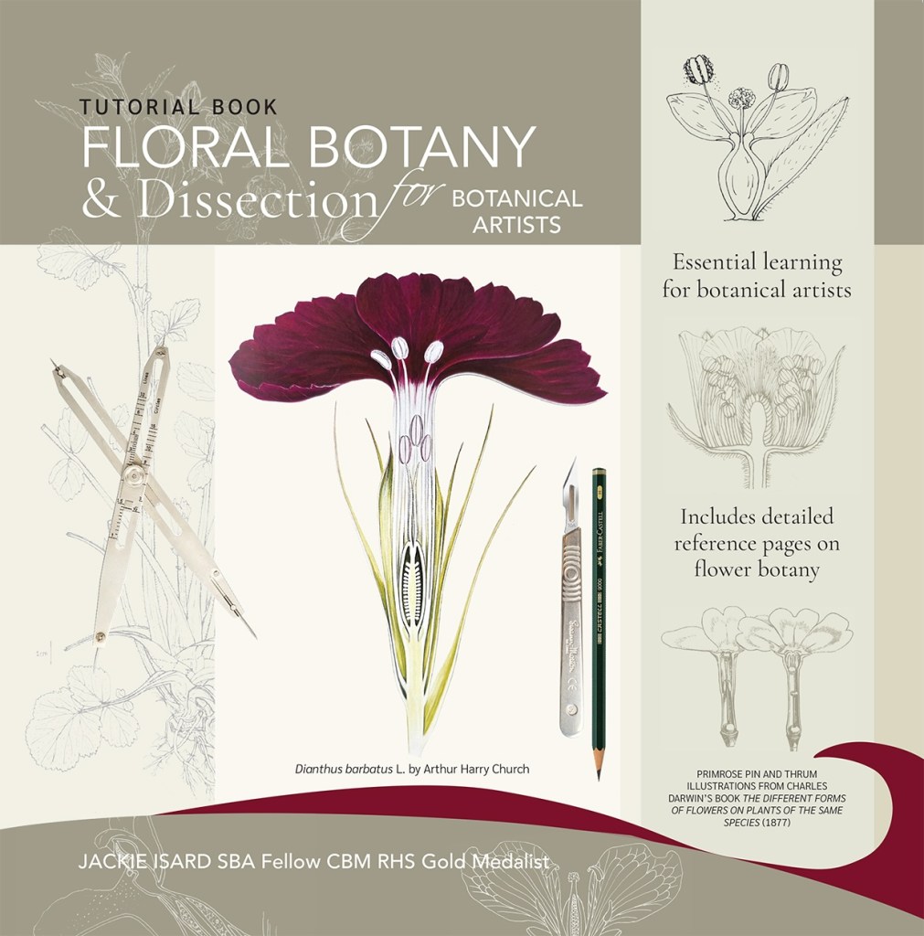
‘Floral Botany and Dissection for Botanical Artists’ Written, designed and printed by Jackie Isard.
When I began my project work for the RHS botanical exhibition I became very interested in botany. It was important to me to paint a true likeness in accurate detail. I wanted my exhibit to look like a series of botanical plates in colour. Each painting included the plant’s lifecycle from bud to seed and because of this my research was done throughout the seasons. Once you start looking at plants, with botany in mind, you just want to know more. It’s very addictive!
I started to teach basic botany to botanical artist students soon after my RHS Gold medal award in 2022. Throughout my RHS studies I learned a great deal about plant botany. I couldn’t have done it without having a professional botanist to hand to check my drawings. It became clear to me that botanical artists really needed to know a little botany in order to understand the plant they were painting. This knowledge helps the artist to make a more accurate and detailed painting. At my basic botany workshops many students would tell me how much their eyes had been opened. It was enlightening for everyone. Knowing a little botany allows you to see or understand important plant details that are typically hidden, distant or unnoticed. Until you start looking more carefully, you really don’t see all the curious and interesting features of a plant!
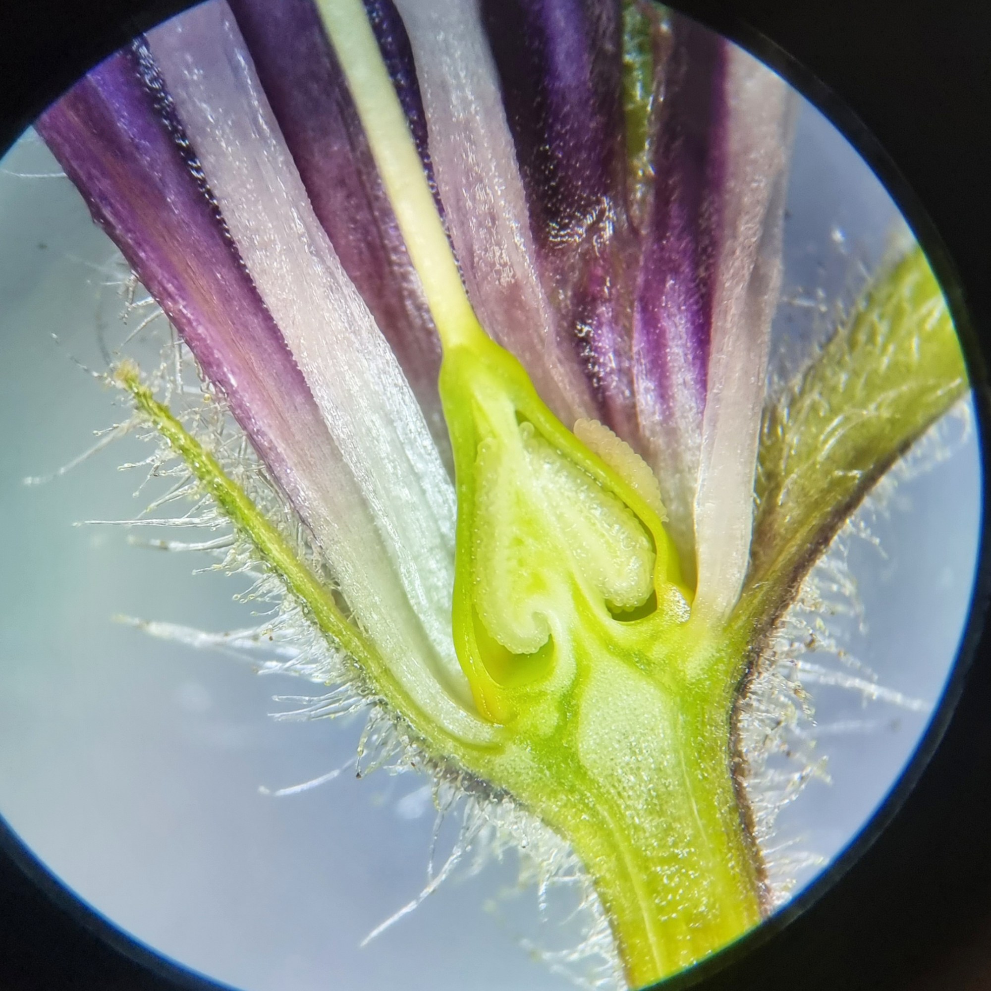
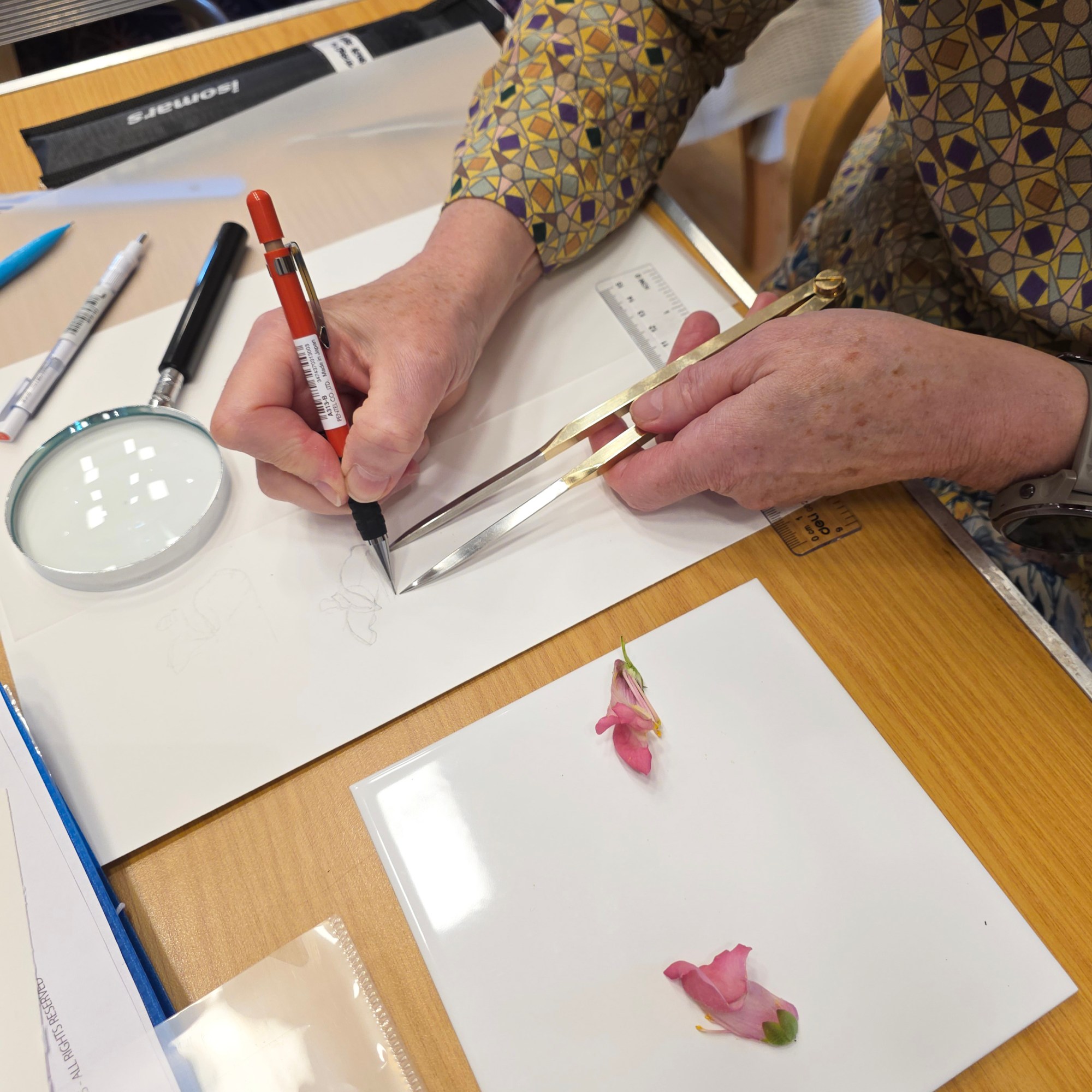
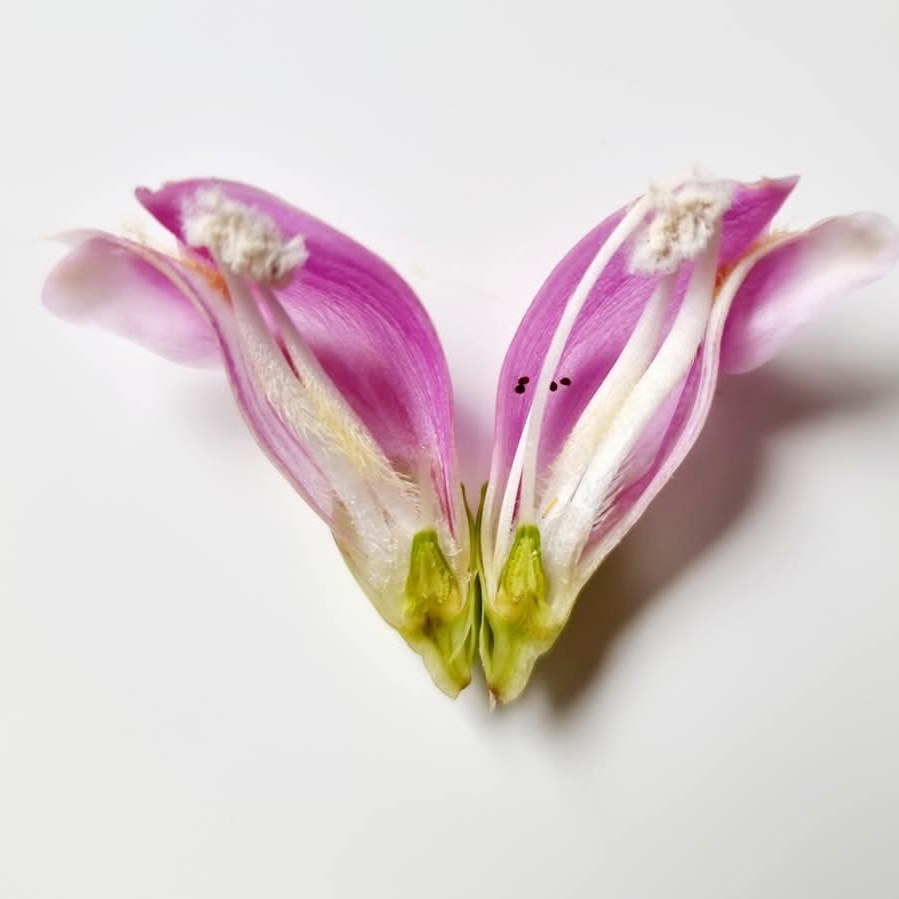
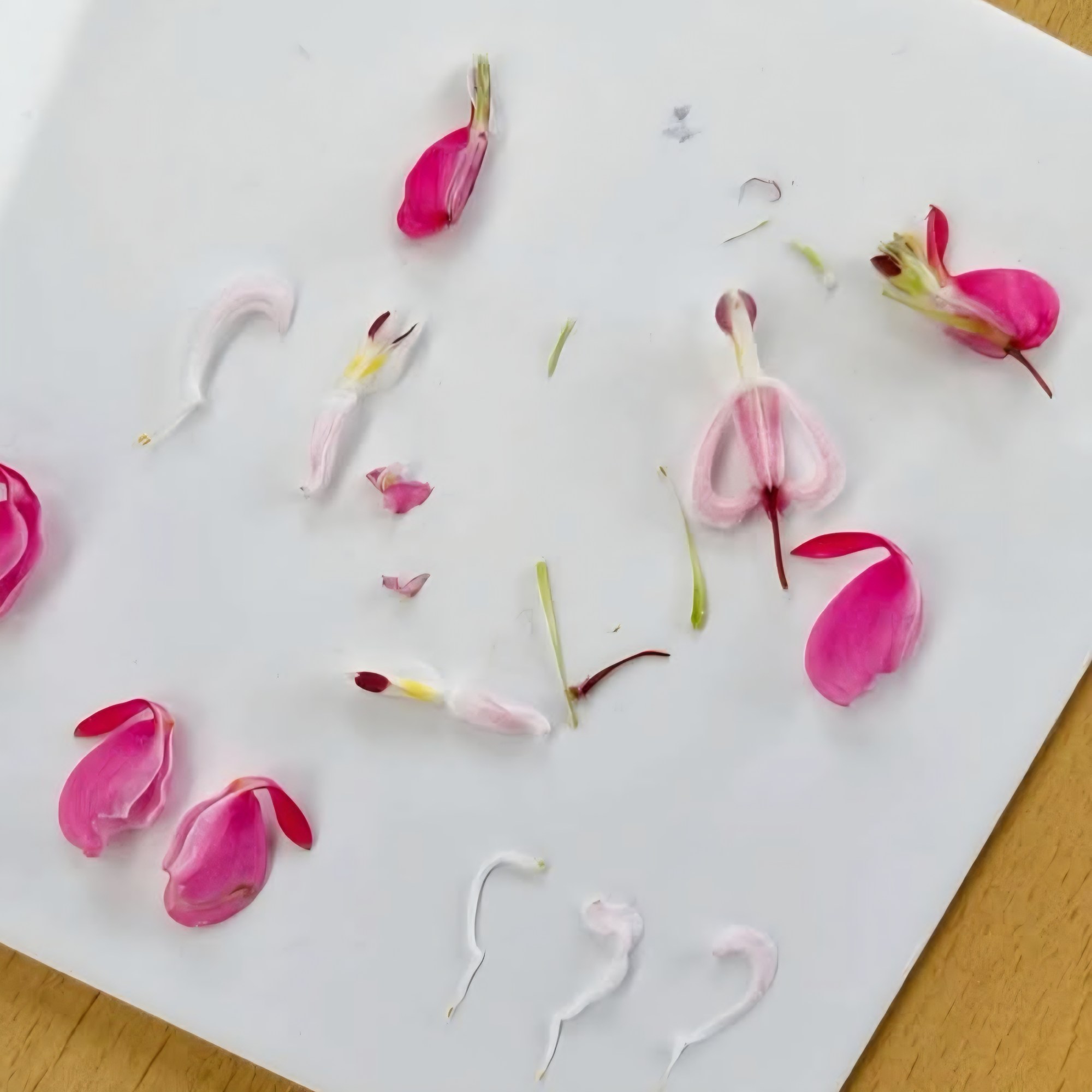
Later, whilst looking at the course notes for my basic botany workshop, I thought about writing a basic botany book. This was too vast a subject and as I am not a trained botanist, I decided to focus on one of my favourite parts, floral botany and dissection. With my professional botanist at hand, I finally made it to the finishing post and created the book you may well be holding in your hands soon. This tutorial book will teach you a great deal about flower botany and give you an understanding of how to draw a flower dissection accurately and in detail. It is packed full of information with plenty of illustrated diagrams and photos. There is also a reference section at the back on flower botany and terms.
What’s in my book
• Learn about the different parts of a flower.
• Learn how to draw a flower dissection to a measured scale.
• Follow a detailed step-by-step Fuchsia flower dissection.
• Explore other more complex flower dissection examples.
• Examples of flowers with unusual botanical features.
• In-depth floral botany section to help you understand the detailed botanical features of flowers.
• Learn how to draw scale bars.
• Understand plant naming and nomenclature.
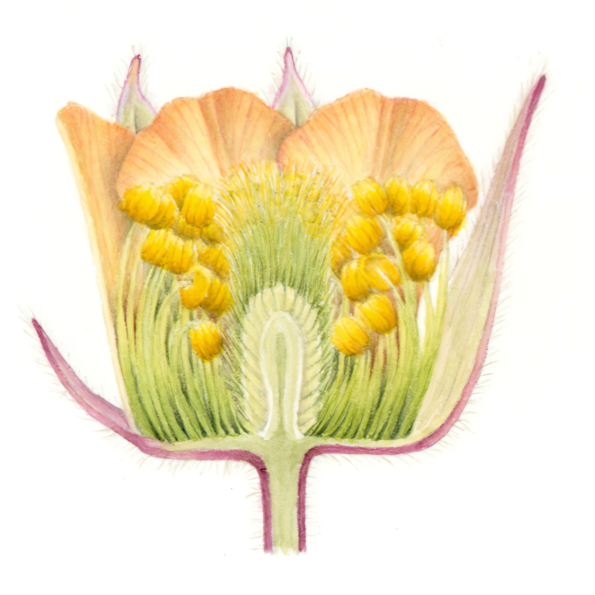
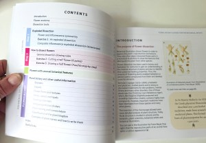
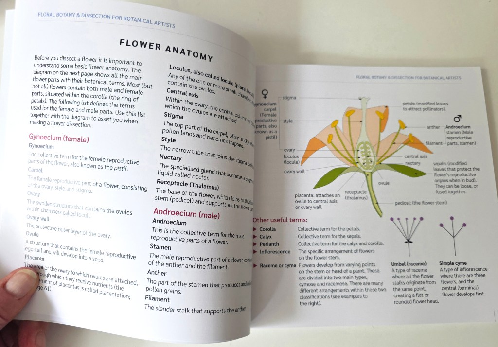
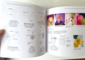
Here are some internal page images. The book has 86 pages and is 20cm x 20cm in size. A nice size to carry around without being too cumbersome.
The book…
£18 + postage (UK and worldwide) Written, designed and printed by Jackie Isard
Please note: This book is only available to botanical students and botanical artists/tutors worldwide (it is an educational book and is not for sale in the public domain). Email me to buy: jackieisard@googlemail.com
I hope you find the read enjoyable and do please pass your knowledge on to your students and other botanical artists.
If you do buy the book I would love to hear your feedback, thank you!
‘The Little Book of Watercolour for Beginner Botanical Artists’ has been enhanced and now has 66 pages!
A very useful little guide for budding botanical artists wishing to learn about watercolour and brush techniques. The book tells you all about how to use watercolour when beginning your botanical journey. It teaches brush skills, colour mixing, pigment choice, brush types, painting equipment and contains useful exercises specific to botanical art. The exercises will teach you pigment to water quantity, brush skills and useful painting techniques. The last section in the book includes a step by step painting of a Pear using wet-in-wet technique.
The book content: • Colour theory and mixing • Water and pigment balance • Brush types and uses • Using a palette • Exercises to improve your brush skills • Painting techniques and exercises • Wet-in-wet – Step by step Pear
£9.00 UK GBP UK buyers only due to high international postage costs. Postage calculated on contact. Size: 66 pages. 148mm x 148mm handy pocket sized Full colour
A little bit of advice today. Never rely on one manufacturers pigment being exactly the same as another brand, even if it has the same name.
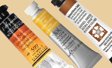
Quinacridone Gold is one example of this anomaly. Winsor & Newton Quinacridone Gold is made with index numbers PY150, PR206 and PV19 but the Sennelier version uses PY150, PR206 and PR101 and Daniel Smith, to further confuse, is made with PY150 and PO48. All three brands will look different when painted due to this.
Quin Golds by Sennelier, Winsor & Newton and Daniel Smith
All brands have the bright PY150 yellow pigment. This is the same pigment used in Transparent Yellow. The Winsor & Newton version is definitely a more muted colour than the Sennelier version and the Daniel Smith one is quite different again.
Let’s look at the colour index numbers first. These are the index numbers for all three brands. Winsor & Newton: PY150 is a bright yellow, PV19 is a cool magenta, PR206 is a red/brown. Sennelier: PY150 and PR101 a reddish terracotta, a little like Burnt Sienna. Daniel Smith: PY150 and PO48 a burnt orange.
Here is an analogy of the index numbers within these three pigments.
Winsor & Newton: PY150 (yellow) + PR206 (red/brown) + PV19 (cool magenta like Permanent Rose and Permanent Magenta) – the spike of magenta makes this version more muted because PV19 is cool and very near to the violet/blue spectrum. When red/brown, yellow and the violet biased magenta are mixed we get a golden beige/brown. The magenta makes this mix a more muted gold with a slight brown bias.
Sennelier: PY150 (yellow) + PR206 (red/brown) + PR101 (terracotta/burnt sienna) – the warmth of this mix is due to red index colours being of the same warmth and bias. It is only slightly muted and more golden than the Winsor & Newton version as there is no violet or cool bias.
Daniel Smith: This version of Quinacridone Gold is made with PO48 and PY150. PO48 is a burnt orange tone. This is a warm and brighter version due to no violet or red/brown influence.
Quinacridone Gold is a colour which sings out in this autumn subjects like this magnolia leaf below!
So when you are selecting new pigments, always check the index numbers. Single index numbers are best for mixing but occasionally you will find a colour with two or even three, like Quinacridone Gold. When mixing with pigments of more than one index number, be aware not to add too many other pigments to it. A maximum of three index numbers mixed together are best for vibrance. Quinacridone Gold is already a muted colour by having three index numbers, so adding more index numbers to it will just mute it even further to brown.
For everything you need to know about colour mixing theory and application techniques see my book below which will be available to purchase next year in March 2021.
Until then, happy painting!
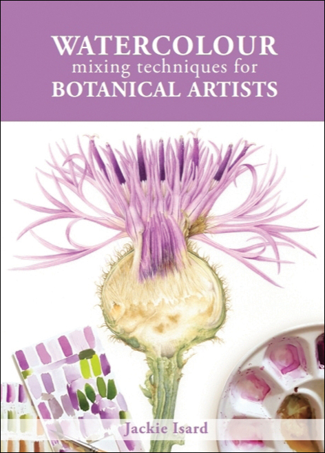
Watercolour Mixing Techniques for Botanical Artists
Published by The Crowood Press
A practical guide to accurate watercolour mixing with primaries for botanical artists Colour mixing is a key skill for the botanical artist. In this practical guide, Jackie Isard explains how to observe and use colour accurately. She shows artists how to make informed choices when selecting pigments, as well as how to learn about colour mixing and its application. • Gives detailed instruction and advice on understanding colour and pigments • Explains how to ‘see’ colour and tricky mixes, from greens and reds to the difficult botanical greys • Includes advanced colour application techniques – colour enhancement, shadow colours and colour temperature transition • Step-by-step guides illustrate how to paint with layers, how to use underlaying colours to enhance, and colour and fine detailing
Order online via book shops or Amazon. More information on how to buy is on my website www.jibotanicals.co.uk. Please note, preorders for USA and Canada are available online. Launch in the states is October 2021. E-books are also available.
Online courses for botanical artists: • Mixing Watercolour Accurately for Botanical • Fine Details and Finishing Techniques For more information and course outlines see my website at: www.jibotanicals.co.uk
NEW MINI-BOOK for beginner botanical artists being launched soon. Order from me direct when it is announced on Facebook or via email if you have joined my website mail-list www.jibotanicals.co.uk. Please note, no preorders are being taken at present.
The Little Book of Watercolour for Beginner Botanical Artists
A very useful little guide for beginner botanical artists wishing to learn how to use watercolour and their painting materials. • Water and pigment balance • Brush types and uses • Using a palette • Exercises to improve brush skills • Useful painting techniques
This self published mini-book is available to purchase. See the preview flip through blog here on my blog. Please contact me personally to buy, jackieisard@jibotanicals
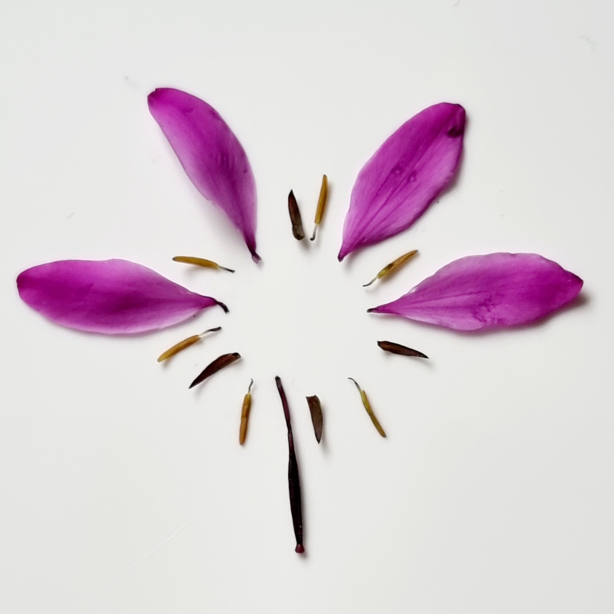
I painted this Greater Knapweed flower head a couple of years ago and it truly was an exercise in pink even though the flower is purple. I cut it in half because I wanted to show the inner parts as well as the flower head. It also gave me the opportunity to use a technique called ‘painting in the negative’ in the area where the seeds are produced. I found this so intricate and interesting. The flower colour, in real life, is a bright purple/pink. Lighter areas are more pink in tone and darker areas more violet/purple. The whole inflorescence is exquisitely designed and beautiful to study up close. I just loved ensuring the colour mix was just right and painting in all those lovely fine details!
I have written the colour mixes next to the painting image below and highlighted where they were used. There is no sign of Opera Rose! Quinacridone Magenta was used to make the really bright pink and some Winsor Blue Red Shade added to make the purple tones. You’ll achieve a brighter effect by making sure the highlights are very light and by using good quality white hot pressed watercolour paper. So no need to go for Opera Rose which we know fades over time. Here’s the pigment list:
Transparent Yellow – TY Quinacridone Gold – QG Winsor Blue (Red Shade) – WBRS Indanthrene Blue – IB Cobalt Blue – COB Quinacridone Magenta – QM Permanent Rose – PR Burnt Sienna – BS Perylene Violet – PV Winsor Violet – WV
I added a thin glaze of Winsor Violet to some areas as a warm overlay towards the end of painting to enhance the violet/purple tones within the subject and occasionally a little thin cool pale blue glaze was added too. Generally, I would use French Ultramarine as a cool overlay. In areas where the pink tones appeared very slightly warmer a pale glaze of Permanent Rose was added. The creamy yellow mix for the bottom of each floret was made with Transparent Yellow and a tiny little bit of Permanent Rose. Some of this mix was also added to the central dissected area which also had many beautiful beige and golden tones.
Comparing pink pigments
Permanent Rose (PV19) is a slightly warmer pink with a violet bias whereas Quinacridone Magenta (PR122) is cooler and has a very strong violet bias. Sennelier Rose Madder Lake (PV19) has the same index number as Permanent Rose and they are indeed very similar. Although I definitely consider Sennelier Rose Madder Lake to be a tad warmer than Permanent Rose. Pinks come in many forms but all these pigments are definitely lightfast.
Many beautiful apricots and warm pink/orange tones can be made with these pigments. Quinacridone Magenta will make the mix more vibrant than Permanent Rose. Just add a warm or cool yellow like Transparent Yellow (cooler), New Gamboge (slightly warmer) or Indian Yellow (very warm). The warmer the yellow, the warmer the mix!
Opera Rose – a much loved colour
Opera Rose is loved by many but as we learned last month it is rated as fugitive. Fading would be much more obvious with certain brands. Winsor and Newton Opera Rose and Daniel Smith Opera Pink are the most reliable for this colour across brands. They will not fade as much as other brands but they will definitely both lose the added fluorescence. Both use colour index PR122. This is the same pigment colour index as Quinacridone Magenta. I personally favour Quinacridone Magenta as my brightest pink pigment purely because it doesn’t pretend to be more vibrant than it is!
Opera Rose and Quinacridone Magenta test for lightfastness
I did a lightfast test for Winsor and Newton Opera Rose and Quinacridone Magenta over a two year period on my studio windowsill. This is quite a shaded room except for late afternoon sunshine. Testing will show more extreme results in direct sunlight. This is an example of what would happen in less intense sunlight conditions. The test was left on the windowsill from 2017 – 2019. It was hard to get an exact photo so you will just need to take my word for it! The Winsor and Newton Opera Rose (PR122) is still bright but all the fluorescent additive has disappeared making it look less vivid in colour. It now looks more like watered down Quinacridone Magenta. The Quinacridone Magenta (PR122) has not altered.
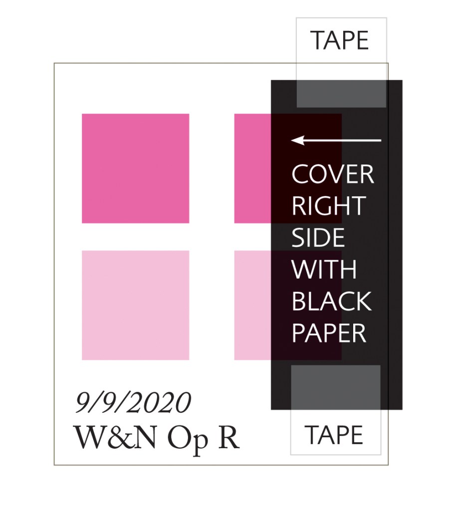
Making a swatch for testing
The swatch test in the previous image was made in a slightly different way to the example below. I painted fresh pigment onto another piece of paper in 2019 and compared it to the 2017 version. Here is another way to do it. Paint two swatches of the pigment in full colour and a weaker tint underneath on a piece of quality white watercolour paper. Cover one side with black paper. Tape this securely top and bottom so that light cannot get underneath it. Write the date onto the swatch. Leave on a very sunny winsdowsill for at least 3-6 months or longer. This is a good exercise for any colour pigments you are unsure of or that are classed as n.r (not rated).
Watch the Winsor and Newton video ‘Masterclass on Colour Permanence’ to see how a simulated 100 year lightfast test changes these fugitive colours; Rose Madder Genuine, Alizarin Crimson and Opera Rose. Here is the link: www.winsornewton.com/uk/masterclass/permanence-in-colour/
based on Winsor & Newton professional watercolours
From today, each month, I will be making a short blog about Winsor & Newton watercolour pigments and explain a few discoveries I have made along the way. Each blog will contain a range of interesting facts, tips and tricks. It will be a monthly post at about the same time each month, so look out for it around the 24th! Like my ‘Jackie Isard Botanicals’ Page to receive it on your Facebook timeline.
You will find my page on this link:
https://www.facebook.com/jackieisardbotanicalnaturepainting/
Alizarin Crimson versus Permanent Carmine…
Is Alizarin Crimson dulling your paintings? It looks really bright in the palette so why should this be? Don’t you wish it would stay bright?… well, unfortunately, that’s not possible as it will always dry a little duller than expected. This is because Alizarin Crimson (PR83) is a warm red with a slight maroon bias. It is also fugitive and will fade in sunlight. If you like to use Alizarin Crimson then make sure you buy the permanent version, Permanent Alizarin Crimson (PR206) for reliability.
Another question springs to mind. What’s the difference between Alizarin Crimson and Permanent Alizarin Crimson? There is very little difference in colour but Permanent Alizarin Crimson is very permanent, rated ‘A’ so shouldn’t fade. Alizarin Crimson is moderately permanent, rated ‘B’ and fugitive so it will fade badly. Alizarin Crimson is not good to use if you are exhibiting paintings where reliability and permanence are expected. An ‘A’ rating is always much better!
You could substitute this colour for Permanent Carmine (Quinacridone pyrrolidone) which is only a teensy, tiny bit cooler. Add a teensy, tiny bit of Transparent yellow to it and you’ll have a Permanent Alizarin Crimson match which stays bright. It will also give a slightly brighter colour mix when added to yellows and blues. Add French Ultramarine for a beautiful rich warm purple/mauve. Add Indian Yellow for really rich and vibrant orange and red mixes. Historically, Carmine was made from thousands of crushed kermes insects, ewwww… Thank goodness for Quinacridones!
Until next months, take care and keep safe!
Look out for my book ‘ Watercolour Mixing Techniques for Botanical Artists’ coming out later this year!
This last week I’ve been working hard to get my website up and running and I’m happy to say it went live on Thursday 6th November. It’s something that was on my list of things to do which kept getting put back but once I had chosen the WIX template it all ran smoothly. In the past I have built and designed using Dreamweaver, very hard…WIX makes it all so simple! Other than one photo which I need to address as it won’t show in the right place via an iPad, (although it’s absolutely fine on a Samsung tablet and my Apple mac laptop!) it’s exactly how I wanted it to look. Clean, simple to operate and functional.
I hope you enjoy it and look forward to being part of the world wide web, at last!
Take a look and sign up for the mail list if you would like to!
Then do look out for my New online course coming in January 2019!
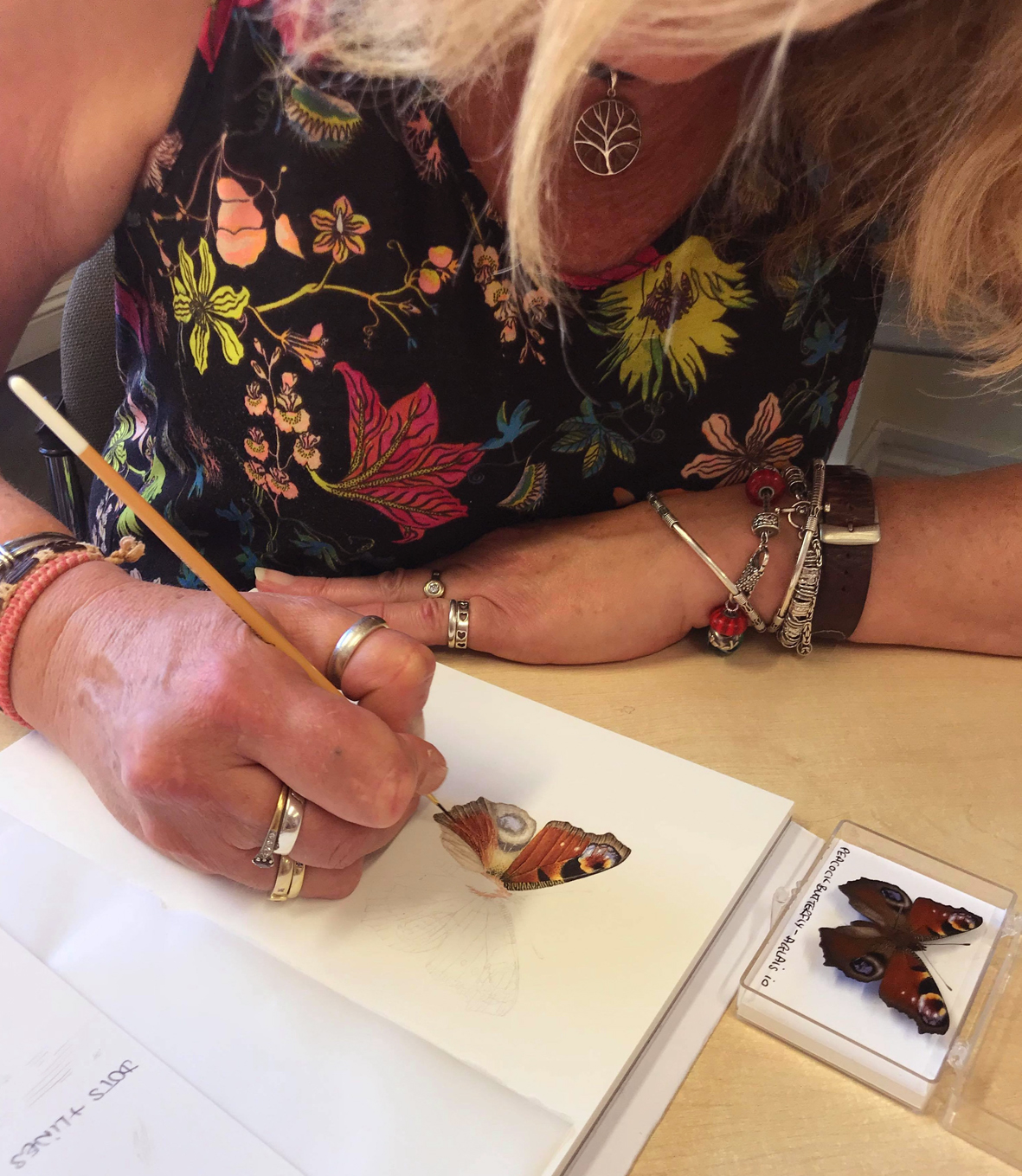
The Peacock is one of my favourite butterflies. The patterns and colours are just so stunning. We’ve seen a lot of butterflies this year as there’s been so much sunshine. Come and learn to paint one of the UK’s most beautiful pollinators with me, yes they are pollinators!
I will take you through the stages and teach you the techniques to create your very own Peacock Butterfly watercolour painting. You will learn how to mix the vibrant colours needed and how to add those incredibly fine details. There will be instructive videos to help you throughout the course. Watercolour painting skills essential please. Not for absolute beginners.
Pop over to my Jackie Isard Botanicals page to see the Event date then private message me if you would like to join. Payment can be made through PayPal. The course fee is £75 UK and £85 Internationals. The difference is purely due to postage cost. For more details on how to register Private Message me on Facebook or email me.
It’s been one long amazing adventure since I first wrote about my RHS Sketching Adventures in 2016 and it’s not over yet! This was the year I was accepted to exhibit with the RHS (Royal Horticultural Society). My journey has been of new learning and a great deal of research so far. This Blog is about my continuing journey and the progress I’ve made so far. Up to now it’s been hugely interesting and at times very intensive but most of all a rewarding and enjoyable journey!
You’re most likely wondering why this is Blog 12a. Well, I’m not usually superstitious but today I am. So it’s 12a, not 13!
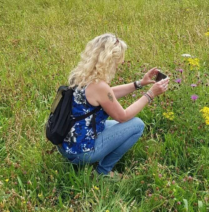
My journey began by selecting a subject matter to paint for the RHS. A theme which would be interesting as well as something I was passionate about. After all, it involves 6 paintings which need to be absolutely spot on and perfect, so I had to be excited and inspired by my theme. Just before I was accepted, I had become very interested in the importance of meadows which have been declining rapidly from our countryside. This is affecting our very important pollinators and may eventually lead to food and fruit crops failing. I also became very interested in pollinating insects, bees and butterflies. So I had to include them somehow!
My garden, over this time, has become a haven for pollinators. I selected a few areas of my garden to grow wild and planted meadow wildflowers in the grass. I purchased solitary bee homes, planted bee friendly plants, painted butterflies and bees too…I was smitten!
Just a few real facts…
97% of our UK Meadows have been lost since the 1930s, taken away by intensive farming, affecting pollinators and wildlife in a staggering way. I became very interested in this subject matter and much to my pleasure I discovered a wealth of organisations all working hard to change things. A few are listed below:
Plantlife (campaigning, sharing knowledge and working with partners for the protection of meadows and introduction of wild road verges); Magnificent Meadows (taking emergency action to prevent the disappearance of meadows and sharing knowledge); Coronation Meadows (initiated by HRH The Prince of Wales to create meadow in every county to mark the anniversary of The Queen’s coronation) and of course The Wildlife Trusts, the National Plant Monitoring Scheme and so on… I joined the NPMS (National Plant Monitoring Scheme) to help with their research in my area, around the Severn valley. You can volunteer to record species growing in an area near you. Sadly, the fields they allocated to me for recording species had been ploughed over. Not what we like to see!
My journey took me to many meadows and open spaces where our beautiful native wildflowers still grow. Seeing again the many wildflowers I took for granted as a child, was like coming home after a long time away. I remember as a child sipping nectar from white nettle flowers. Everyone thought I was weird! The wildflower plants were there but I didn’t really pay attention to them much as a young adult, although I’ve always loved long nature walks. Now, I admire them each and every day and through learning recognise many species. I’m always in awe when I see one I recognise!
Bannerdown
River Severn
Crantock meadow
Bannerdown
Crantock meadow
Eades Meadow, Wiltshire
Pyramidal orchid
Box Farm meadow
Tea with Jeni Burton
Box farm meadow
I even made friends along the way. Thank you Jeni Burton (pictured above) for taking me to Eades Meadow, a truly sacred place. I saw my first Bee orchid with Jeni, we were so excited! (it’s the first photo below).
I take a lot of photos of these wondrous wild flowers. Their beauty really comes to life in a close up. You could quite easily walk right past them!
Bee orchid
Common vetch
Common spotted orchid
? let me know please!
Marjoram
Kidney vetch
Yellow Rattle
Selfheal
Wild comfrey? let me know!
Small scabious
Greater Knapweed
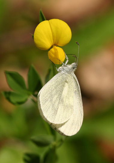
Bird’s-foot trefoil
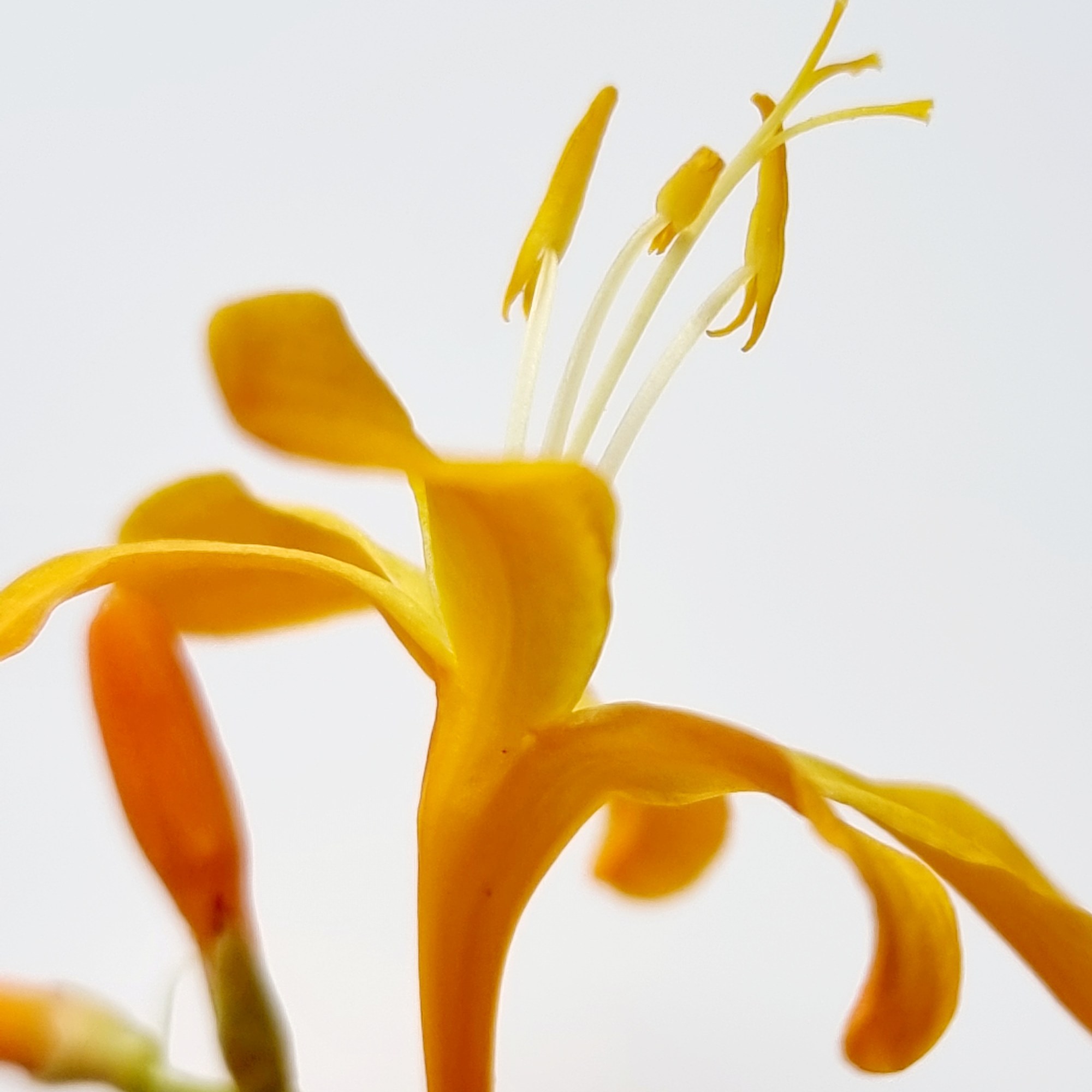
The places I went to all had different habitats. Some were grassland, some damp meadows and some just road verges. I started to learn about which plants favoured particular habitats and decided that this would be my ‘theme’ for the RHS. To study a set of species which favour certain environments. Also included in my ‘theme’ would be relevant pollinators to these habitats and plants as I feel they are just as important. I went through many wildflower plant choices before I finally decided my final 6 earlier this year. I even started sketching some of them which I have now excluded. My final 6 are wet meadow plants.
My first choice was Cardamine pratensis (Cuckoo flower). It grows in the field behind my house. I like to call this field a ‘meadow’ as over the last two years more wildflower species have arrived. The local farmer looks after it. The area where I live is damp so the fields surrounding the house and garden favour wet meadow species. Nice bonus!
Here my research and preparations began. I have watched all of my chosen plants grow through their lifecycle. I decided to plant some Cardamine pratensis plants in my garden which grew beautifully. One day, I was studying the plants and discovered a butterfly egg on one of them. Soon there were more eggs. I was delighted as I knew it was most likely an Orange Tip Butterfly as they use this plant as their larval food plant. Of course, the pollinator I would link to this painting would be the Orange Tip! ….and guess what it’s latin name is? Anthocharis cardamines!
Orange tip male resting overnight on a cold evening, see egg under him
Orange tip butterfly mature caterpillar
Seedpod forming
I watched the caterpillars grow over a few weeks until they were quite large. What I didn’t realise was that they would devour the whole plant all the way down to the basal leaves. Every little bit…. so to finish off my studies I went out into our back meadow and thankfully some of those plants were still intact! One cold night this year an Orange tip butterfly rested overnight on my garden plants near one of the eggs (photo above). It was there for 39 hours!
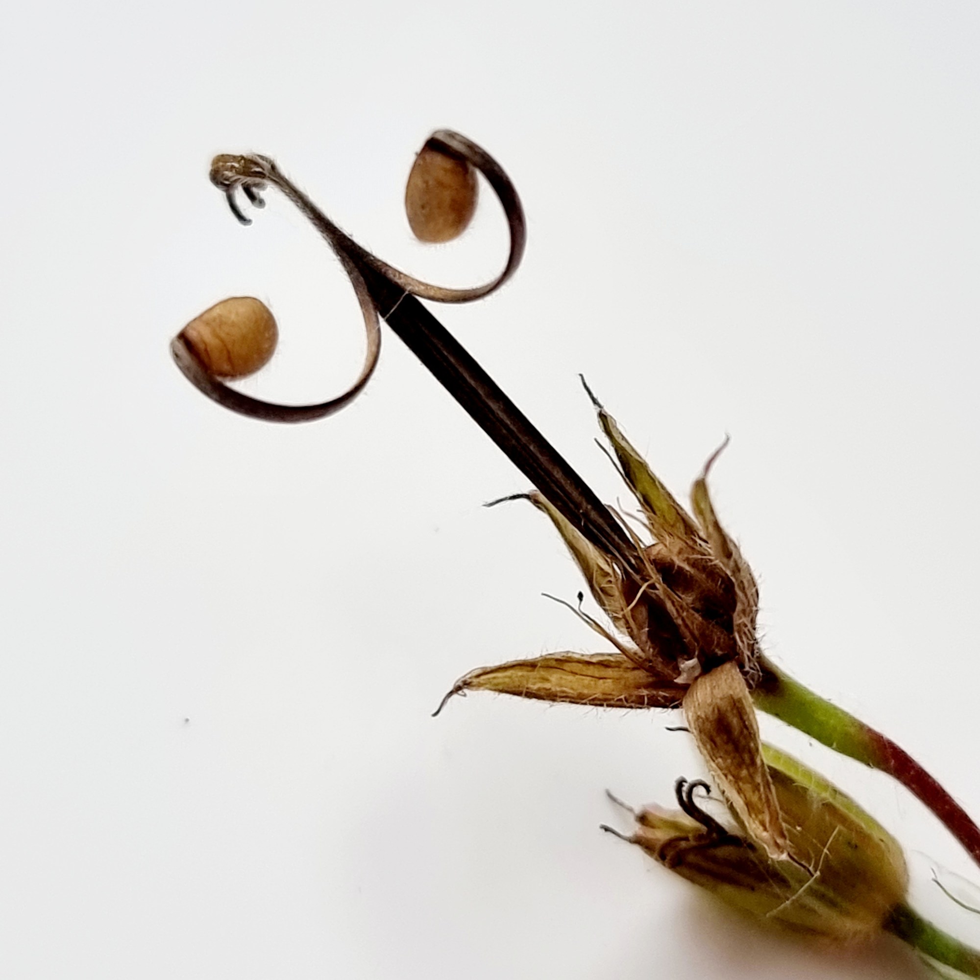
My studies continued and involved some dissection and learning a little botany. It was important to study the whole plant, including a little botany, so that I could understand all its details. Even a study under the microscope to see what’s inside the flowers and how its reproduction works. This would make it a lot easier to draw accurately. By happy accident along the way I discovered that reproduction was not only via seedpods but also from the plants basal leaves. Left in a dish of water for a few days, my basal leaf specimen started to sprout babies! The botanical term for this is viviparous (see photo below). My composition started to form but it changed again this year to the left side composition in the last photo. I felt the arrangement and story made more sense in the second composition idea.
First rough sketch and measurements done in the garden
Different leaf types
Dissected flower
Inflorescence
Viviparous
Seeds under microscope in pod
Seedpod forming
First ideas for composition
More compositions
I have started my final 6 this year and completed research and sketchbook notes for 3 of my choice wildflowers. I approached each one with the same detailed research. The ones I have finished researching and almost done compositions for are Cardamine pratensis, Lychnis flos-cuculi (Ragged Robin) and Lotus pedunculatus (Greater Bird’s-foot trefoil).
We’re having a really hot Summer this year which means everything is going over and seeding too early. This is the same in the meadows. The Greater bird’s-foot trefoil growing in my garden didn’t grow to full height and started to seed almost as soon as the flowers opened. This made measuring very tricky! A very kind friend, from a little further north than where I live, offered to pick a few pieces near her house and send it to me. The amazing thing was, she was going on holiday and just happened to be passing my house that day! The pieces of plant were quickly measured and placed in the fridge minutes after they were delivered. These wildflowers are very fragile and fade very quickly once picked. Thank you Paula Golding, you were a life saver!
Ragged Robin
Greater Bird’s-foot trefoil
Specimens for measuring
I still have 3 more wildflowers to study and make compositions of this year and early next year. After that I’ll be painting my final compositions for the rest of the year when the plants are in flower. Here are my final sketchbook notes which will include some dried pieces of each plant on the right side page gap.
My advice to anyone thinking of applying to exhibit with the RHS is to look at Katherine Tyrell’s pages on the Botanical Art and Artists website. There she explains the procedure, rules and how to plan your exhibit. If you are accepted spend at least a couple of years watching and studying your subjects. Preparation and research for the final paintings is essential.
I will return with more about my journey next year. I plan to exhibit, if all goes well, in 2020.
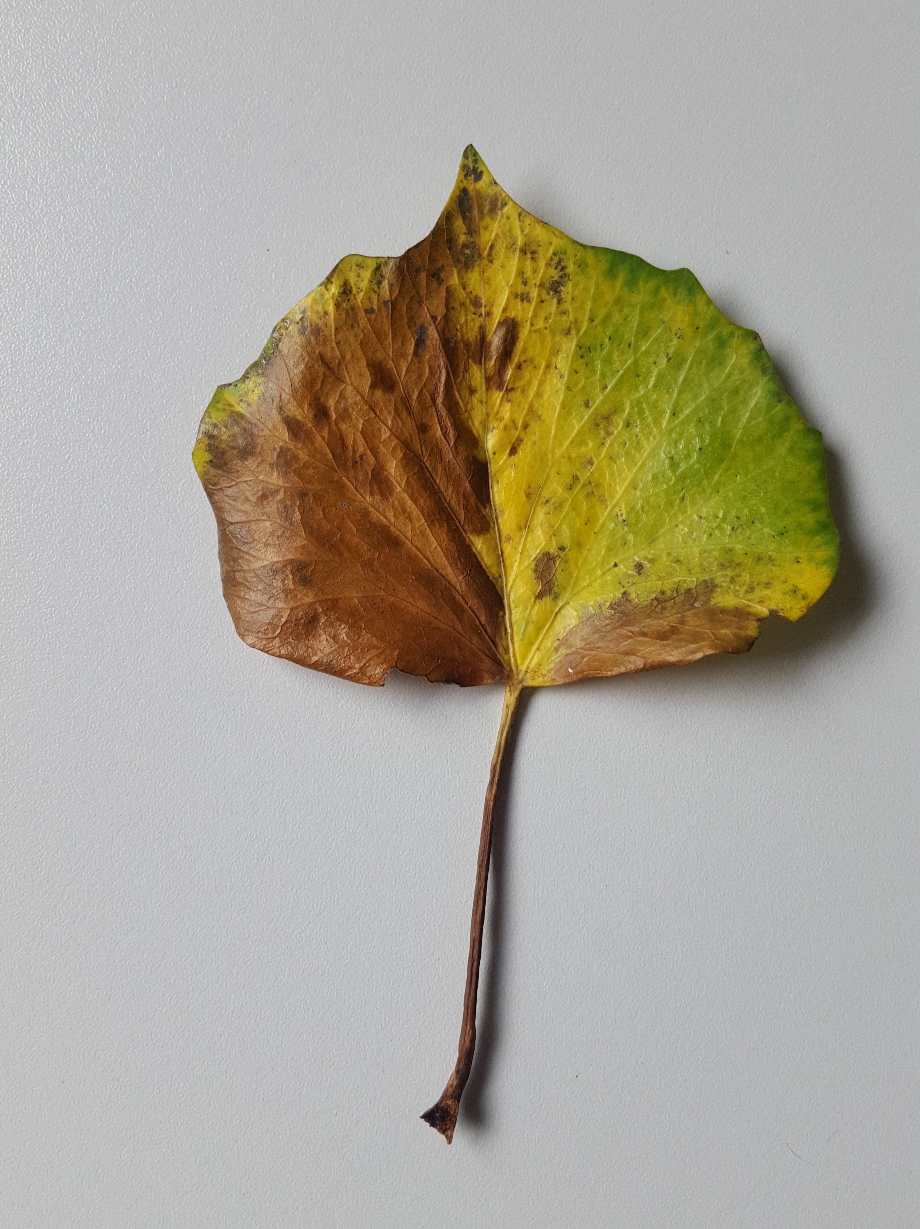
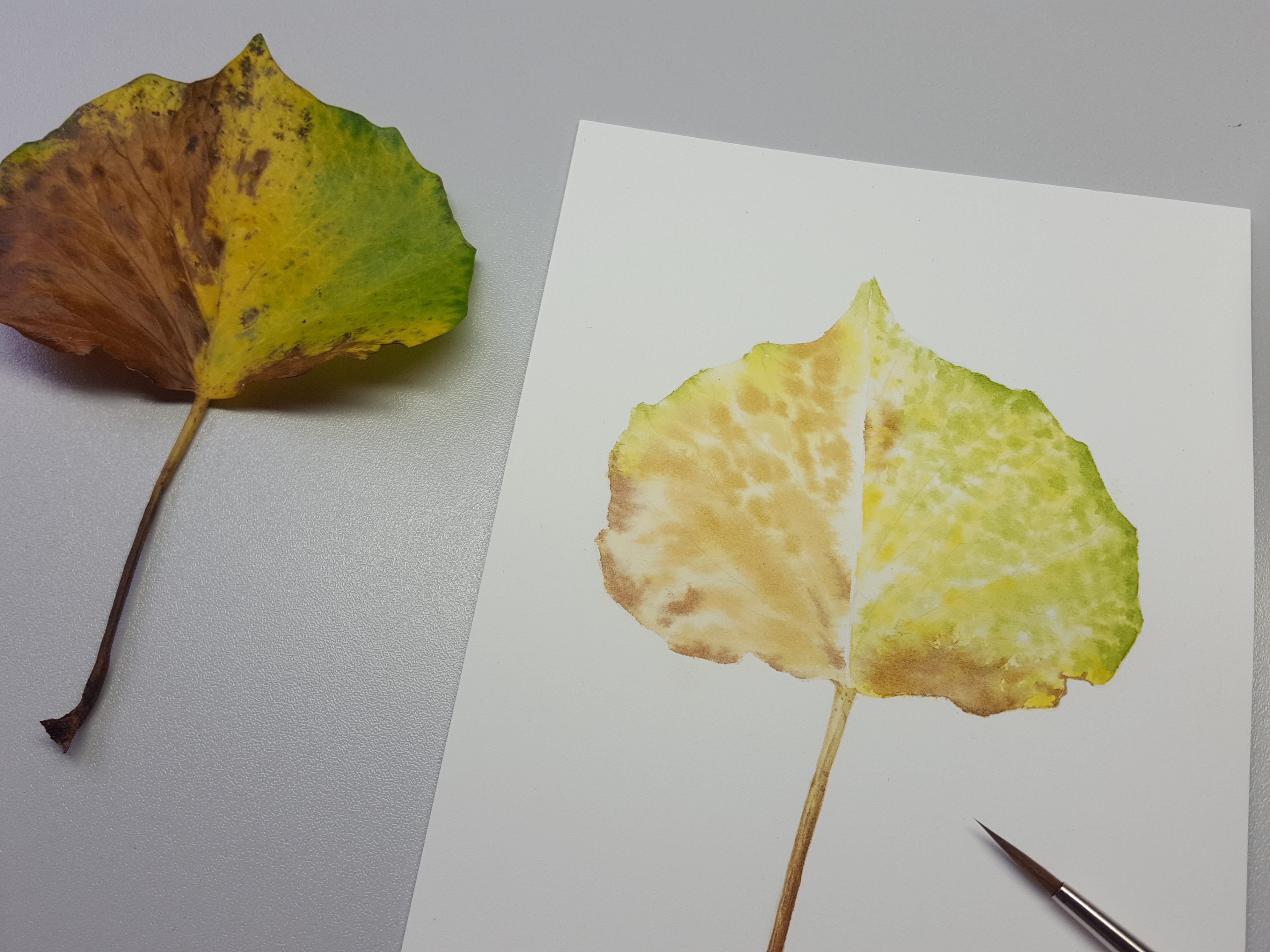
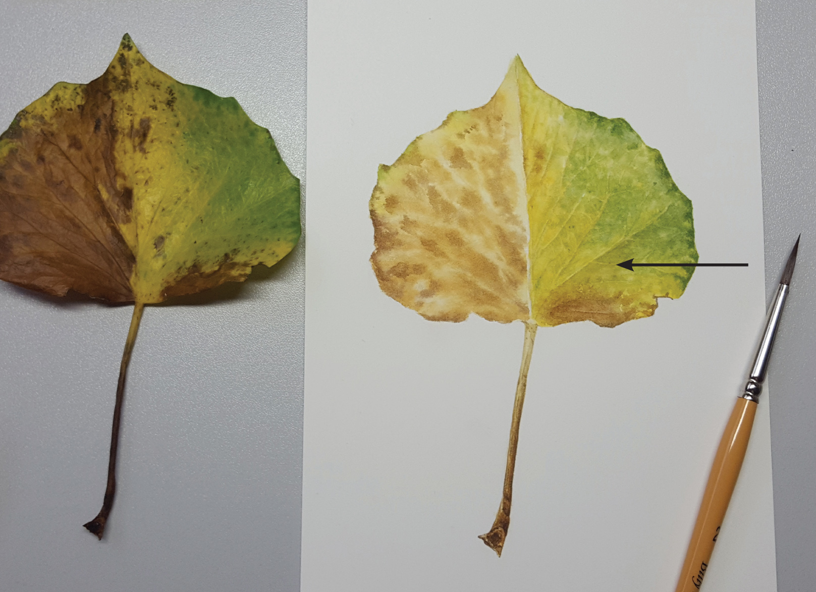
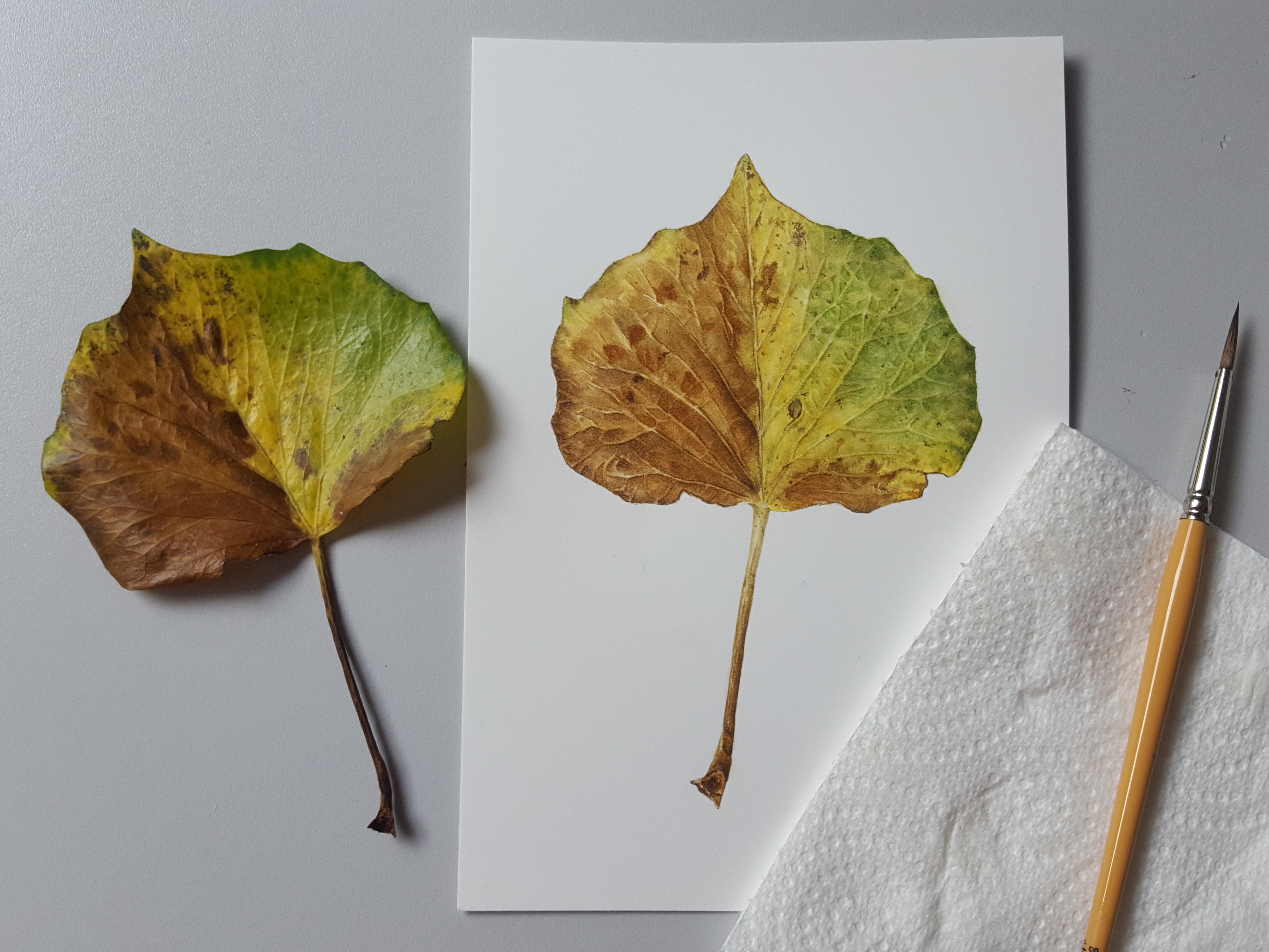
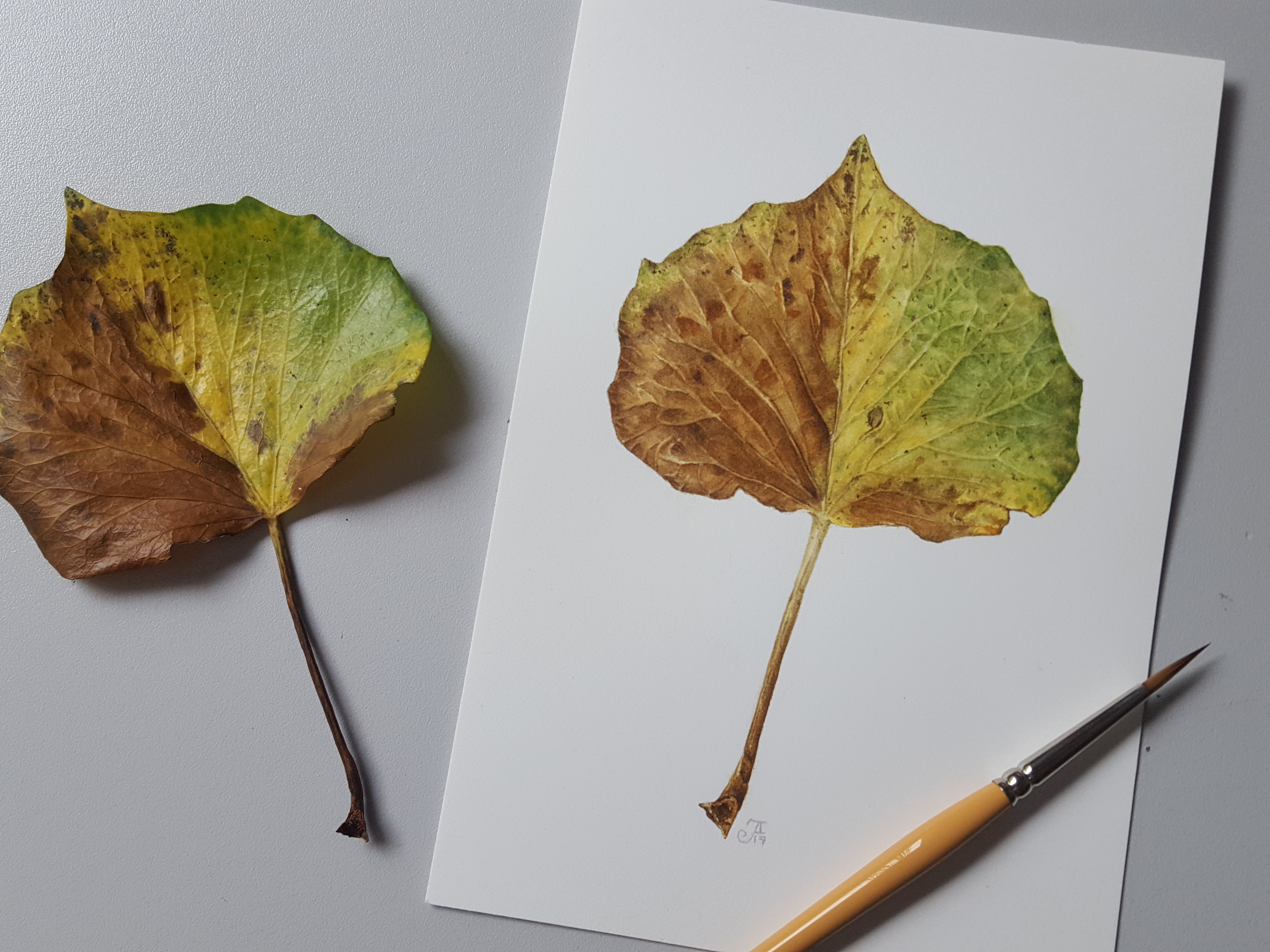
Autumn leaves can be difficult! …but with all of those wonderful colours, such a delight to paint.
In this blog I hope to help you understand the method more clearly. I found this Hedera (Ivy) leaf in my garden and decided to paint it as it was so colourful. It sang out to me with those colours of Autumn as they just begin to show.
When I start a painting a subject of any type, I first study it carefully. I look at texture, colour, pattern, form, growing habit, shape and how the light falls on it before I start to draw. The drawing will be more accurate if you take time to study your subject carefully. Look at every little detail and blemish. Fall in love with it!
I loved this Hedera leaf with its wonderful colours and the first stage was to mix my colours. When I do this I look for all the tones and shades. There will be many more than you imagine!
All about the colours…
My swatch included the greens, yellows and browns – quite a few of these. I added to this palette as I went along, with some darker shades for the stalk and blemishes on the leaf.
This is my leaf along side my final swatch. If you look you can see two different shades of green, a darker one at the edges which is more blue in tone and the lighter one across the leaf which is a more yellow/green. There are many browns too! Here’s how my swatch works: The X signs on the swatch are colours I didn’t use after testing.
The green mixes (1&2) are made with Winsor Blue Green Shade (WB), Transparent yellow (TY) and a tiny bit of Permanent Rose (PR). The PR rounds the green to make it less stark and more natural looking. Green No. 1 has a little more WB added than the No. 2 mix. Green no. 1 is used around the edge of the leaf, on blemishes within the lighter green area and to define the shadows in between the small veins at the fine detail stage. The yellow/green no. 2 is for the main area of the leaf. The yellow area is purely TY (3) and sometimes TY plus water (H20).
There are many shades of brown, six to be exact. These all vary slightly. The darkest ones are for blemishes and the stalk, 7, 8 and 9. No.s 4, 5, 6 and 10 are the ones used on the brown areas of the leaf. No. 11 (top right on swatch) is the green/yellow used at the top of the stalk only. Here are the mixes for 4-11:
4 – Burnt Sienna (BS), Quinacridone Gold (QG) and Winsor Violet (WV) = (= means a little bit!). In addition I have added a little more QG to make a slightly yellower version of no. 4.
5 – BS, QG and Indathrine Blue (IB) = (=a little bit). Again I have mixed a slightly darker version of this tone by adding a little more IB.
6 – BS, IB and QG=
7 – IB, QG and PR (Permanent Rose) making a very dark brown 8 – IB, QG and PR with extra PR and QG making a reddish brown 9 – IB, QG and PR with extra PR and QG plus a little extra IB making a dark mahogany brown
10 – BS, QG and IB= making a conker rusty brown
11 – TY (Transparent yellow) and WB= making a pale greeny/yellow
Let’s start painting the wet-in-wet layer!
For the first layer, I used wet-in-wet technique on one side of leaf at a time. Always do one side at a time because if you try to do both sides at once, one side will dry up on you before you reach the other side! Let each side dry thoroughly before attempting the second side.
You will need to use good quality Hot Pressed watercolour paper for this technique. I am using my ever dwindling old stock Fabriano paper which is perfect but the quality has changed completely over the last two years. An alternative paper, which I tested recently, is St. Cuthbert’s Mill Bockingford Traditional Watercolour HP white. This paper I find as good as the old Fabriano for wet-in-wet although for colour not so vibrant. Saunders Waterford 425gsm is also a good paper.
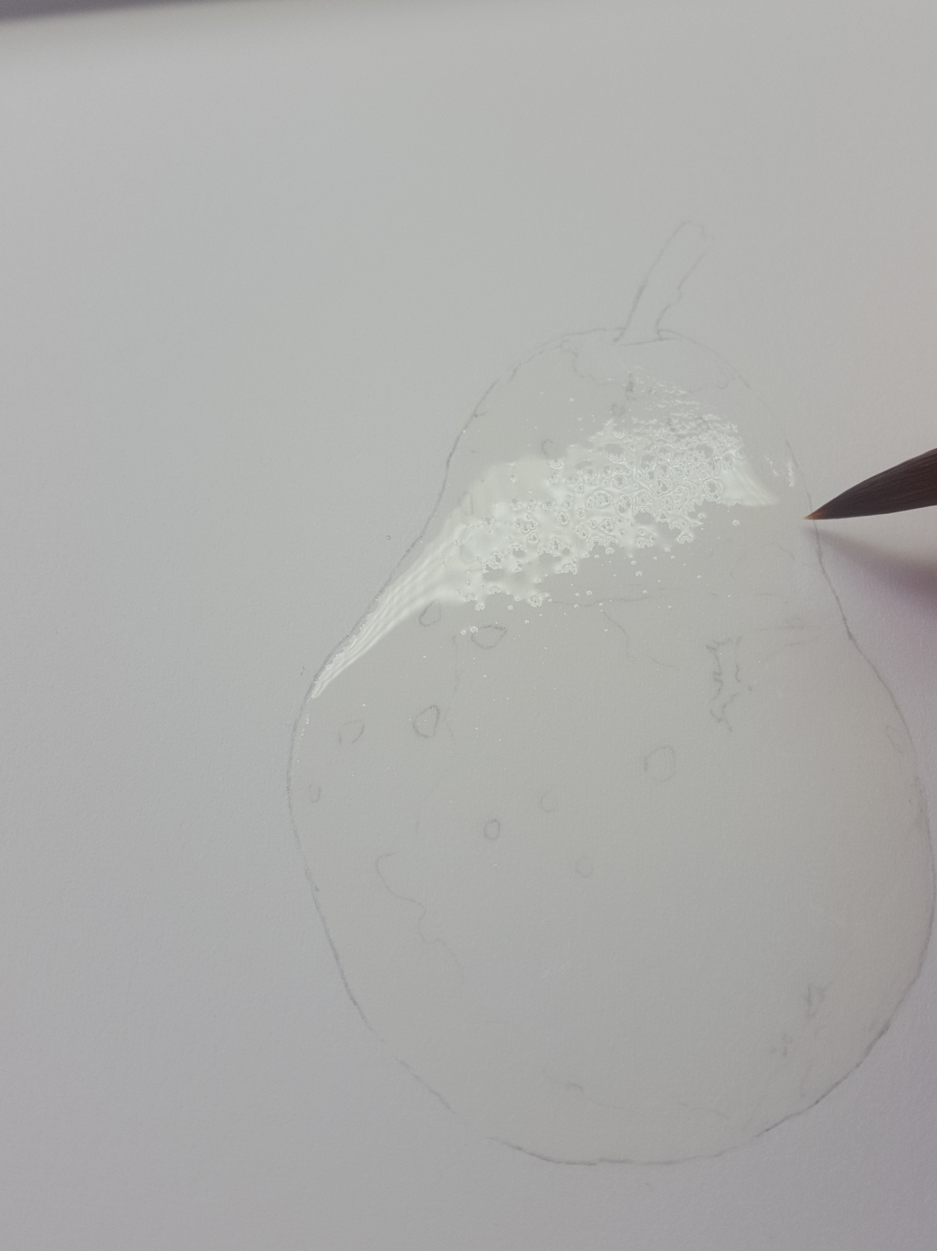
Firstly, the whole area needs to be wet, this must be done carefully and evenly. When doing this technique take care not to leave pockets of water but aim for a smooth all over effect. You’ll need a No. 6 full bodied pointed tip sable brush. Fill your brush with water and make a puddle in the middle of the area first. Use the tip of the brush to pull the water up to the edges for a neat outline. The following photos show an example of wet-in-wet I photographed for a Pear painting.
Carefully move the water with the tip of the brush into the uncovered areas, dragging the water from the central puddle. Along the edges use the very tip to move the water very slowly around the edge of your drawing. The brush tip will help you to move the water accurately up to the line for a nice neat edge.
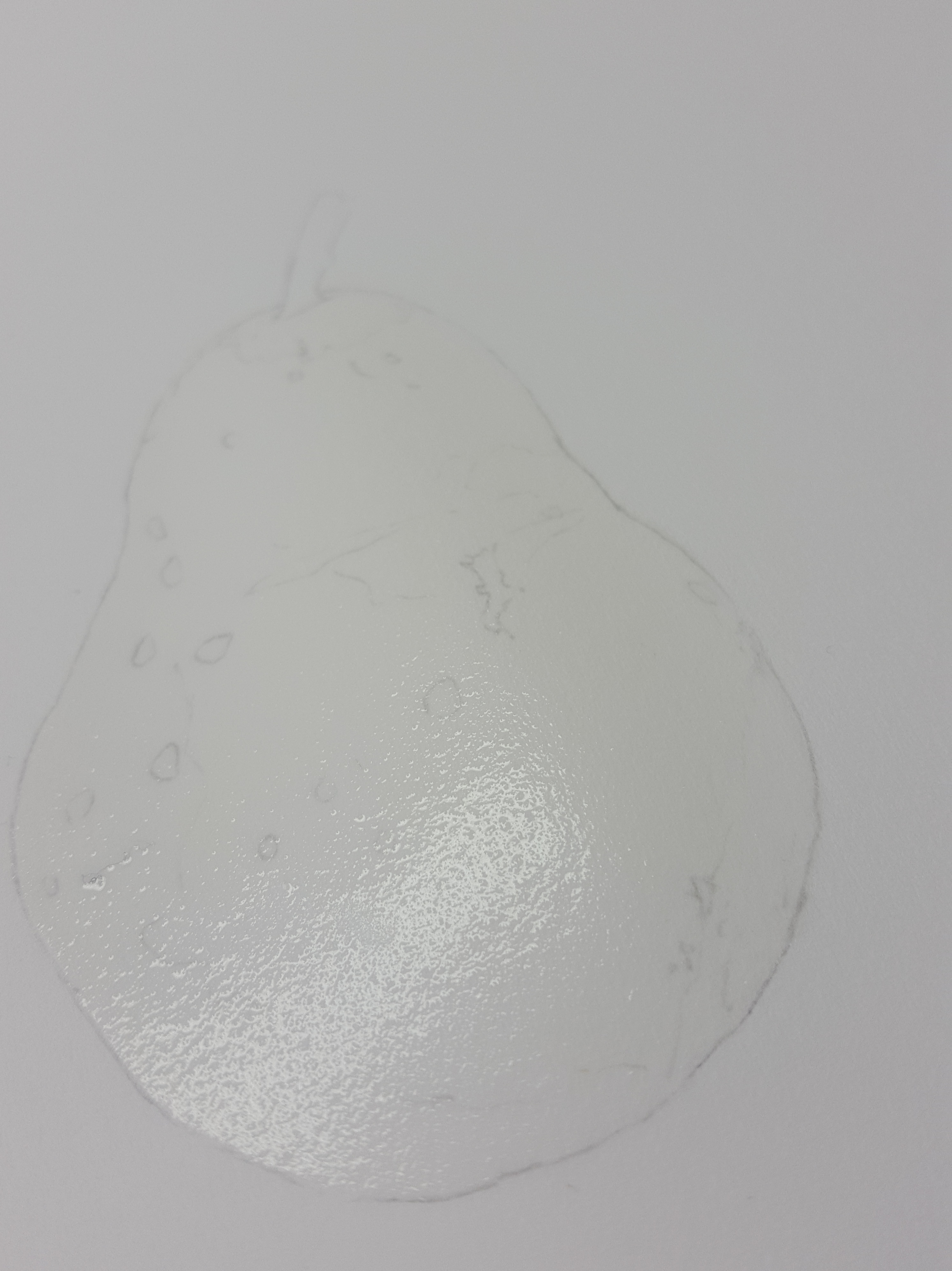
Now check for puddles and gently sweep off some of the water as needed with a damp, not wet, brush. Don’t sweep too much off or you’ll end up with a dry bit!
Once the area is even all over, turn the paper sideways to check you have covered every little bit evenly. Now wait until the water is at a ‘glistening’ stage. When it is ready it will look shiny (glistening) but not really shiny. It’s important to catch it just at the right time. If you wait too long it will start to dry on you. Once the whole are is covered and glistening it is ready to apply colour.
For this part I use my no.2 full bodied pointed sable brush. Drop your colour mix (a lighter-medium thickness of pigment to water, not very thick!) into the areas where it you see it, taking care to leave highlights clear of paint to start with. Some areas will need a lighter mix of pigment added. Make sure you wipe the excess off your brush before adding this or you will flood the area. Rinse and dry your brush off quickly before adding other colours to the painting. The paint will spread out and blur naturally. I have dotted the green and yellow paint in on the right side and this gives the impression of smaller light veins where the paper shows through. You can move the paint around a little and wipe it out with a dry brush if you make a mistake. After this I have added in a little stronger mix of the blue/green mix to areas like the edges where the green is stronger. You need to move quickly and if any area starts to dry out on you, STOP! and leave it all to dry thoroughly. DON’T attempt to keep going or you will ruin the layer. Once it’s dry you can repeat the whole process again and add more to this layer. The other side is done in a similar way once the first side has dried completely!
Your first layer should look like this, a bit wishy washy, but it is best to work with a lighter mix to start with or your paint will smudge on subsequent layers. Notice here I have left the strong highlights clear of paint. When the first layer is done, make sure it is completely dry before you attempt the second layer.
Painting the second layer…
The second layer is the layer where you will add more colour in glazes to enhance the first layer. In this photo the left side looks more colourful now. On the right side I have started the 3rd layer which involves graduated washes and a little subtle shadowing has been added under some of the larger veins. I have added a thin glaze of the yellow and yellow/green to the dry paper. This smoothes out the leaf making the appearance more solid, but without losing the highlights below. Where the arrow is on the photo above, I have already started to add a little of my shadow mix to create form and depth. My shadow mix is a very watered down version mix of no. 6 on my swatch. It creates just the right tone for shadows on this area. On some areas I will use mix no.4 for shadowing depending how pale the shading appears on the subject. Towards the top part of my leaf (right side) I have used no. 4 rather than no.6. Little slightly darker pigment fine lines have then been added to make the veins appear more obvious. These have been softened in places, to blur their edges, with a damp brush. To do the softening apply a damp brush along the edge of the paint so that it fades away smoothly rather than leaving a definite line. These washes line the edge of the veins as well as giving form to the undulations. In areas between the main veins I have made shapes to define the smaller veins more using this same method. Fiddly work! The veins are more subtle on the lighter areas of the leaf.
I added some of my darker blue/green mix along the edges of the leaf to enhance it. After this layer I added a shadow tone, grey/brown, to the very edge of this leaf. This enhanced the tight edge curl.
The same technique is applied to the left hand side of the leaf using various brown mixes, enhancing veins, shadows and creating depth. Firstly, I used the different brown mixes to create the mottled pattern. Once this was totally dry, I applied graduated washes along the bottom sides of the larger veins to create the shadows. Next I worked into the areas in between the side veins to define the undulations and finer veins using the same method. You can see how it’s starting to take shape now. Lastly, I added a thin wash of BS and QG mixed to enhance and warm up the browns.
I couldn’t resist painting the stalk earlier in the painting! I just love fine detail work. For the stalk I began by putting a thin wash of no. 11 all the way down the stem. Then I added the brown details using 4, 5 (darker one) and 9 using dry brush method. Lastly, I added thin washes of my shadow colour no. 6 along the left and right side edges to create the curve of the stalk. This is more obvious at the top of the stalk where the leaf begins.
The final details… To finish up the left side I applied more shades of brown, to create the patterning, using no. 4, 5 (darker version) and 6. I also enhanced the shadowing under the larger veins a little more. Finally, I added in the rusty parts (no. 10) and fine detail using 7 & 8. I then added a fine thin wash of grey/brown along the left side of the middle vein to give it depth. This enhances the dip where the leaf bends.
The finished painting…
So that’s it, all done! I would like to have kept more light on the right side of the leaf but with all the working into the small veins it disappeared a little. We learn something from everything we paint!
Any question please feel free to contact me via here or private message me on facebook!
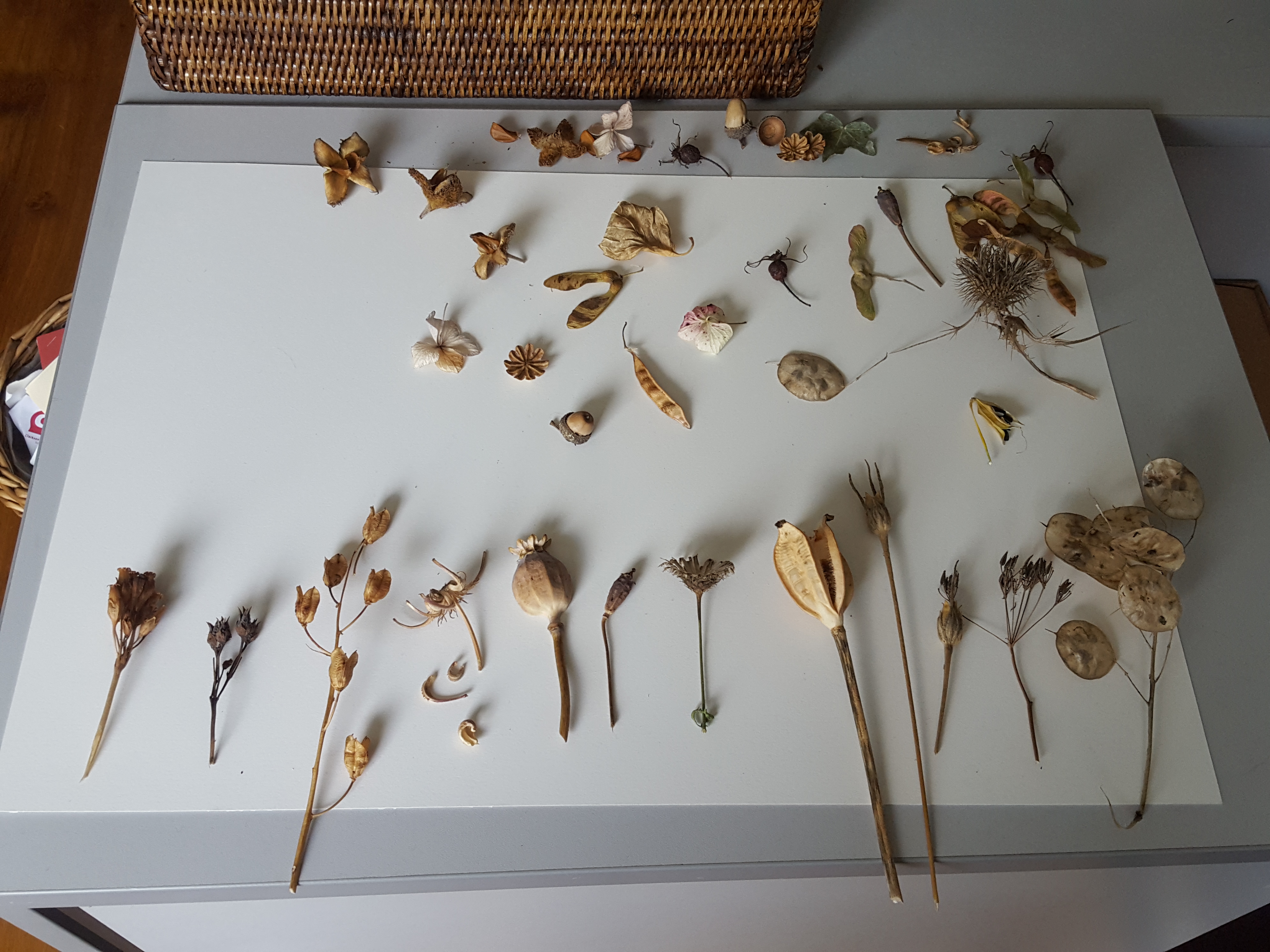
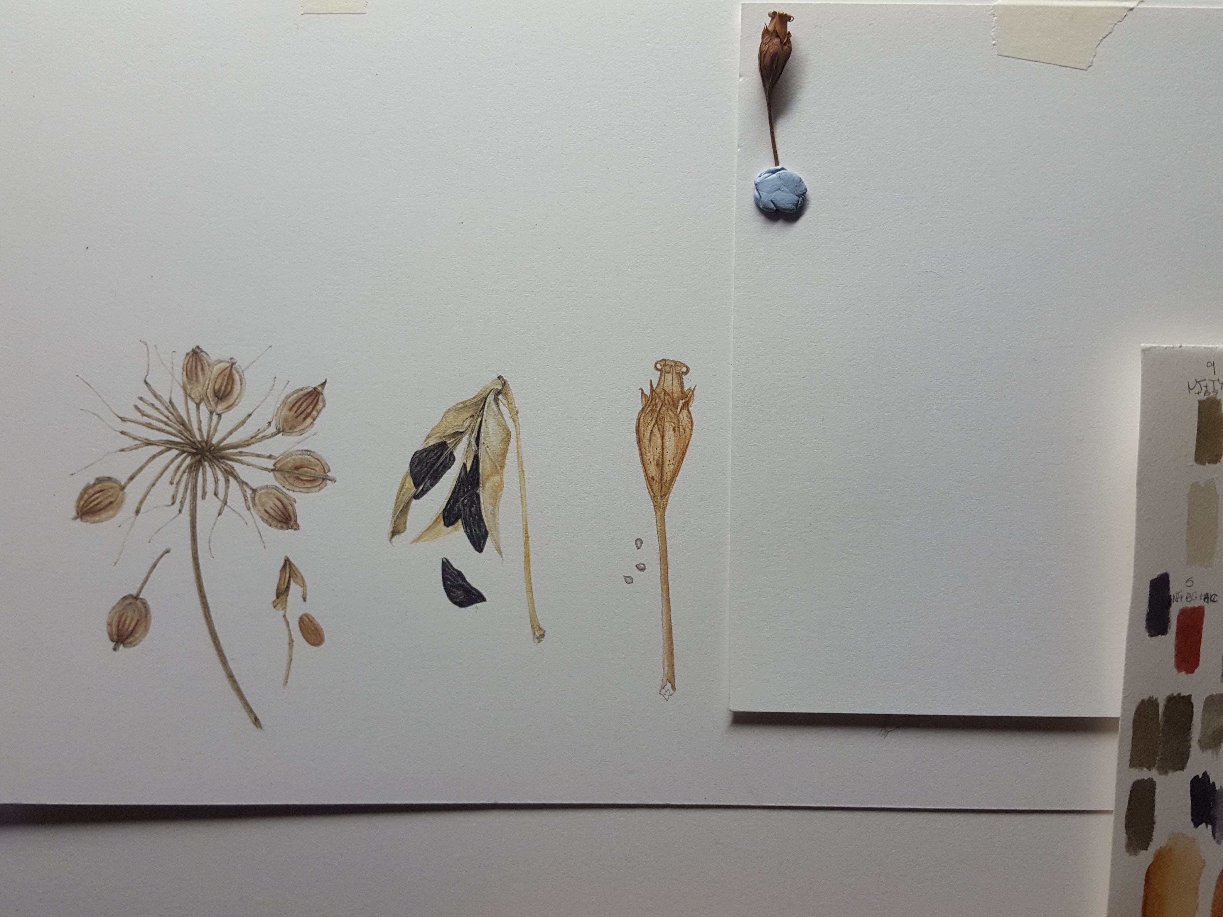
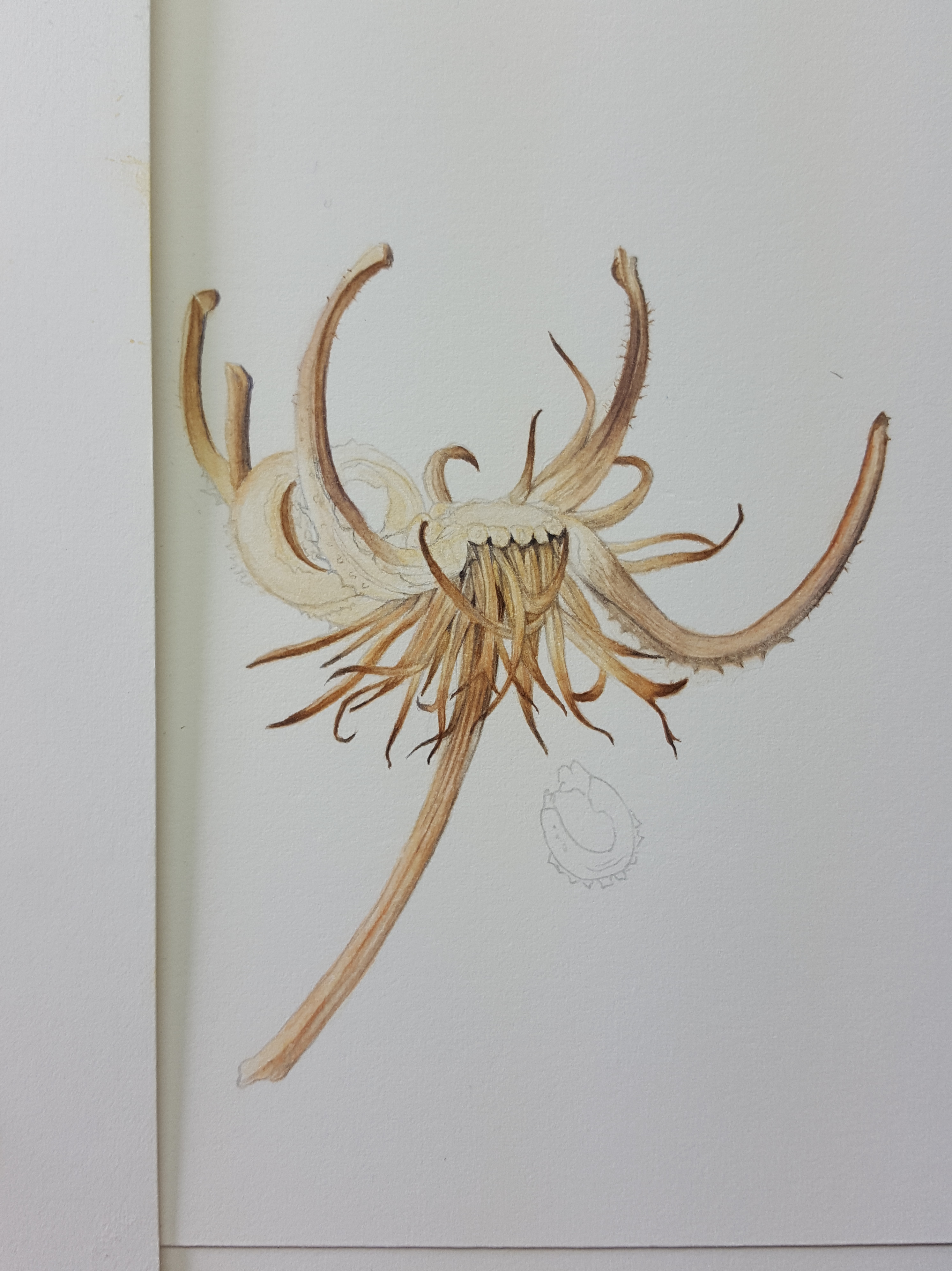
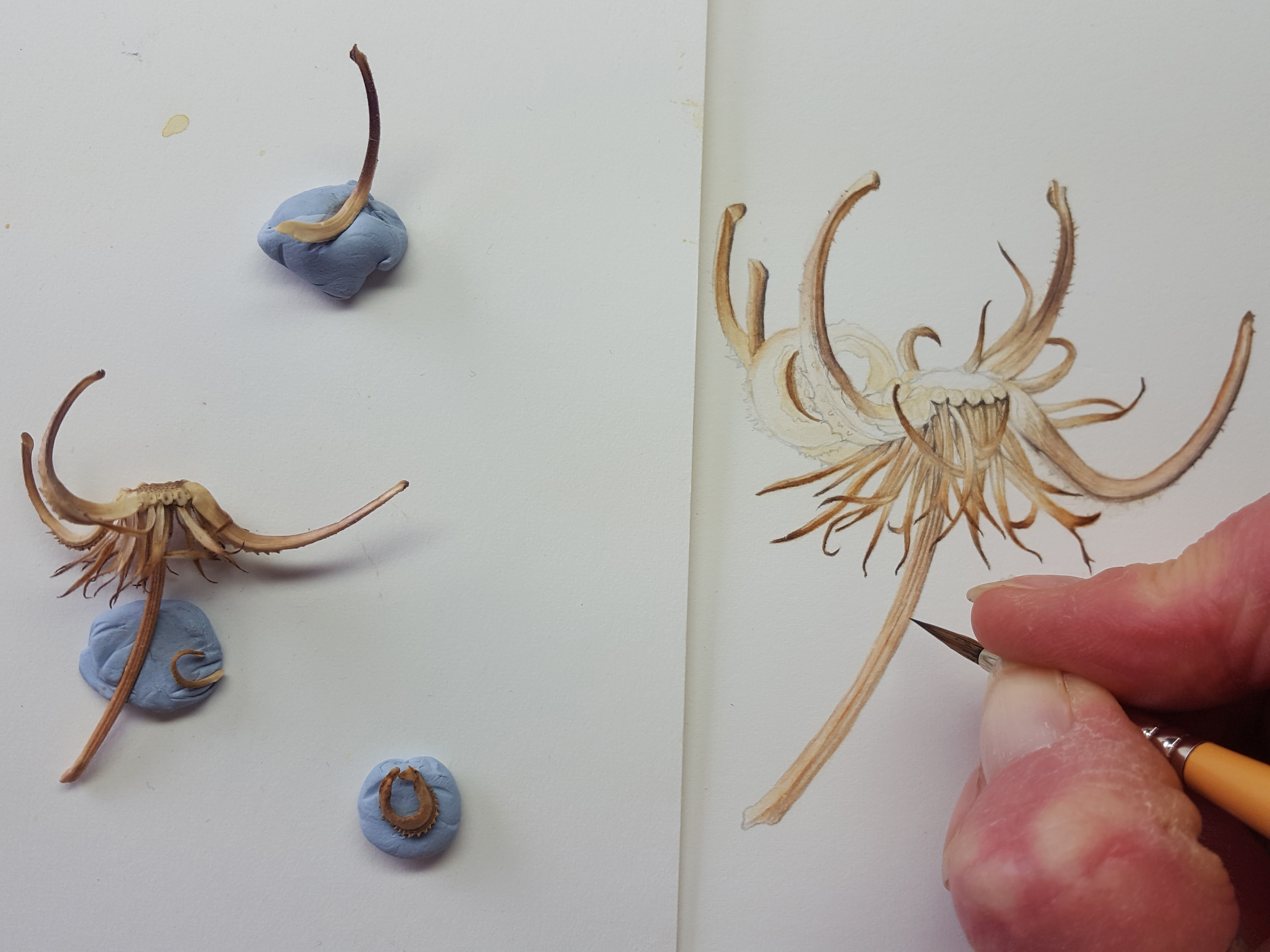
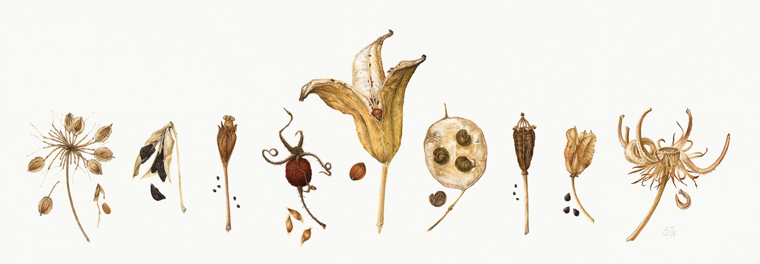
I have a passion for Autumn colours and all the bits and pieces you find on the ground at this time of year. I began collecting these seed heads around a year before I decided to make this painting. Like a lot of Botanical artists I soon found that I needed to invest in quite a few storage boxes!
I can’t believe the beautiful things nature throws down from the trees and plants in the Autumn. These little ‘vessels of life’ really are so very interesting. Firstly, I laid out my collection on the desk so I could decided which ones to use. Then I tried out different arrangements for possible compositions. This went on for about a week… I kept changing my mind! Please swipe the images below and on this blog from right to left. There is usually more than one!
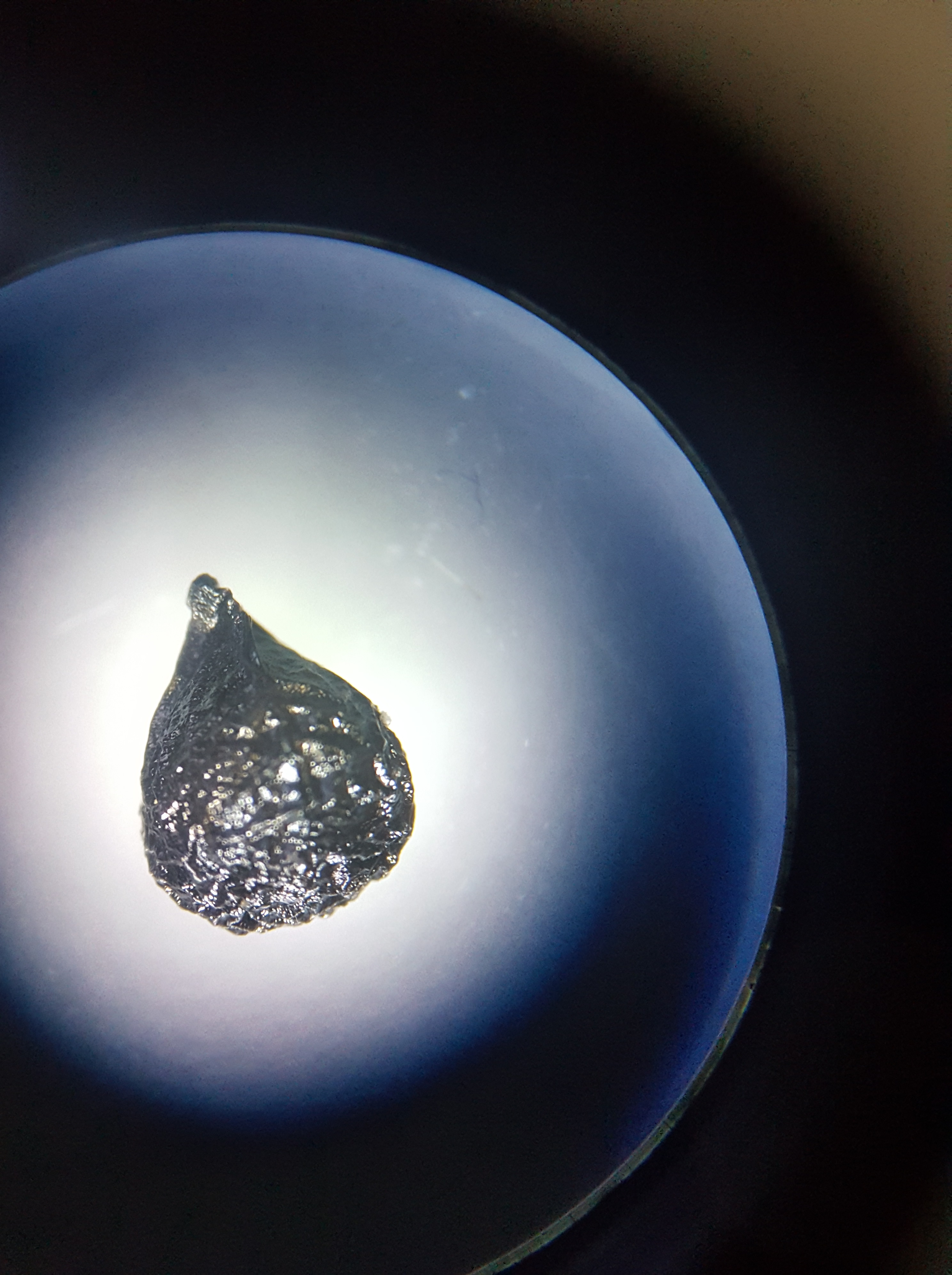
At Christmas I was lucky enough to receive a microscope from my better half. I decided to have a closer look at the little seeds falling out of my seed heads onto my desk. I don’t have a microscope camera but managed to take these with my Samsung 6 phone by resting it on top of the viewer. They proved very interesting indeed!
Recently, I find I am looking at almost everything under my microscope to discover what’s within. It really opens your eyes! I have found it a great tool for studying small flowers before I paint them. It gives me so much more information than with the naked eye.
Selecting my subject matter
So, I began by selecting the seed heads which I felt went best together and drew them all up on tracing paper. When I was totally happy with the drawings I outlined them in black fine liner and cut them all out….this was only the beginning! It then took me about another whole week of fiddling around and rearranging them in between painting before I finally decided on my final composition!
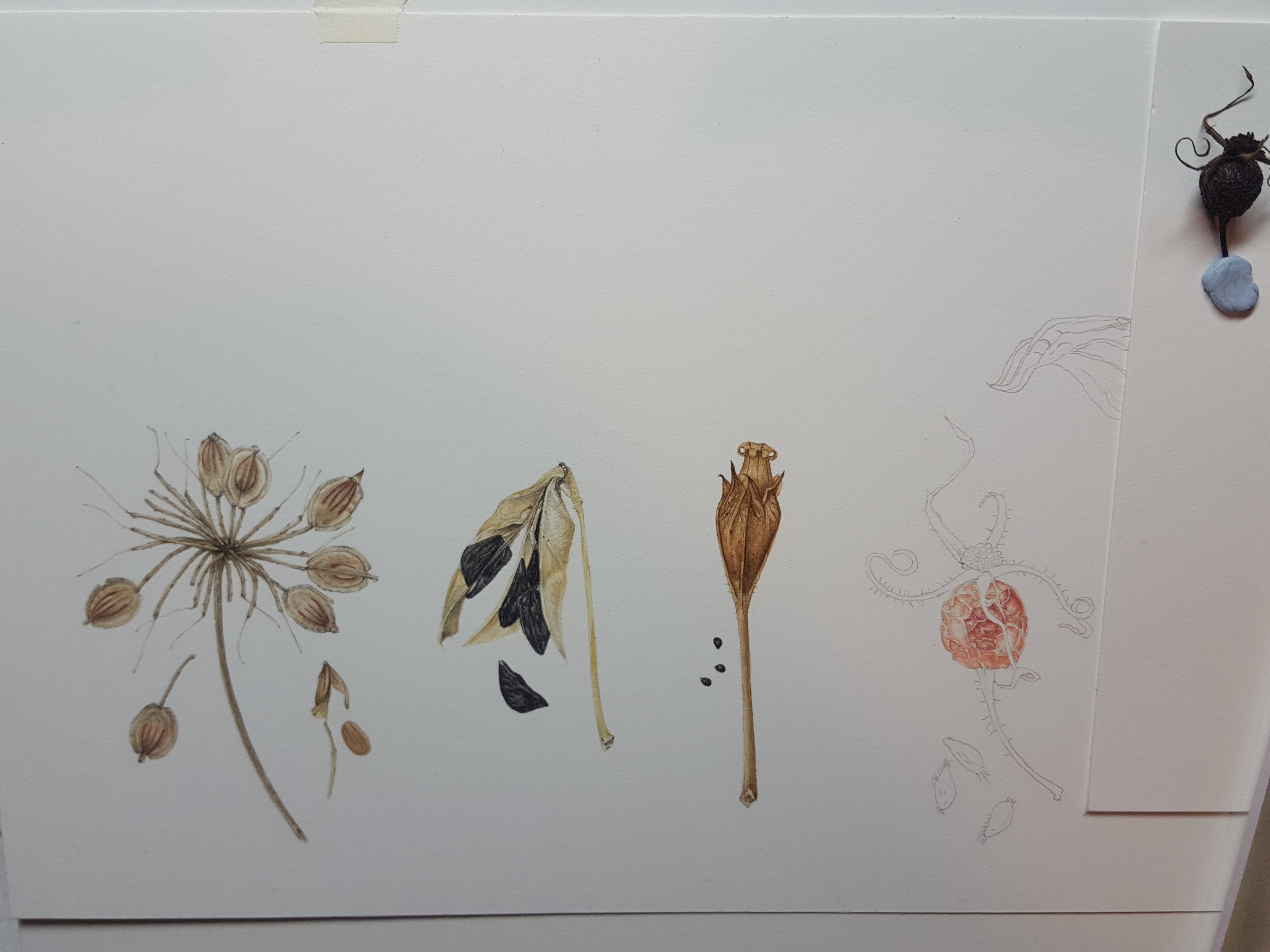
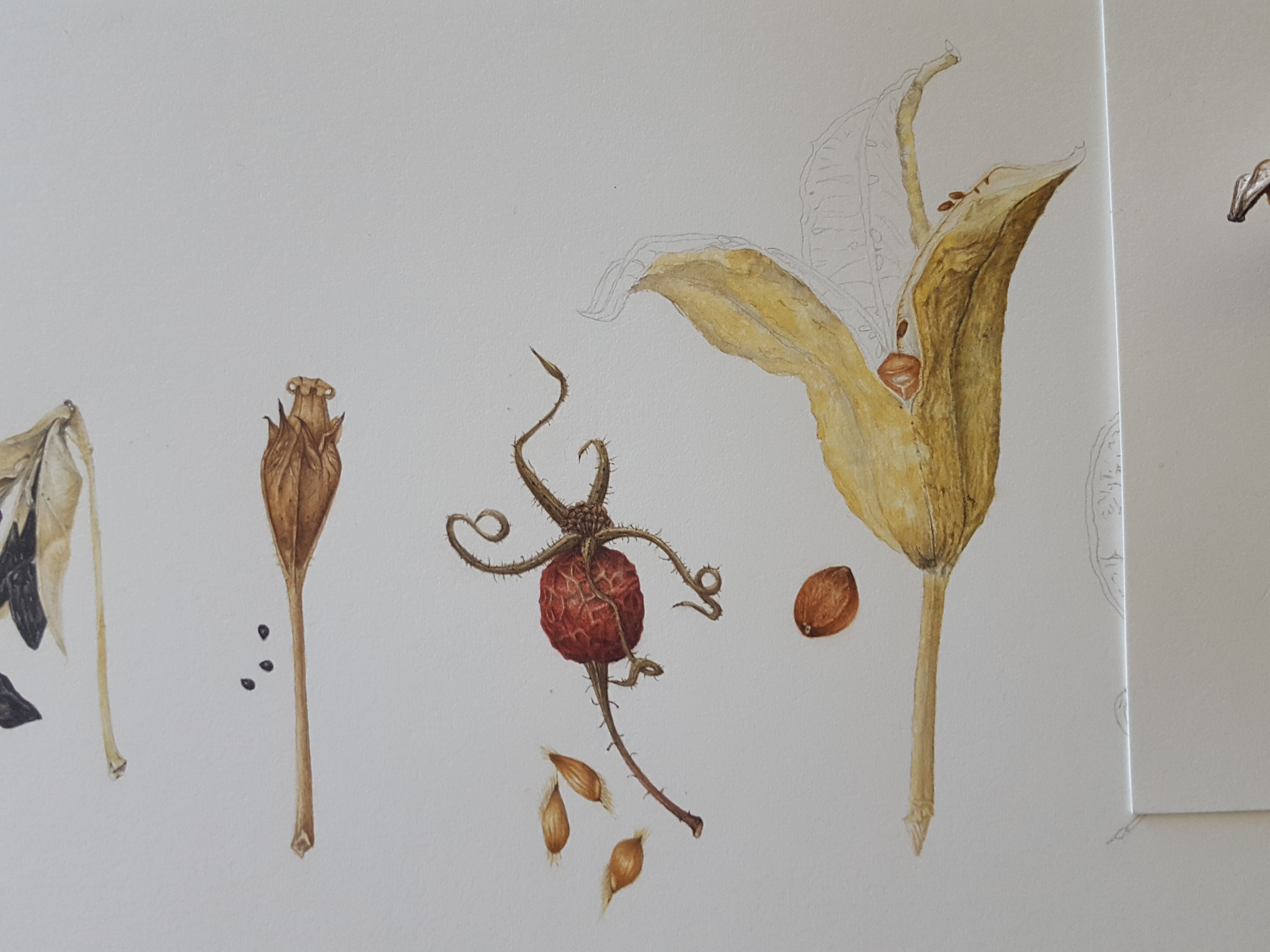
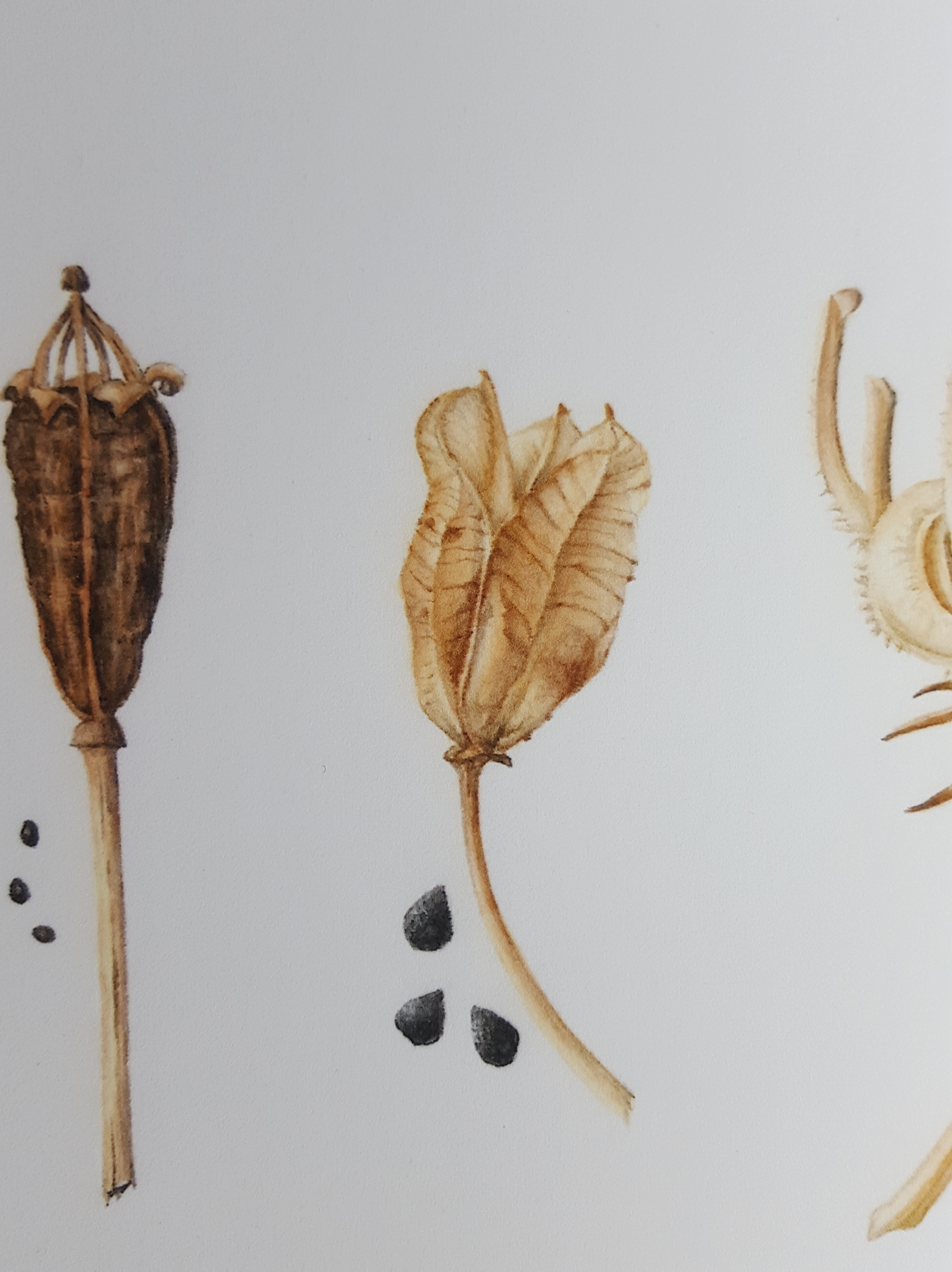
At last I was ready to transfer them to my watercolour paper using my light box. The ones I chose are as follows: Cow Parsley, Agapanthus, Cowslip, Rosa Glauca pourr. rosehip, Iris sanguinea, Honesty, Yellow poppy, Camassia and Marigold.
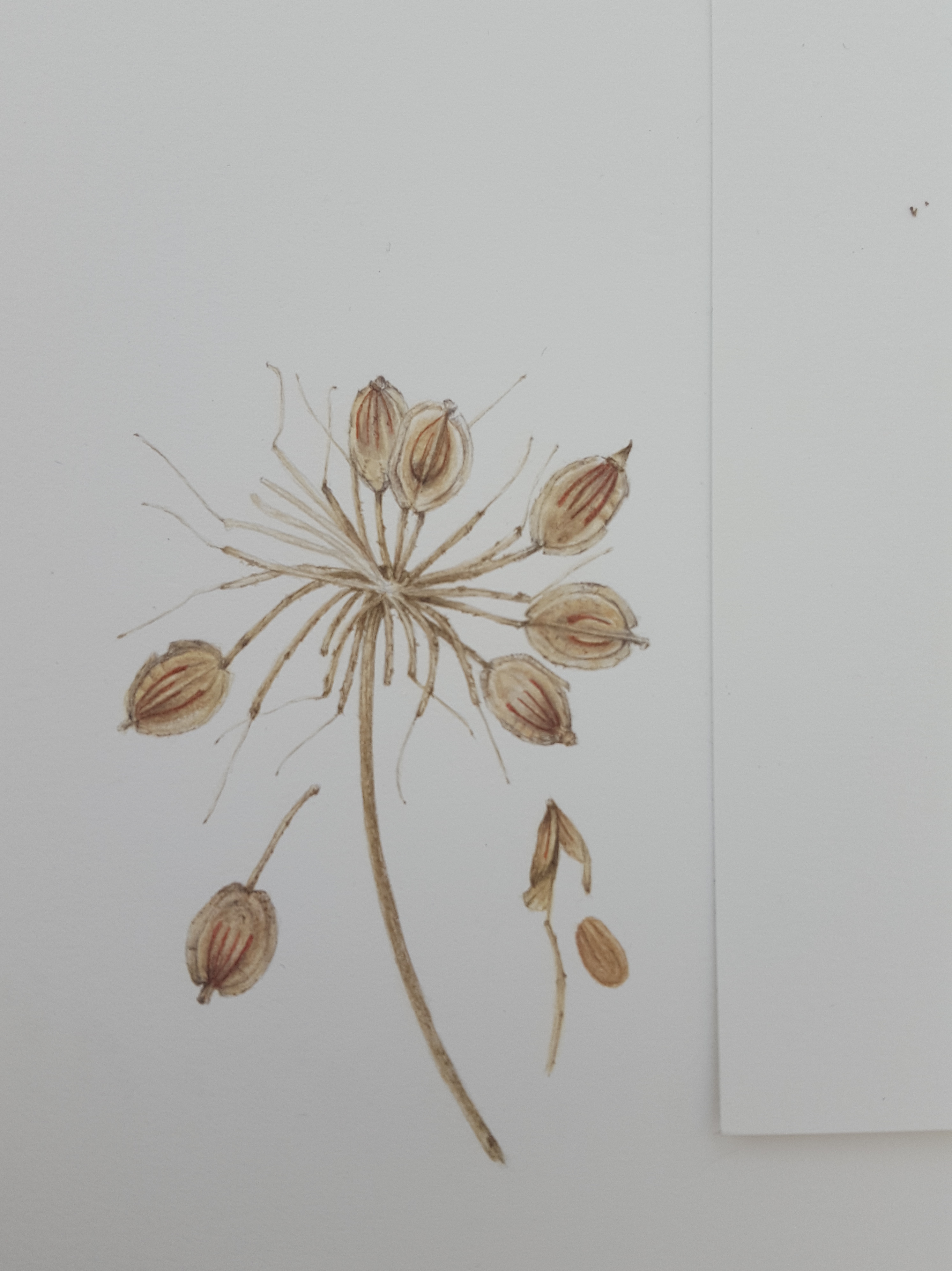
Cow Parsley seed head
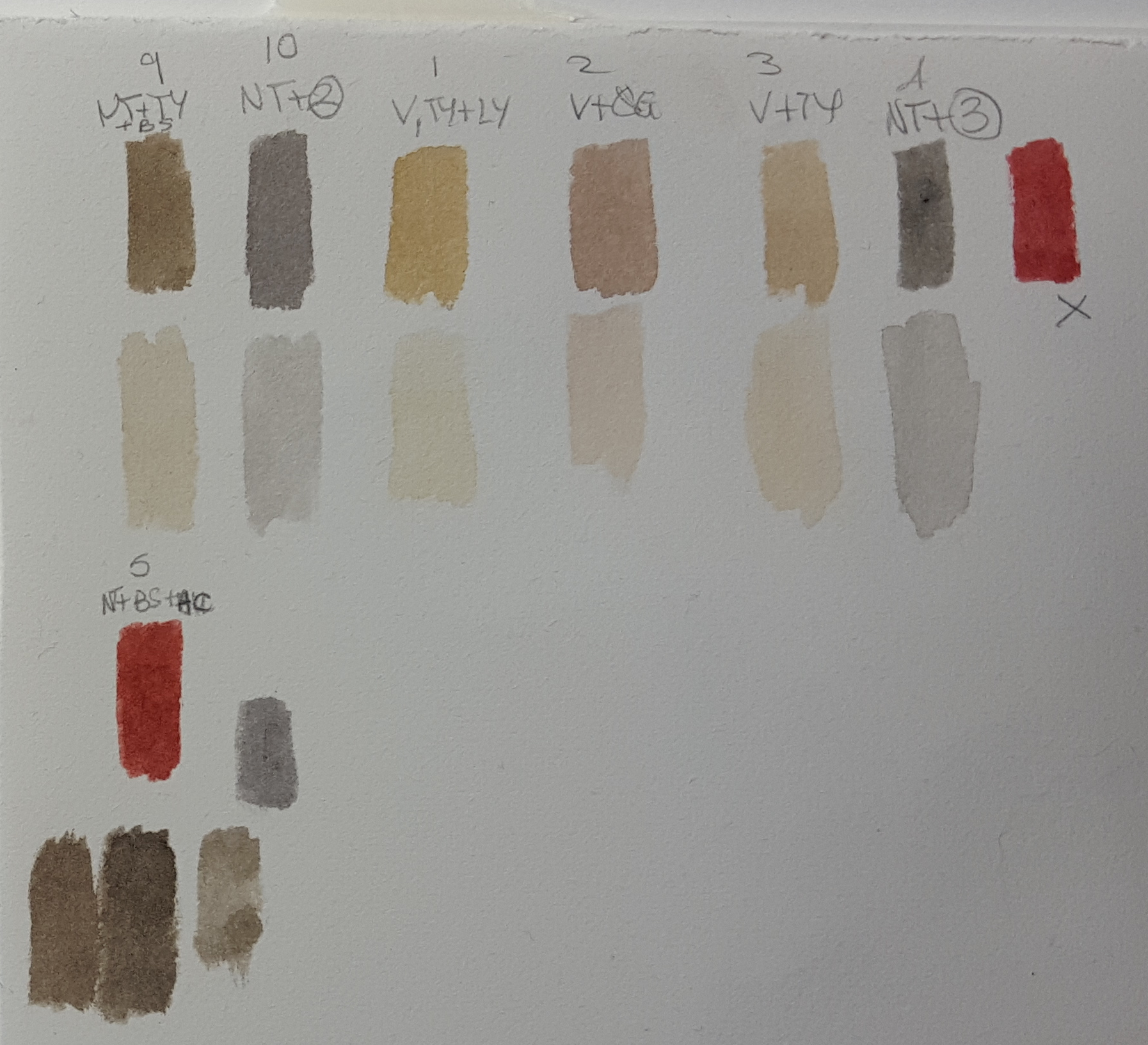
The first seed head on the composition was Cow Parsley. It has flat discs which pop open in the same way as Honesty seed heads and the seeds fall to the ground. They have little reddish brown stripes on them. For all my seed heads I have used very neutral tones of different beige, brown and grey mixes. Each one is very individual. Cow Parsley seeds are pale beige in colour but with a greyish tone, so I mixed up a range of colours and tints matching them against my subject as I went. It’s important to match your colours against your subject to get an accurate mix. Make sure the paint is absolutely dry though before you decide as these pale tones always dry darker than you think! I mostly used Winsor Violet (V), Neutral tint (NT), Quinacridone gold (QG), Winsor Lemon (LY), Transparent yellow (TY) and Burnt Sienna (BS) for this one. Please note here that I do not use Neutral tint any more as it is opaque. Opaque pigments will flatten your work. I only use transparent and semi-transparent pigments now. Thankfully very little of the mixes using NT were used in this painting.
And so I began painting the first seed on the sprig, firstly with a pale wash, then building up the shadow areas and tones to give it form. The stem was woody in appearance and the beige/grey tones worked well on this to give it that feel.
Here’s some little videos of me working on it.
I built up the individual seeds with my beige and grey tones to give the curved shape of the casing. This part holds the seed inside. I dissected a seed head to see what the inner seed was like inside and painted that too. It had an orangey/pink tone which I made with Burnt Sienna (BS), Quinacridone Gold (QG) and Winsor Violet (WV). Looking at the seed casing I noticed that the reddish brown lines were different on each side. There were 4 on the front and only two on the reverse. Some of the seeds were twisted on my sprig so the reverse showed. This was an important discovery! I studied all of my seed heads very closely before drawing them to ensure I understood all the detail which is needed to make them look as realistic as possible.
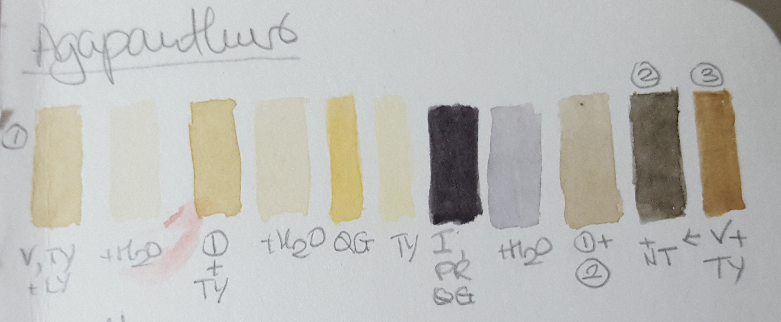
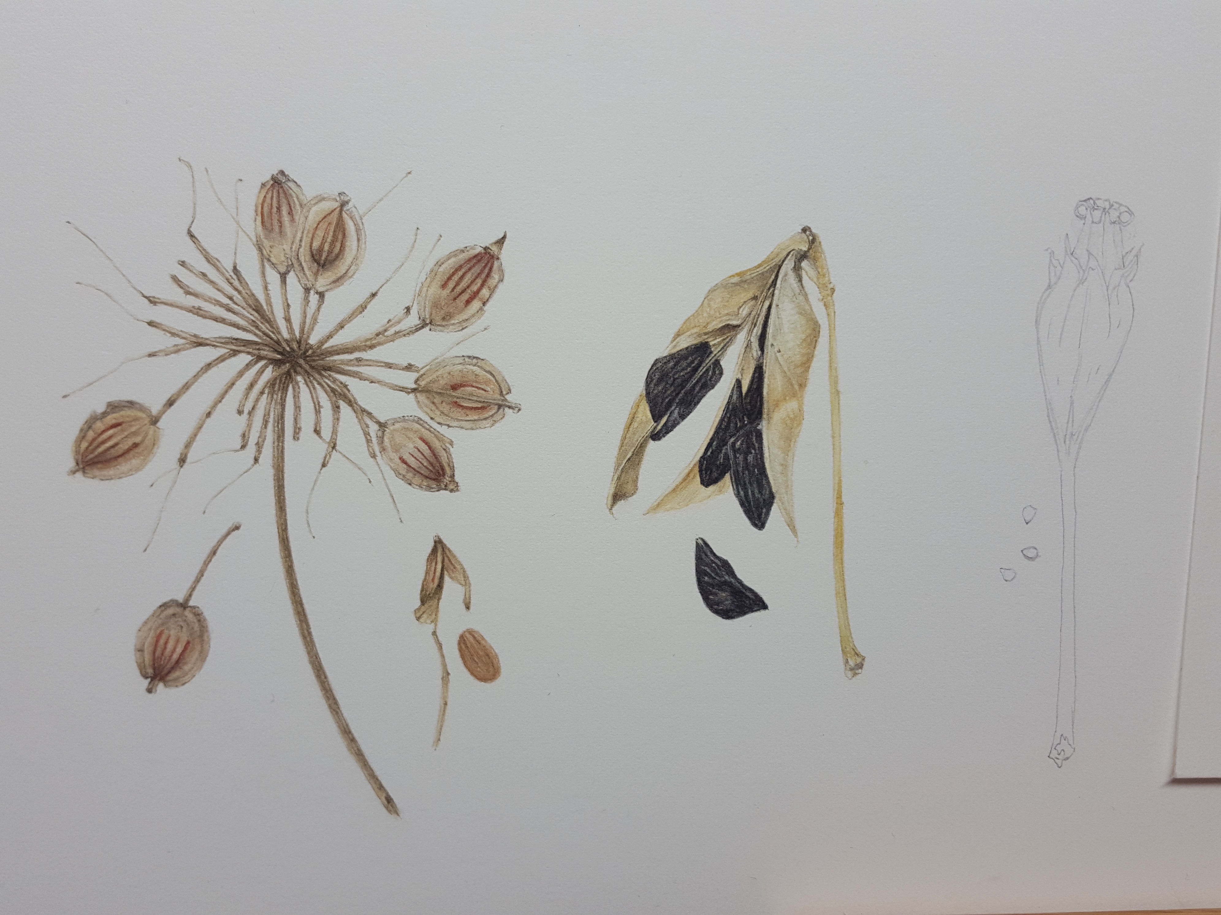
Agapanthus seed head
Next was the Agapanthus seed head. What amazing black, flat and crinkly seeds inside the pale yellow/cream casing! This one was tricky to draw as the seed casing twists open and curves exposing the seeds from within. These seed casings flick open and the seeds pop out, like sweet pea pods. The casing is a very pale and only has hints of colour so it is important not to overwork it and retain the highlights. I left paper white highlights and painted deeper shadow tones to create contrast. I used similar neutral mixes but Transparent Yellow instead of Quinacridone Gold as it is brighter. Quinacridone Gold would have dulled the mix. I mixed a selection of warm greys of different tones for the shadow areas. For the seeds I made a nice blue black out of Permanent Rose (PR), Quinacridone Gold and Indanthrene Blue (IB). I left paper white spaces between the strokes to achieve strong highlights and give the appearance of the crinkled surface on the seeds. At the end I added a little (very watered down) Winsor Blue tint over the seeds in some areas to enhance their blackness and shine.
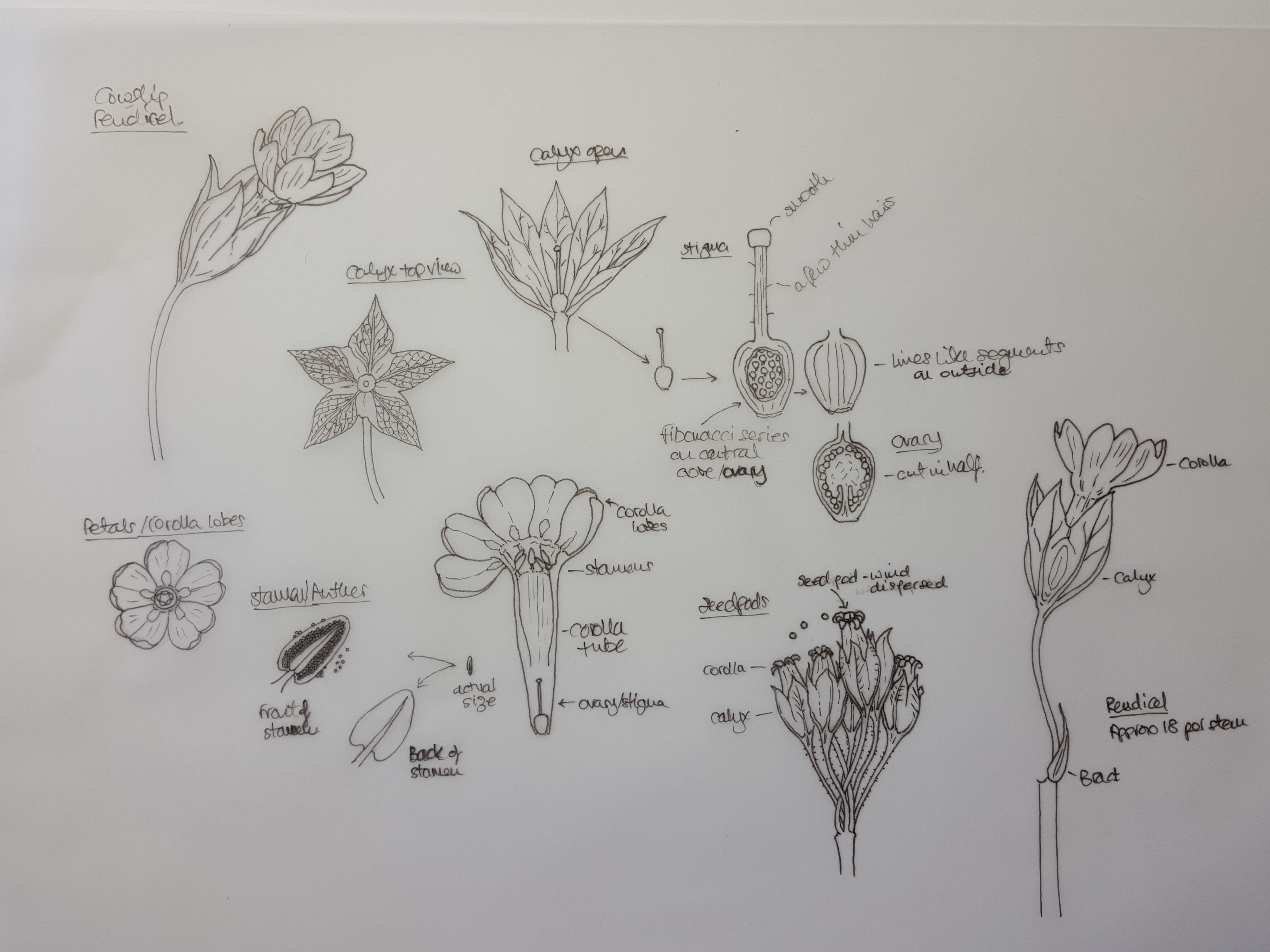
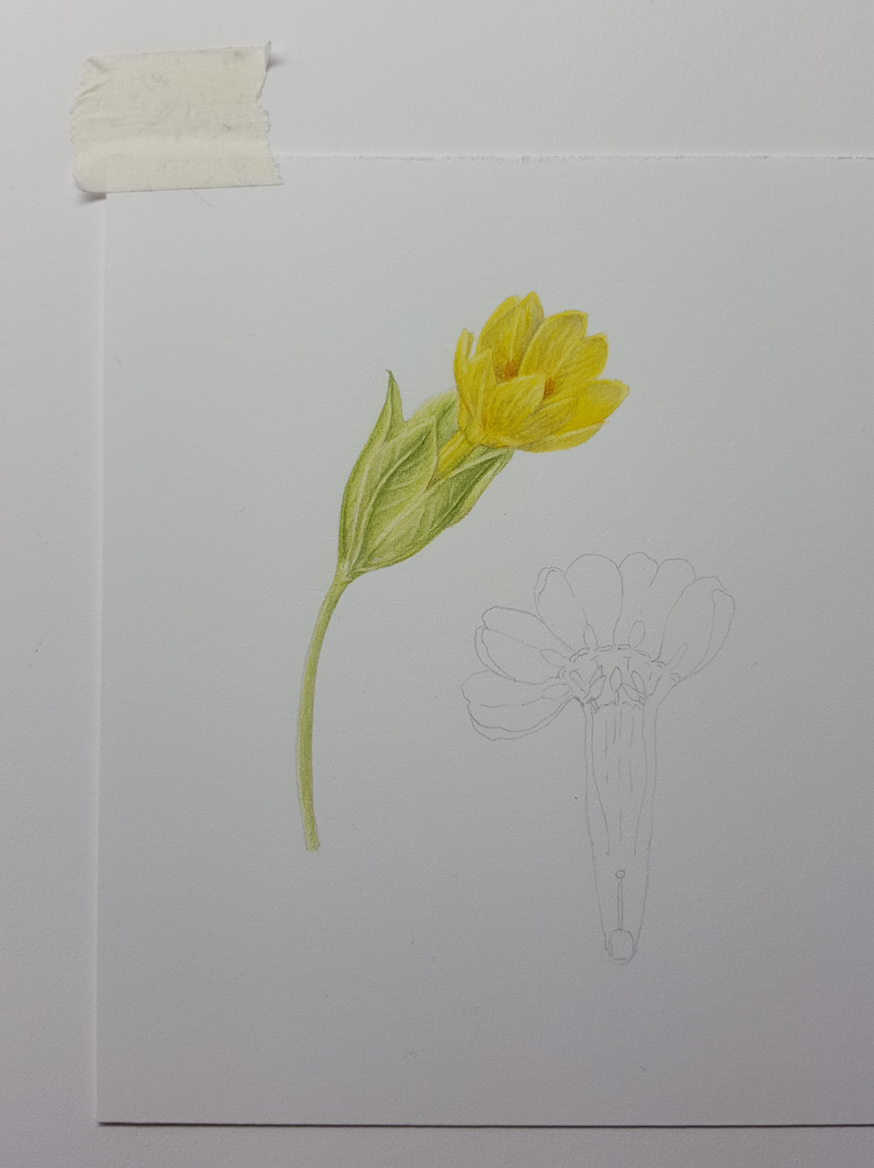
Cowslip seed head
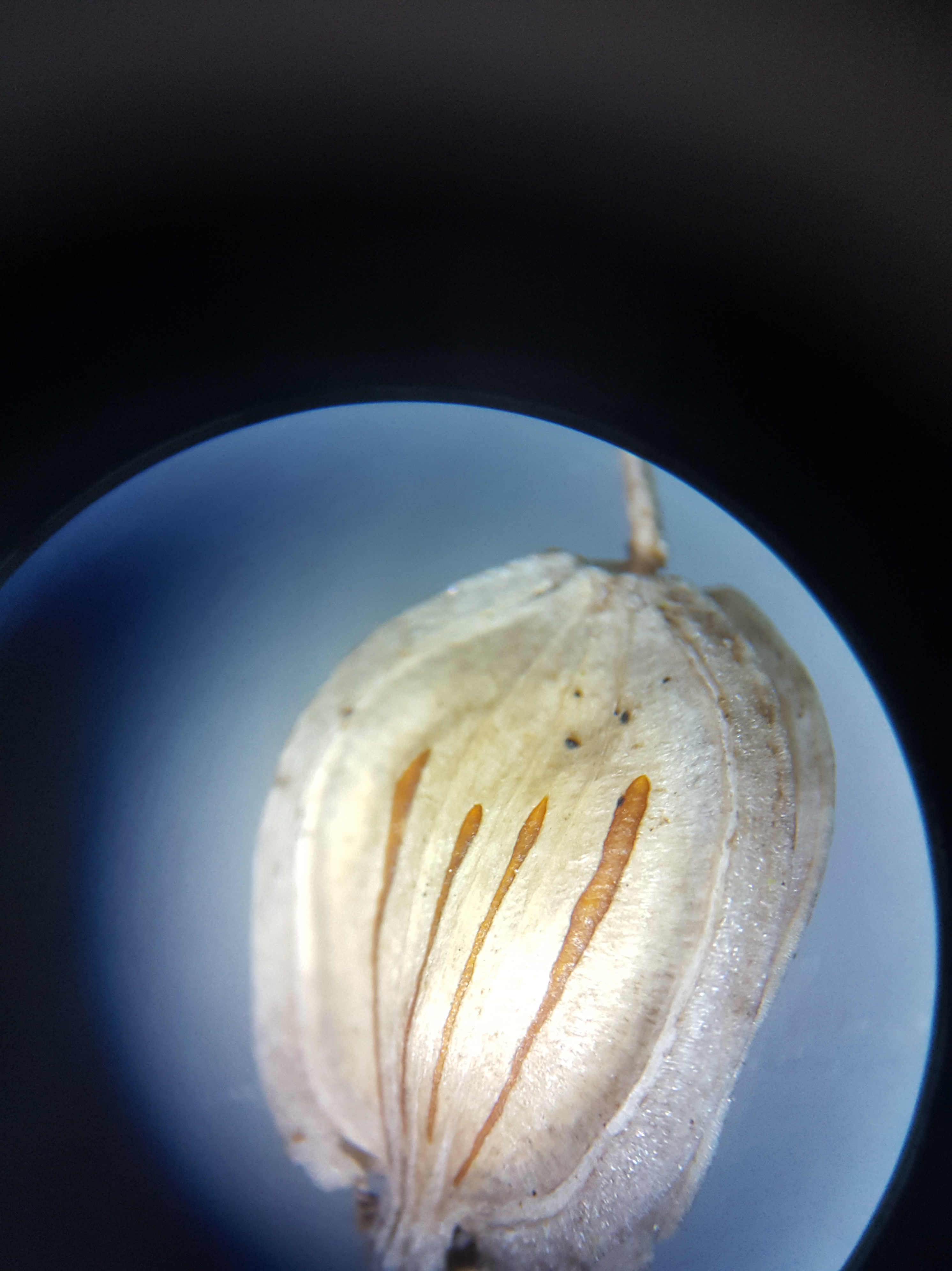
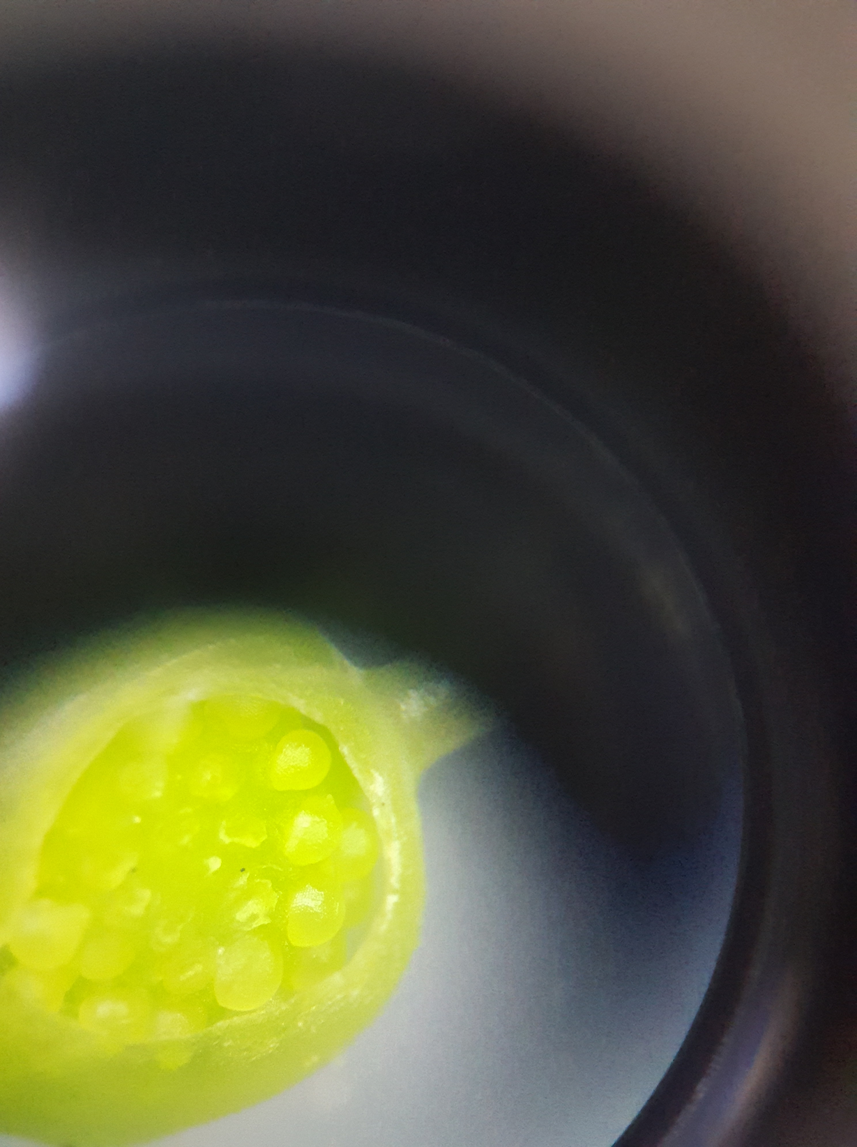
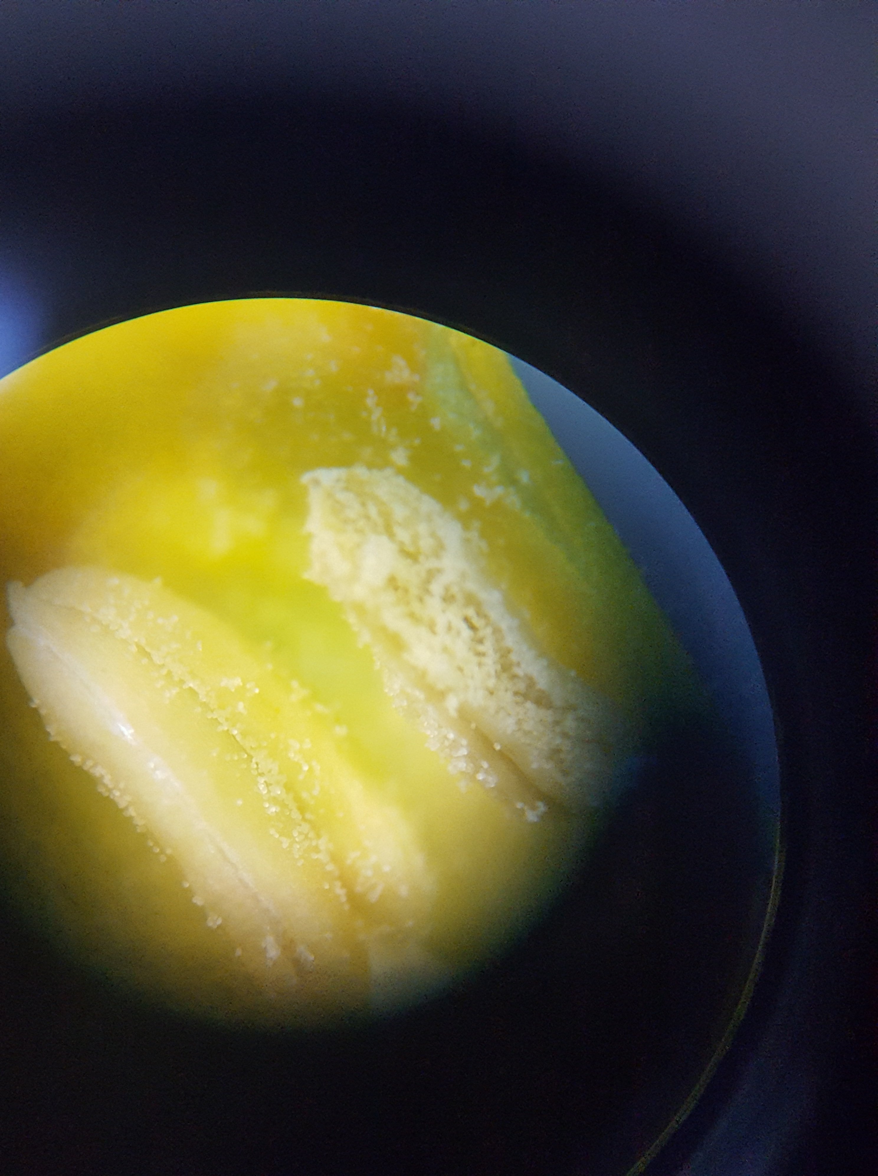
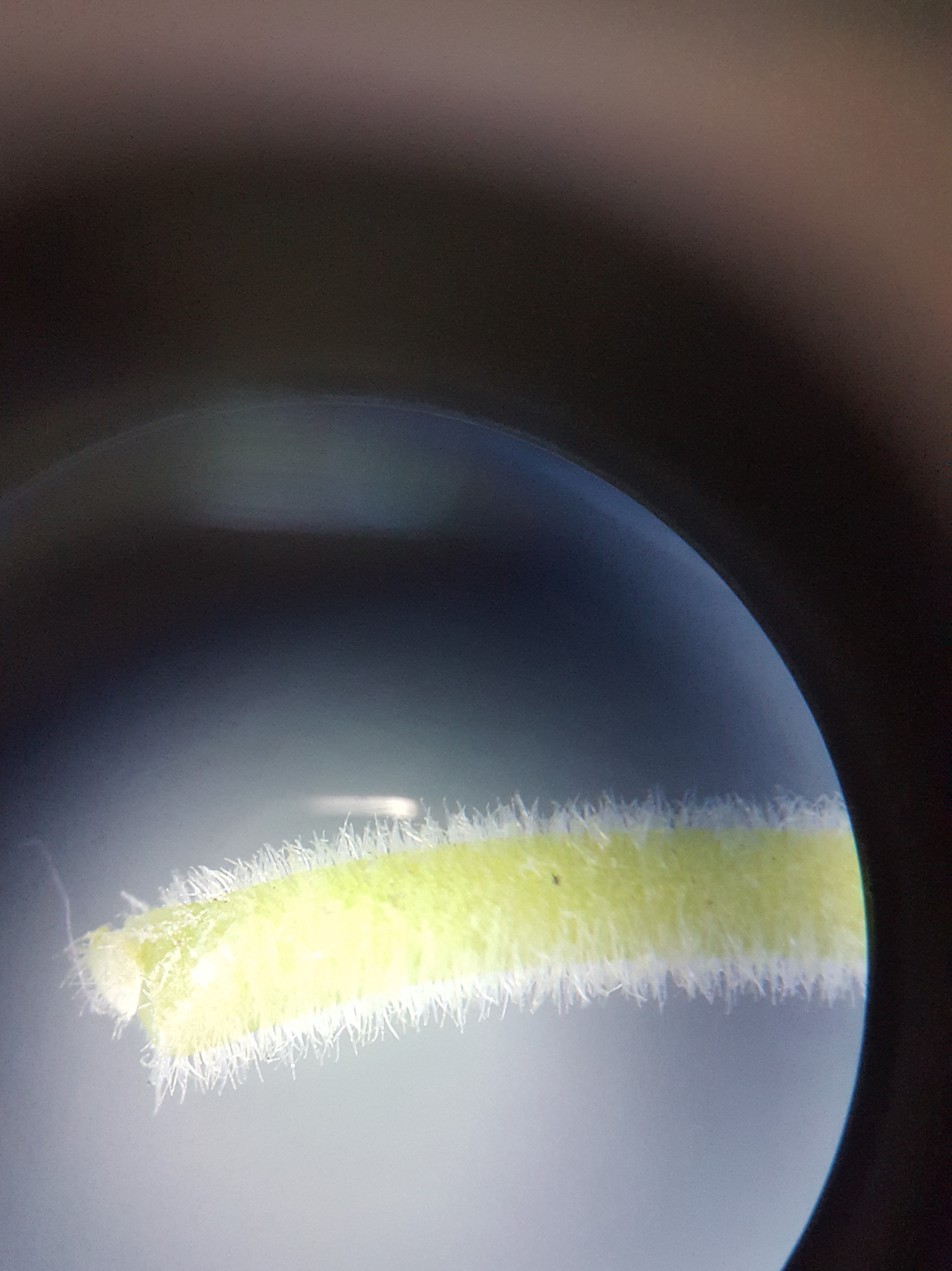
Next on the agenda was the Cowslip seed head. Cowslip flowers are really interesting as when they dry, the petals (corolla) curl back to form the top of a little ovary cup in which the seeds sit. The sepals (calyx) become the bottom part of this container. as the ovary swells inside it. The seeds are dispersed by the wind as they shake about. Below is a diagram drawing which I drew showing the flower parts and some microscope photos of the Cowslips’ ovary, stamen, stem and leaf detail. You may be familiar with the fibonacci series found in nature, well, in the ovary where the seeds are formed, the immature seeds sit inside their capsule forming the fibonacci spiral pattern.
For the seedcase I mixed some warm browns and some warm reddish browns using Winsor Violet (WV), Quin Gold (QG). In some of the mixes I added Burnt Sienna (BS) or Sennelier Rose Madder Lake (SRML) to enrich them. For the darker browns I used Indigo (I), Quin Gold and Burnt Sienna and a little Burnt umber (BU) to the darkest brown mix. For the very darkest brown I used Indigo, Permanent Rose and Quinacridone Gold, almost a black mix but with less blue. Please note: I do not use Indigo any more due to it being opaque. When mixing these colours years ago I thought I needed to use a very dark blue or grey to darken brown mixes. This is not so. Indanthrene Blue, Permanent Rose and Quinacridone Gold would make these mixes easily and they would not be opaque.
I started working on the first layer with pale tones and then added stronger colour for the detail and shadows. I had to work very carefully to get the shadows into the corolla curls at the top!
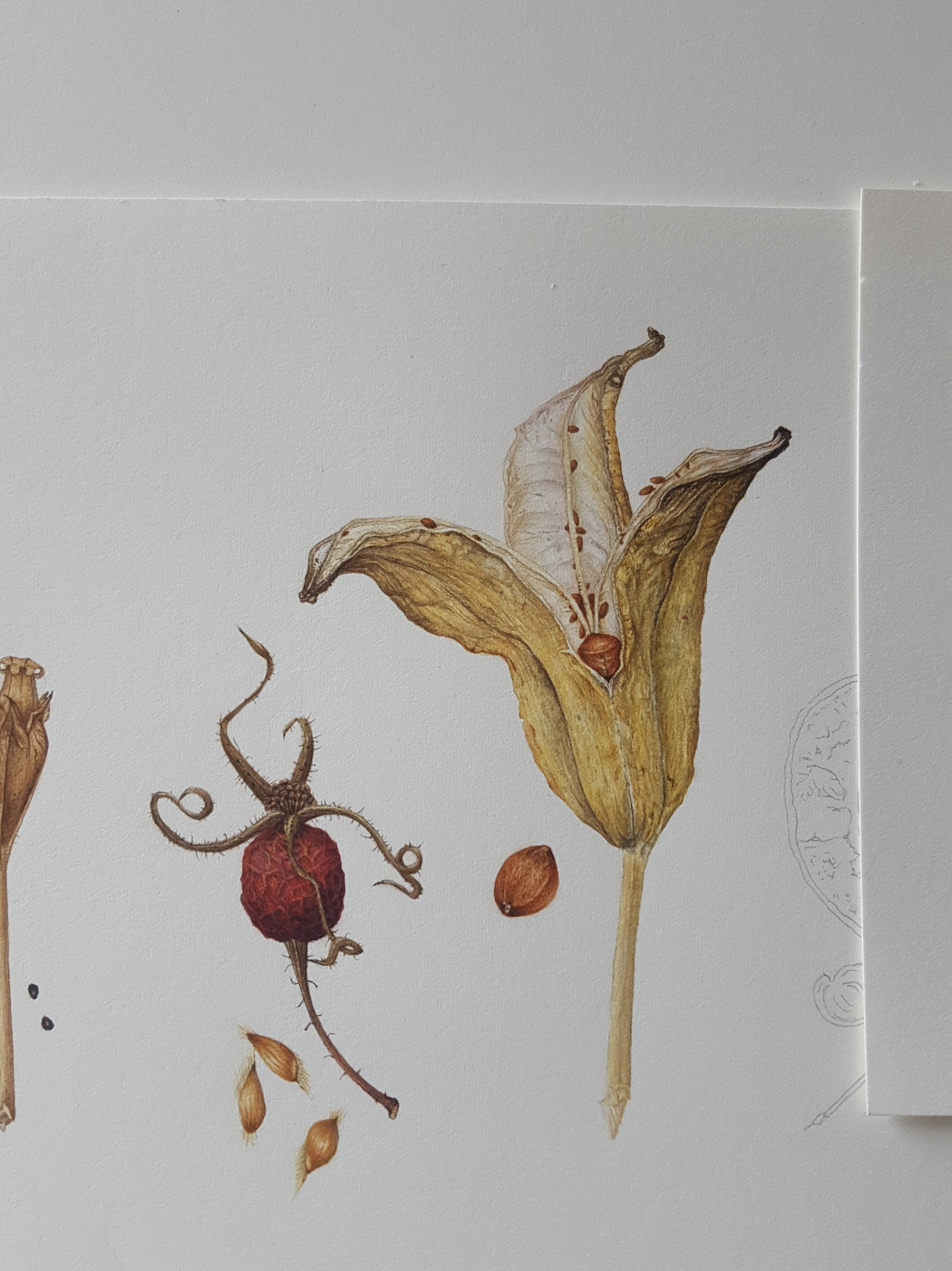
Rosa Glauca Pourr. Rosehip
The next seed head was the Rosa Glauca Pourr. rosehip, …not a seed head I hear you say! Well it is a seed head but this time the seeds inside the rosehip are injested by birds or they rot on the plant and fall to the ground eventually. The hip contains quite a few seeds inside it’s skin. This rosehip was turning dark red and black and drying out hence the crinkled surface. It was hard to keep the highlights as the crinkled areas were very small. My favourite part were the sepals, wonderfully curly and spikey! I used a lot of colours and tones for this piece.
I started with a thin wash of my red mix leaving unpainted areas to create the highlights where I saw undulations on the surface. I then built this up slowly using shadow tones mixed using my original red and browns to achieve the round form. I will admit it was very hard to keep the highlights as this piece is very small. On reflection now (2021) I would have started the initial layer by painting in the shadow areas in a thin glaze of WV. Then I would paint thin layers of the red mixes afterwards gradually building up to the stronger red. This way I would have found it easier to retain those highlights on the creases. Once I finished the hip I used my brown and black mixes to develop the sepals and stalk. The seeds within the capsule have tiny hairs at both ends and almost look like waxy apple seeds.
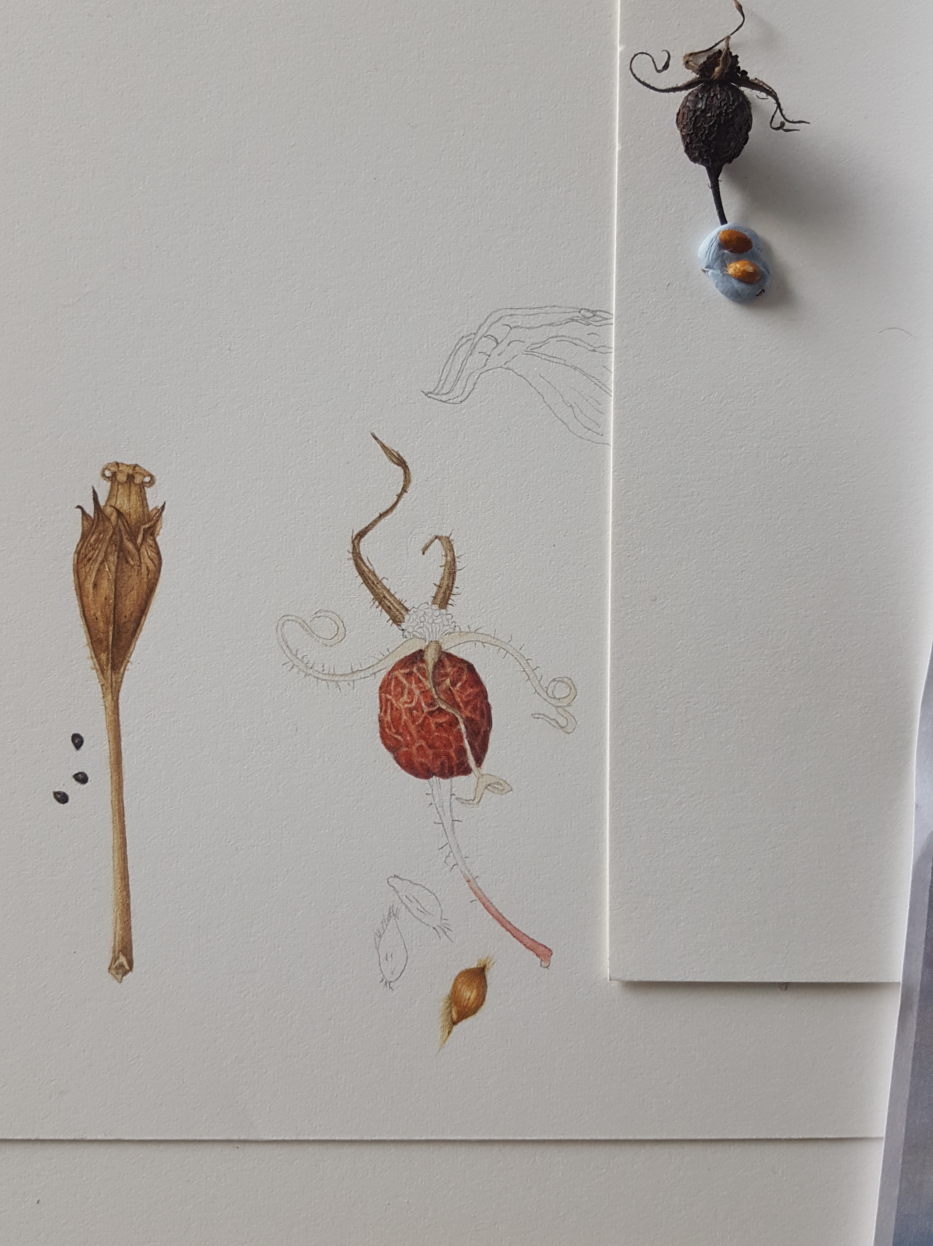
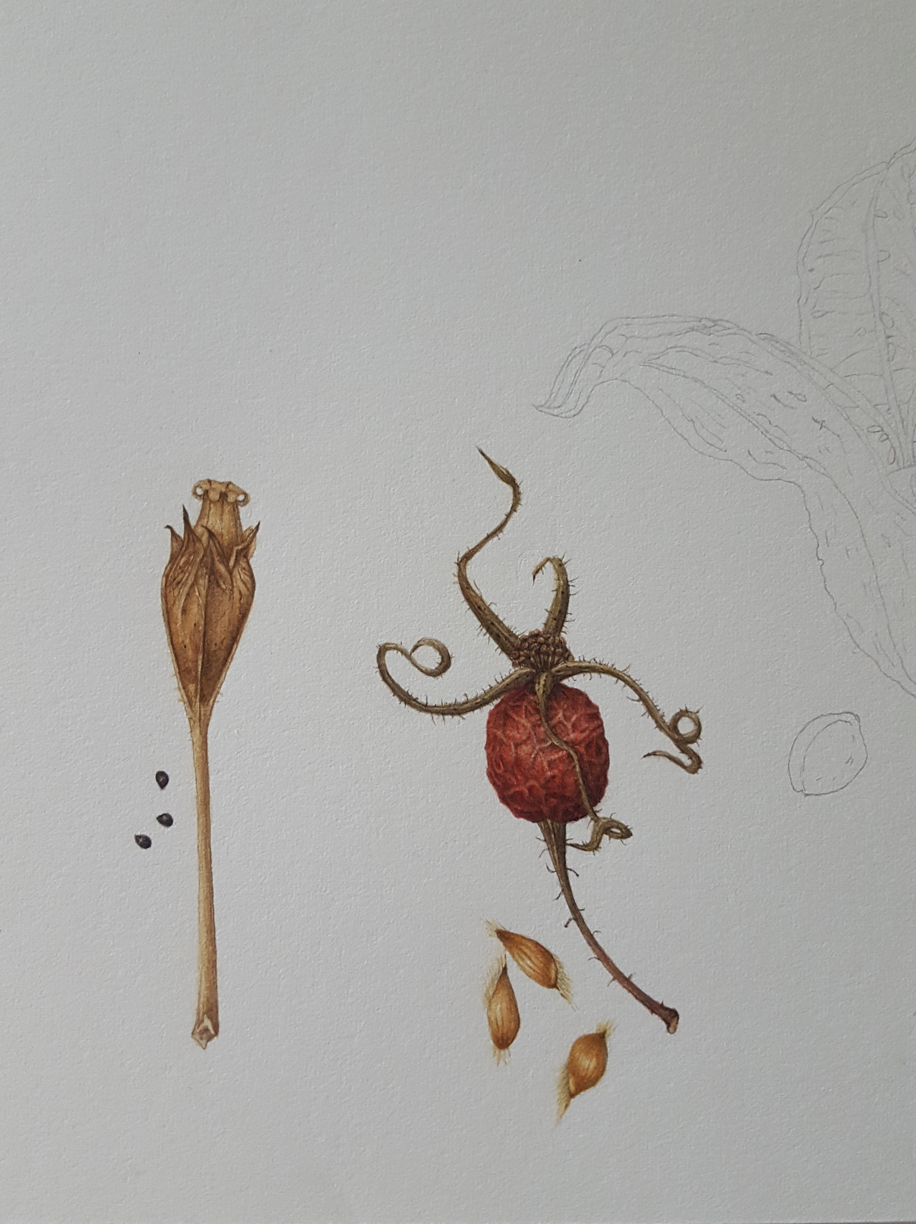
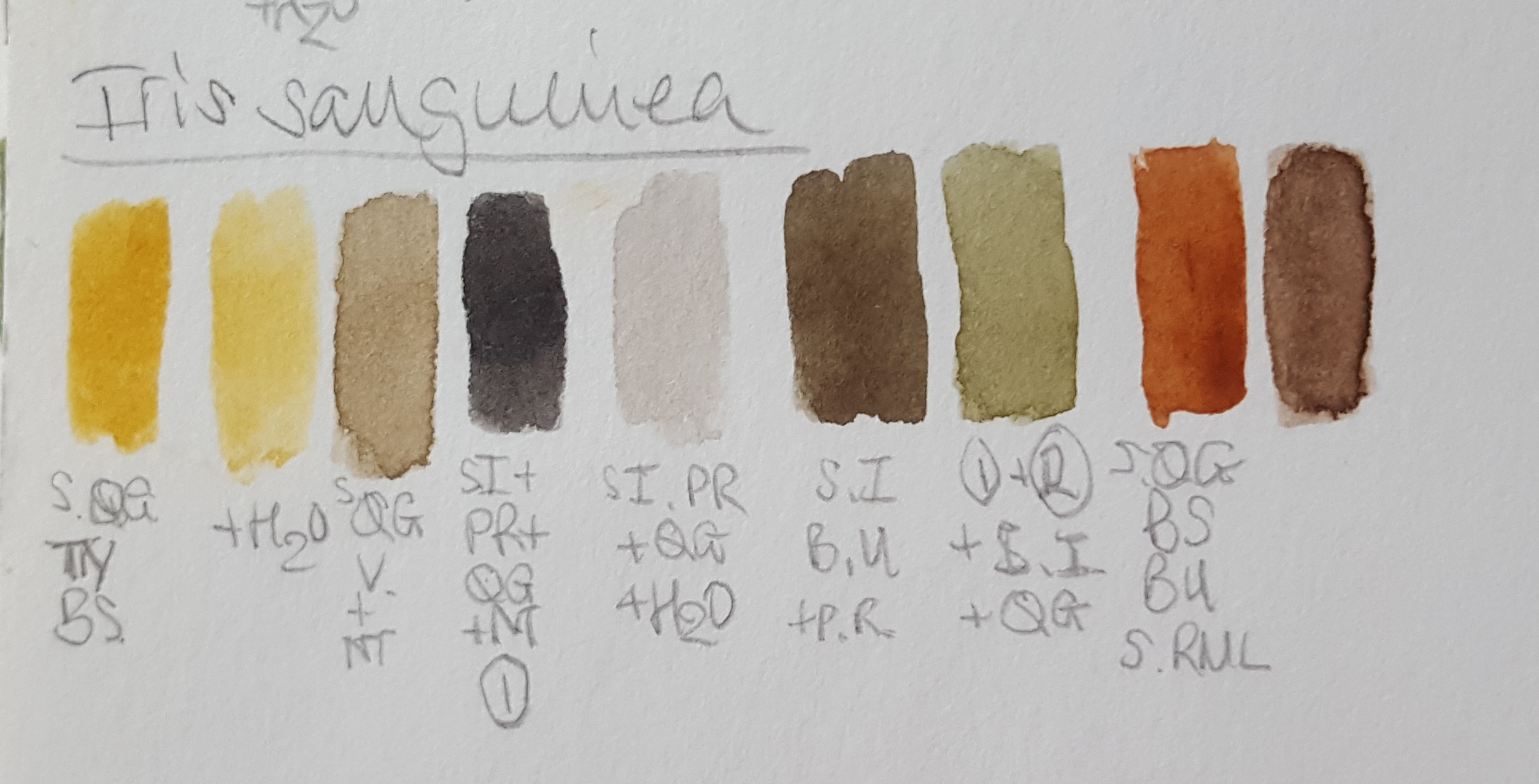
Iris sanguinea seed head
The Iris sanguinea seed head was larger and more complex than previously painted ones. This would be more of a challenge! A friend gave me this seed head as a gift as I thought it so interesting! I loved the curves and colouring. I thought it would make a perfect focal point to my painting, right in the centre! This one was great to paint as it had immense detail. It is shaped like a cup and the seeds sit in rows. As the Iris cup curls open the seeds drop out. This seed head has very strong yellow tones on the outside mixed with shadow greys. It is very pale inside so I needed to mix some very watered down grey tones and take care not to over paint these. The seeds are a dull orange/brown. My colour mixes included my regular pigments, as previously on this blog, but I added SQG is Sennelier Quinacridone Gold deep, SI is Sennelier Indigo and SMRL is Sennelier Rose Madder Lake. Please note: Again the Indigo and Neutral Tint would be omitted and a 3-way blue, red and yellow mix used to make the browns and blacks.
This was one of the hardest ones to paint and the finished piece looks like this, I spent a long time creating the wrinkles using cool and warm neutral tones and neutral greys to make the cup look three dimensional.
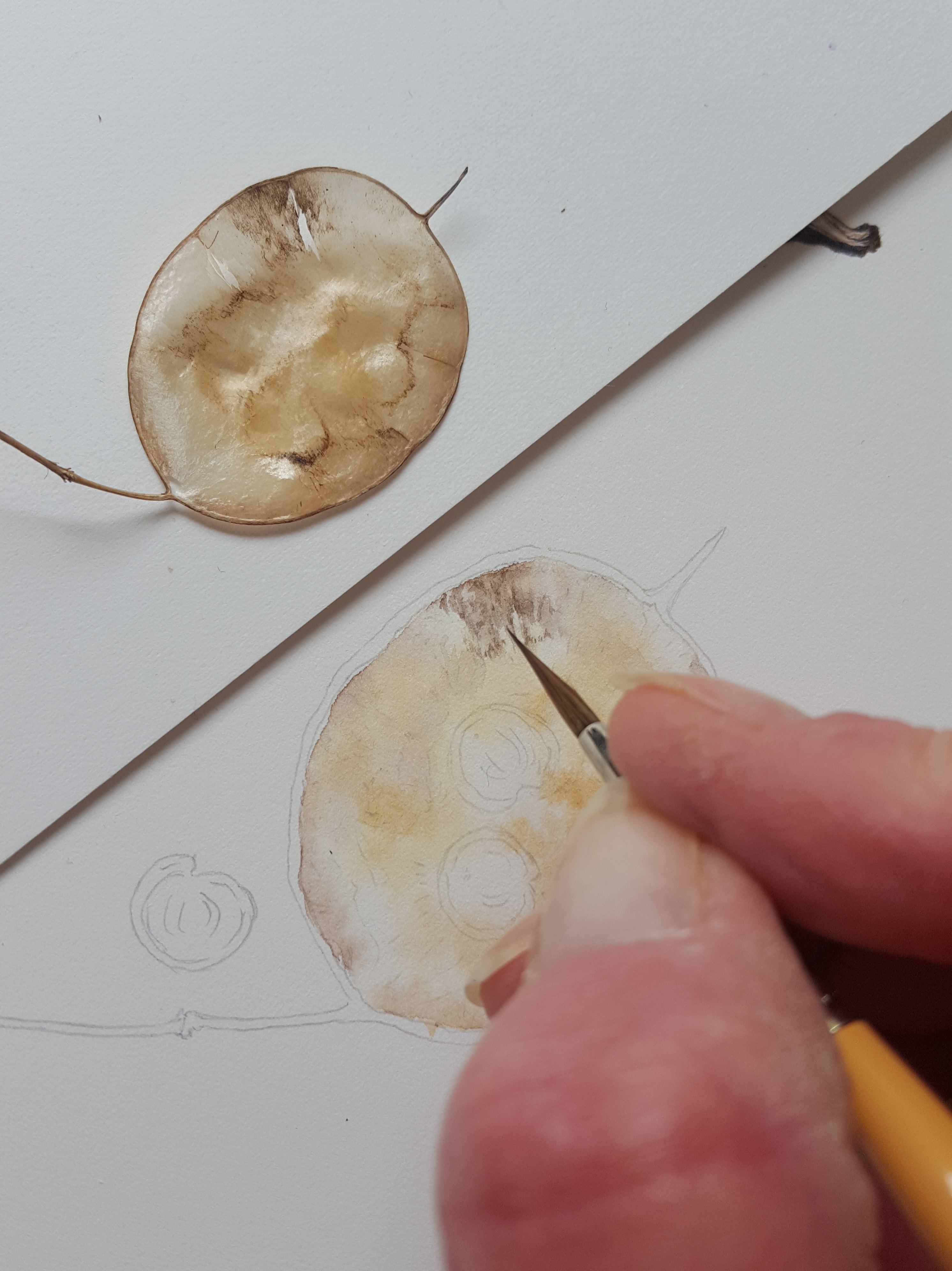
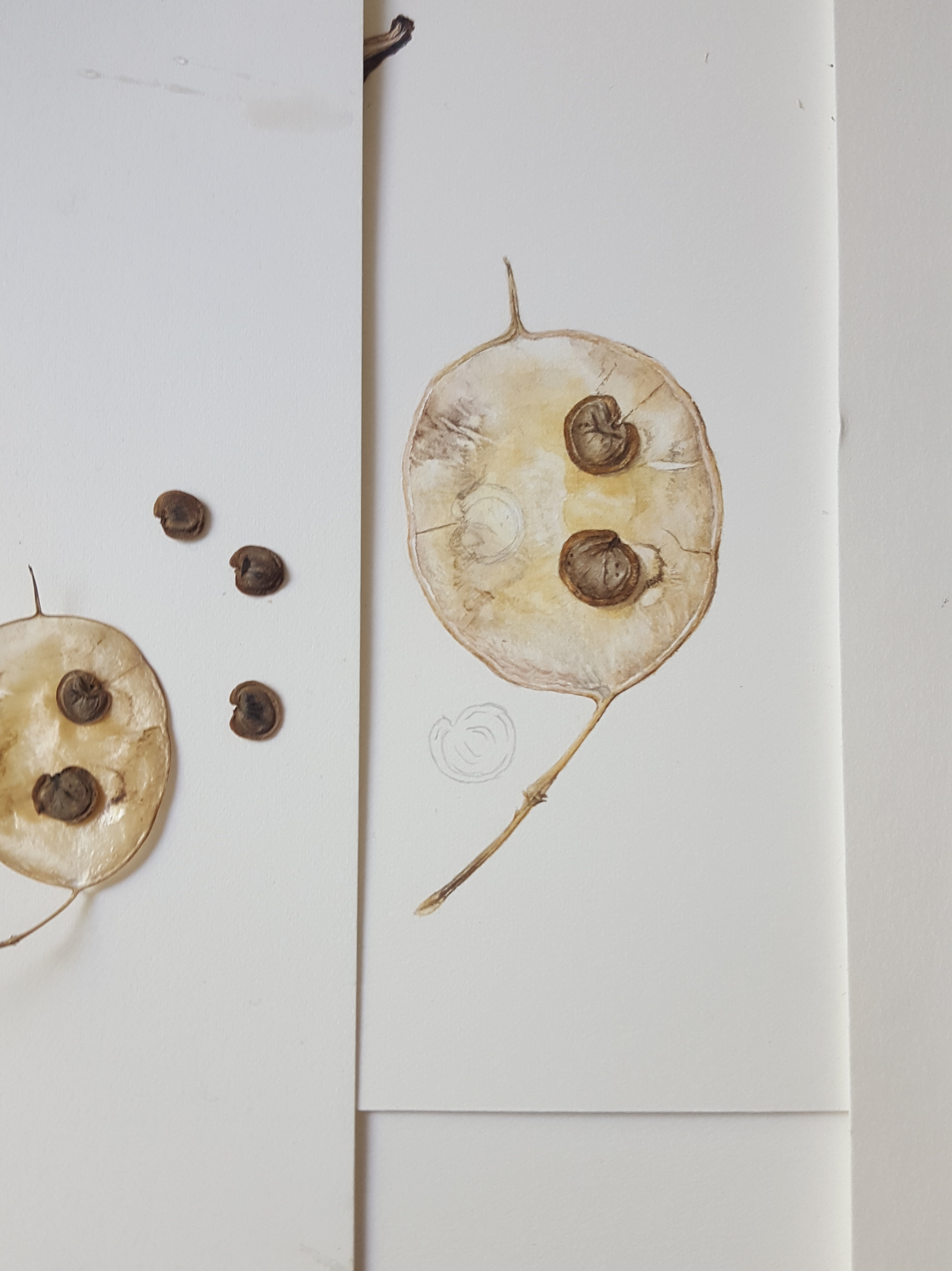
Honesty seed head
Honesty…. this is very tricky to paint! It has such subtle tones all over and needs perfect highlights to keep it looking shiny. Again I used the same colours to make my neutral tones which were very watered down, as below. An Honesty seed head is papery thin and made up of three layers. In between each layer sit the seeds and the whole thing pops open to let the seeds drop out.
I started by putting a thin blobbed wash of the cream/yellow mix over the areas which were darkest in the centre and the paler beige/grey tone around the sides. There were tints of a pink/orange around some of the edges too. It’s good to study your subject and look for all the tones before you start painting. There were many different shades and tones in this delightful little subject. It was hard to create a shiny feel which is so apparent in these seed heads but keeping the highlights very light helps.
Here’s a little video of the beginnings:
Once I had finished the background by building up colour to define the undulations, I then painted in the edges, stem and the pointed spike at the top, which brought together its shape and form. I decided to add 3 seeds to the painting. I was only going to do 2 seeds originally but decided 3 was a better balance. I used various shades of browns for the seeds and a very dark grey mix (PB, IB and QG) to define the shadows. I had collected a number of seeds and selected three that varied in their patterning to make them look more interesting. A little deepening of the central beige and cream/yellow tones added more depth.
The finished Honesty seed head…
Yellow Poppy seed head
Next on the agenda was the Welsh Poppy seed head. I love the little crown at the top of this seed head! The seeds are contained in the cup below the crown, just like a regular poppy, and dispersed as it shakes in the wind. It’s colouring is quite dark so I mixed a few different browns for the base cup and some neutral beige tones for the crown top. I also mixed a warm reddish brown to add to the cup as some areas were a more rusty tone. It would have looked very drab without this additional warmth! I also mixed an ‘almost’ black colour to define the creases and shadows. It was especially important to add shadow tones to the top ‘crown’ where the pieces all join together to make it look real.
Camassia seed head
Next in my row of seed heads was the Camassia. It has a beautiful golden yellow tone so Quinacridone Gold (QG) and Transparent Yellow (TY) shouted out to me! I love this plant and it grows in my garden ‘wild’ area in the Spring. Here’s a photo of it in flower.
These seed heads are like cups and again the seeds disperse when the wind blows. I began by mixing up my colours. These were a series of warm beige and yellow tones, a reddish brown for blemishes and veins, a warm grey and brown for shadowing. Quinacridone gold featured highly as you can see below!
This seed head is also shiny and papery. To get this across I needed to ensure my highlighted areas were as light as they could be. You’ve probably noticed that I stick the seed heads onto my drawing board with Blutac. This is so I can see them close up and at eye level. I added pale cream/yellow washes first and then I worked into it adding a little of my reddish brown to define the detail and vein areas. I added a pale beige/grey tone into the shadow areas to define the undulations and inside of the cup.
Here’s a little video of me working on the camassia seed head:
Next to give it some depth I added more layers and some other warmer beige/yellow tones to create the lighter shaded areas. Now for the three seeds by the stalk. These seeds are quite black in tone with a blueish highlight. You can just see it showing through on the final painting below. To enhance this I laid down a wash of watered down Indanthrene blue first on the darker areas of each seed. After this I used my black mix to create the patterning and shadow areas. Highlight were left unpainted but the blue shows through from below.
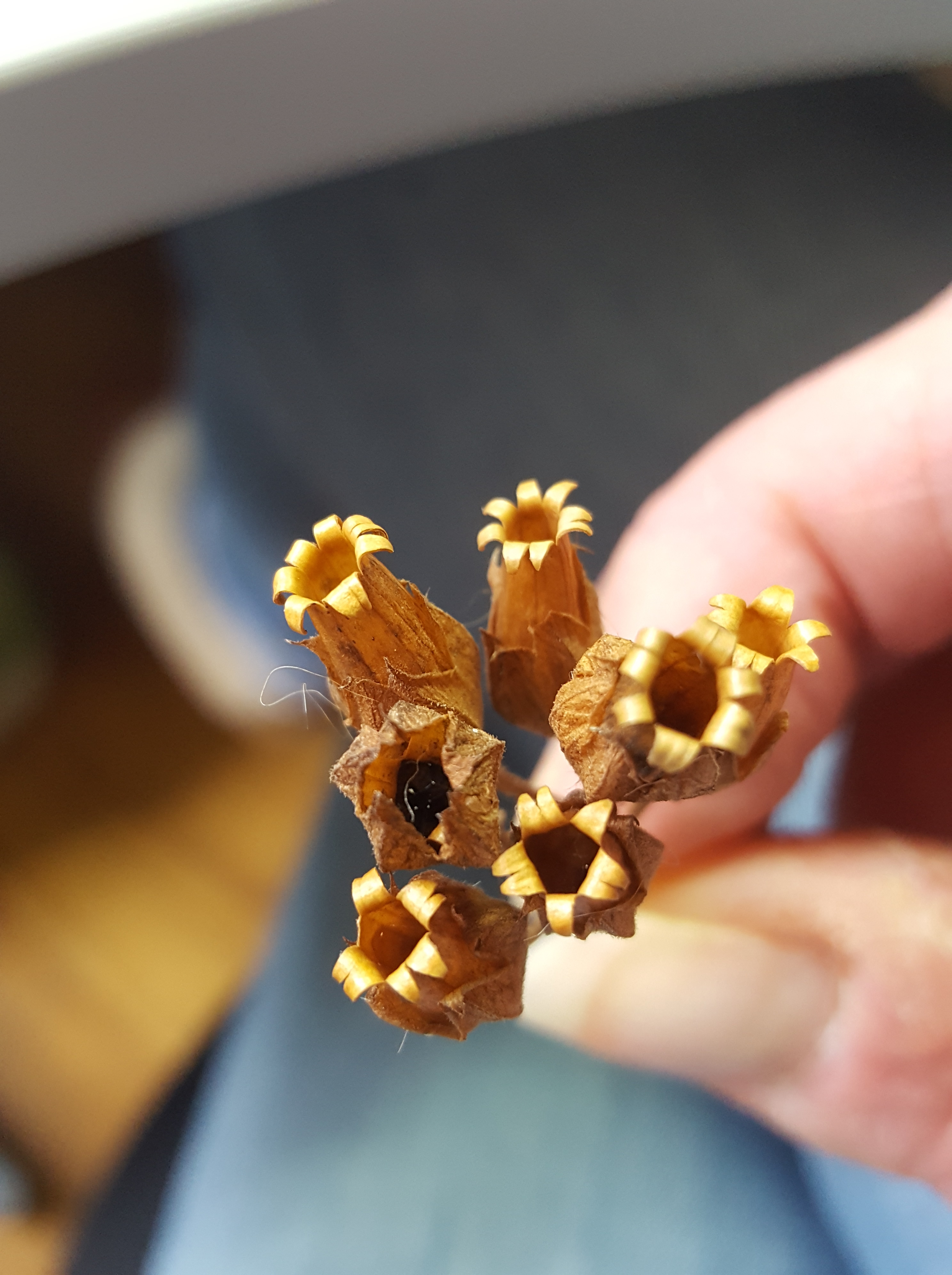
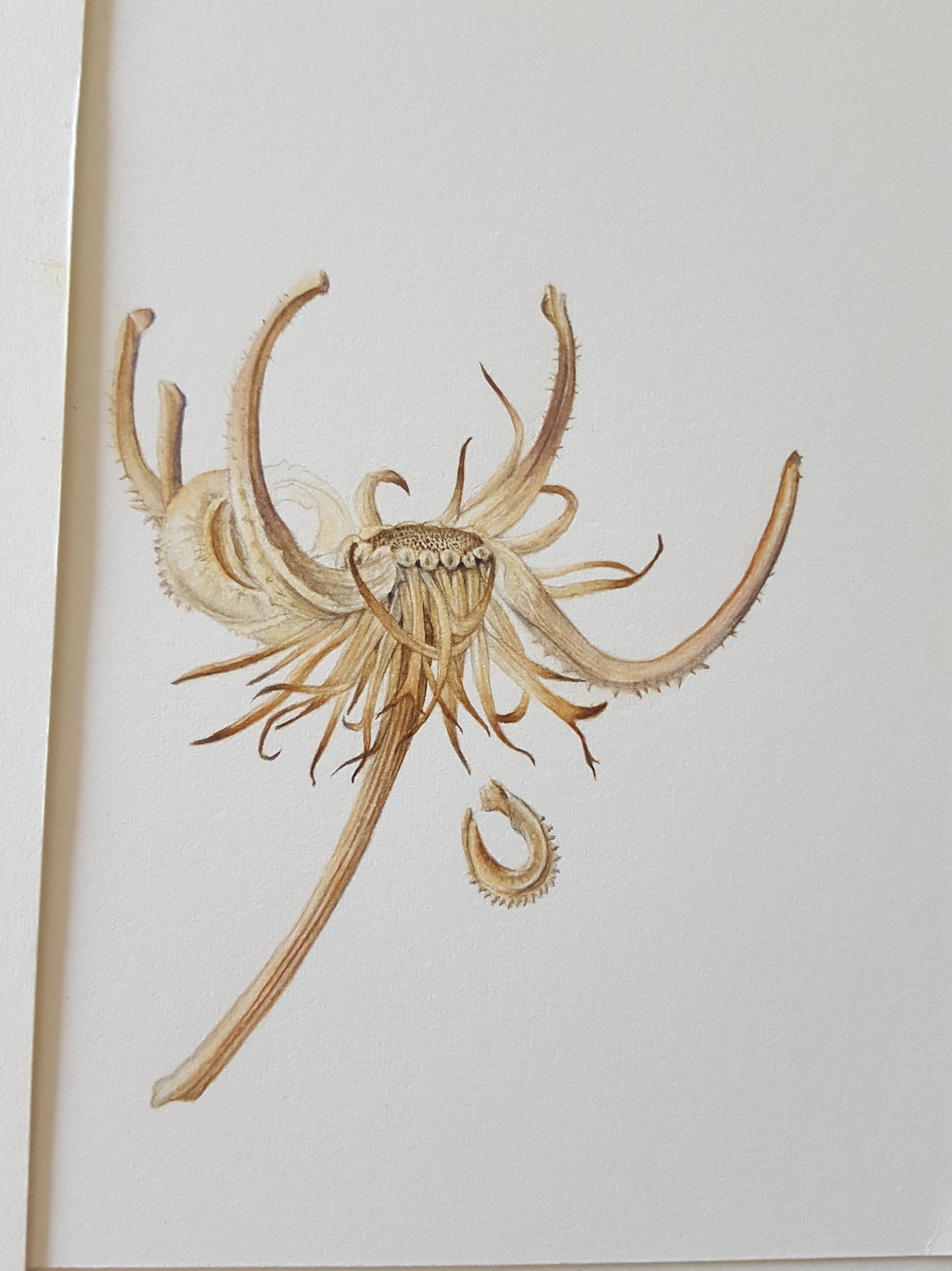
Marigold seed head
Last but not least, the Marigold seed head. What an amazing shape this is! The seeds on this seed head are curled up inside the head and snap off as the seed head dries. They are very sturdy and have spikes around them. The whole seed head is extremely interesting to look at and is made up of many different parts. I must look them all up one day! It was a huge task to get the drawing right but I really enjoyed it. I mixed very similar neutral tones once again, beiges, yellows, warm browns, greys and tans. One extra colour was added, Perylene Violet, to create the burgundy/brown tones on the long curved ‘arms’ of this seed head. This one was going to be a challenge!
I started again by laying down thin washes of my pale yellow/beige mix then began defining the wispy parts at the bottom with pale shadow tones and brown at their tips. I used the Perylene brown mix for the very tips of these. The rest was created using mostly dry brush and graduated washes. Finally with the very tip of my brush I added in the fibonacci series of dots on the flat centre part. I only added one falling seed to the side of this one as the painting was very detailed and more would distract. I felt it was enough to have just one to look at!
The finished piece…
And so the painting was complete… ‘Vessels of Life’ seemed an appropriate name.
I hope you enjoyed this blog and that it will have been of help to you.
Happy painting!!
All photos, content, text and videos are subject to copyright – All rights reserved – Jackie Isard Botanicals 2017


")


")