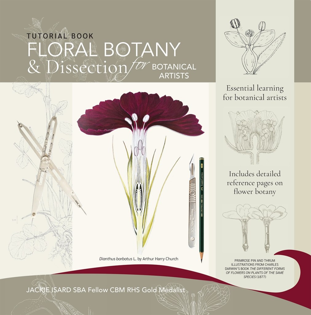
‘Floral Botany and Dissection for Botanical Artists’ Written, designed and printed by Jackie Isard.
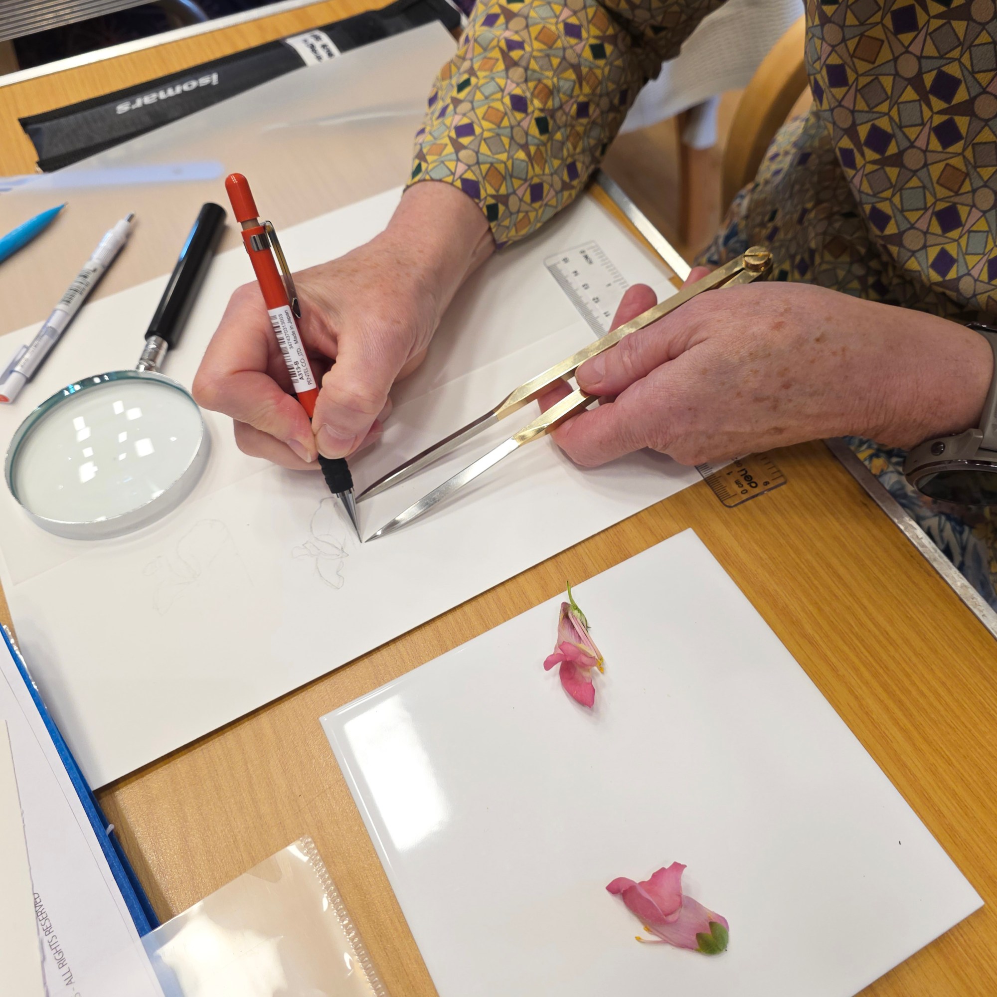
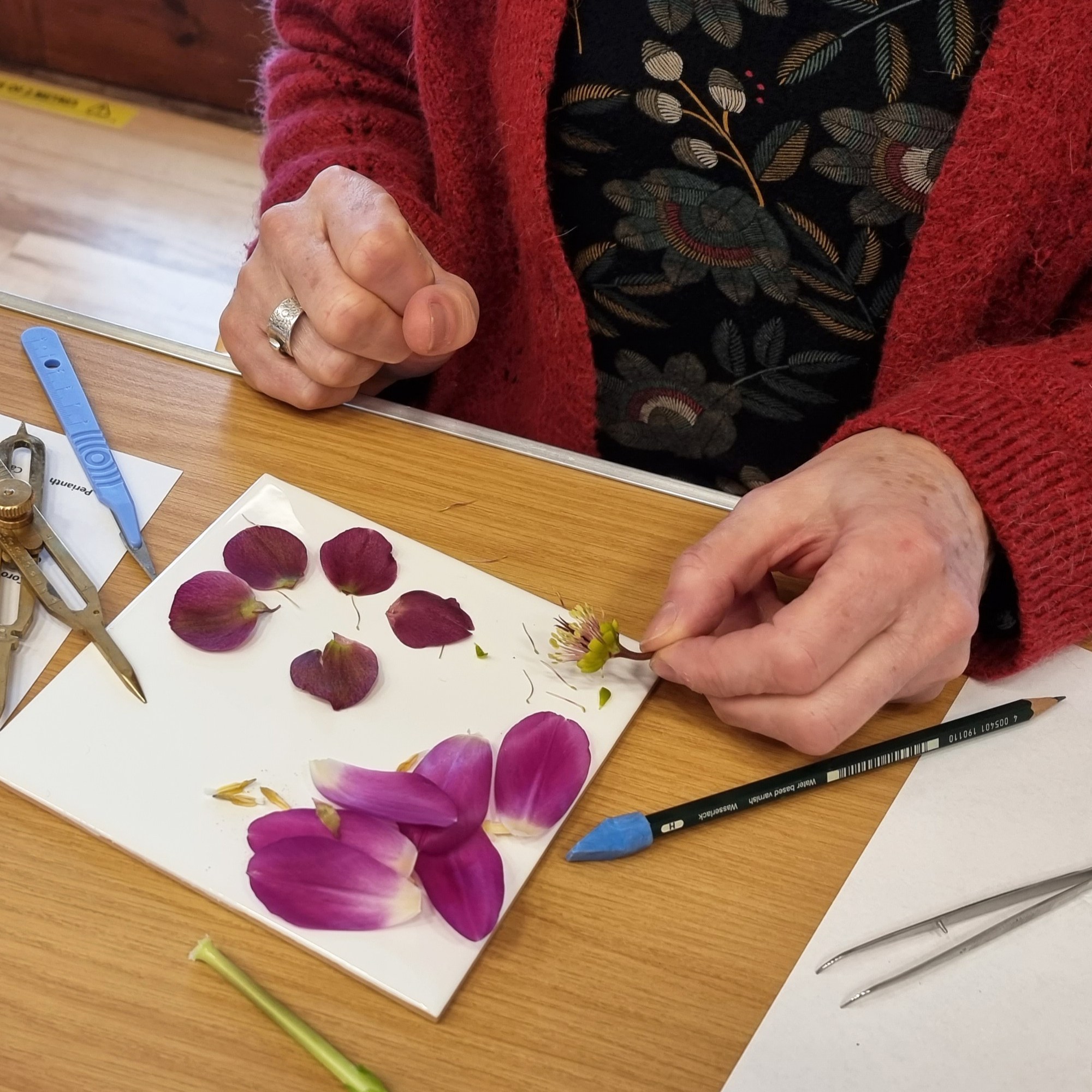
When I began my project work for the RHS botanical exhibition I became very interested in botany. It was important to me to paint a true likeness in accurate detail. I wanted my exhibit to look like a series of botanical plates in colour. Each painting included the plant’s lifecycle from bud to seed and because of this my research was done throughout the seasons. Once you start looking at plants, with botany in mind, you just want to know more. It’s very addictive!
I started to teach basic botany to botanical artist students soon after my RHS Gold medal award in 2022. Throughout my RHS studies I learned a great deal about plant botany. I couldn’t have done it without having a professional botanist to hand to check my drawings. It became clear to me that botanical artists really needed to know a little botany in order to understand the plant they were painting. This knowledge helps the artist to make a more accurate and detailed painting. At my basic botany workshops many students would tell me how much their eyes had been opened. It was enlightening for everyone. Knowing a little botany allows you to see or understand important plant details that are typically hidden, distant or unnoticed. Until you start looking more carefully, you really don’t see all the curious and interesting features of a plant!
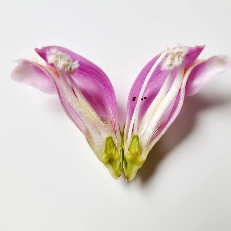
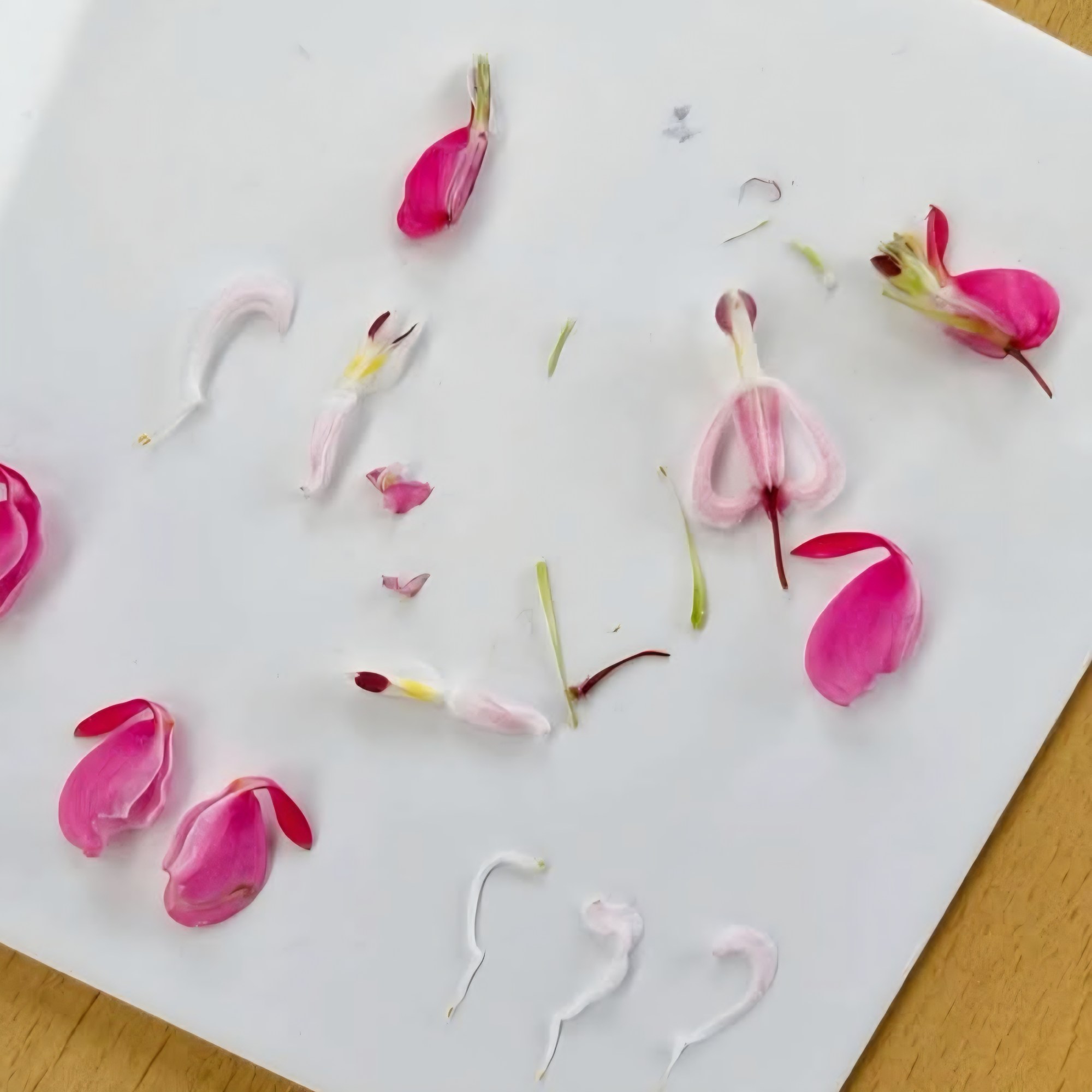
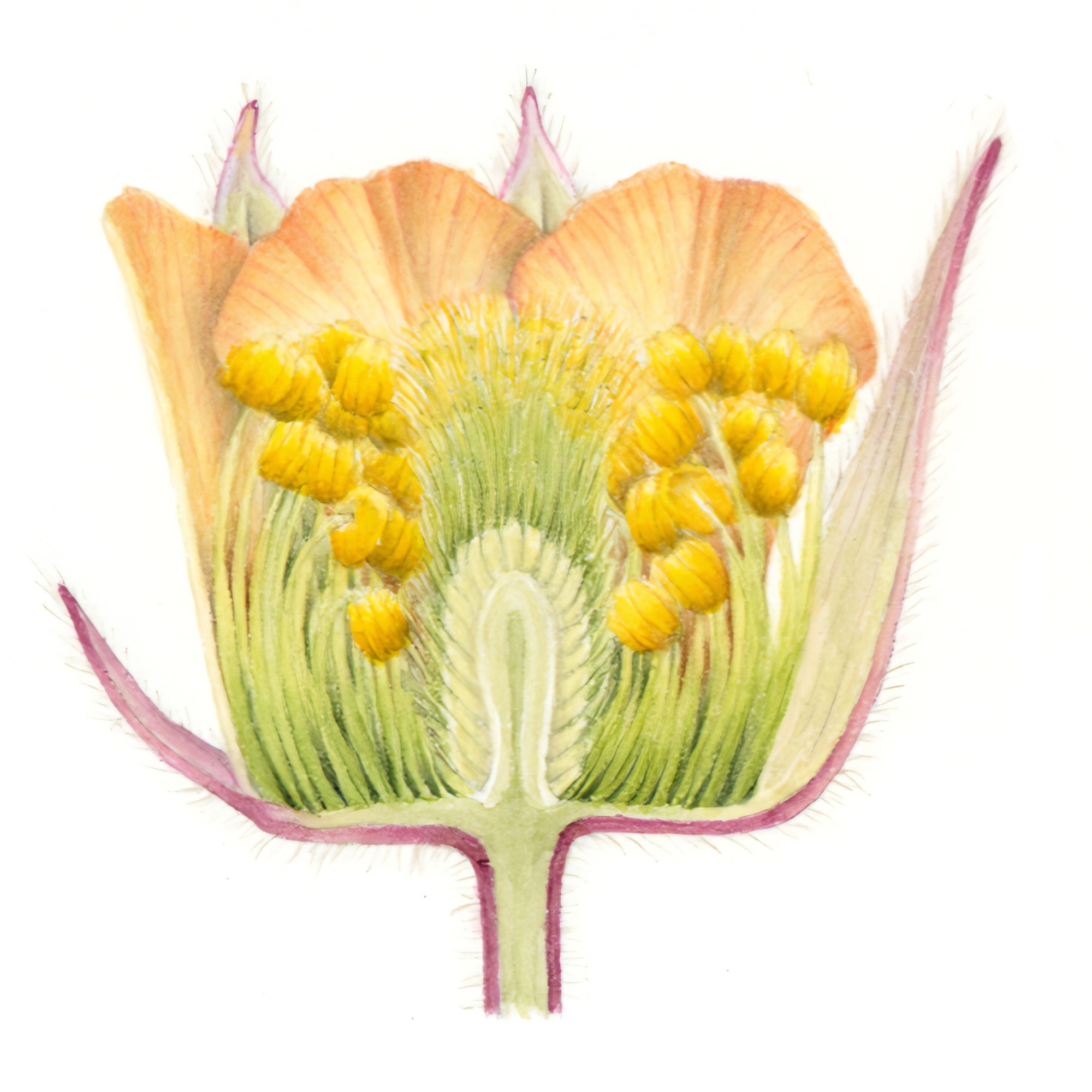
Later, whilst looking at the course notes for my basic botany workshop, I thought about writing a basic botany book. This was too vast a subject and as I am not a trained botanist, I decided to focus on one of my favourite parts, floral botany and dissection. With my professional botanist at hand, I finally made it to the finishing post and created the book you may well be holding in your hands soon. This tutorial book will teach you a great deal about flower botany and give you an understanding of how to draw a flower dissection accurately and in detail. It is packed full of information with plenty of illustrated diagrams and photos. There is also a reference section at the back on flower botany and terms.
What’s in my book
• Learn about the different parts of a flower.
• Learn how to draw a flower dissection to a measured scale.
• Follow a detailed step-by-step Fuchsia flower dissection.
• Explore other more complex flower dissection examples.
• Examples of flowers with unusual botanical features.
• In-depth floral botany section to help you understand the detailed botanical features of flowers.
• Learn how to draw scale bars.
• Understand plant naming and nomenclature.
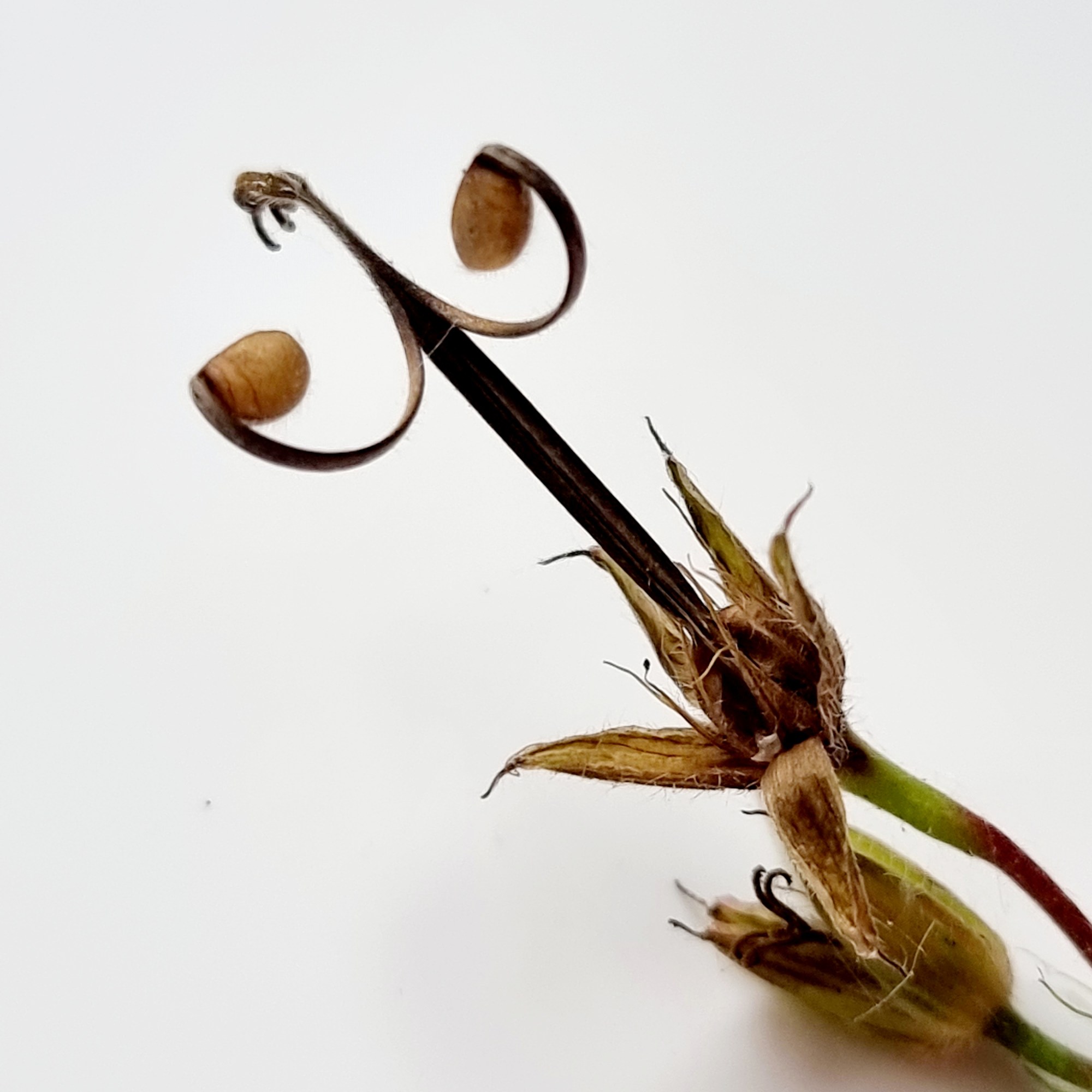
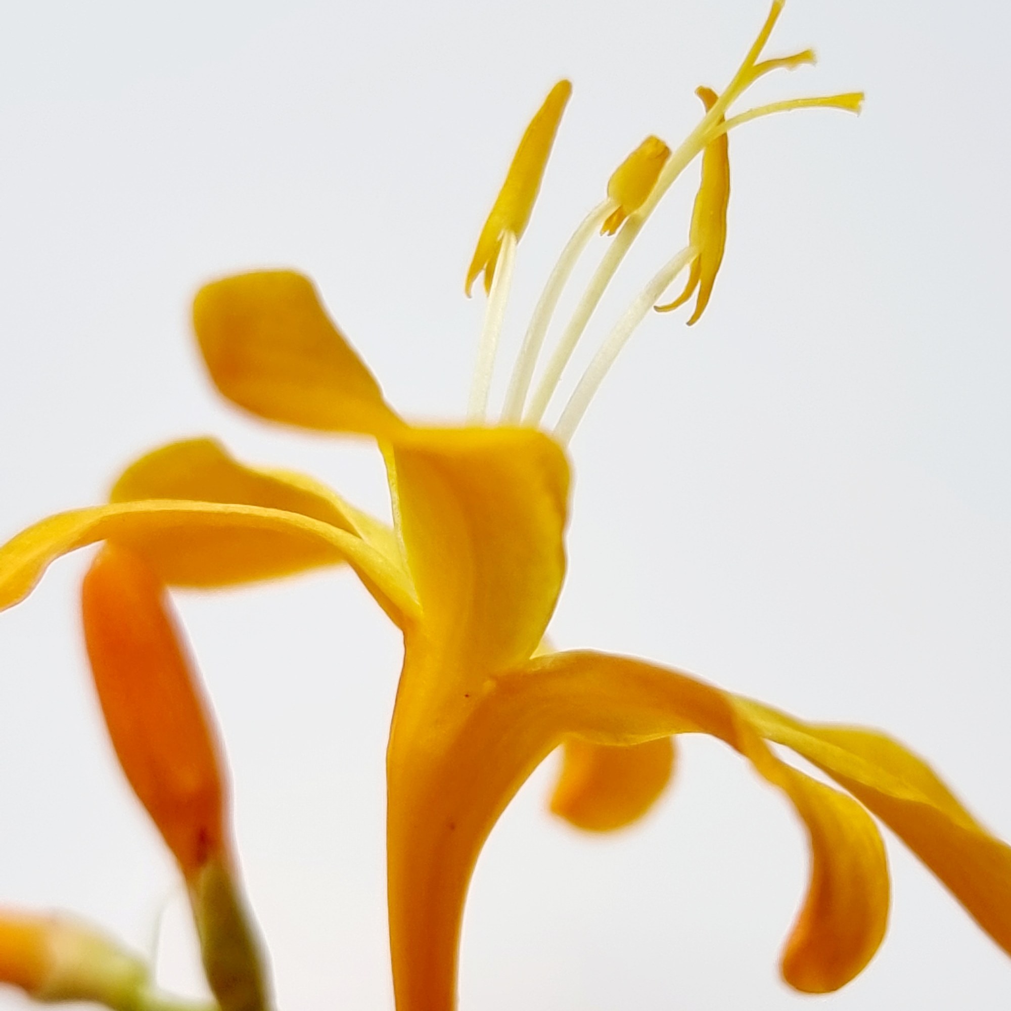
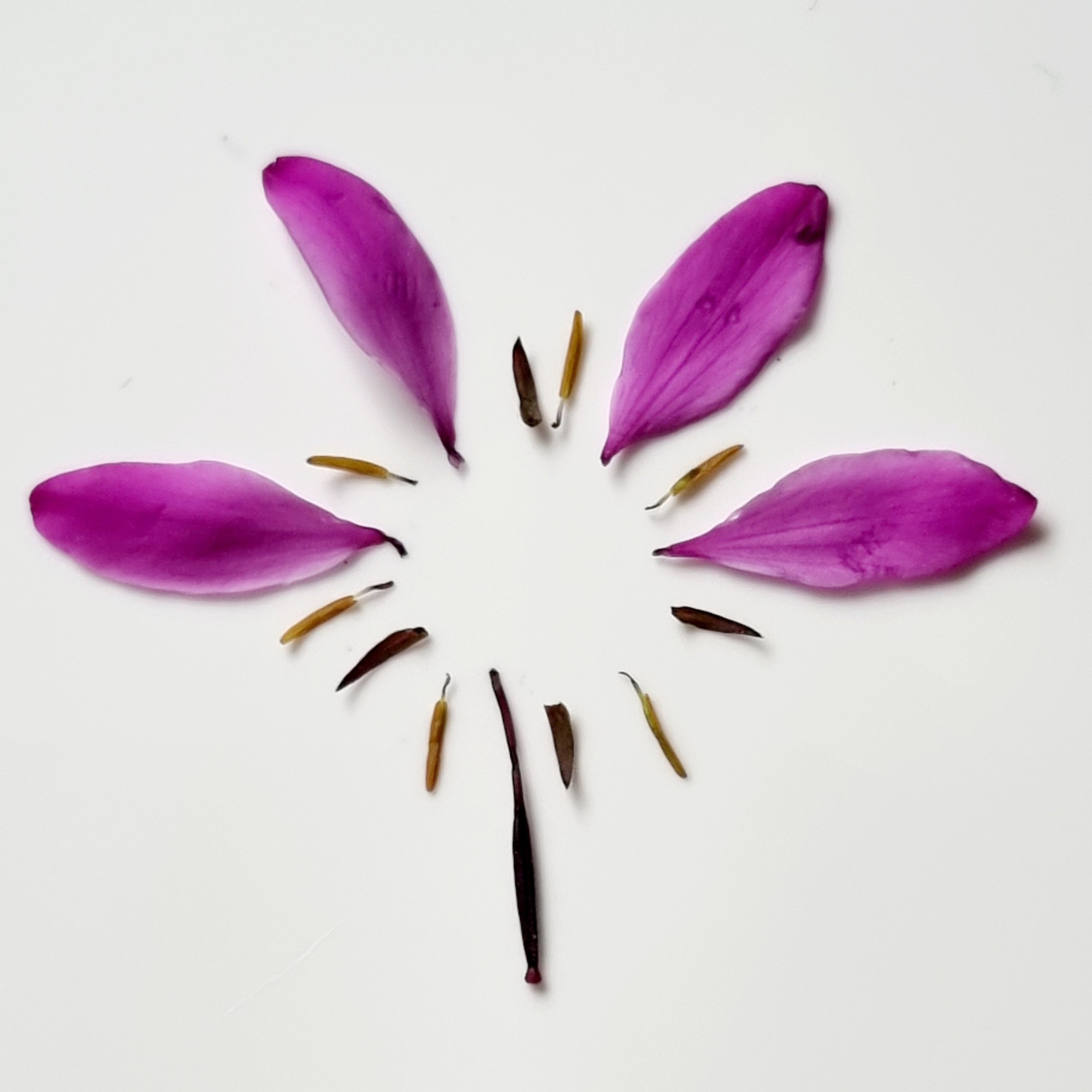
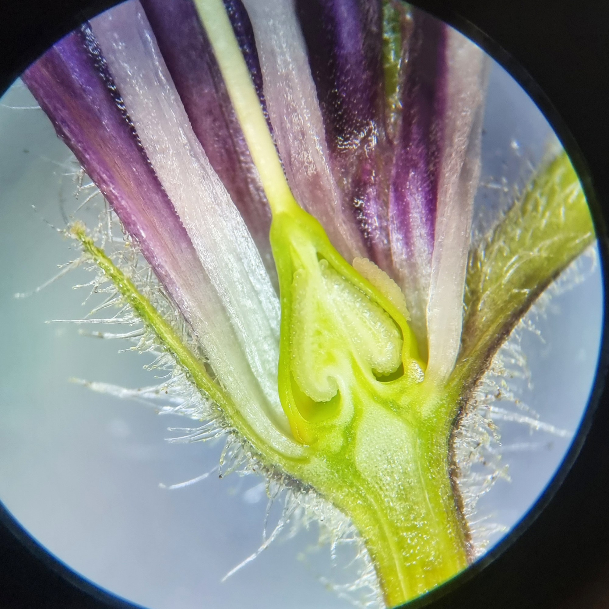
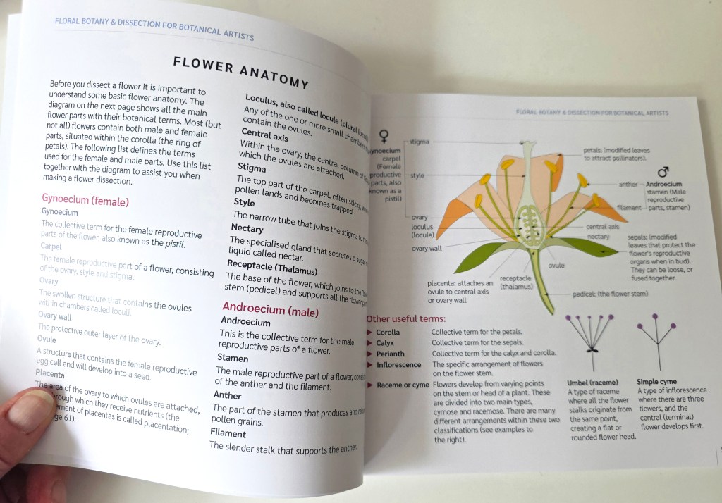
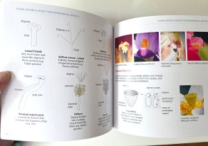
Here are some internal page images. The book has 86 pages and is 20cm x 20cm in size. A nice size to carry around without being too cumbersome.
The book…
£18 + postage (UK and worldwide) Written, designed and printed by Jackie Isard
Please note: This book is only available to botanical students and botanical artists/tutors worldwide (it is an educational book and is not for sale in the public domain). Email me to buy: jackieisard@googlemail.com
I hope you find the read enjoyable and do please pass your knowledge on to your students and other botanical artists.
If you do buy the book I would love to hear your feedback, thank you!
You may have seen my post a few days ago about two pigments in the Winsor & Newton range which are changing due to index colour PR206 (Quinacridone Pyrrolidone) being discontinued. Many of you love these two colours so went out and bought some before they disappear. The two colours were W&N Professional Quinacridone Gold and W&N Permanent Alizarin Crimson. Both have index colour PR206 at present. The Quinacridone Gold will now include PR179 (previously PR206), PV19 and PY250 and has changed its name to Transparent Gold Deep. PR179 is also the index colour for Perylene Maroon.
Following on from this I thought it would be helpful to do some research on other brands to see which of those would be affected too. I have compiled a list below for you all.
Pigments which have index number PR206
Colours by name:
Winsor & Newton Permanent Alizarin Crimson Quinacridone Gold Brown Madder
Daniel Smith Quinacridone Burnt Scarlet
Sennelier Quinacridone Gold Crimson Lake ( not the Crimson Lake Alizarin)
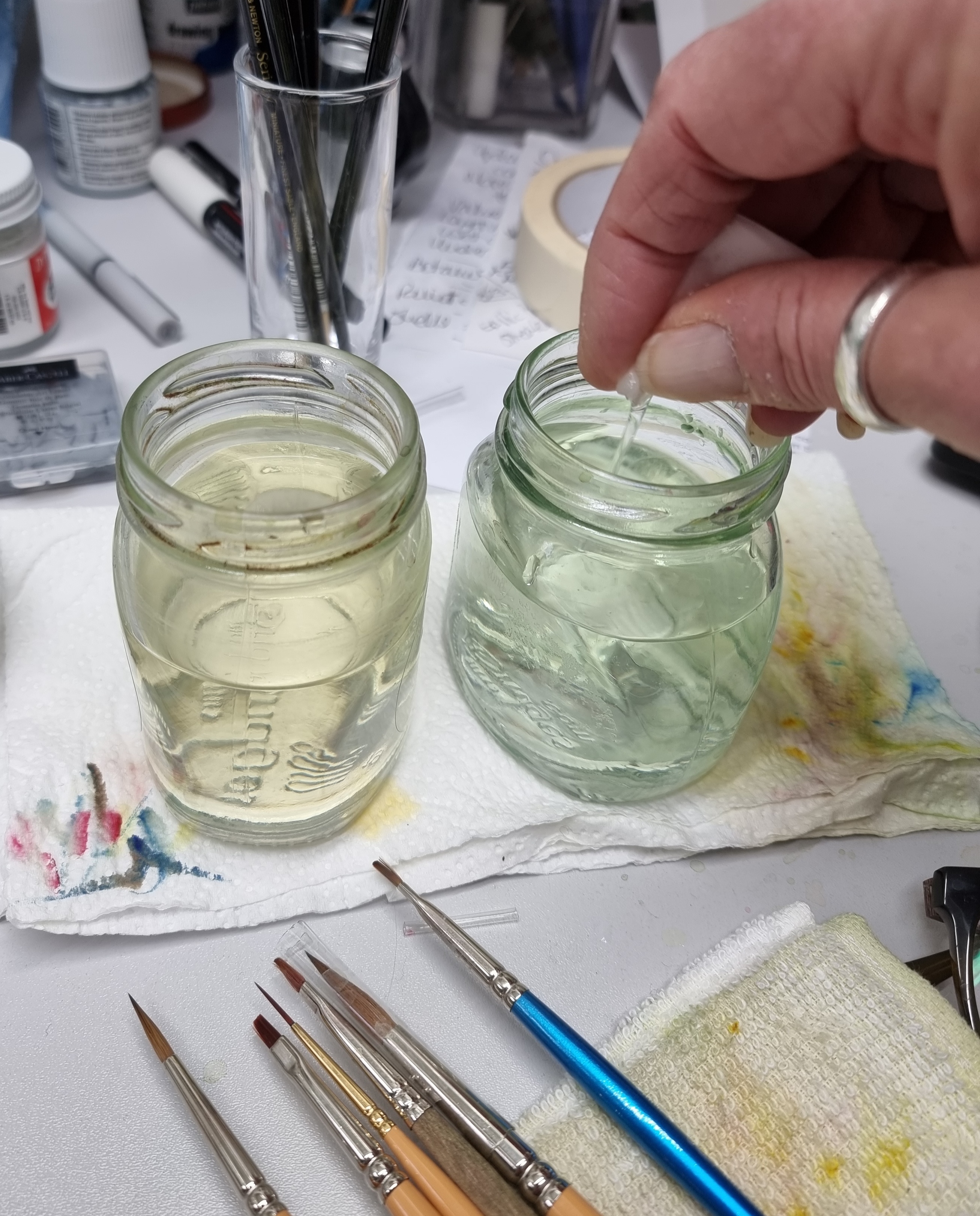
Yesterday I made a mistake which is an easy one to make when you’re rushing. I brushed my hand across part of my painting to remove a speck of dust when it wasn’t quite dry. This resulted in rather an annoying pale smudge on an area where I couldn’t possibly add anything in to cover it up!
The smudge!
It could have been pretty fatal had it been darker. I decided to try my Eradicator brush to remove as much as I could before letting it dry thoroughly overnight. The Eradicator brush is a super useful tool, you can buy them from Billy Showell or Jackson’s Art. There is a method to using it which I will explain under the photos below…
Wet the brush in clean waterWipe the excess water off to make the brush damp, not saturatedTo tidy edges : Rub the side of the brush gently just outside the edge of the painted area then dab with kitchen roll. For bigger areas : move the brush gently in circles or strokes. Do not use force or you will break up the papers surface. Important : Clean the brush and remove excess water between each stroke or you will rub more paint into the paper!Dab with kitchen roll. The brush will have loosened the surface paint so dab it off. Don’t forget to clean the brush before doing more erasing!
If the stain isn’t fully removed (as it wasn’t in my case) leave it to dry overnight before attempting to try again. Don’t panic and keep erasing or you will ruin the paper surface completely.
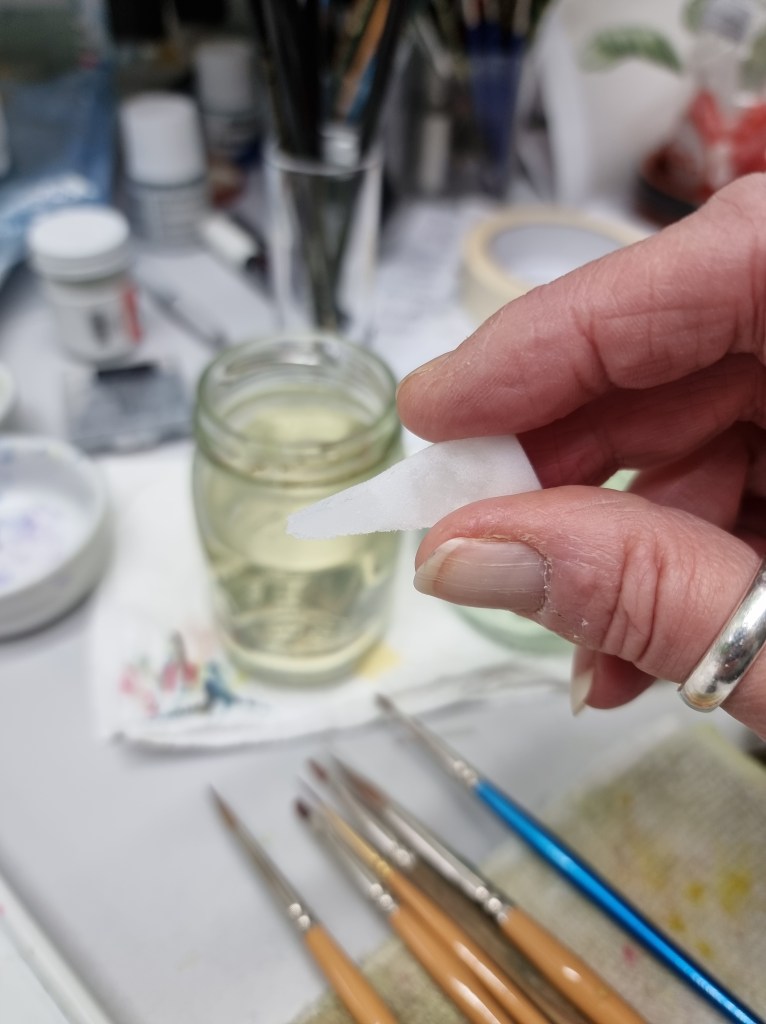
You can use magic eraser to remove stubborn stains. This is a white foam which I cut into a small wedge shape. This for ease of erasing close to an edge of paint and it is more comfortable to hold whilst working with it.
Cut a small wedge of magic eraserDip it into clean waterSqueeze it dry, it only needs to be dampGently use small strokes on the area near an edge. Do not rub hard! Clean it in water and squeeze dry again before carrying on.You can use the fatter end to do bigger areas. Once it’s removed let it dry thoroughly before burnishing it. This is described below.
Once it’s dry you can burnish the area to try and flatten any fibres which are still loose. They may not go away completely but it will feel a little smoother. A second attempt using this method proved successful on my painting, thank goodness! After letting it dry thoroughly I burnished the area again. This is described below.
This is my burnishing stone. You don’t necessarily have to buy a burnishing tool. So long as its very smooth and easy to hold, a smooth pebble will do. You can even use the back of a spoon!Take a piece of kitchen roll, or even better a piece of silk, and place it over the area you want to burnish. Rub quite firmly in circles across the area. Remove the kitchen roll and check, with a clean finger, if it is smooth. Repeat if needed.
I used a very fine sanding block to smooth the paper again as the fibres were still obvious. This is only suitable if you don’t want to paint over the area again. If you do, then stick to burnishing and use dry brush method carefully over the area. Washes will lift the fibres again.
This is a fine emery block. It can be used to wipe away fibres which may have been left after erasing. Do it carefully and don’t press too hard. On thicker 300lb paper it isn’t such a problem but on 140lb you could rub a hole into the paper!Only use gentle strokes to remove fibres.Stain gone… yippee!
If you have any questions please don’t hesitate to contact me with a comment or via my contact details below.
I’m back at last! I have decided to continue on from Blog 25 which discussed Quinacridone Gold across three brands and how very different they all were. It is very easy to make the mistake of thinking different brand pigments will be the same if they have the same name or a very similar name. Some even have the same pigment index number!
In this blog I will be looking at a number of pigment colours across the Daniel Smith and the Winsor & Newton range. All but one have identical names but as you will see many of them are quite different. One colour even shows a difference in temperature, one is warmer and the other cooler. Some are more intense than others, five are completely different!
I am a big fan of W&N as the colour selection, where primaries are concerned, suits me well. Don’t get me wrong I like DS pigments too. DS pigments are beautifully intense and I especially like their iridescent range. These are great for adding shine to butterfly wings. I just feel there is too much choice in the DS range as it is possible to mix every colour you need with 3 blues, 3 reds and 3 yellows. When you mix with primaries, I really don’t think you need 25 reds to choose from, do you? There are also 13 violets in the DS range and I only use 2 from the W&N range, Winsor Violet and Perylene Violet. Some pigment colours across both brands make you think, do you really need them? W&N Ultramarine Violet for instance, why not add a little Winsor Violet to French Ultramarine? Cobalt Violet….a little Quinacridone Magenta mixed with Cobalt Blue will do the trick! Anyway, it’s food for thought.
I have selected 25 W&N pigments for my palette and one DS, Lemon Yellow. The only reason this yellow is there is because it is very like cool Winsor Lemon but DS Lemon Yellow is transparent, not semi-transparent. I generally use 6-9 of my pigments at the most when painting, depending on the subject.
The colours with the same names (except one) that I have selected to compare across these two ranges are listed below:
New Gamboge Indian Yellow Quinacridone Gold Quinacridone Red Permanent Alizarin Crimson Perylene Maroon Burnt Sienna Cobalt Blue French Ultramarine Indanthrene Blue (Indanthrone Blue) Perylene Green Perylene Violet
I have written an outline for each pigment below to show you the differences and qualities. As you will notice below there are four DS pigments which are semi-transparent. I prefer to use transparent or semi-transparent pigments. Some of the differences here are huge but some are actually quite favourable!
(Note: Some photographs are not always a true representation. The DS transparency symbols are different to W&N. Their semi-transparent symbol is a circle which is half black and half white. W&N uses a square which is half white and black but in this brand it means semi-opaque).
New Gamboge DS – Transparent PY97, PY110 W&N – Transparent PR209, PY150 DS – very close to the primary yellow with a slight orange bias. A lovely pure pigment similar to W&N Indian Yellow but nearer to the yellow spectrum. W&N – a muted yellow, similar to Transparent Yellow with a very slight brown bias when at full colour. A little warmer than Transparent Yellow. Makes a beautiful pale cream/yellow when watered down.
Indian Yellow DS – Transparent PY97, PY110 W&N – Transparent PO62, PY139 DS – a cool yellow with translucency. Not what I would consider an Indian Yellow, more like W&N Transparent Yellow or Winsor Yellow Deep. This pigment could be used as a transparent yellow although Nckel Azo is closer. W&N – a rich orange-yellow, flows smoothly and makes beautiful cream/apricot tones when watered down. Great for mixing bright oranges and muting green to an olive/green tone.
Quinacridone Gold DS – Transparent PO48, PY150 W&N – Transparent PR206, PV19, PY150, Be aware W&Nhave run out of index colour PR206 so this will change. It will be replaced with PR179. The name is changing to Transparent Gold Deep. So, if you love Quinacridone Gold buy some now! DS – a warmer, less muted version with a lovely golden glow. It has an orange bias. W&N – a muted, duller QG with a strong warm yellow bias. Rich brown/gold when at full strength.
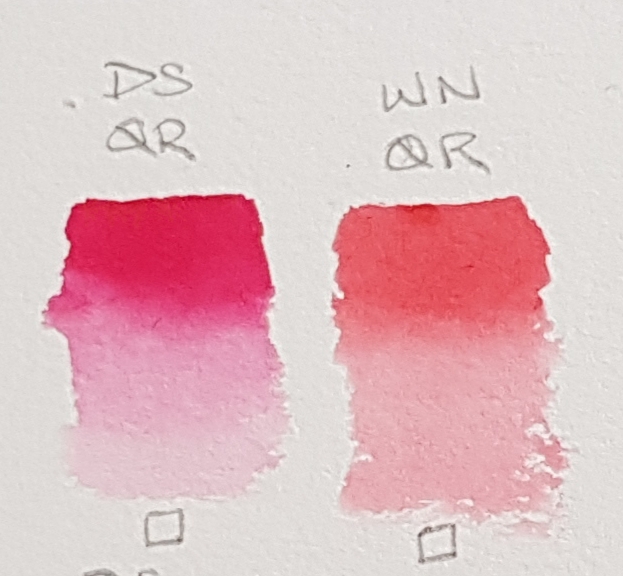
Quinacridone Red DS – Transparent PV19 W&N – Transparent PR209 DS – a cool magenta/red resembling Permanent Rose (PV19). Quinacridone Red in the DS range is closest to Permanent Rose. W&N – a warm primary red. The match for this red is Quinadridone Coral (PR209) in the DS range. It is quite a weak pigment in both ranges but a beautiful pink/red.
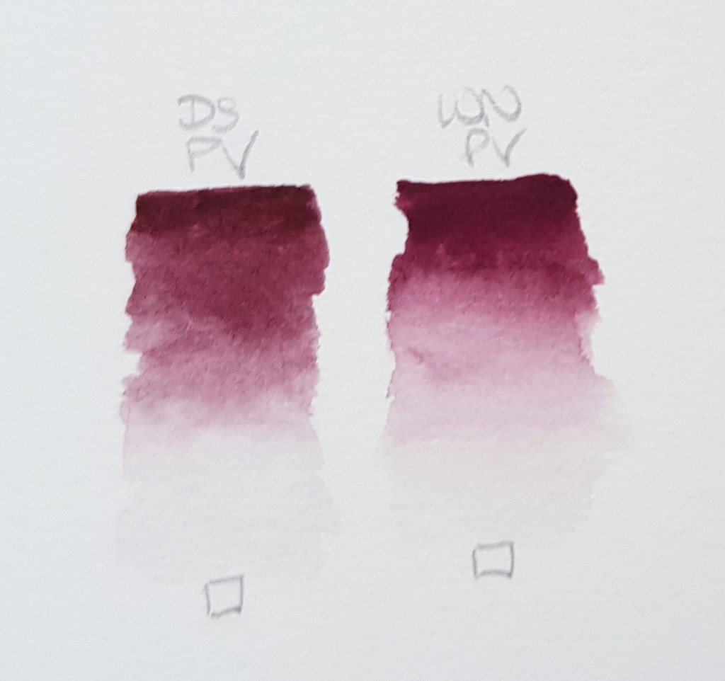
Permanent Alizarin Crimson DS – Transparent PR177, PV19, PR149 W&N – Transparent PR206! Be aware W&N have run out of this index colour so this will change. So if you love Permanent Alizarin Crimson buy some now! DS – a rich intense version of this colour but made with three index colours. It has a slightly warm red bias compared the W&N version which is cooler. W&N – a cool not as intense version which can look a little flat when watered down on some watercolour papers.
Perylene Maroon DS – Semi-Transparent PR179 W&N – Transparent PR179 DS – a rich intense version of this colour. It has a slightly warm red bias compared the W&N version which appears a little cooler. W&N – Nicely intense too. Very slightly cooler than the DS version.
Burnt Sienna DS – Semi-Transparent PBr7 W&N – Transparent PR101 DS – a very different Burnt Sienna to W&N and it appears to granulate. It is also semi-transparent. W&N – one of my favourite reds. A much warmer version than DS. It is more like Pompeii Red (PBr7) in the DS range. I would add a tiny bit of Transparent Yellow (DS Indian Yellow) to Pompeii Red to make it a perfect match!
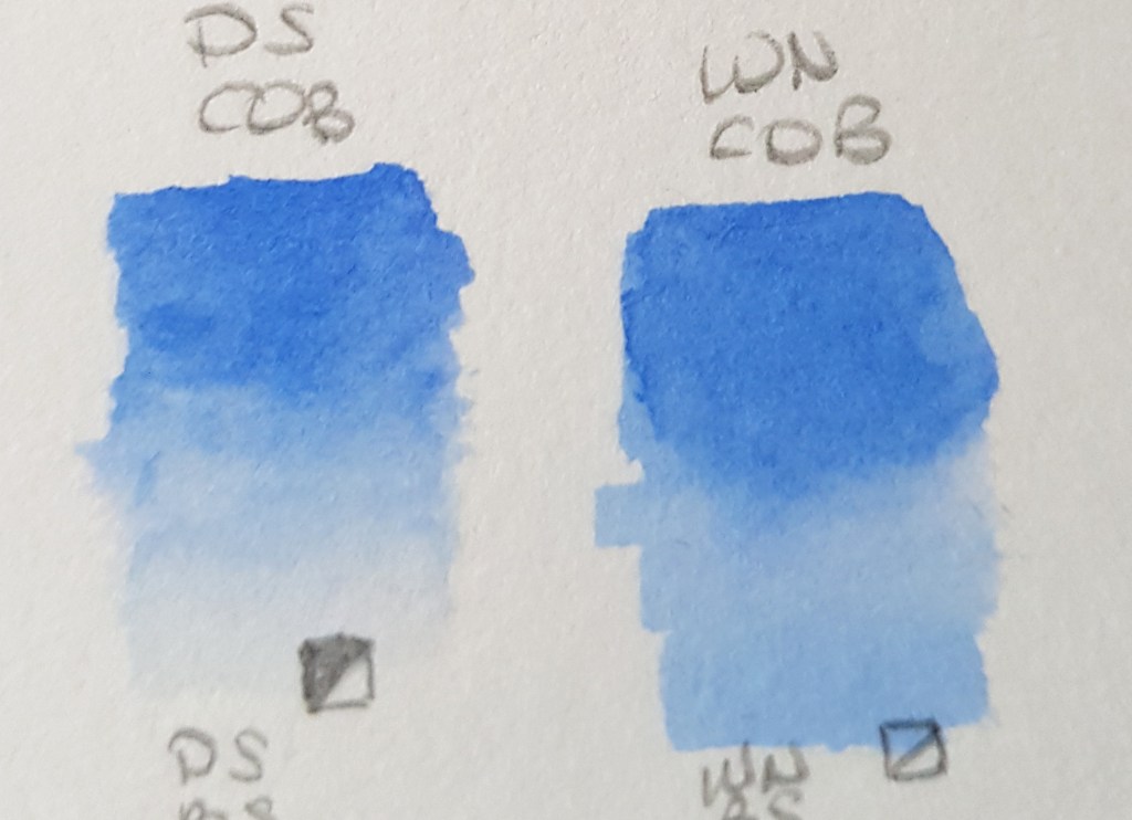
Cobalt Blue DS – Semi-Transparent PB28 W&N – Semi-transparent PB28 DS – this appears to granulate a little more than the W&N version and is very, very slightly cooler despite having the same index number. W&N – a lovely middle blue, granulating. There seems to be a very slight difference but it is minimal.
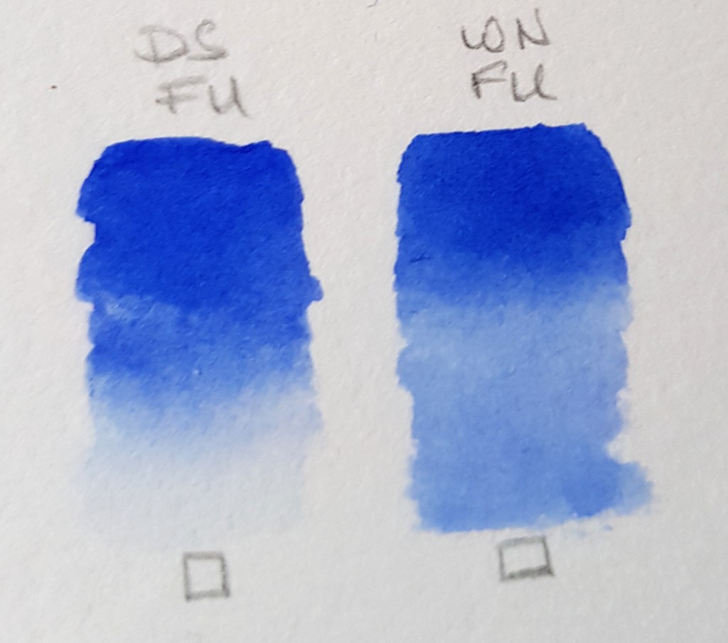
French Ultramarine DS – Transparent PB29 W&N – Transparent PB29 DS – a pure primary blue slightly more intense than the W&N version. Granulates. W&N – a vibrant primary blue with no bias. Granulates. The only difference here is the intensity of pigment is greater in DS.
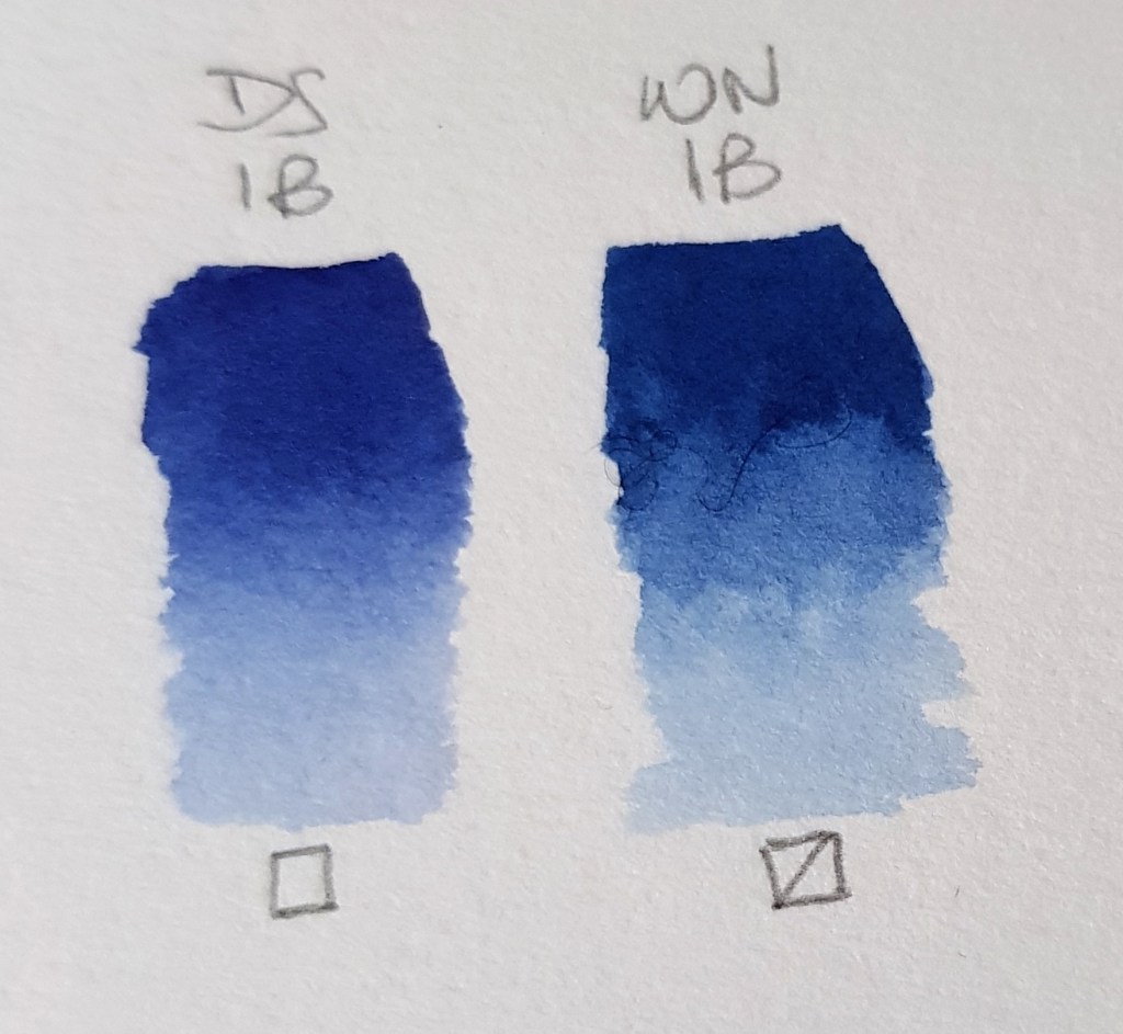
Indanthrene Blue & Indanthrone Blue DS Indanthrone – Transparent PB60 W&N Indanthrene – Semi-transparent PB60 DS – Indanthrone Blue is more like royal blue compared to Indanthrene Blue. It has a very slight red bias. W&N – this version is very different to the DS version. It is a deeper blue with a very slight green bias. They both have the same index number though! These are a nice option for a choice of warm or cool darker blues!
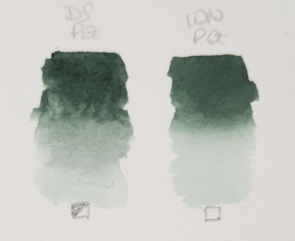
Perylene Green DS – Semi-Transparent PBk31 W&N – Transparent PBk31 DS – very slightly warmer than W&N. It is semi-transparent. Mix it with a rich red like Pyrrol Crimson for a true black. W&N – this version is very similar but it has a very slight blue bias. It is totally transparent. Add a rich red like Permanent Carmine for a true black mix.
Perylene Violet DS – Transparent PV29 W&N – Transparent PB29 DS – a rich pigment but it is more muted than the W&N version, that is, it has duller appearance. W&N – slightly brighter and more intense. It veers more towards the violet spectrum and less towards the brown like DS. A favourite pigment of mine, seen so much in plants! Mix with different yellows for some wonderful muted ochre and brown tones.
As you have seen there are various differences for a number of pigments listed above. There are even slight differences with pigments that have the same index numbers. This variation will most likely be due to different production processes and binders. On one occasion above we saw that a comparison offered up warm and cool versions, W&N Indanthrene Blue and DS Indanthrone Blue. When mixing with these two pigments, the tones would be more muted with Indanthrene Blue and brighter with the DS version. A few DS and W&N pigments have the same name but another colour in the DS range matches more closely.
So, I hope you enjoyed this blog and that it proves useful to you. Thank you for reading and I’ll be back soon with more interesting colour matters.
For more information on colour mixing, theory and painting techniques, see below.
My book is selling well all over the world I am pleased to say! I have had some excellent reviews and people writing to me to tell me that it is their go-to reference book. Thank you for all your kind comments and reviews!
Watercolour Mixing Techniques for Botanical Artists
A practical guide to accurate watercolour mixing with primaries for botanical artists Colour mixing is a key skill for the botanical artist. In this practical guide, Jackie Isard explains how to observe and use colour accurately. She shows artists how to make informed choices when selecting pigments, as well as how to learn about colour mixing and its application. • Gives detailed instruction and advice on understanding colour and pigments • Explains how to ‘see’ colour and tricky mixes, from greens and reds to the difficult botanical greys • Includes advanced colour application techniques – colour enhancement, shadow colours and colour temperature transition • Step-by-step guides illustrate how to paint with layers, how to use underlaying colours to enhance, and colour and fine detailing
Order online via major book shops or Amazon. Published by The Crowood Press Ltd
For this blog I have decided to discuss how a pigment with a bias affects the mix using orange and red as an example. There are many different tones of red and orange from the bright and vivid to the muted and dark. Colours can range from a pale apricot to the bright orange in a Gerbera and with reds, from a deep dark red Dahlia to a bright red field poppy and the orange-red of a slightly unripe tomato. So, let’s start with orange and find out how we can select the right reds and yellows for the job in hand.
Mixing your own orange tones is more accurate than buying a ready-made orange pigments. There are many ready-made oranges but you will most likely find that they are opaque. Cadmium pigments are always opaque and Winsor Orange is also semi-opaque. Daniel Smith have a very good selection of reds and oranges which are mostly semi-transparent and transparent. There is a relatively new orange in the Winsor & Newton professional watercolour range called Transparent Orange. This is totally transparent and has a beautifully bright orange/red hue. However, it may not be quite the tone of orange you are looking when painting a marigold for instance, but adding a little Transparent or Indian yellow will adjust it, simples! Opaque pigments are not good for layering watercolour when painting as you will not achieve as much depth or translucency.
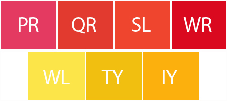
The image below shows the pigments used for this experiment. They are all Winsor & Newton professional watercolour pigments. Four reds: Permanent Rose (PR), Quinacridone Red (QR), Scarlet Lake (SL) and Winsor Red (WR). Three yellows: Winsor Lemon (WL), Transparent Yellow (TY) and Indian Yellow (IY). They are all transparent or semi-transparent pigments. They all have different qualities of their own. PR is a violet bias magenta red pretending to be pink, QR is a saturated and very appealing red (close to the primary), SL is a lovely warm orange biased red and WR is a richer saturated primary red with a slightly darker value. WL is a very cool green biased yellow, TY is a slightly orange biased yellow and Indian yellow is a very orange biased rich yellow. Let’s see how these colours mix together and what the results are like. You could add many more reds to this experiment such as Permanent Carmine, Perylene Maroon, Quinacridone Magenta and Permanent Alizarin Crimson. If you try mixing all these variations too you will discover a million different tones of red and orange!
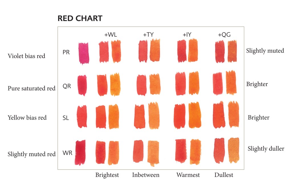
The chart below shows a mix of oranges with different amounts of yellow added to each red. Three variations of each. The violet bias of the PR makes makes the mix look more muted, especially in the TY column. These mixes are not as vivid as the other orange mixes, although the PR orange is a little brighter with IY added. My favourite bright orange mix is QR or SL and IY. However, oranges come in many guises and you would need to match your subject by testing your yellow and red mixes first. Test yourself for a true colour match as the photos here are not totally accurate.
The red chart below also shows the differences in orange tones across four yellows. This time I have introduced Quinacridone Gold (QG). QG is a gorgeous colour but a very muting yellow. It is probably easier to see the difference on this chart as the first mix in each column is a red mix with a little yellow added to make orange. Again, there are subtle differences to intensity of colour depending which red and yellow are used. The QG column is quite muted. The TY column is slightly muted. The PR and WR rows are also muted in places. Brightness is appearing more in the first three yellow columns of the SL and QR rows. The differences happen partly due to the colour index numbers within each pigment which I have described for you below. Again, test yourself for a true colour match as the photos here are not totally accurate.
The Yellows Winsor Lemon – PY175 – A lighter yellow with a green bias, this will generally brighten. I personally prefer Sennelier Lemon Yellow (PY3) as it is totally transparent whereas WL is semi-transparent. It has a very light value and is a good primary yellow. Daniel Smith Lemon Yellow (PY175) is similar. Transparent Yellow – PY150 – An intense very slightly orange biased middle tone yellow, very slightly muting. Indian Yellow– PY139, PO62 – A warm orange biased yellow, a beautifully rich colour! Great for orange mixes but it will dull green mixes to olive/earthy green tones due to the orange pigment content. Quinacridone Gold – PY150 slightly orange biased yellow, PV19 violet biased red, PR206 brown biased red. This colour has three colour index numbers. The violet bias and brown bias are the muting elements.
The Reds Permanent Rose – PV19 – A violet bias magenta/red. A cooler red but with a warm pink undertone. Quinacridone Red – PR209 – A saturated red with a little warmth. It is a less intense, softer red. Scarlet Lake– PR188 – An intense orange biased red. Mix it with a cool green bias blue though and you’ll get a muddy mess! Winsor Red – PR254 – A deeper value saturated and intense red. It will mute because of it’s deeper tone.
The orange Transparent Orange – DPP (Diketo-Pyrrolo-Pyrrol) – a lovely rich orange/red pigment.
I hope this blog was useful and wish you all a very merry Christmas!
Watercolour Mixing Techniques for Botanical Artists
A practical guide to accurate watercolour mixing with primaries for botanical artists Colour mixing is a key skill for the botanical artist. In this practical guide, Jackie Isard explains how to observe and use colour accurately. She shows artists how to make informed choices when selecting pigments, as well as how to learn about colour mixing and its application. • Gives detailed instruction and advice on understanding colour and pigments • Explains how to ‘see’ colour and tricky mixes, from greens and reds to the difficult botanical greys • Includes advanced colour application techniques – colour enhancement, shadow colours and colour temperature transition • Step-by-step guides illustrate how to paint with layers, how to use underlaying colours to enhance, and colour and fine detailing
Order online via major book shops or Amazon. Published by The Crowood Press Ltd ISBN: 9781785008283
More information on how to buy is on my website www.jibotanicals.co.uk. Please note, preorder for the USA and Canada are online. Launch in the states is October 2021. E-books are available worldwide.
Online courses for botanical artists: • Mixing Watercolour Accurately for Botanical • Fine Details and Finishing Techniques For more information and course outlines see my website at: www.jibotanicals.co.uk
NEW MINI-BOOK for beginner botanical artists. Order from me direct via email or visit my Etsy shop, link below.
The Little Book of Watercolour for Beginner Botanical Artists
A very useful little guide for beginner botanical artists wishing to learn how to use watercolour and their painting materials. • Water and pigment balance • Brush types and uses • Using a palette • Exercises to improve brush skills • Useful painting techniques
More little mini-books which will be added to this series All these books will be aimed at the beginner botanical artist. Subjects will include: What is Botanical art, Easy to understand botany, Measuring and accurate drawing – tips, Painting techniques and application, Colour values in painting, Botany and the botanical artist, Developing a composition – tools and tips, Framing and exhibiting – tips.
LAUNCHED THIS WEEK! See inside the ‘The Little Book of Watercolour for Beginner Botanical Artists’. A mini-book packed full of useful information about how to use watercolour if you are a beginner plus equipment suggestions. This little book also contains a few exercises to follow which will improve your skills. Take a look inside below in the video.
I have spent lockdown writing this little book and hope it will be useful to many. What else can you do apart from plan helpful books and paint during this frustrating period!
The printed version will be posted next week to all those who have ordered since it’s launch two days ago. How to order is below.
Here is an overview of my little book. I hope you enjoy it.
What’s inside this one?
This book has been updated and enhanced. Now 66 pages with a step by step wet-in-wet Pear tutorial.
A very useful little guide for budding botanical artists wishing to learn about watercolour and brush techniques. The book tells you all you need to know about watercolour when beginning your botanical journey. There are exercises teaching you skills and tips on colour mixing, pigments, brushes and painting equipment. The final part of the book introduces you to useful painting techniques specific to the botanical style of art. The last section in the book includes a step by step painting of a Pear using wet-in-wet technique.
The book content covers: • Colour theory and mixing • Water and pigment balance • Brush types and uses • Using a palette • Exercises to improve your brush skills • Painting techniques and exercises • Wet-in-wet – Step by step Pear
£9.00 UK GBP UK buyers only due to high international postage costs. Postage calculated on contact. Size: 66 pages. 148mm x 148mm handy pocket sized Full colour