‘The Little Book of Watercolour for Beginner Botanical Artists’ has been enhanced and now has 66 pages!
A very useful little guide for budding botanical artists wishing to learn about watercolour and brush techniques. The book tells you all about how to use watercolour when beginning your botanical journey. It teaches brush skills, colour mixing, pigment choice, brush types, painting equipment and contains useful exercises specific to botanical art. The exercises will teach you pigment to water quantity, brush skills and useful painting techniques. The last section in the book includes a step by step painting of a Pear using wet-in-wet technique.
The book content: • Colour theory and mixing • Water and pigment balance • Brush types and uses • Using a palette • Exercises to improve your brush skills • Painting techniques and exercises • Wet-in-wet – Step by step Pear
£9.00 UK GBP UK buyers only due to high international postage costs. Postage calculated on contact. Size: 66 pages. 148mm x 148mm handy pocket sized Full colour
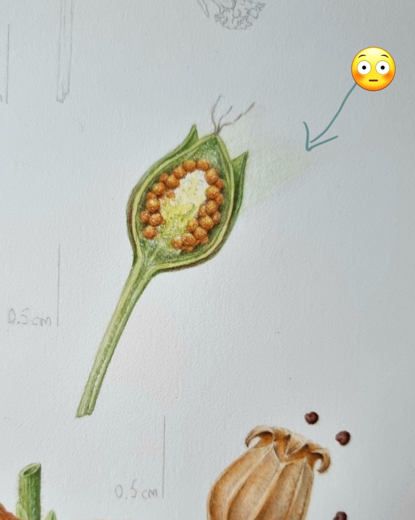
Yesterday I made a mistake which is an easy one to make when you’re rushing. I brushed my hand across part of my painting to remove a speck of dust when it wasn’t quite dry. This resulted in rather an annoying pale smudge on an area where I couldn’t possibly add anything in to cover it up!
The smudge!
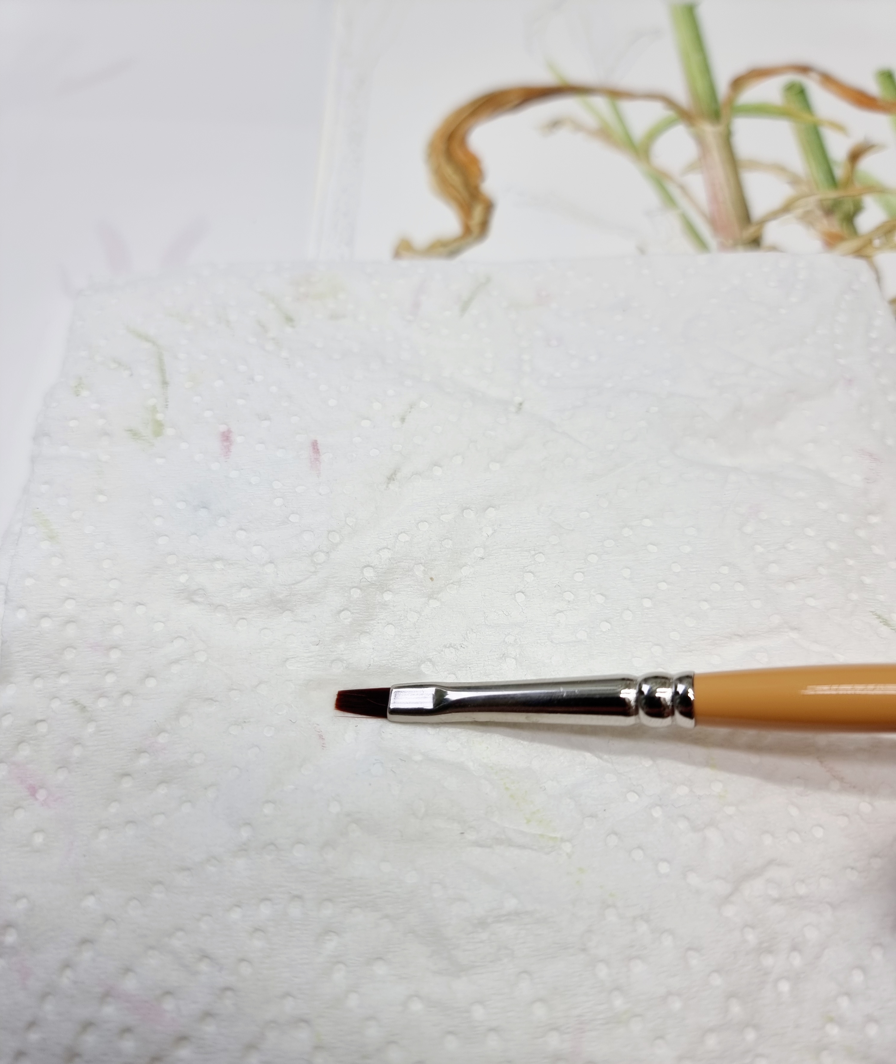
It could have been pretty fatal had it been darker. I decided to try my Eradicator brush to remove as much as I could before letting it dry thoroughly overnight. The Eradicator brush is a super useful tool, you can buy them from Billy Showell or Jackson’s Art. There is a method to using it which I will explain under the photos below…
Wet the brush in clean waterWipe the excess water off to make the brush damp, not saturatedTo tidy edges : Rub the side of the brush gently just outside the edge of the painted area then dab with kitchen roll. For bigger areas : move the brush gently in circles or strokes. Do not use force or you will break up the papers surface. Important : Clean the brush and remove excess water between each stroke or you will rub more paint into the paper!Dab with kitchen roll. The brush will have loosened the surface paint so dab it off. Don’t forget to clean the brush before doing more erasing!
If the stain isn’t fully removed (as it wasn’t in my case) leave it to dry overnight before attempting to try again. Don’t panic and keep erasing or you will ruin the paper surface completely.
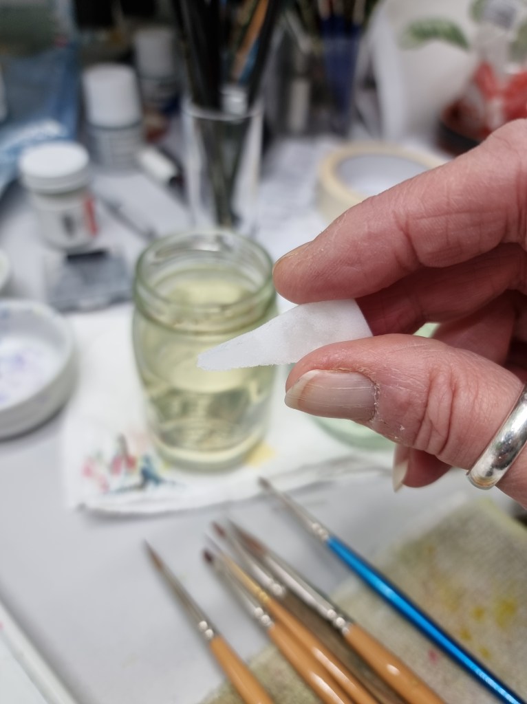
You can use magic eraser to remove stubborn stains. This is a white foam which I cut into a small wedge shape. This for ease of erasing close to an edge of paint and it is more comfortable to hold whilst working with it.
Cut a small wedge of magic eraserDip it into clean waterSqueeze it dry, it only needs to be dampGently use small strokes on the area near an edge. Do not rub hard! Clean it in water and squeeze dry again before carrying on.You can use the fatter end to do bigger areas. Once it’s removed let it dry thoroughly before burnishing it. This is described below.
Once it’s dry you can burnish the area to try and flatten any fibres which are still loose. They may not go away completely but it will feel a little smoother. A second attempt using this method proved successful on my painting, thank goodness! After letting it dry thoroughly I burnished the area again. This is described below.
This is my burnishing stone. You don’t necessarily have to buy a burnishing tool. So long as its very smooth and easy to hold, a smooth pebble will do. You can even use the back of a spoon!Take a piece of kitchen roll, or even better a piece of silk, and place it over the area you want to burnish. Rub quite firmly in circles across the area. Remove the kitchen roll and check, with a clean finger, if it is smooth. Repeat if needed.
I used a very fine sanding block to smooth the paper again as the fibres were still obvious. This is only suitable if you don’t want to paint over the area again. If you do, then stick to burnishing and use dry brush method carefully over the area. Washes will lift the fibres again.
This is a fine emery block. It can be used to wipe away fibres which may have been left after erasing. Do it carefully and don’t press too hard. On thicker 300lb paper it isn’t such a problem but on 140lb you could rub a hole into the paper!Only use gentle strokes to remove fibres.Stain gone… yippee!
If you have any questions please don’t hesitate to contact me with a comment or via my contact details below.
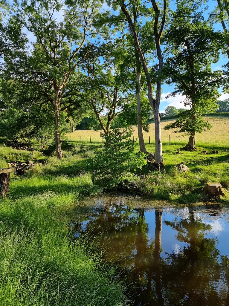
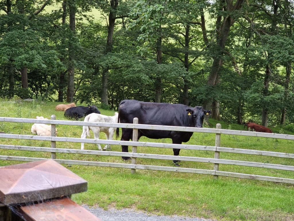
I had a wonderful summer this year with time to concentrate on my RHS paintings. I took myself away to a lodge in Trefeglwys, Wales. The lodge was in a quiet, remote location and it gave me time to focus on my work. The lodge is surrounded by fields, woodland, hills, sheep (I miss the bleating!) and cows.
What more could you want!
The wildlife
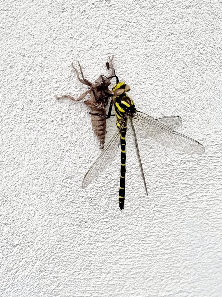
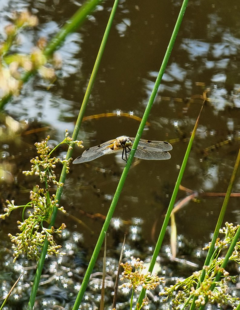
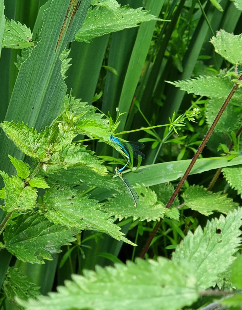
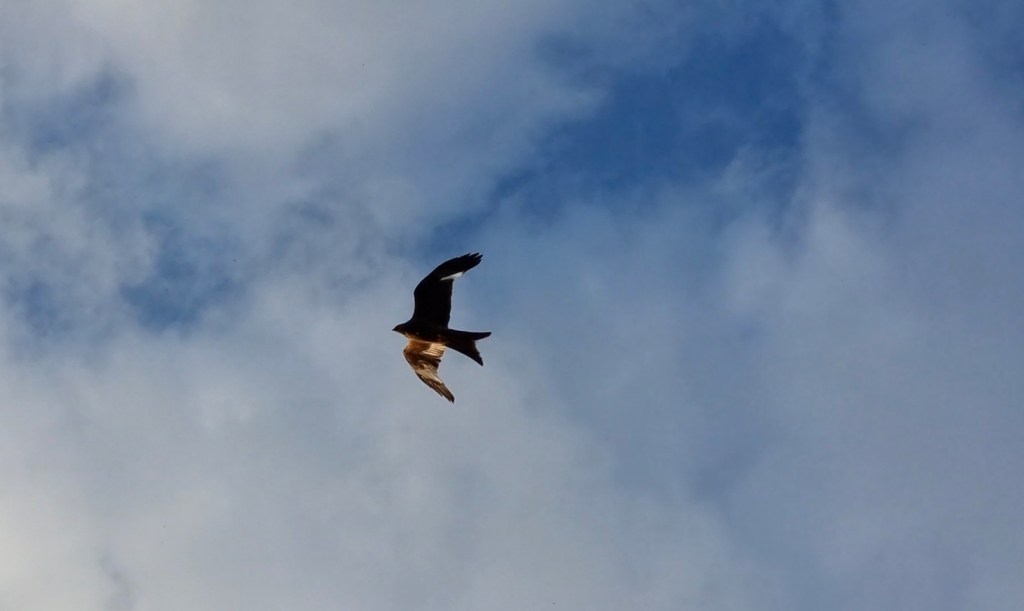
Wild hares leapt around the fields at night. A pond faced the deck of the lodge and many dragonflies and damselflies frequented it. For the first time, I saw a dragonfly emerge from its nymph. The process took almost 2 days and was fascinating to watch even though I found the nymph a little scary at first! Overhead many Red Kites flew, I’ve never seen them this close up. They are magnificent birds, although a little noisy on occasions as they were nesting!
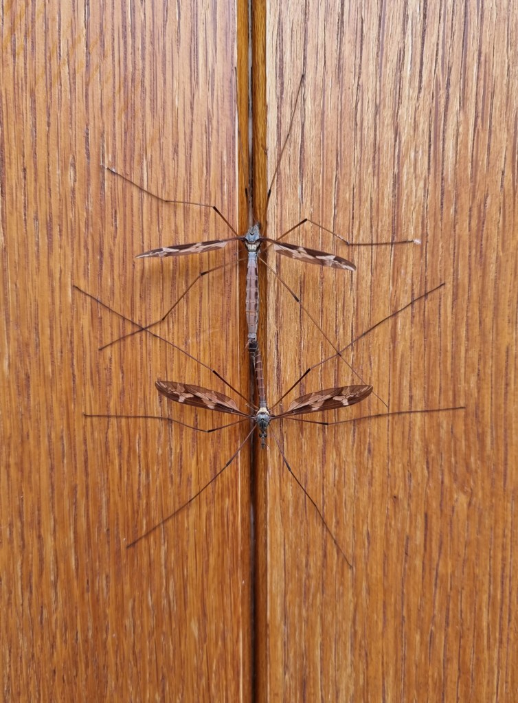
Bugs and birds
Nature reserve visits
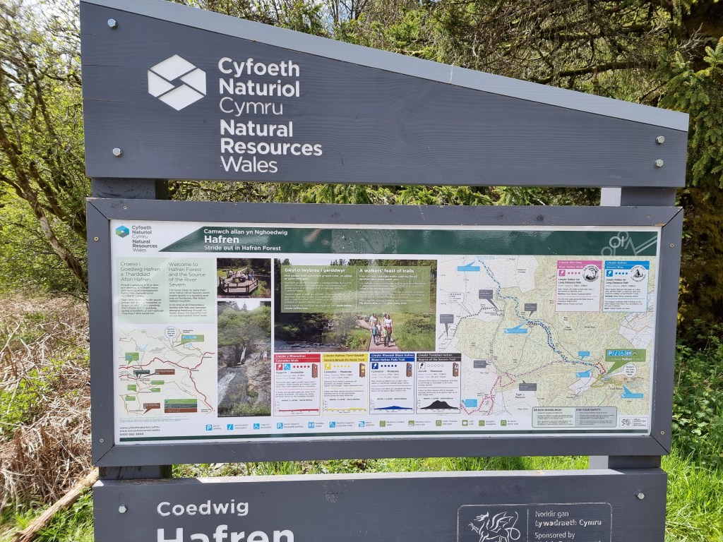
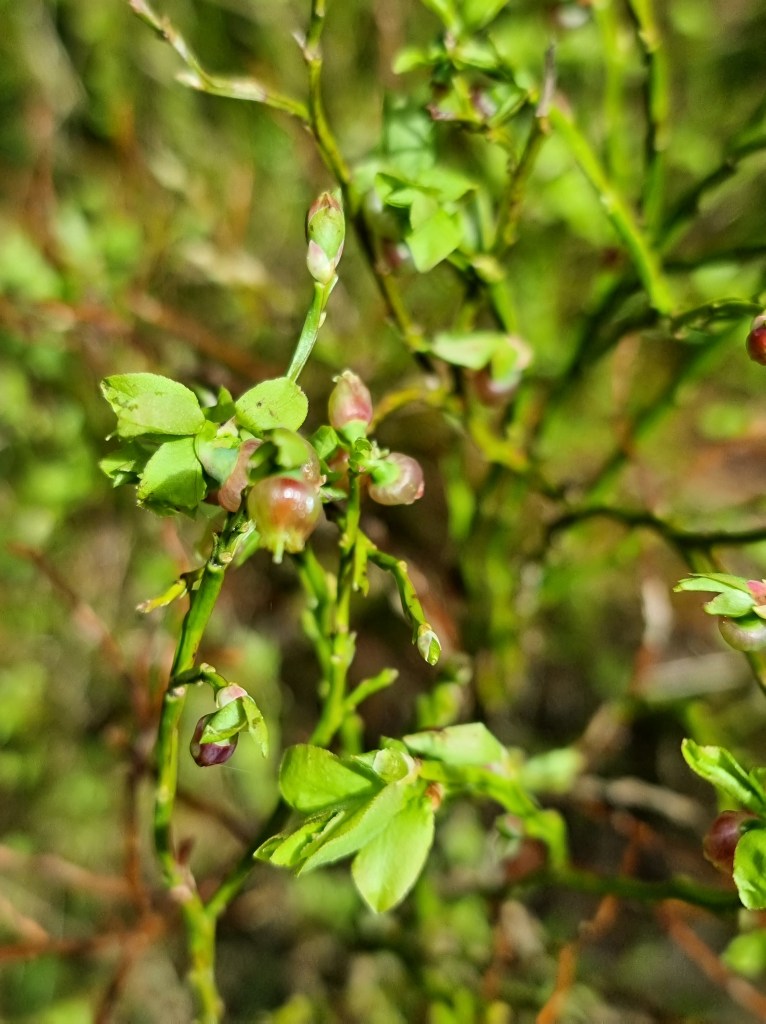
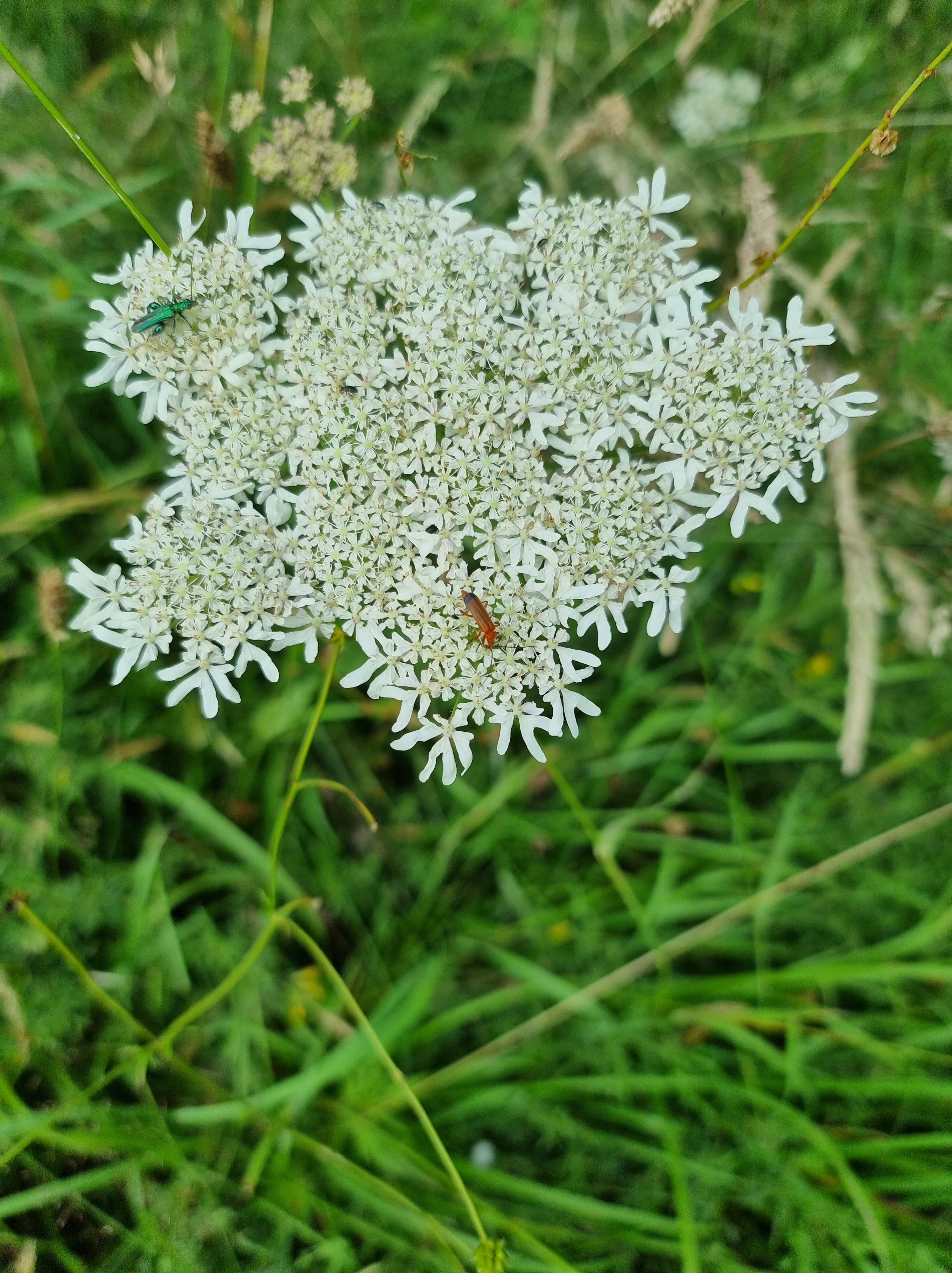
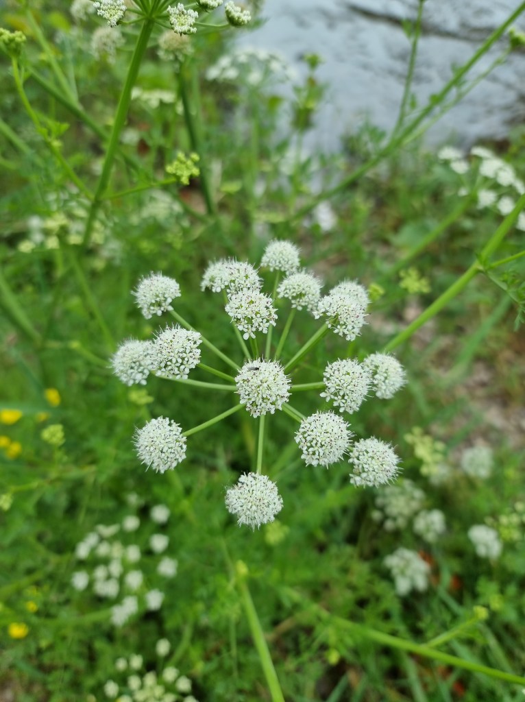
As well as visiting my usual Trewalkin meadow, on the journey, each time I travelled to the lodge, I also visited two other local meadows, Llanmerewig and Pen Y Waun. The latter was such a tiny meadow but full of wildflowers. One weekend my cousin and hubby came to stay and we went to Hafren forest. An amazing place, the atmosphere there is very dear to my heart. It was teaming with unripe bilberries too.
Hafren Forest Nature Reserve
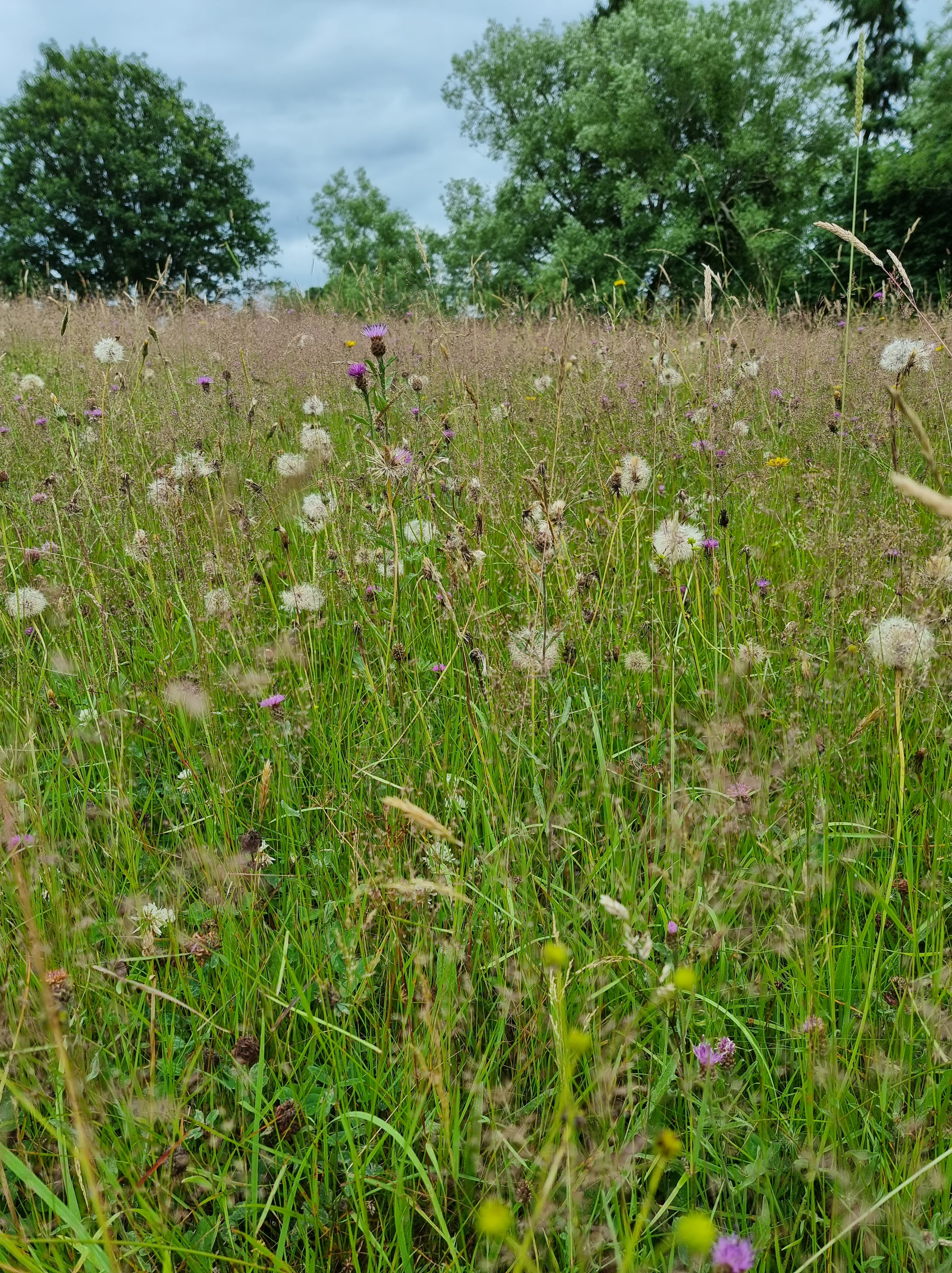
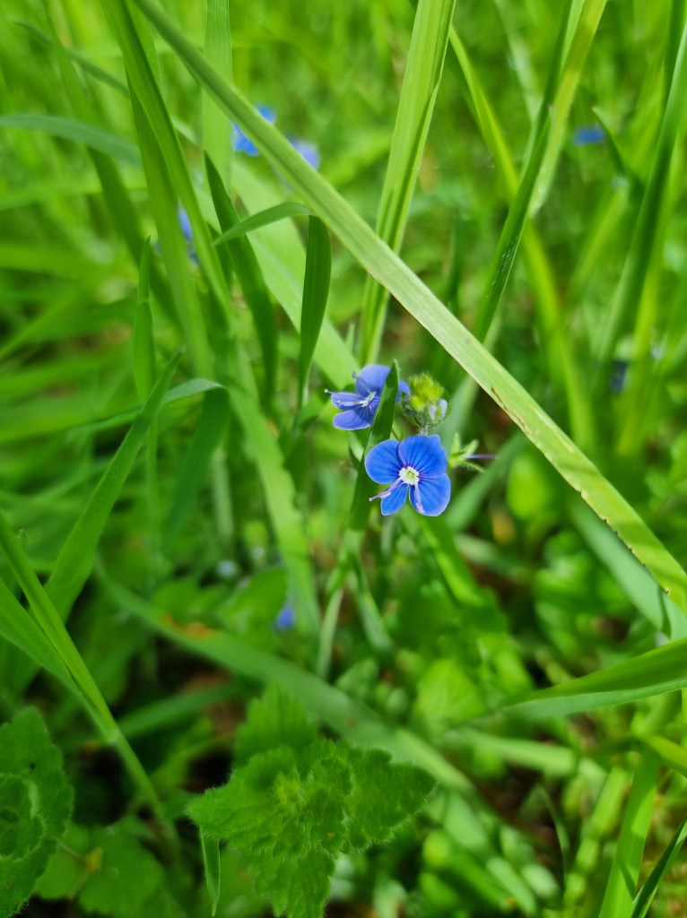
Below are photos of Llanmerewig meadow. It was a very hot balmy day and it was buzzing with bees, hoverflies and I even spotted a nursery spider web. These grassland habitats fill my heart with joy especially so as they are very rare. Let’s hope in the future we will see more of these grasslands appearing and that there will be protection for what we have left – only 2% only since the 1930s!
I visited Pen Y Waun meadow in June. The tiniest nature reserve I’ve ever encountered! However, this tiny meadow was boasting some wildflower species. I went in the hope of finding evidence of Devil’s bit scabious growing there. This plant doesn’t flower until late summer but I would recognise the basal leaves if they were present. Unfortunately, nothing was to be seen. Below are photos of Pen Y Waun. You can literally see all of it in the first photo!
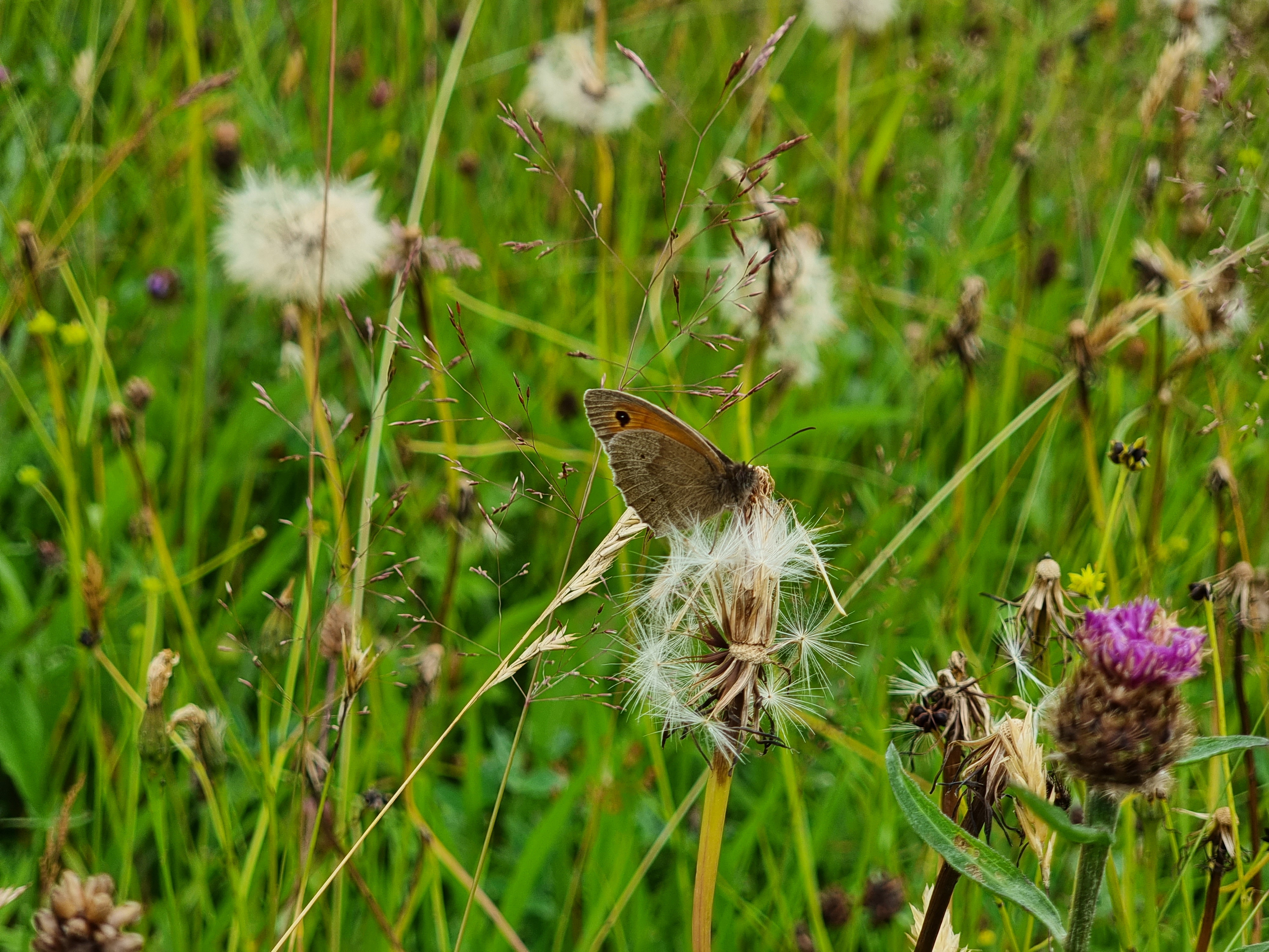
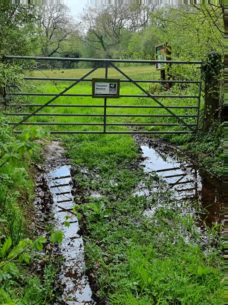
The main meadow for my research, Trewalkin
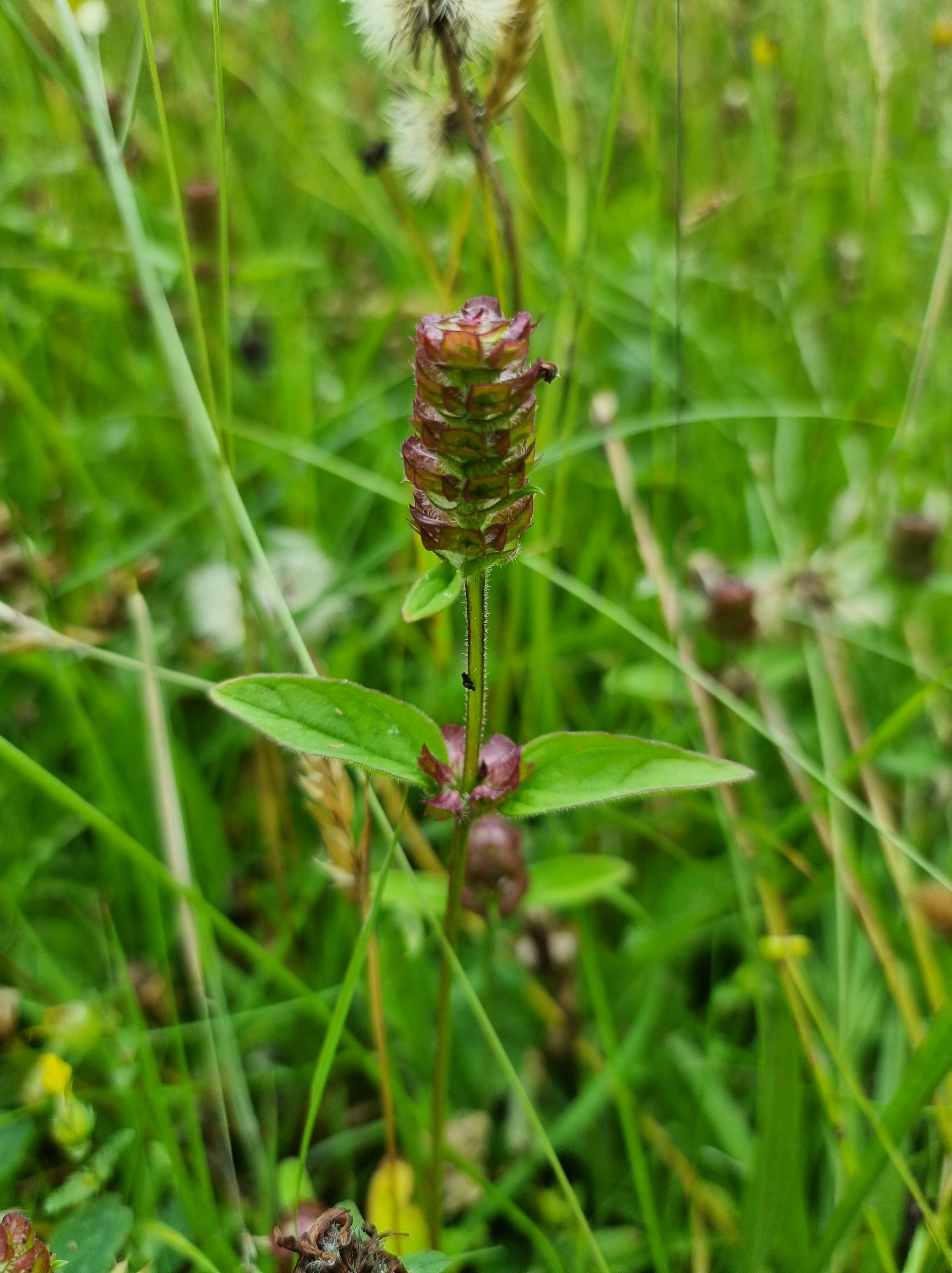
Trewalkin meadow is en-route to the lodge in Trefeglwys, snuggled down a narrow country lane. A small, damp, flower-rich meadow at the foot of the Black Mountains between Llangorse and Talgarth. I stopped on the way on all my journeys to see how the meadow was progressing. I have visited this meadow many times since I started my plant research. It is home to all but one of the species I am painting. I was delighted to find a lot of them still flowering along with wild orchids when I visited in July.
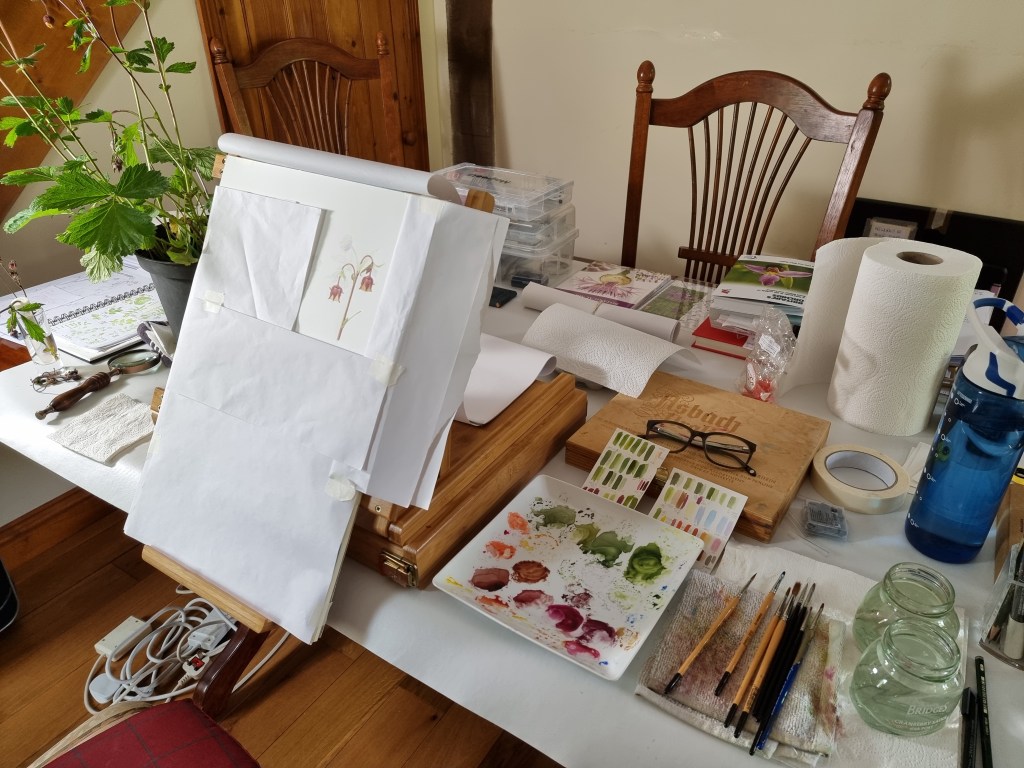
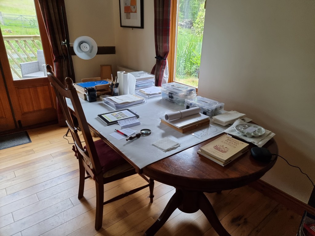
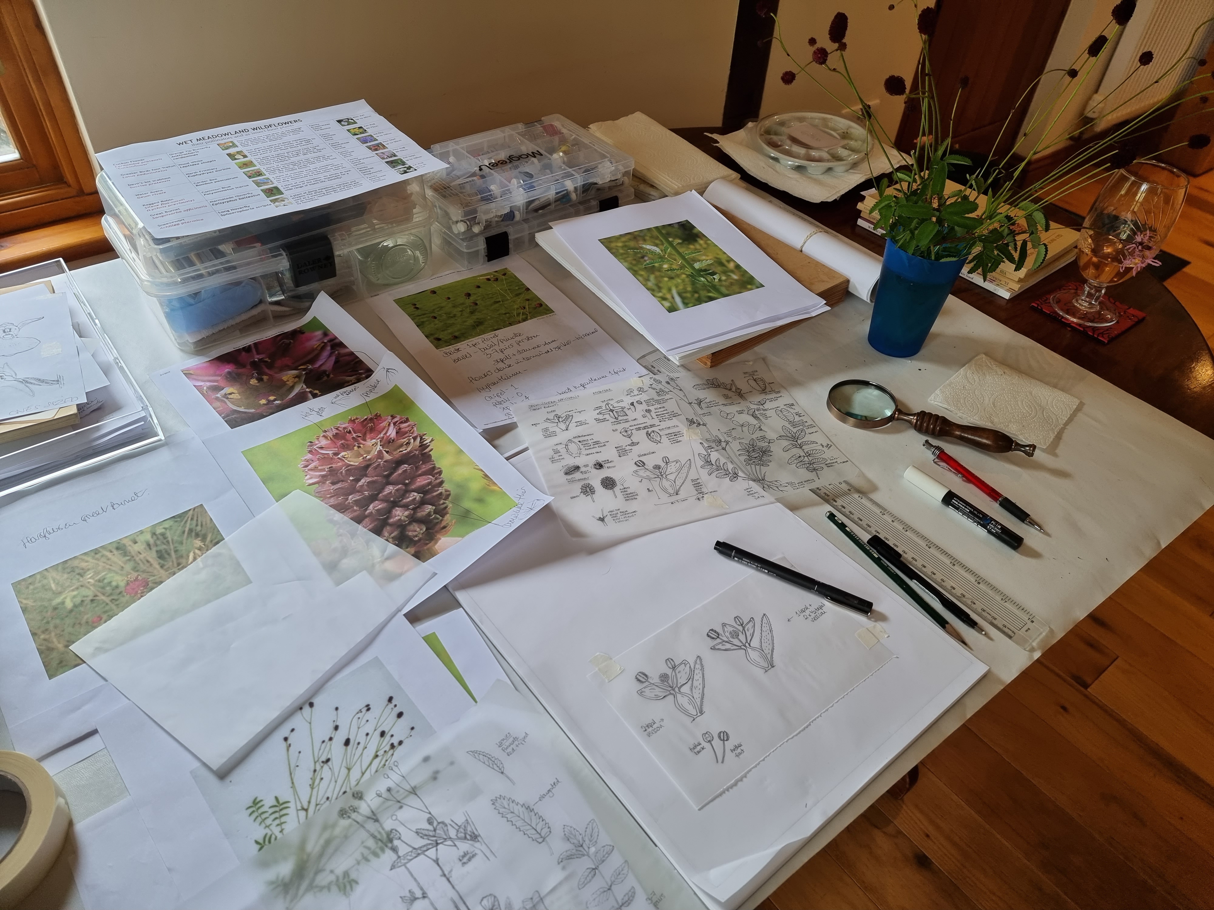
I took with me all the paintings I have already started in order to do some more work on them. Setting up my workspace at the lodge was simple, there was a huge dining table! The light wasn’t as good as I expected but I had pre-empted this and taken my lamps with me. I moved the table as close to the windows as I could. My car was overflowing as I needed to take reference books, research work and all my equipment too. I didn’t enjoy the packing and unpacking but the place was perfect and idyllic. I also had to take some plant stems from my garden at home for reference.
The painting
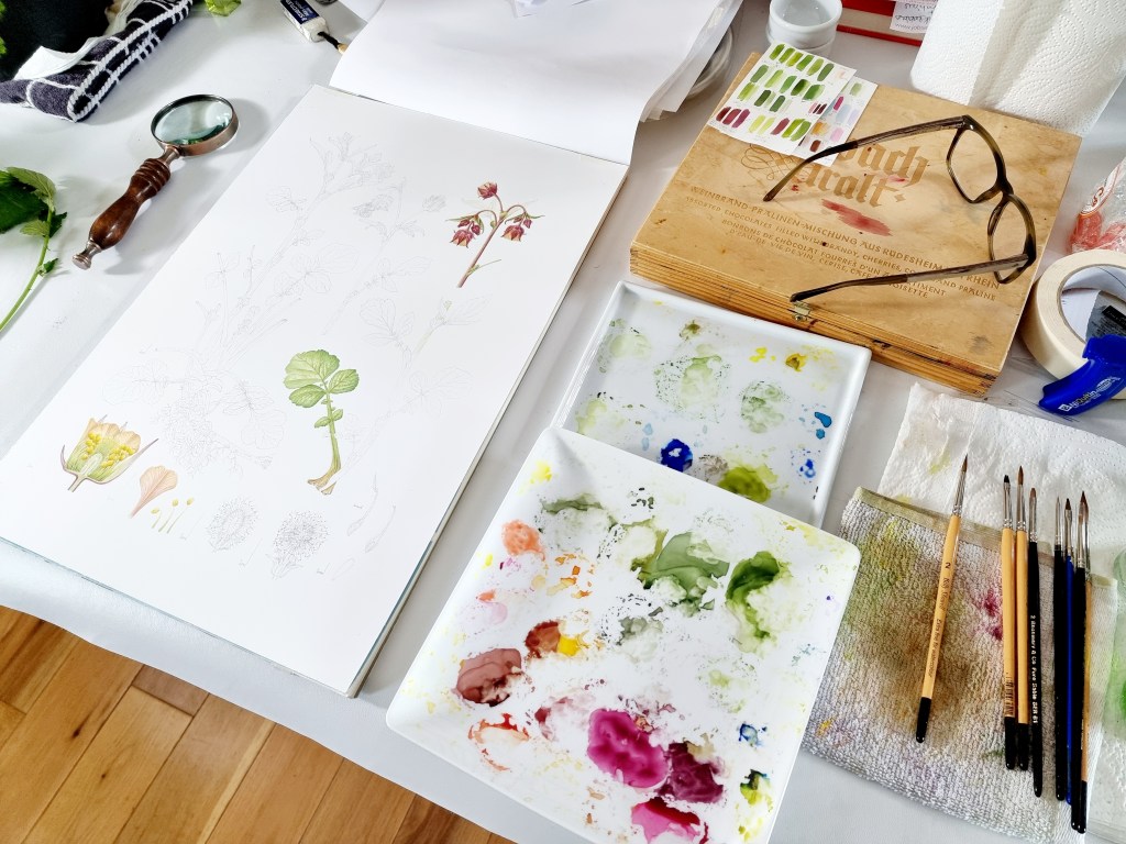
I started by working on my Ragged Robin and Greater Birds Foot Trefoil dissection details using my plant specimens as reference. Here are some photos of the work I completed whilst away. The hours flew by…
On my next trip to the lodge, I took a Water Avens plant with me and again checked Trewalkin meadow on the way. Trewalkin was very water-logged in May and the Water Avens plants growing there were very short in comparison to my home-grown Water Avens. I have found it was important to find all my chosen species growing in the wild as they grow more naturally than in a garden. Habitats in the wild are quite different. Because the field was so water-logged, this year the plants had been stunted a little. They were much smaller than last year.
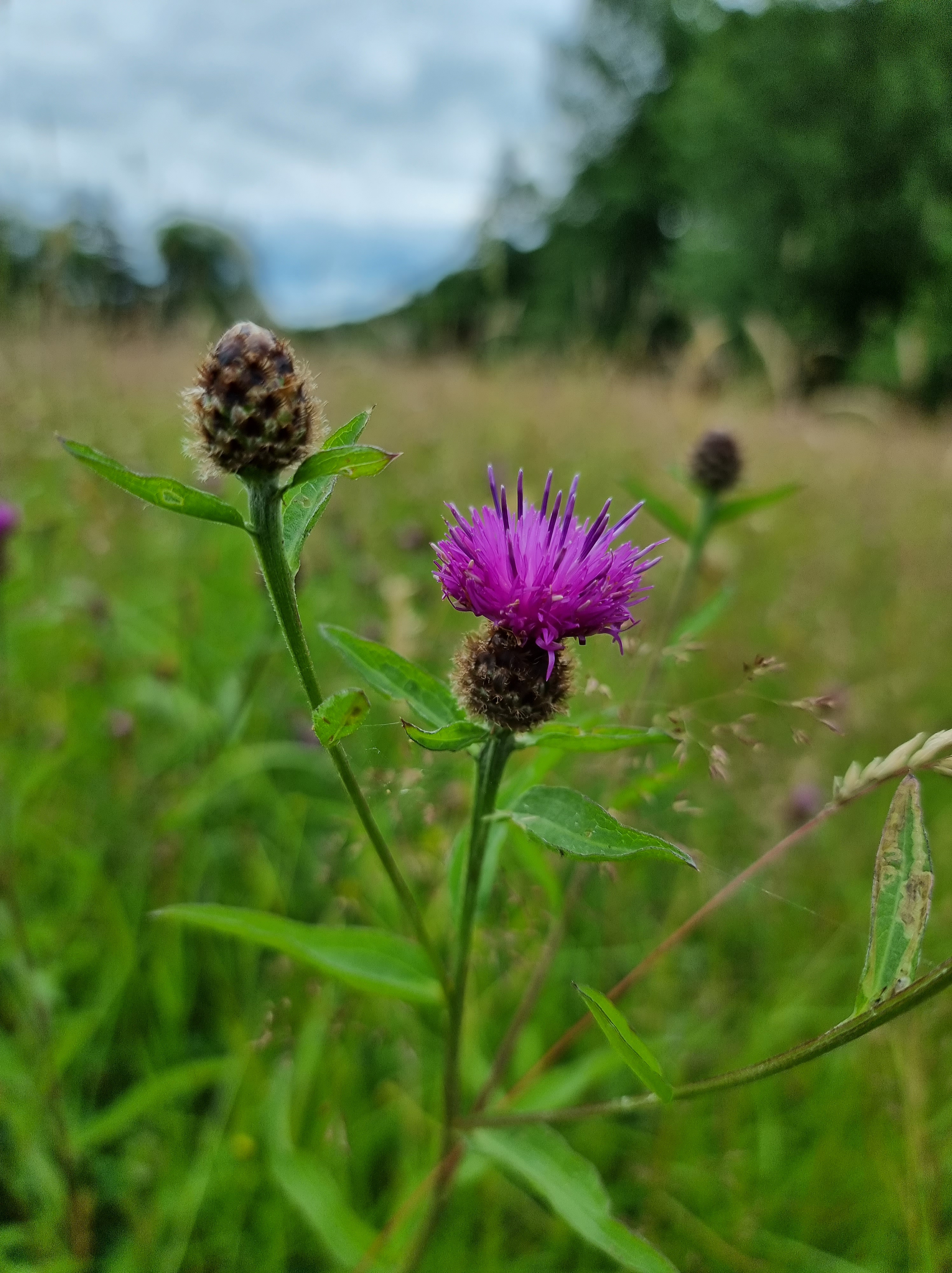
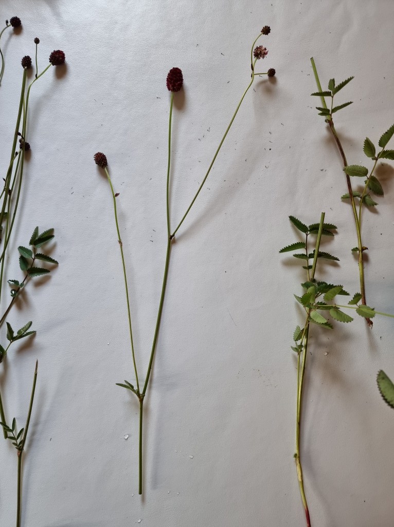
On my final visit to the lodge, I collected Great Burnet specimens (with permission) from Trewalkin to study this plants botany and make preliminary sketches. In August Great Burnet (Sanguisorba officinalis) fills this field and looks like hundreds of red lollipops. It’s a sight to see in real life. Hoverflies were enjoying the nectar too!
I had come to the end of my visits to Trefeglwys where I had done a great deal of work. I was pleased with my progress. On returning home I was distracted by other things I needed to catch up on and pressing work for the SBA. It took a little while before I could settle into my studies again. I have just completed a Devil’s bit scabious composition which you may have seen on Facebook. This has taken over three weeks to get the composition and drawing just right. Next, I will be making my composition for Great Burnet. This will be the last one of the six paintings prepared, then all I have to do is complete the paintings!
I have learned a great deal along the way about wildflowers and botany. Thanks must go to a well know botanist who has helped me learn and get my drawings right along the way. I am very grateful to her. I so enjoyed learning about botany that I designed a course for my local students in September. I called it ‘Flower Studies and a little Botany’. They learned so much and made a page of botanical studies on a chosen plant. They were all very excited by what they had learned and are now looking at plants in a new way!
Well, that’s it for now. I hope you enjoyed this blog and I will be back with another one soon.
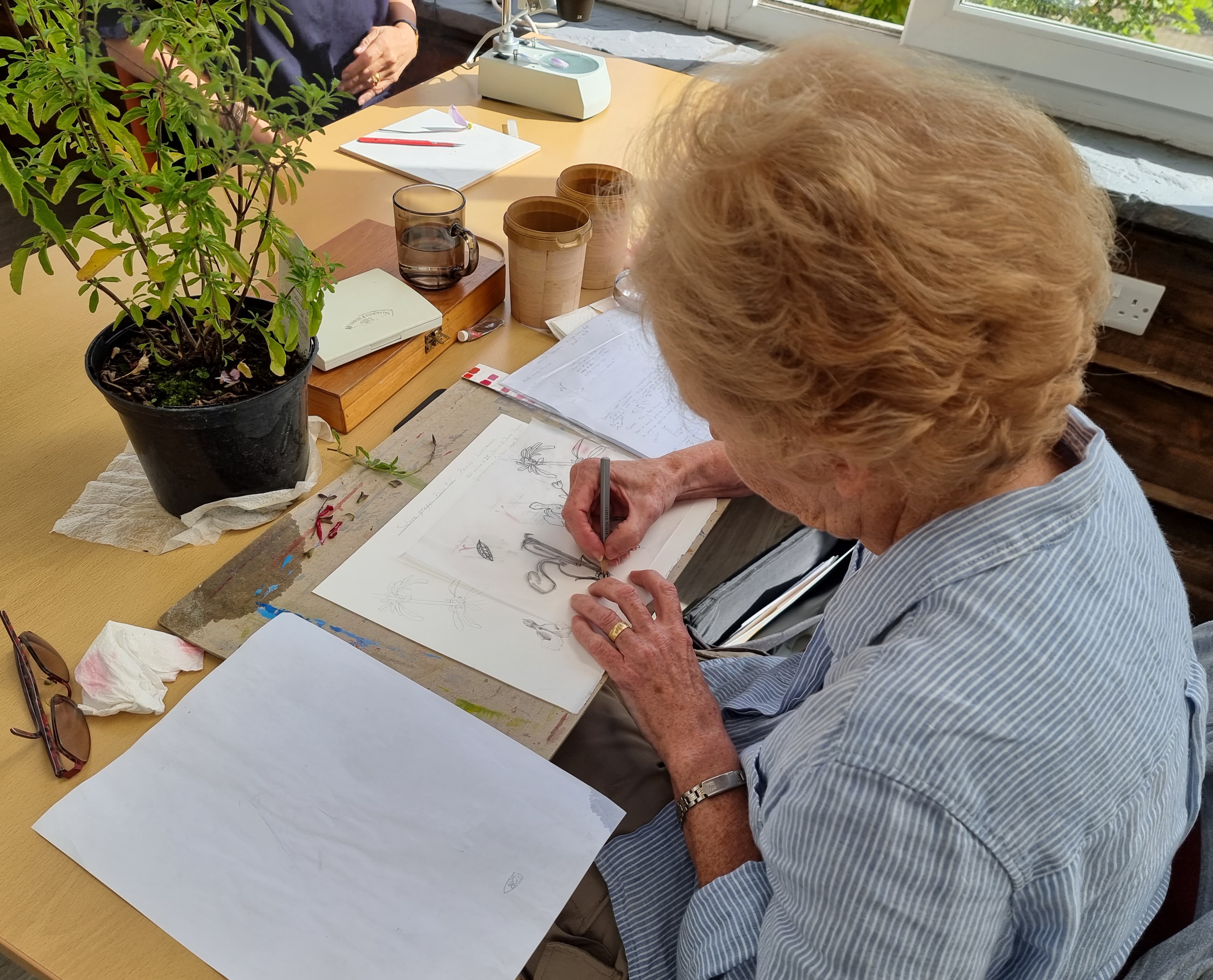
During the winter I’ve been very busy continuing with my RHS studies and finalising 3 compositions. It’s been a long trek! In between these studies I’ve been enjoying preparing for a course at Brackenwood which will cover White and Yellow Spring flowers. A subject many find hard to paint…even I do!
I also had a chance to go on an owl event where I had the pleasure of holding 6 different owls. The Owls in the photos above are a Barn Owl, a Tawny Owl and a Little Owl. My favourite was the Tawny Owl as we have a mating pair in the area where I live. I love hearing their calls, Twit – T-wooo. Apparently they are the only owls who make this type of call. I even got to hold an Eagle Owl. They are huge and very heavy! I’ve always admired these beautiful birds but never been this close up. It was delightful and I will remember it for a long time.
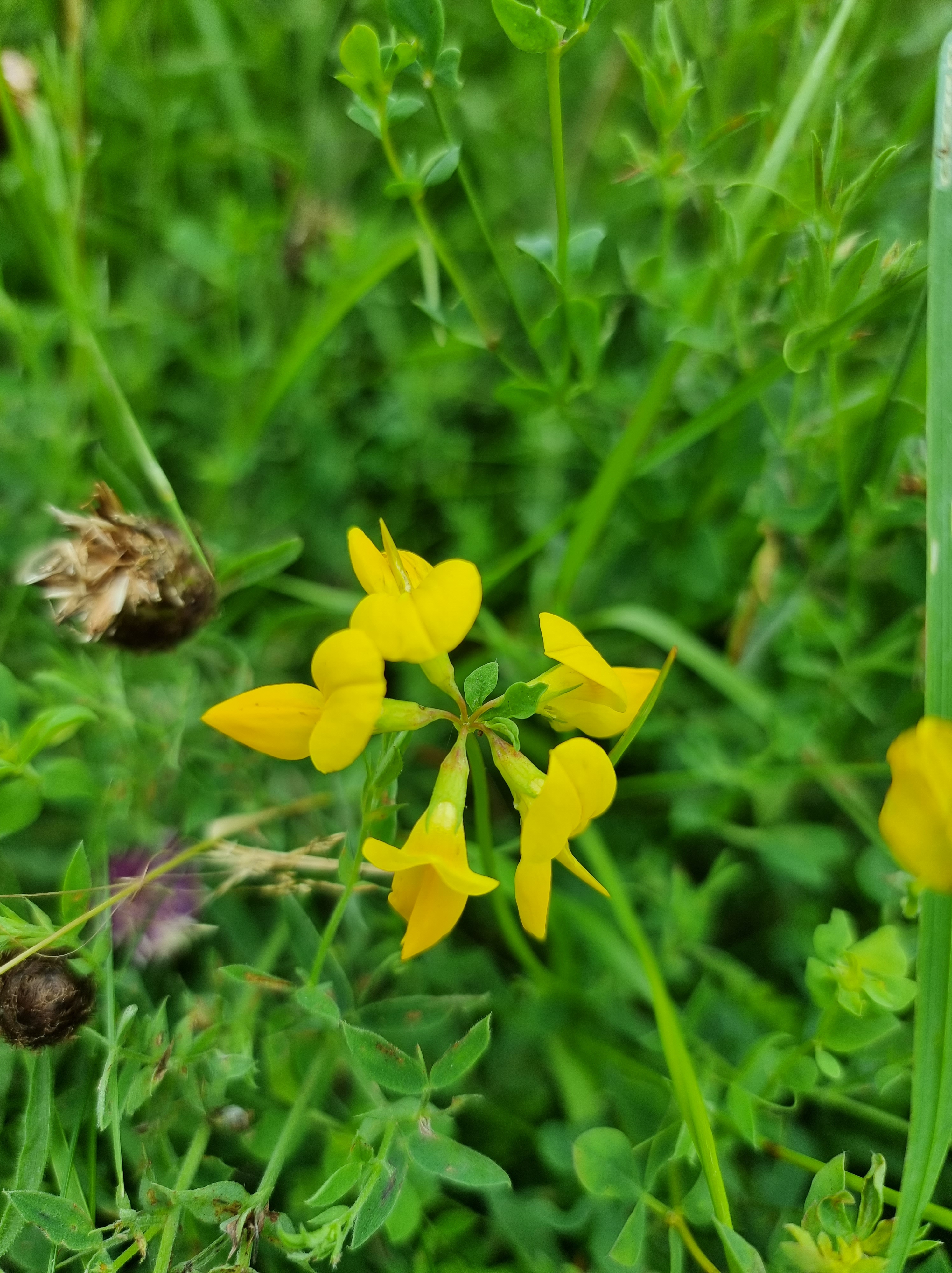
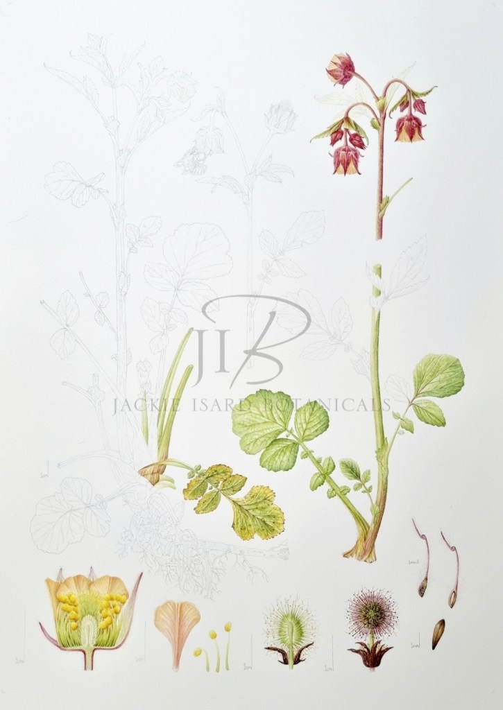
I have now completed my compositions for Cuckooflower, Ragged Robin and Greater Birds foot Trefoil.
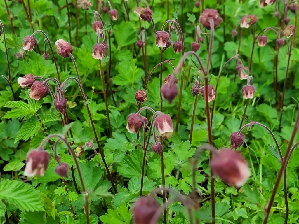
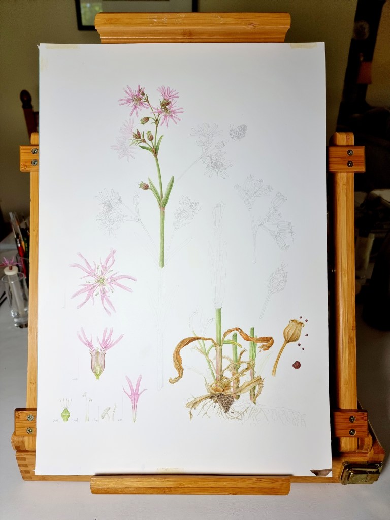
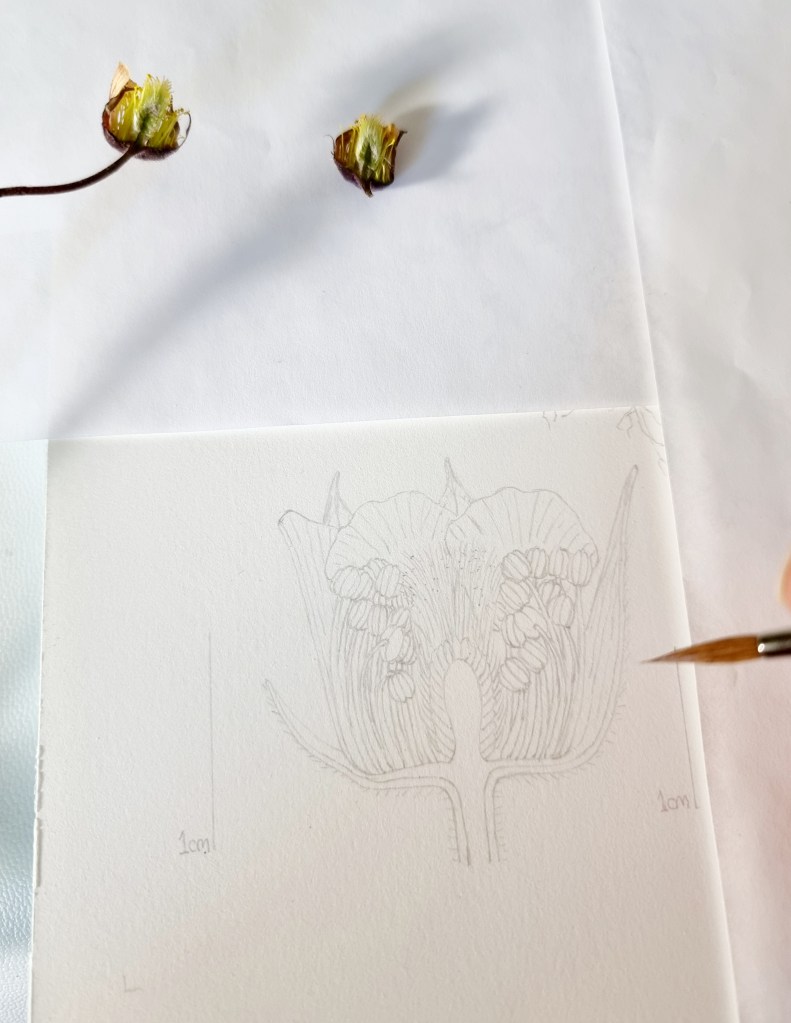
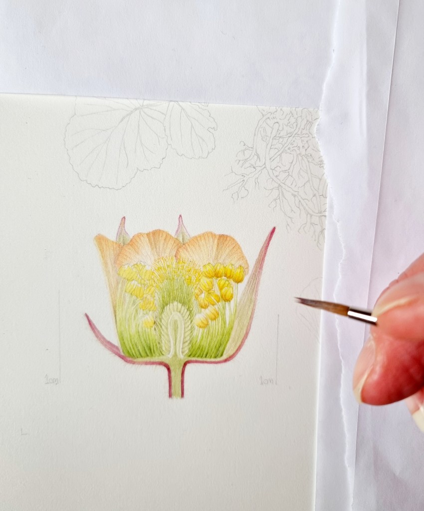
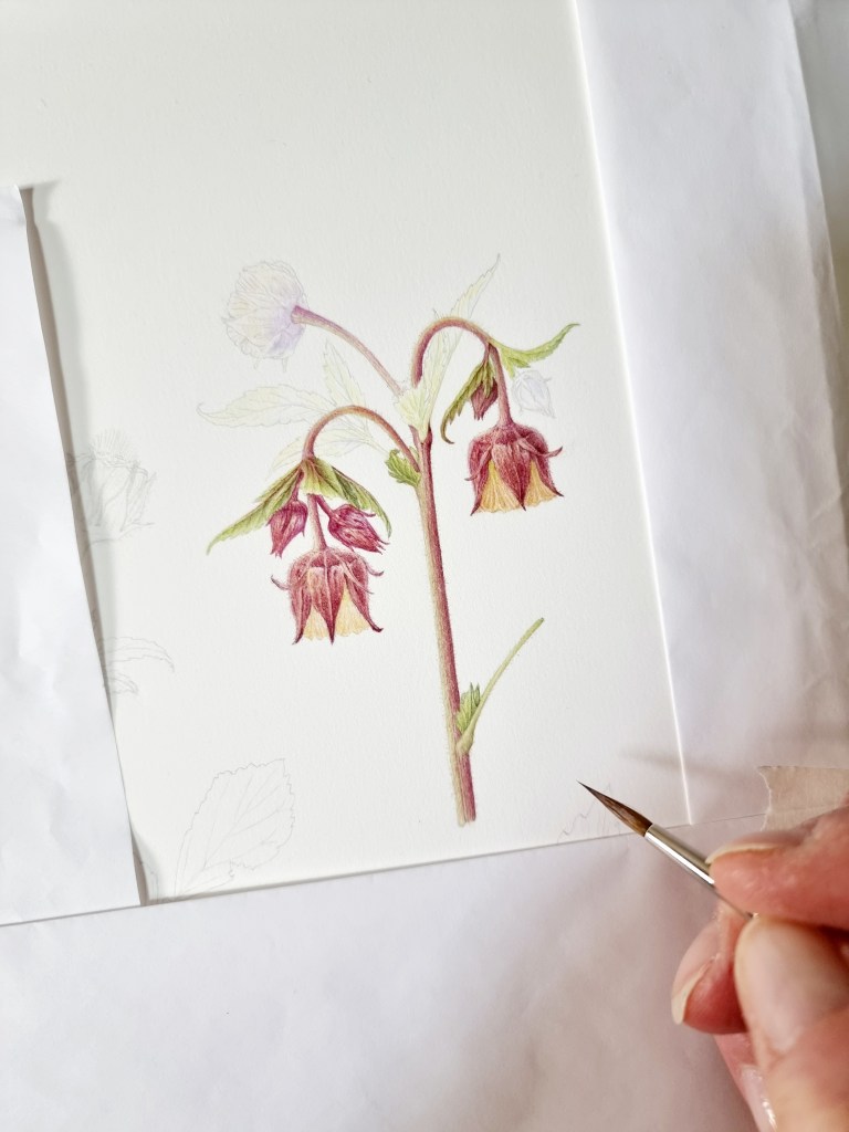
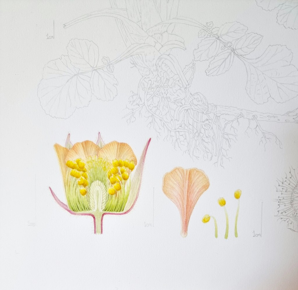
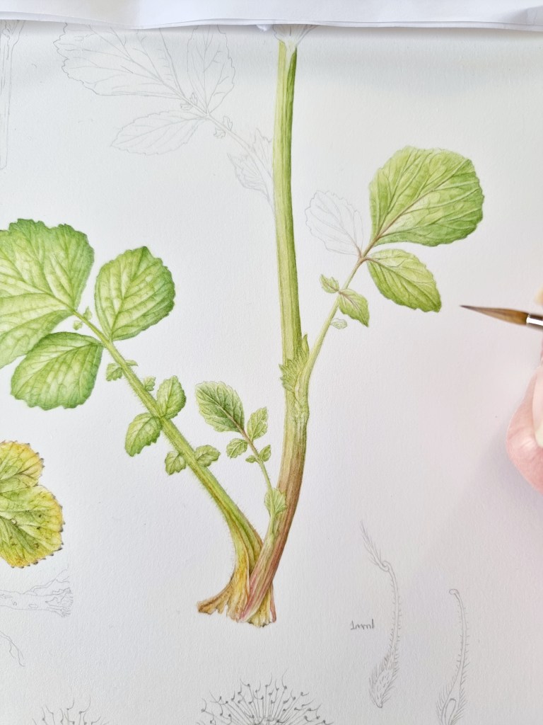
Last week I started preparing sketchbook studies and botany notes for the fourth plant, Geum rivale – Water Avens. What a gorgeous little plant! It has delicate nodding flower heads and beautifully shaped leaves. Very much overlooked I think.
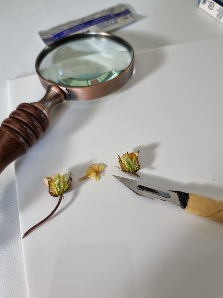
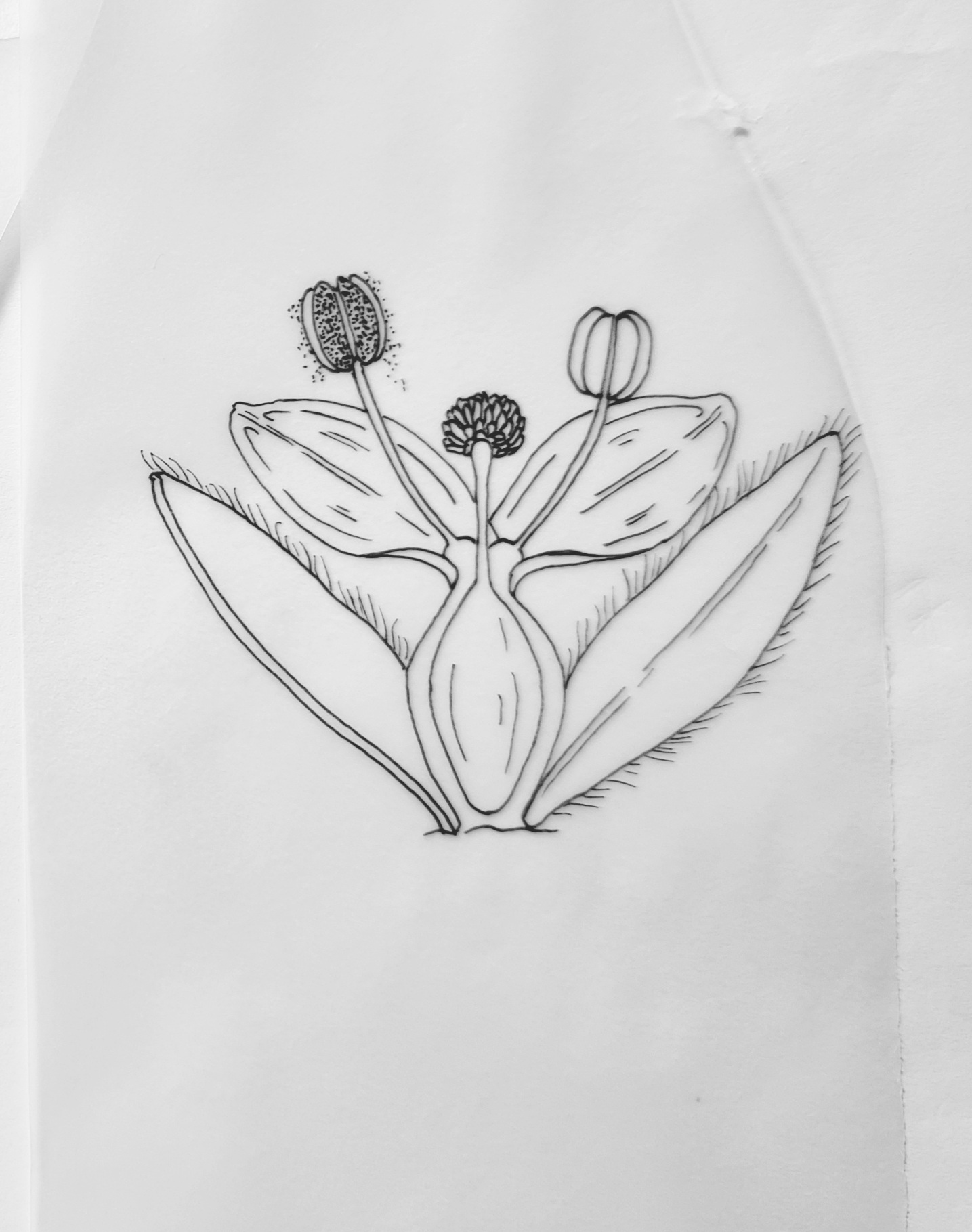
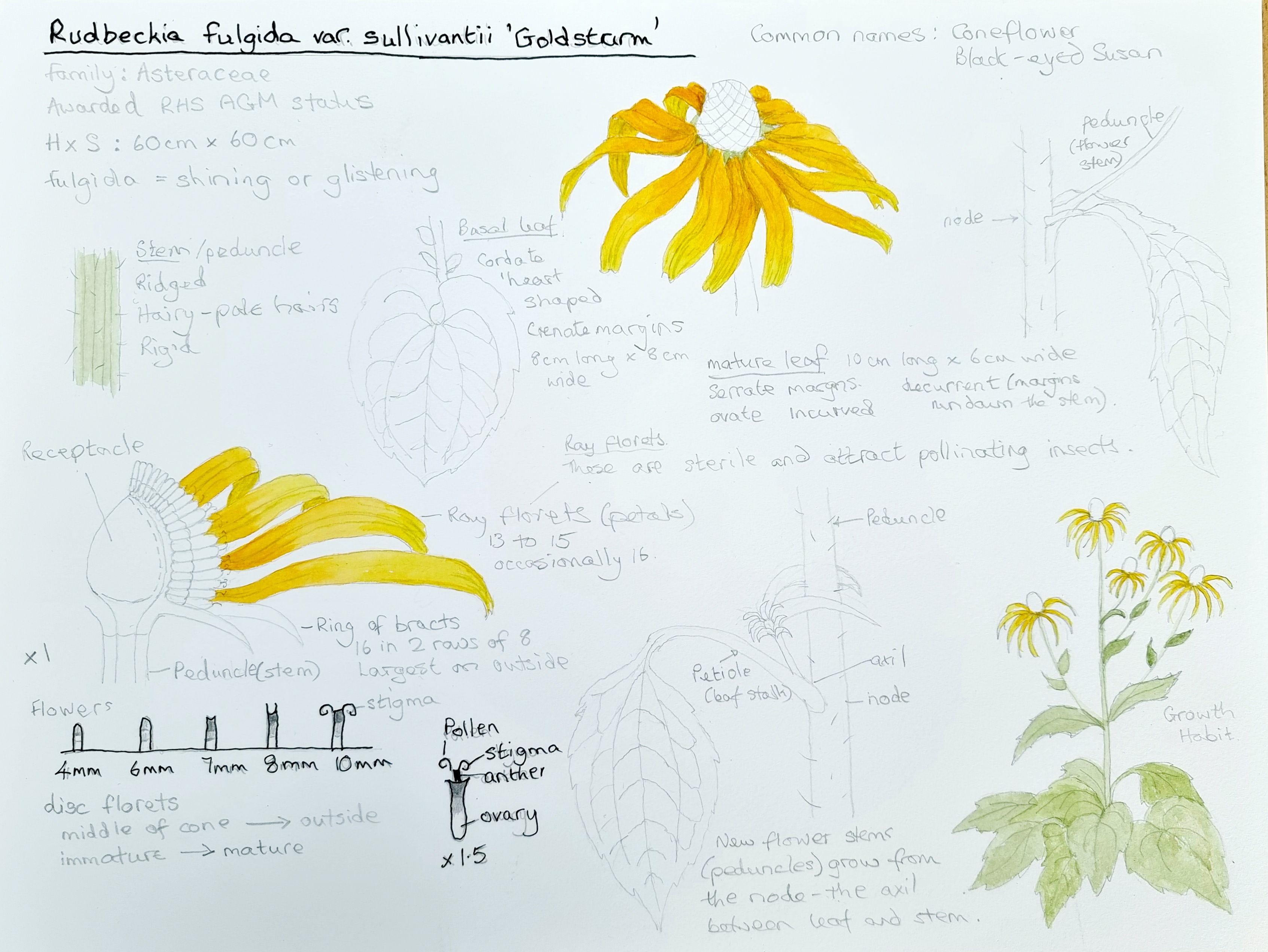
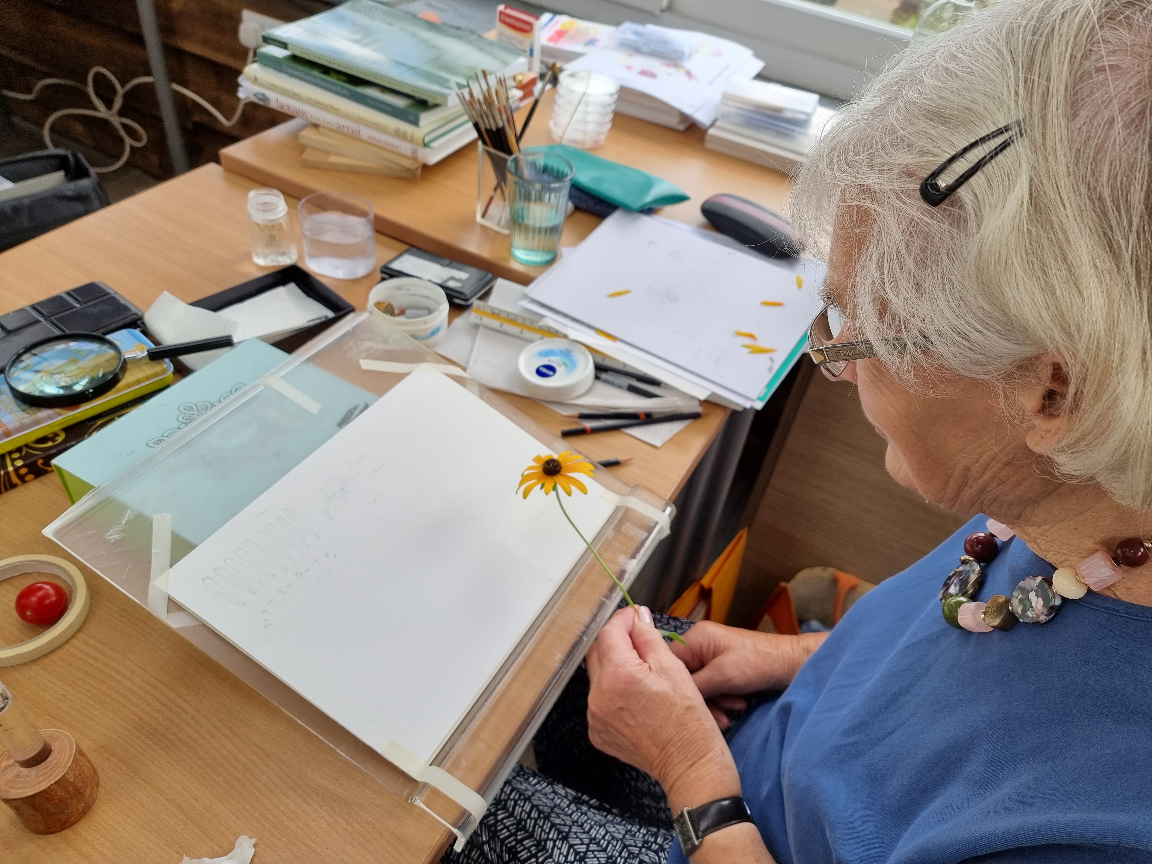
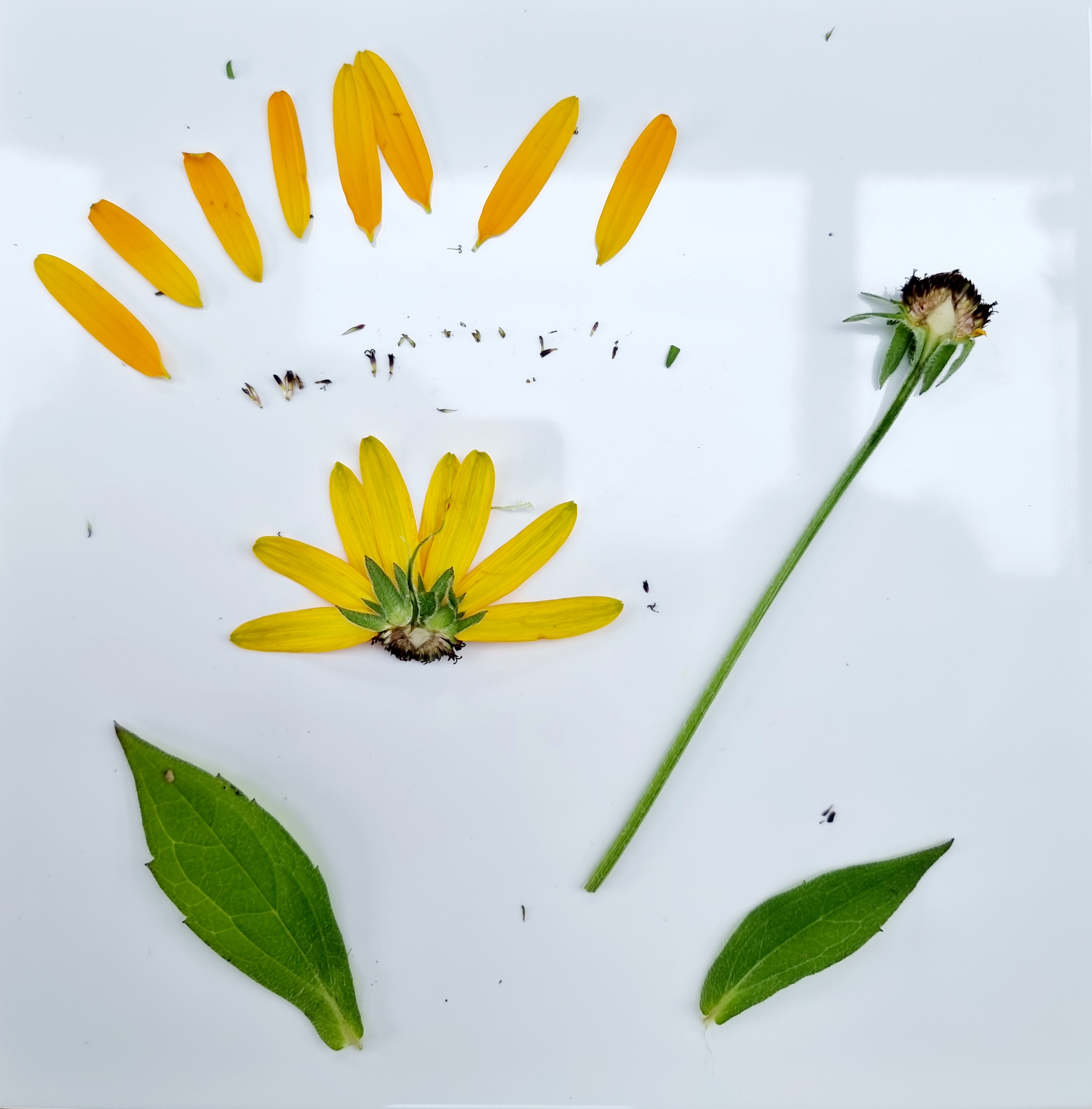
This plant has a very interesting botany. Quite different to the other plants I have studied. So much is learned about botany when dissecting and studying plants. I’ve really got into it! Like Cardamine pratensis it has different shaped basal leaves. They are more rounded at the top with leaflet pairs running down the stem. Quite attractive! It’s also very hairy in places and has hundreds of stamens all enveloped beneath 5 petals. There will be lots of fine details on this one. Here are some microscope images of the stigma (of which there are many too!), stamens and hairy buds…
So far I’ve dissected a young flower head, drawn up a budded branch, a flowering branch and one of the basal leaves. This is my drawing to date. I love the shape of those leaves! This will be a tough one to draw accurately. So much botany going on!
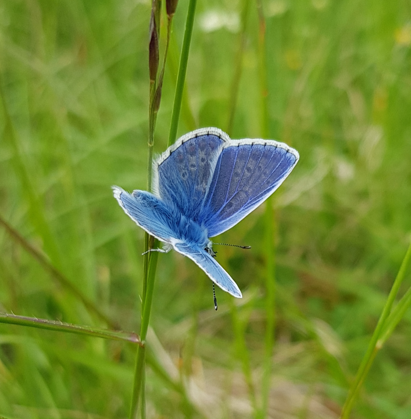
I have chosen to include pollinators in my work and a lot of research has gone into finding suitable insects for each plant in my series. It is important for me to make the insects to be relevant to the plants. You won’t believe how long this research takes! Below is a photo of a Common Blue which I took in Alveston, beautiful!
For my final 6 plant choices I have included two options for the last one. This is because it’s always good to have a back up. I have chosen 5 butterflies, a bee and a hover fly. They all use one of my chosen plants as either a larval food plant or for feeding. The butterflies are the Orange Tip, Marsh Fritillary, Wood White Common Blue and a large Scarce Blue.
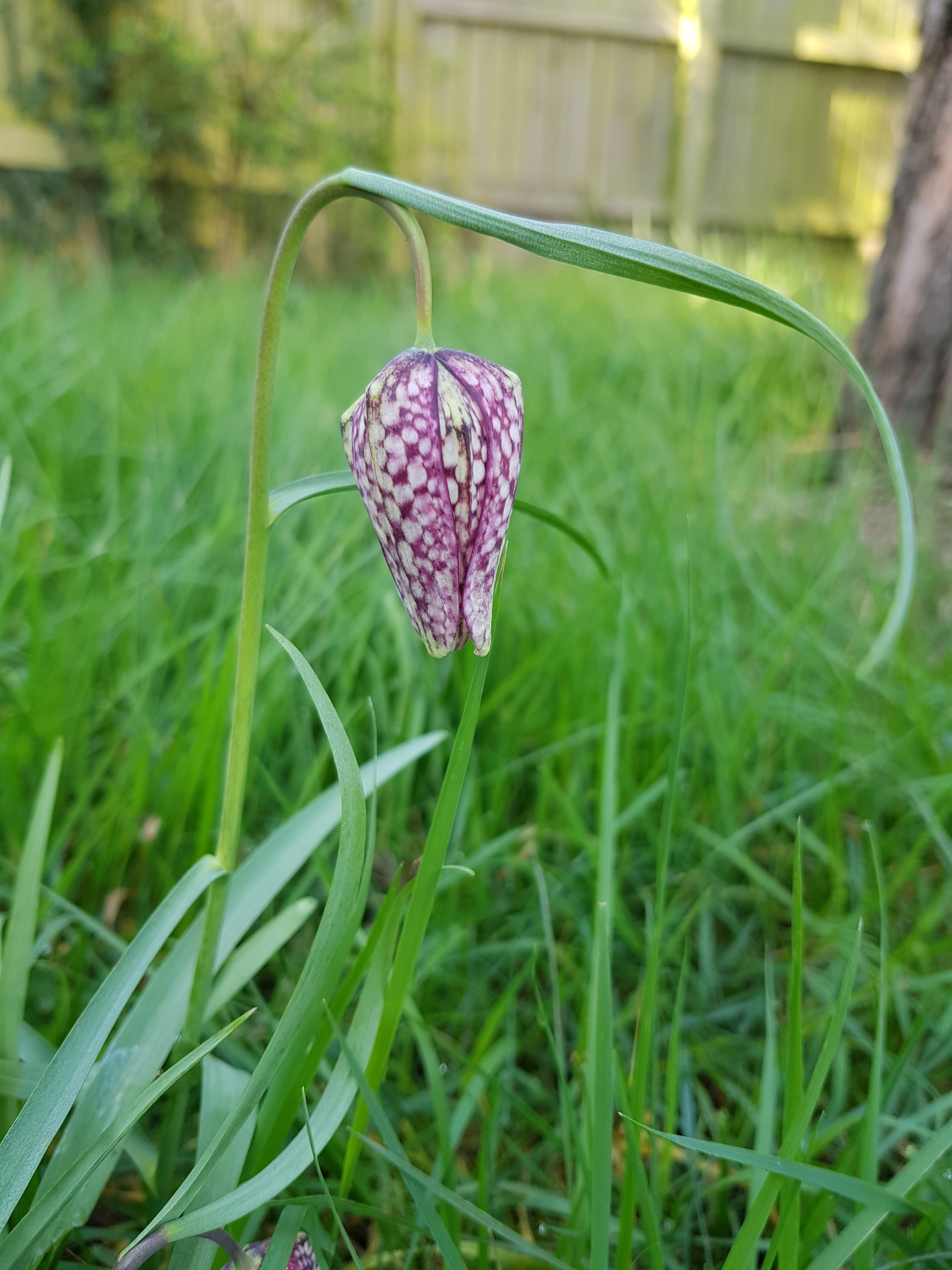
This weekend I was taken on a surprise trip to a Nature Reserve by my son. I’ve been wanting to visit this place since I discovered it late last year. It is a farm in Cricklade called Lower Moor Farm. There are many fields of meadow flowers and wet meadow plants too! Although too early in the season to see the meadows in full swing, I did see evidence of plants beginning to peep through. My heart sings when I visit these places which really helps with the intense work I’ve had to carry out. I hope to view some of my chosen plants in another natural habitat later in the year when I visit again. I also wanted to see the Snake’s-Head Fritillary which are growing wild at North Meadow Cricklade not far from Lower Moor Farm. The fields of North Meadow are protected as this species is now very rare in the wild. Unfortunately, we were a little premature as they were only just starting to grow. Another visit is planned for Easter weekend to see it in its full glory.
This plant is actually not a British native species otherwise I may have chosen it as one of my Wet Meadow species. It’s a shame because it is a much loved flower to paint by Botanical artists! I have planted some in my garden wild areas which are flowering already …perhaps because the weather is milder in Bristol than North Meadow.
So, from here I must carry on with my Water Avens studies and composition ready to begin painting soon. Three of my plants will be flowering between April and June so time will be short! I’ll be back later in the Summer with more news and to show you how I’m getting on, plus some more meadow visit photos.
Until then Easter is just around the corner, so enjoy all that chocolate!
Jackie Isard Botanicals – Mixing Colour Accurately for Watercolour for Botanical
A course for those who struggle to mix accurately with watercolour! Learn how to mix watercolour accurately using primaries. You’ll be amazed at what can be achieved with practice and you won’t need to buy so many pigments!
THIS IS A COURSE YOU CAN JOIN AT ANY TIME! Private message me on Facebook or email me to Register, please – jackieisard@googlemail.com.
This course is for Beginners and Intermediate students. The course contains a lot of exercises, detailed course notes, pre-recorded video tutorials and a dedicated Secret Facebook Group, all designed and created by your tutor Jackie Isard. It concentrates on mixing with primaries and aims to help you ‘see‘ colour more easily whilst building your confidence in colour mixing. It’s definitely not another course with endless colour charts!
Details of the course:
• A course designed to help you ‘see’ colour more easily and build your confidence with colour selection and application
• No endless charts!
• A listed palette of pigments to buy (Winsor & Newton professional watercolours). A very versatile palette of pigments!
• Learn how pigments work
• Many exercises that teach you how to mix accurately.
• Detailed notes and pre-recorded video tutorials
• Develop a structured way to test colours and mixing possibilities
• Understand which pigments to choose for vibrant mixes and subdued tones
• Practical tasks for a better understanding of colours and what they do
• Patient online appraisal at every stage throughout the course
• A dedicated student group page to share and learn
• A final appraisal letter and certificate
The course exercises can be done in your own time. We will cover pigment qualities, warm and cool pigments, those difficult greens, botanical greys (we touch on this, there is more detail in my book ‘Watercolour Mixing Techniques for Botanical Artists’), mixing purely with primaries and neutral beige/brown tones for those beautiful Autumn colours. Learn from the pre-recorded video tutorials and there are a couple specifically for beginners. You will be added to a hidden Facebook Group where the video tutorials are held. In this group you can view other students work, find useful tips and post your work for appraisal if you choose to (personal appraisal is always done via private messenger, not publically). One-to-one tuition and help is always on hand and you will never have to wait long for a response. It is important to me that every student is given the attention and help they need to ensure they have a successful and rewarding journey throughout the course.
Exercises include making a few small reference charts, matching swatch colours, mixing with cool and warm primaries and many other useful tips/exercises from which you will learn how to ‘see‘ and mix colour more accurately.
I am always available on Facebook Private Messenger or Email (unless I’m asleep!) to answer any questions you have during the course. Please bear in mind the time difference if you are overseas! I appraise your work as you complete each of the Lesson exercises and give you a personalised final appraisal at the end of the course. You will also receive a graded certificate for your efforts!
Lantana montevidensis colour matching by student Raashmi
Some student reviews:
“I wanted to learn from Jackie the day I first saw a pic of her painting on FB. Her painting was highly detailed and showed a certain sensitivity to colour. Fortunately for me, Jackie announced an online course a few days later. I paid up for the ‘Mixing colour accurately course’ but was a bit skeptical of learning online. Having completed the course, my doubts stand dispelled. The course content, the exercises and the patient online appraisal of the exercises by Jackie, all made for good learning. I recommend the course to anyone on a tight budget. It has taught me a structured way to test a colour and it’s mixing possibilities.” Raashmi
“Mixing colour accurately is exactly what this course has taught me and a most enjoyable process too. Very much a novice, the notes were clear and easy to follow. The feedback was prompt and very helpful. All in all – Brilliant, Thanks Jackie” Sylvia
“At last! I now approach colour mixing in a more organised and knowledgeable way. I now search for ‘many’ colours within a plant and have gained the confidence to closely match them. This course should be compulsory for all Botanical artists. Jackie is a knowledgeable and encouraging tutor who responds quickly to your questions and posts on the dedicated group page.” Christine
“Thank you for the very clear instructions, I read them all and watch all the videos, they are all very useful and easy to follow. Jackie Isard you are great artist and a great teacher too!” Mari
“I am very pleased with this course! After all the exercises and tasks, I finally began to see colour and understand how to mix it. I liked the fact that I had not only charts of colours but even in the end practical tasks for a better understanding of colour on real leaves and flowers. Separately it will highlight the fact that Jackie responded very quickly to questions and supported me throughout the course. I highly recommend this course to anyone who wants to learn how to mix watercolour accurately for botanical” Svitlana
“The course material for this colour mixing course is structured, interesting and clear. The exercises explained well and the extra videos and Facebook group tips are a bonus. I have learned to look further than ‘first sight’ when looking at a plant. A green leaf is not just green but a myriad of green tones and hues. What I most appreciated was Jackie’s personal support and the speedy replies with appraisal. It is an important motivator when working online.” Hilde
Payment can be made via PayPal, details will be sent on Registration. The fee is £105 UK and Internationals. If you do not have PayPal, it’s really simple to set up online. Just visit www.paypal.com. Bank transfer is only available using a UK bank account.
Please contact me by email or Facebook private messenger for Registration details!
Great news received March 2021!
My first published book has arrived in the UK! So exciting! More details below.
Watercolour Mixing Techniques for Botanical Artists
A practical guide to accurate watercolour mixing with primaries for botanical artists
Colour mixing is a key skill for the botanical artist. In this practical guide, Jackie Isard explains how to observe and use colour accurately. She shows artists how to make informed choices when selecting pigments, as well as how to learn about colour mixing and its application. • Gives detailed instruction and advice on understanding colour and pigments • Explains how to ‘see’ colour and tricky mixes, from greens and reds to the difficult botanical greys • Includes advanced colour application techniques – colour enhancement, shadow colours and colour temperature transition • Step-by-step guides illustrate how to paint with layers, how to use underlaying colours to enhance, and colour and fine detailing
Order online via major book shops or Amazon. Published by The Crowood Press Ltd
Arriving 22nd March 2021, USA arrival October 2021. E-books are also be available worldwide.
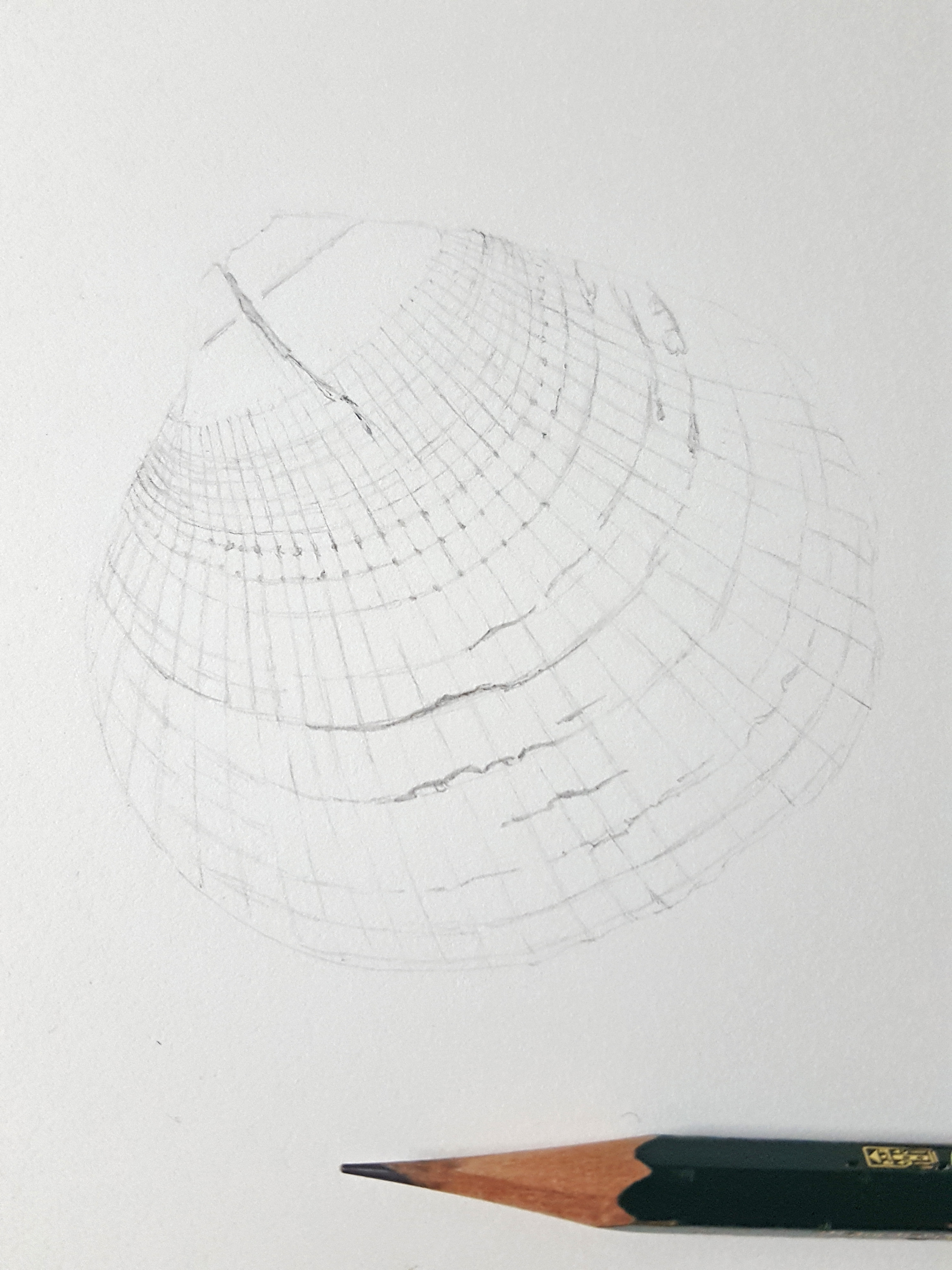
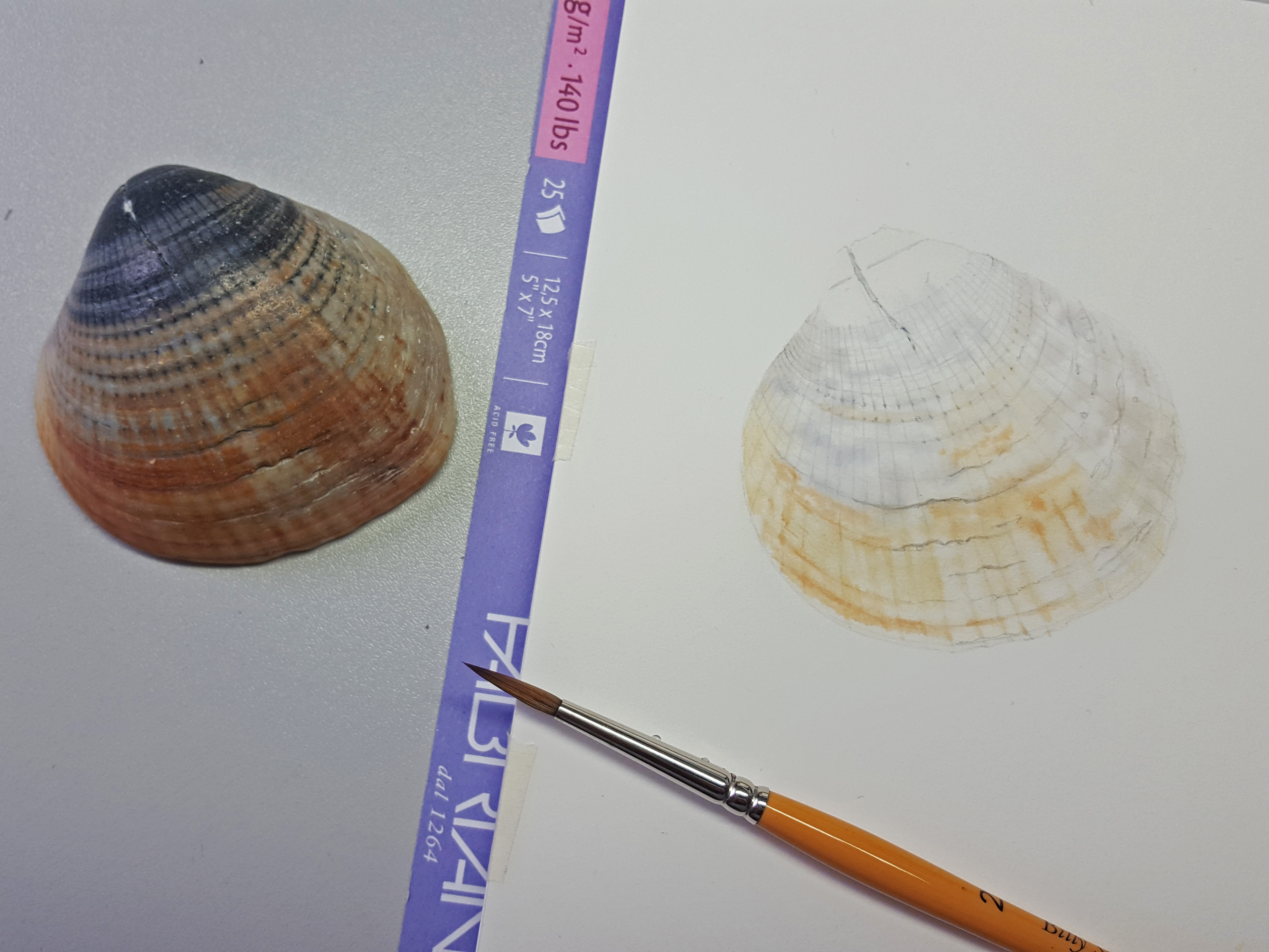
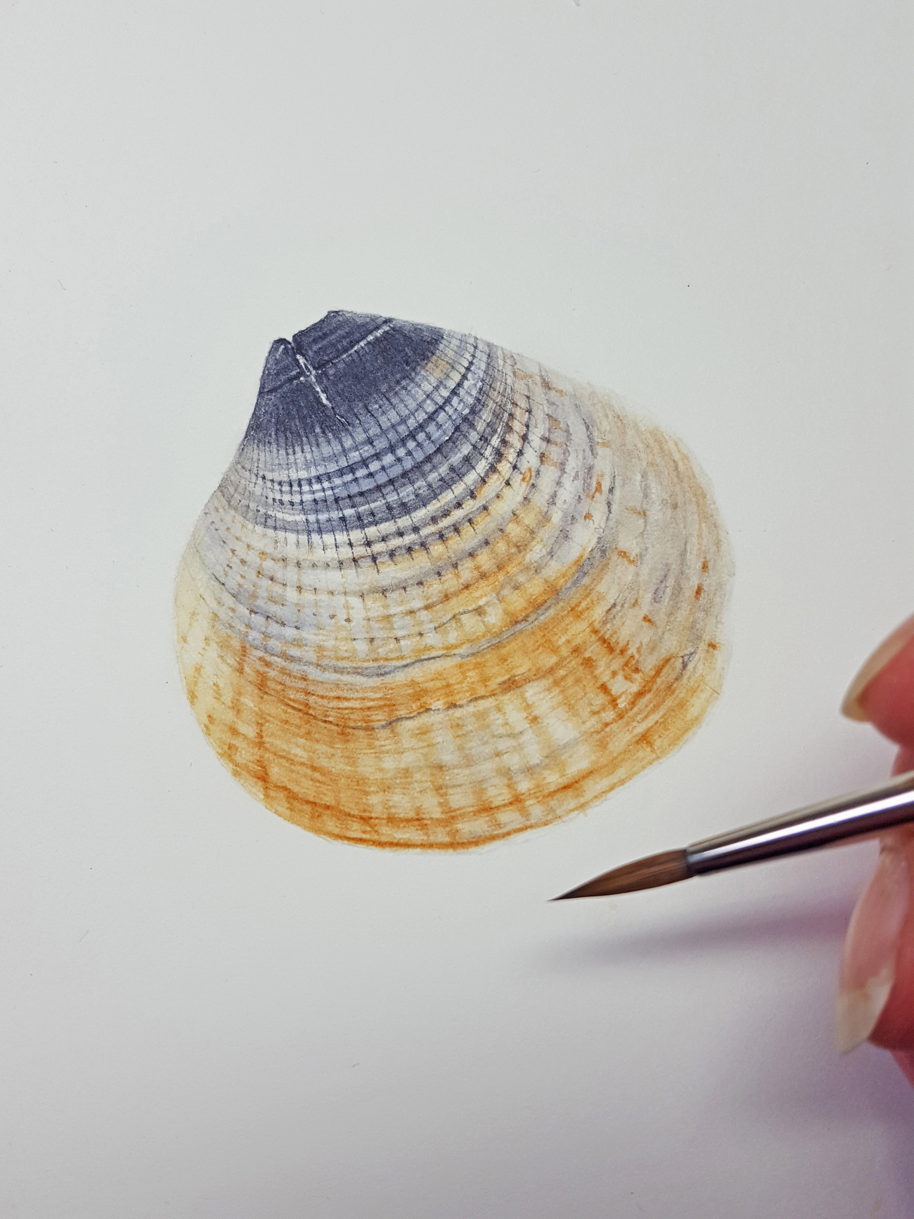
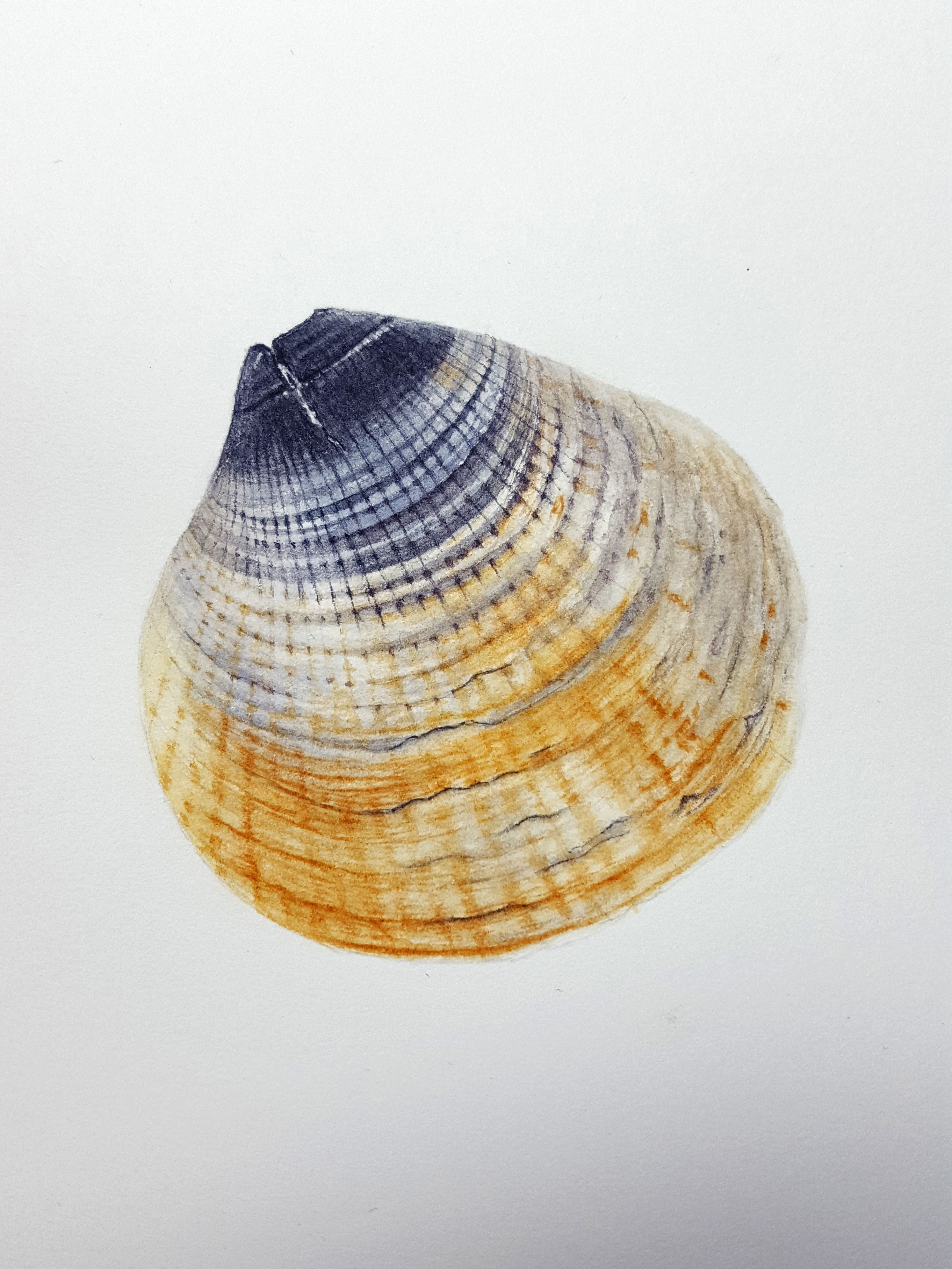
I was given this shell at my Daughter-in-laws wedding last year in Portugal and it has their wedding date inscribed underneath it. It has a special meaning to me as you will no doubt understand. So, I had to paint it for the couple to enjoy in their home!
To begin with, shells are rather difficult shapes to draw. Full of spirals or curved lines and beautiful patterns. This shell has lines going both vertically and horizontally over a curved surface. We really need to get those right first! I started by doing the outline of it’s total shape and then worked from the top/middle of the drawing putting in the curves carefully as they go from left to right. As they go round to the edges the space between them reduces almost to a vanishing point. Once these were completed and the little cracks across it’s surface drawn on, I then worked from the centre/top, putting in the vertical lines, across to the left and then across to right. These also curve across the surface subtly….quite tricky!
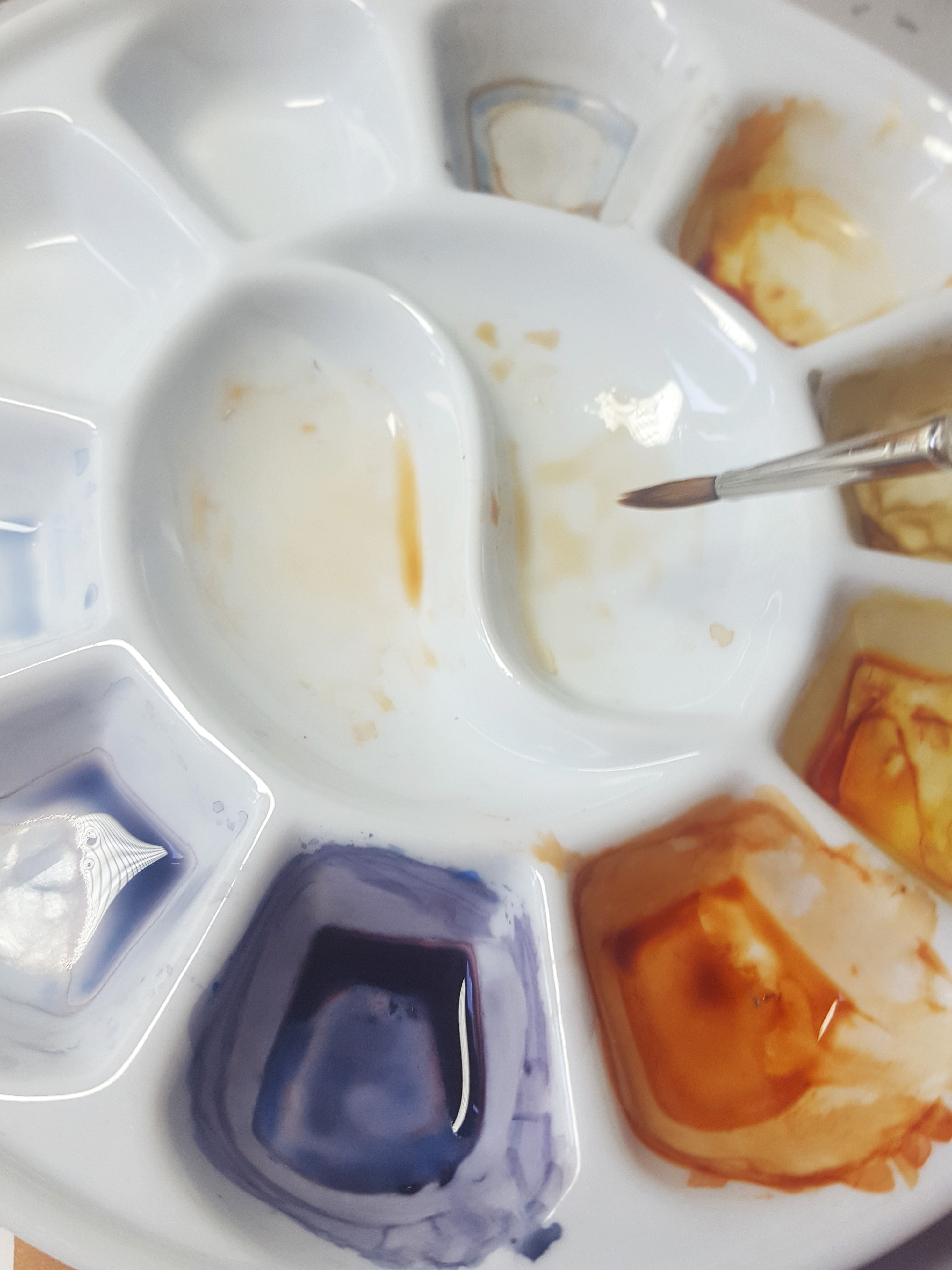
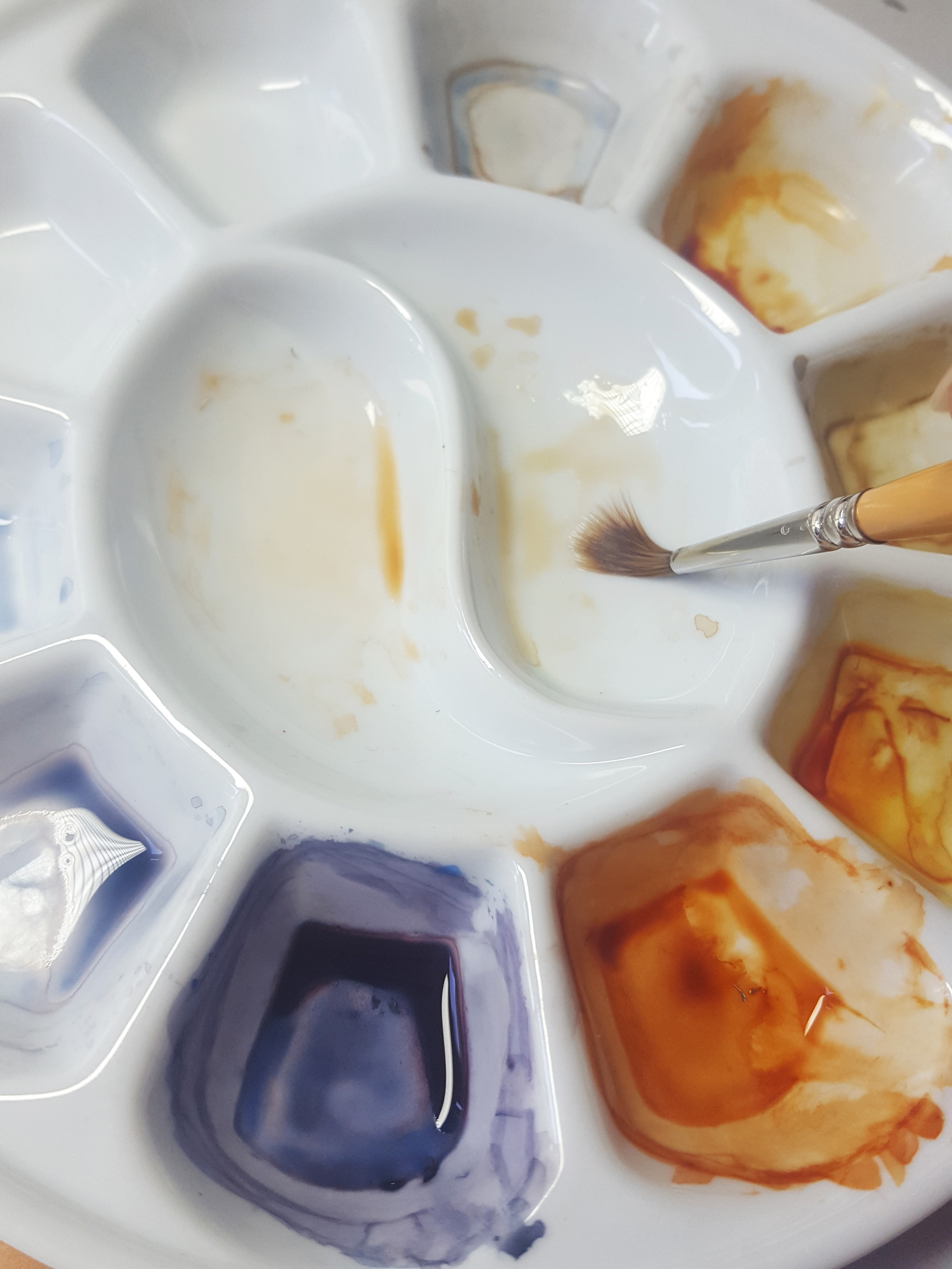
My shell has a number of interesting colours and I studied them carefully before I started to make my swatch. A lovely slate blue grey at the top and warm tan colours at the bottom intermingled with beige tones and yellows. I now had a good idea of what colour mixes I would use and created my swatch of colours.
For the slate blue/grey I used W&N Ultramarine Green Shade (U(GS), Transparent Yellow (TY) and Permanent Rose (PR). Mix it like you’re making black (70% blue, 20% red and 10% yellow) but add in a little bit more of the blue. For the Tan colour I used Burnt Sienna (BS), Quinacridone Gold (QG), a tiny little Indanthrene Blue (IB) and a tiny bit of Sennelier Rose Madder Lake (SRML) – this could be replaced with W&N Permanent Rose, PR. I used a little SRML to just add a little brightness to the mix. For the second tan colour which is paler and more orange, I used QG and BS, more of the QG. I also mixed up a black using IB, TY and PR.
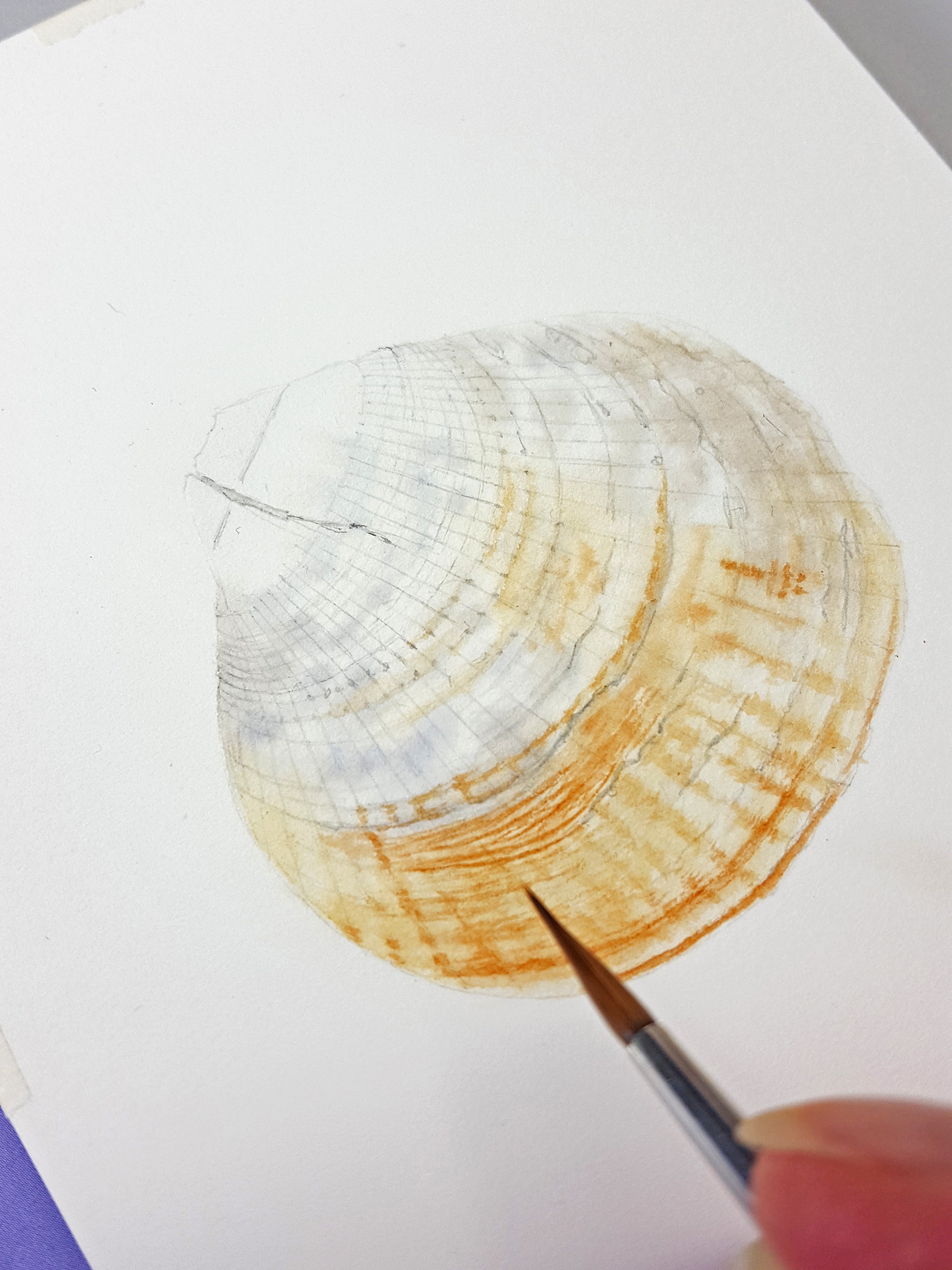
The first step was to add a wet-in-wet layer using the base colours, grey, beige, warm yellow and rusty browns. When the wet-in-wet layer was totally dry, I started to add in some of the details using a little stronger beige mix. Image 1: Here I started to add in some of the vertical and horizontal patterning. Image 2 : Here I am adding a little more shadowing and some of the cracks in. It’s best not to work with the mix too thick at this stage or you will not be able to add further colour without it smudging. Now it’s starting to look more interesting!
After this, I added in more of the background colours to give my shell some form. These were very watered down versions of my original colours plus a slightly more blue version of my slate grey/blue. I applied these individually as a thin wash and then quickly rinsed/dried off my brush before softening the edges. It’s important to soften the edges of these washes with a damp brush. This blurs the edge rather than leaving a sharp edge. It gives a lovely smooth finish.
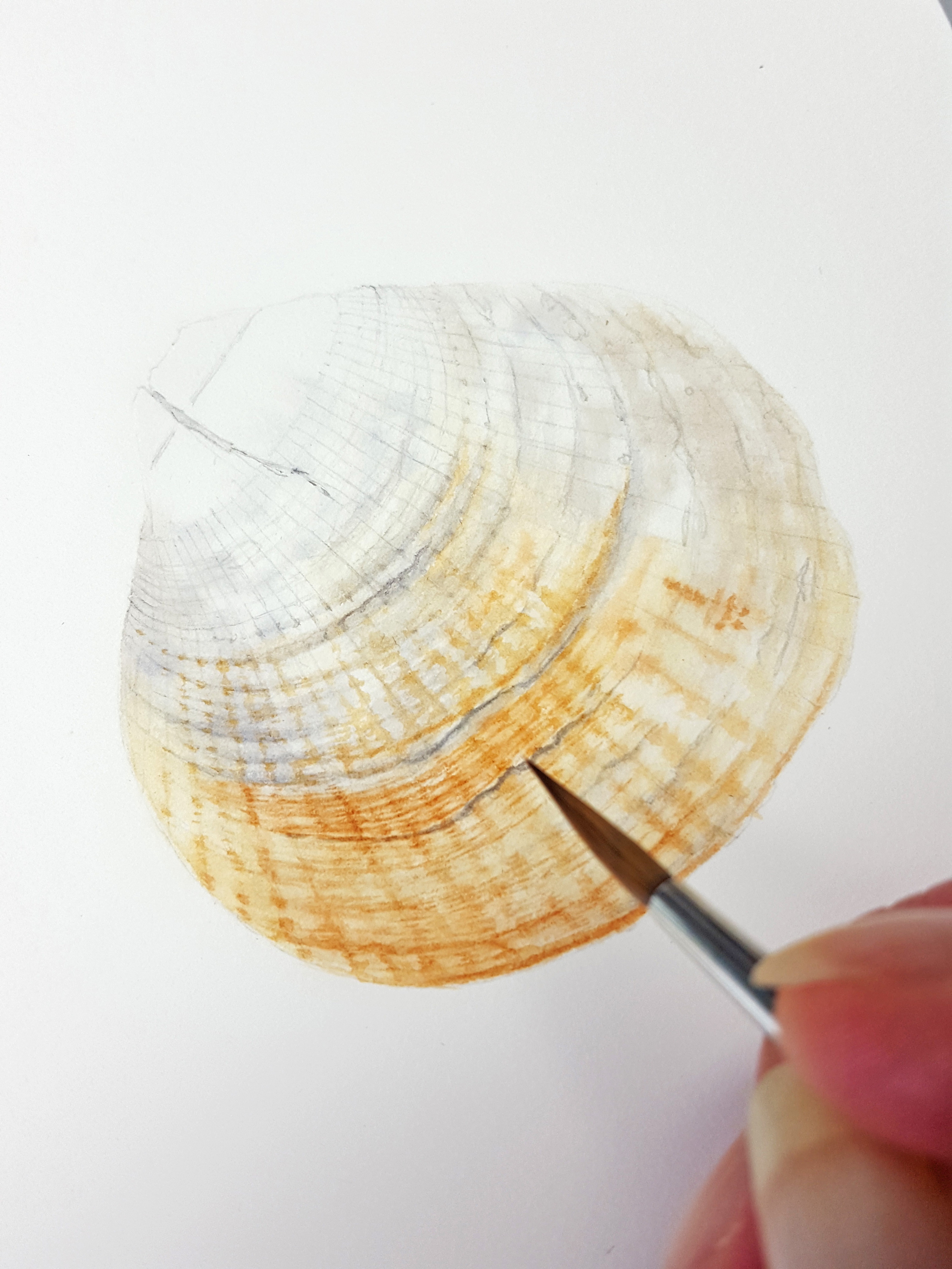
See how it’s starting to take shape! On some areas I used a Billy Showell technique to apply rough lose lines, a dry brush method. This gives a little more interest to the patterning, which are not always just curved lines. To do this, I load my brush and splay it into a fan in my palette. Then I slide the brush away from the palette until it forms little points instead of one point. Holding the brush as a 45° angle I then brush lightly across the area. For thinner lines hold the brush more upright. (There is a video demo of this technique on my Feathery Pursuits blog) This takes a bit of practice, so try it out on a separate piece of paper first!
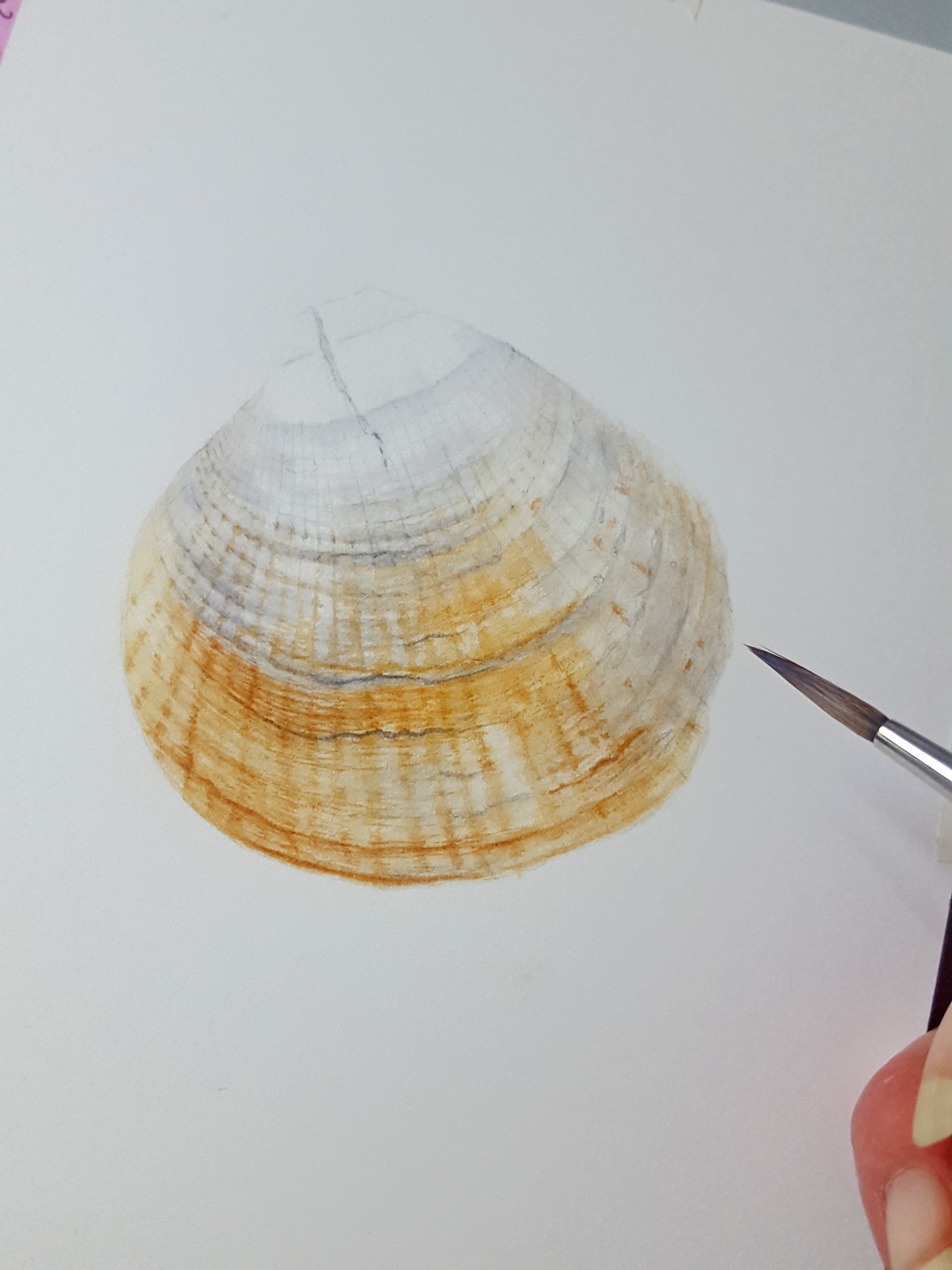
To add in the spots onto the surface I used another technique. These are not just spots you see. Some are blurred and others have a line coming down through them. To achieve a blurred effect the paper needs to be lightly damp. But rather than dampen the paper first, I prefer to do this with the brush afterwards. You have to be quick and patient! Here’s how it’s done:
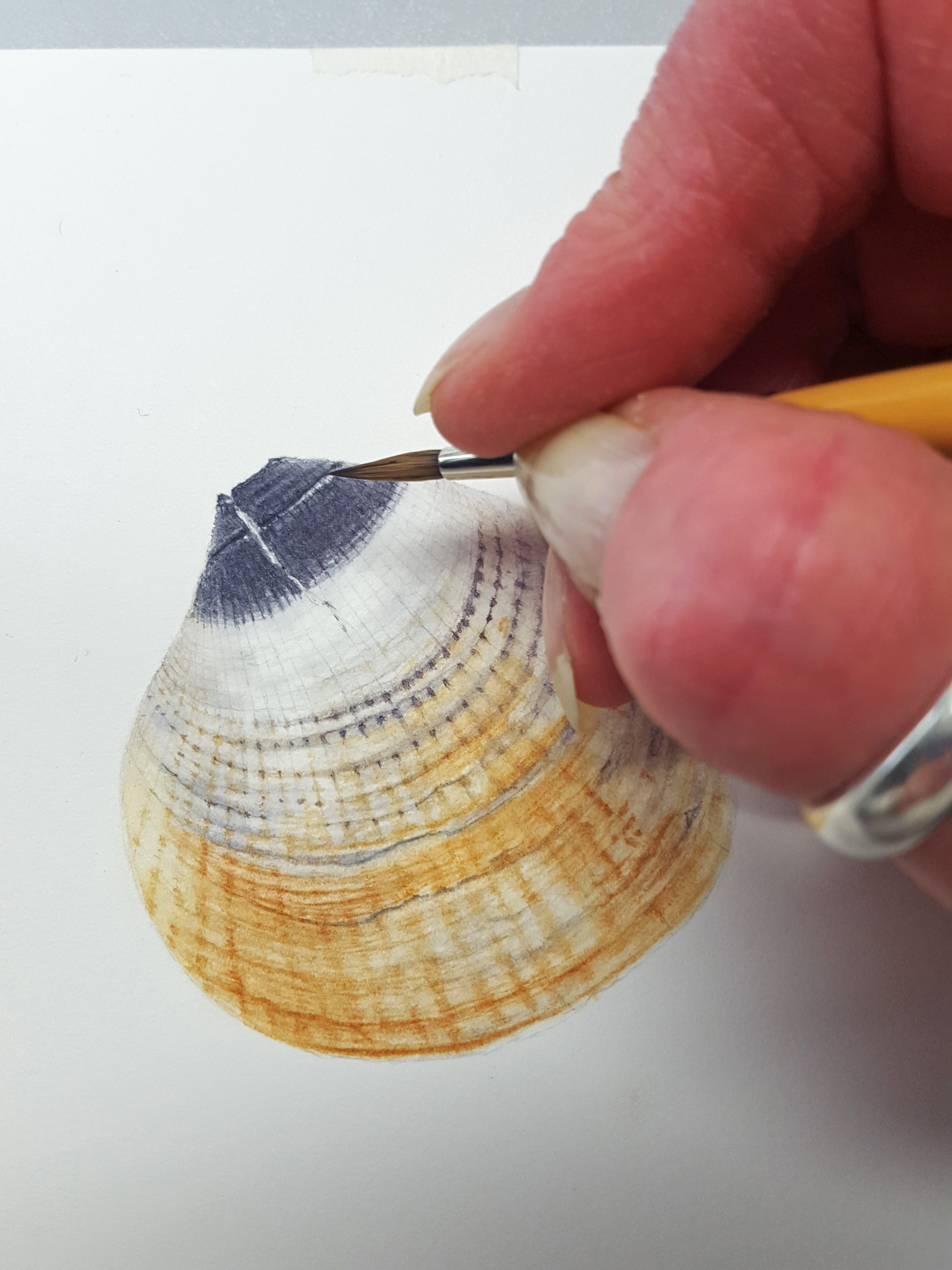
Some of these dots were paler than others so I used a paler mix for those but the same method to apply them. Once the dots were finished I worked on the top of the shell. This area is not solid colour so I’ve dampened the paper first to get a more mottled effect. It looks pretty messy at this stage but once I add the fine detail it comes together. To get a strong darker mix, this time I’ve used Indanthrene Blue (IB), TY and PR with a little U(GS) in my mix. This part of the shell is quite dark. Indanthrene Blue will strengthen this and the U(GS) will add just a little brightness. It will be similar tone as the slate grey/blue though.
After deepening the slate grey mix a little on the painting, not too dark though, I worked at the fine detailing on the top part of my shell. Vertical line patterning goes over this area too. To the right side there is a slight halo of light where the slate grey disappears over the edge of the shell. I left this part a little lighter and graduated it away. This is the reflected light from the surface. It is only a small area but crucial to create good form (** see photo further down).
Now to join bottom and top together. There were lots of lines to do here so I had to be very careful! Firstly, to guide me I added in the paler blue/grey sections between the darker lines. Then I carefully added in the vertical lines and horizontal lines and curves. **You can see the slightly highlighted edges at the top of the shell better in this photo below middle.
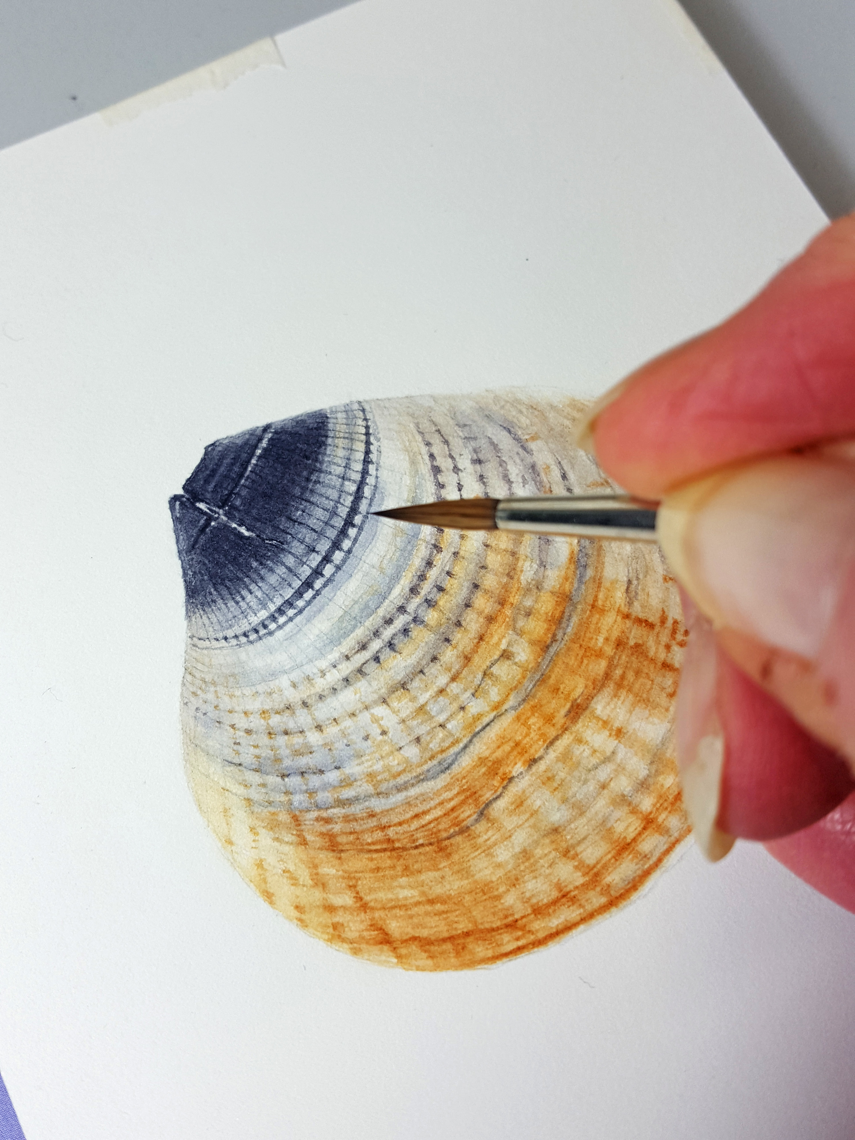
Next, I worked on the cracks to enhance their depth. I added a slightly darker mix into the top areas of these cracks with a thin wavy line. This was softened a little with a damp brush. At the same time as softening I pushed the paint back into the top part of each wavy line a bit. This creates backup which creates a definite edge, perfect for this type of detail. It gives a nice sharp edge with a thin graduation in front of it. Lastly, a little glazed shading around the sides and bottom to make it pop off the page!
I hope you enjoyed this Blog and that you are encouraged to have a go at a shell. Happy painting!
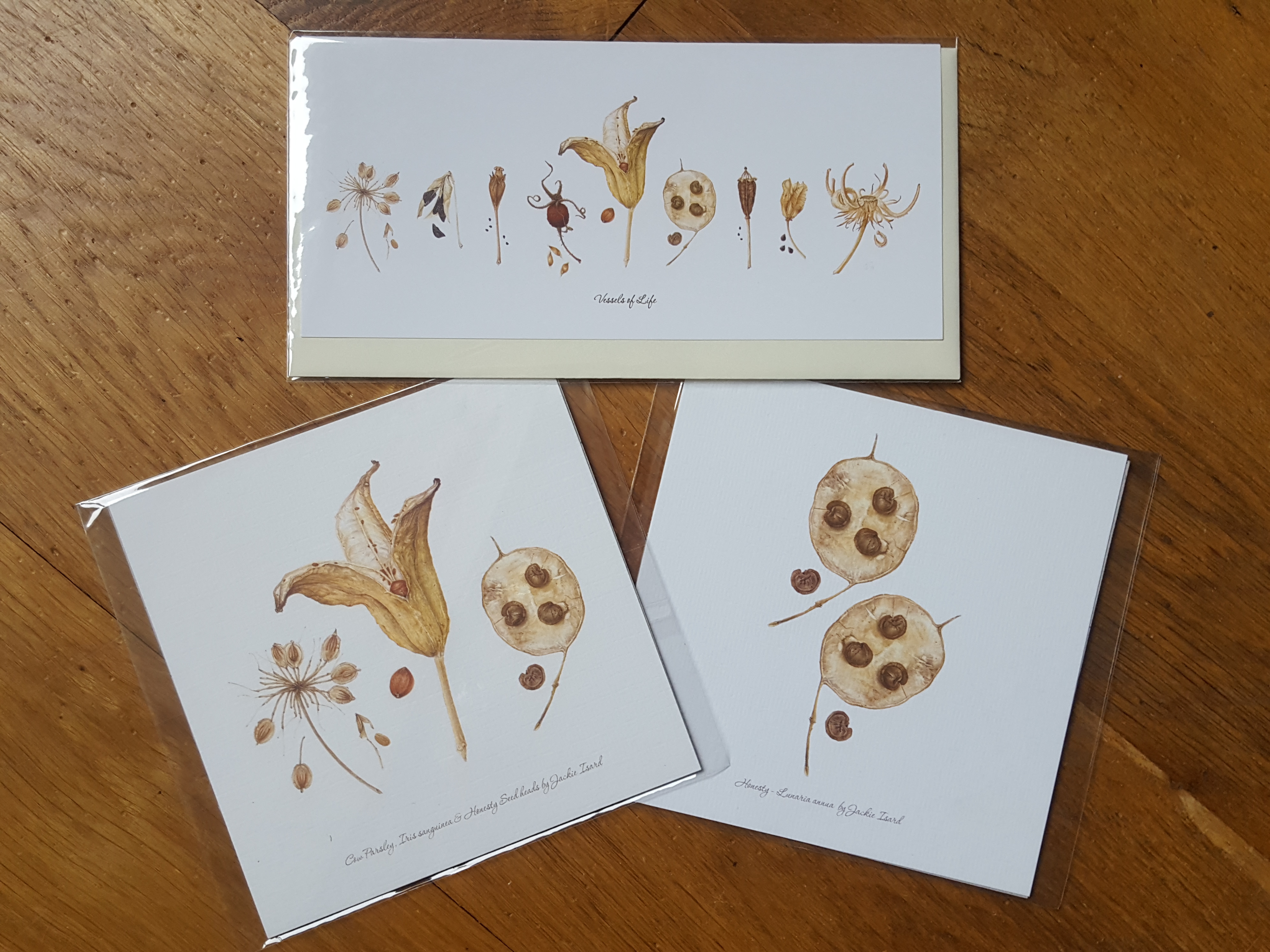
I was thrilled last week to receive a phone call from the SBA (Society of Botanical Artists) announcing that I had been presented with a CBM (Certificate of Botanical Merit) award for my seed head painting ‘Vessels of Life’. This award was created by the SBA to give credit to artists whose paintings/drawings are created in true botanical style and who may at some time in the future be awarded medals at the RHS (Royal Horticultural Society) Botanical Exhibition. I am now very privileged to use the letters CBM after my name. So you can see why I am so excited!
This was one of three paintings which were chosen to be hung at the SBA exhibition The other two are featured below –
Ash Keys- Fraxinus excelsior seeds
Stinking Iris – Iris foetidissima
The exhibition this year is outstanding and I will now be seeing it twice when I go again on the 21st! My award was presented to my by Jekka of Jekka’s Herb Farm . Her speech was really interesting, informative and funny. It is sad to see Sarah Wall-Armitage retire as president but welcome Billy Showell as the new one!
For more about the painting of the painting and video tips, see Blog 9
Cards, small prints and Limited Edition unmounted or mounted prints available. Contact me on Facebook or here.
Thank you for reading! All photos and images on this blog are copyright of Jackie Isard Botanicals, all rights reserved
I’m excited to announce that I have launched 3 initial courses at Brackenwood Plant & Garden Centre, Leigh Court Estate, Pill Road, Abbots Leigh, Bristol BS8 3RA starting in March 2017. Courses are £35 per person per day. It’s an exciting adventure for me!
The first three courses are geared around important watercolour painting techniques which aim to improve your skills and give you the know-how to create beautiful botanical watercolours.
On the second course I will teach you washing out, shading, dry brush, how to paint fine lines, erasing out and perfect fine detail. Link to event on FB
Course 3: Mixing Colour Accurately – 27th May 10am-4pm
On this course we will learn colour mixing and matching to plants making swatch records, learn how to create bright tones, learn how to get perfect neutral (natural) tones, other bits and pieces like overlaying tints to enhance colours and not quite 50 shades of grey! Link to event on FB
To book please contact me personally by email at jackieisard@googlemail.com and I will send you full details and material lists. Look out for more courses and future online tuition on my FB page Jackie Isard Botanicals
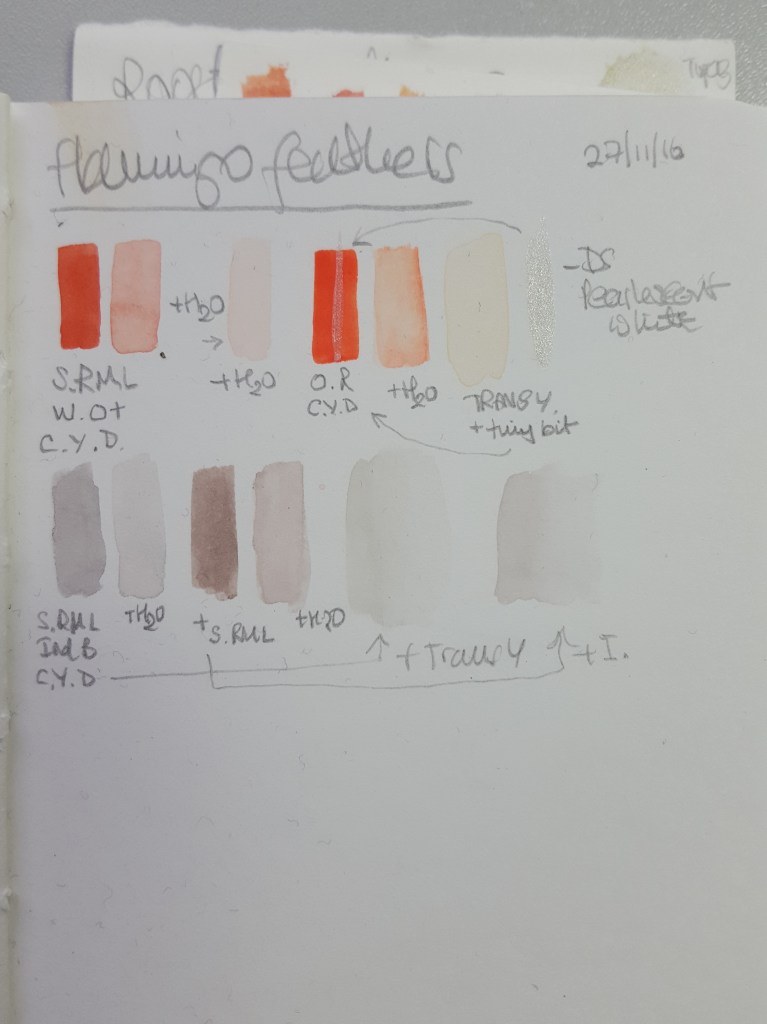
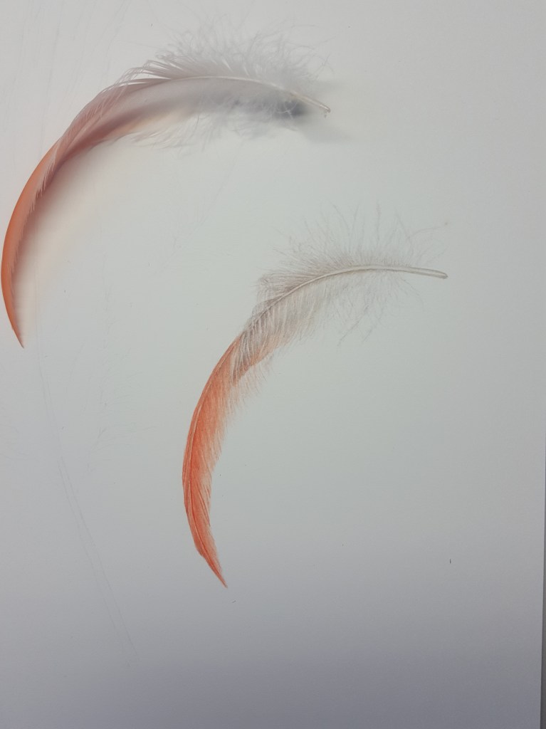
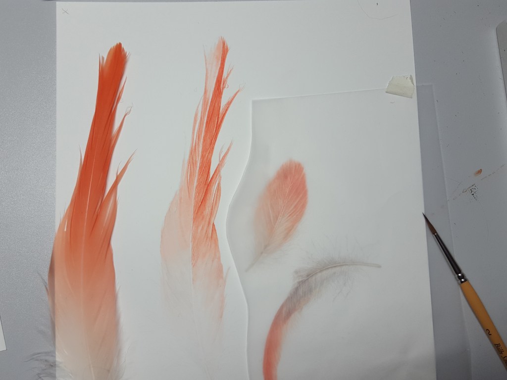
After a visit to Slimbridge Wildlife Park I was keen to paint Flamingo feathers. It was hard work trying to source some moulted feathers but eventually Birdland Park & Gardens in Bourton on the Water came up with the goods, thank you Simon at Birdland! www.birdland.co.uk
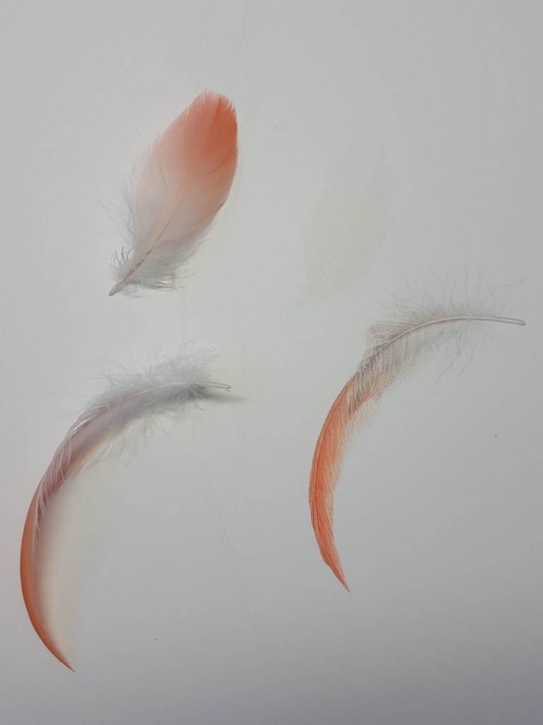
I selected three feathers from the bundle posted to me. I chose these three for their wonderful shapes and thought they made a lovely composition together.
A bit about Flamingos…
These tall wading birds are called Phoenicopterus and the feathers that were sent to me are from the Greater Flamingo species Phoenicopterus roseus. Flamingos have been know to man for thousands of years. They feature in cave paintings in Spain (5000BC) and the Egyptians used them as a symbol to indicate the colour red and even regarded it as the living embodiment of the sun-god Ra. The red/pink feather colour comes from a diet of crustacea and algae. Here are the Flamingos at Birdland in Bourton on the Water, Cotswolds. My feathers are from the paler birds.
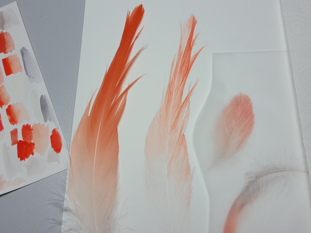
Mixing the pink!
To begin my painting I had to match the beautiful pink of these feathers. After a few trials, I found that Winsor & Newton Opera Rose (OR) and Cadmium Yellow Deep (CYD) gave me the rich bright orangey/pink I needed. Today (2022) I wouldn’t use these pigments as they are both opaque and Opera Rose is unreliable where lightfastness is concerned. I prefer the translucency of transparent pigments. Please note: I would most likely use Quinacridone Magenta and Indian Yellow.
Some other colours I mixed were various pale greys, a pink/grey, a cooler grey and a very pale yellow using Transparent Yellow (TY) mixed with a tiny bit of the Flamingo Pink I had mixed previously. I also use some of this pink to make my pink/grey. You’ll notice on my swatch that there is a slightly duller looking pink which I used for shadows and stronger details, this was mixed using Sennelier Rose Madder Lake (SMRL – Permanent Rose could be used instead), Winsor Orange (W.O) and Cadmium Yellow Deep. When re-mixing the Flamingo pink I had to test it a few times as the mix would look different with the slightest change in quantities.
Painting the curved feather
The curved feather had awkward angles and so I had to make sure the drawing was absolutely spot on. I started by adding pale washes and then built up the colour gradually. There were some deep shadows where it twisted and for this, I used stronger versions of my pale cool grey and beige/grey. I added a very pale glaze of Transparent yellow to warm the underneath pale wispy feathers. I created these deeper shadowsby working in between the whiter wisps, this is called negative painting. Note: the photo of the feather appears much darker than in real life. Again I used some iridescent paint towadd shine.
Painting the oval feather
The oval feather was a lovely shape but much paler than the others. It would be hard to keep the subtlety of this one without overpainting it. I built up the layers slowly and kept it as light as I could throughout. There were more highlights on this one which helped to keep it from looking flat. Also, notice the subtle shadows I have added along the right side and the left side of the rachis (mid vein), this enhances the curved appearance.
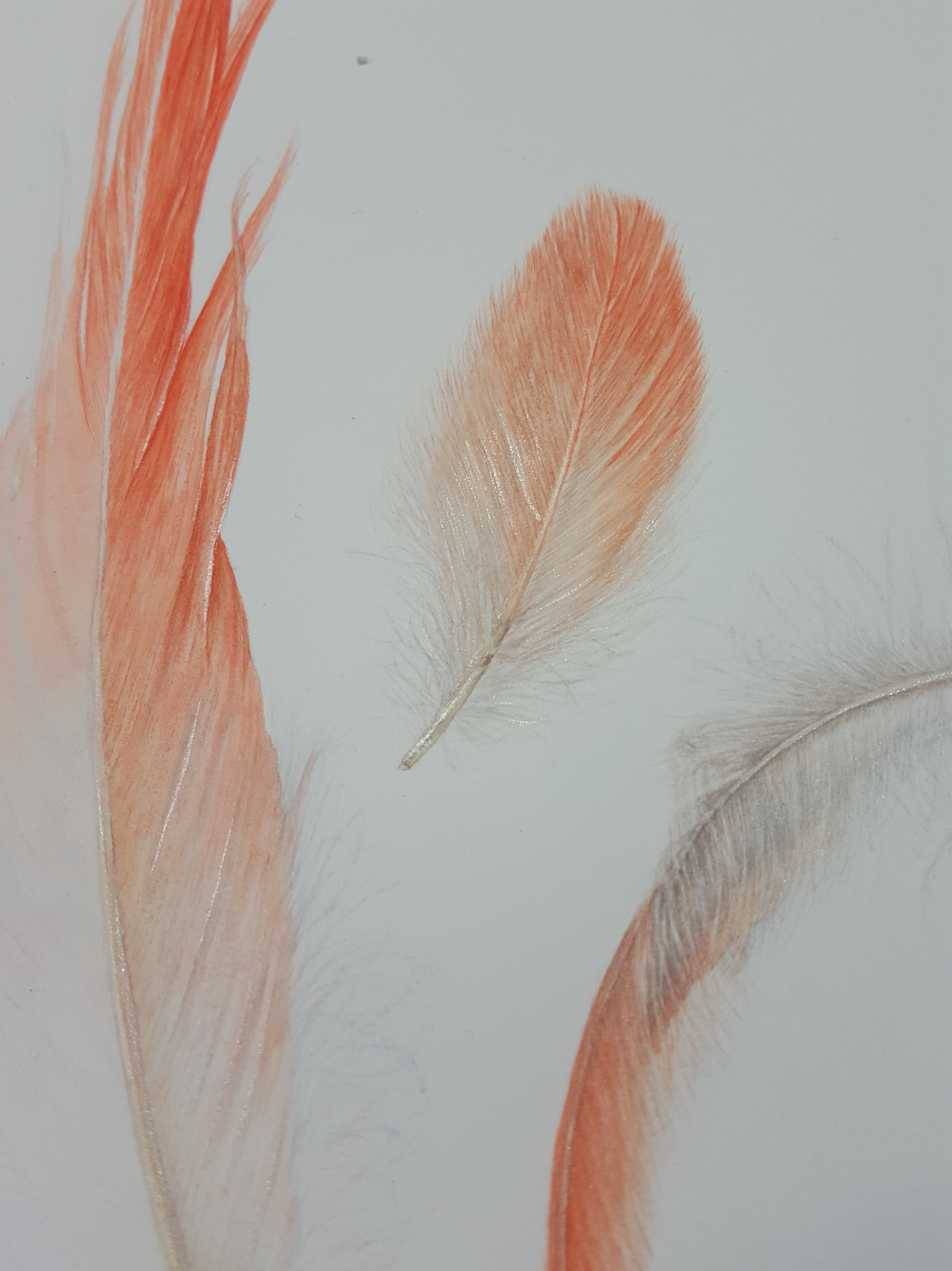
Painting the large feather
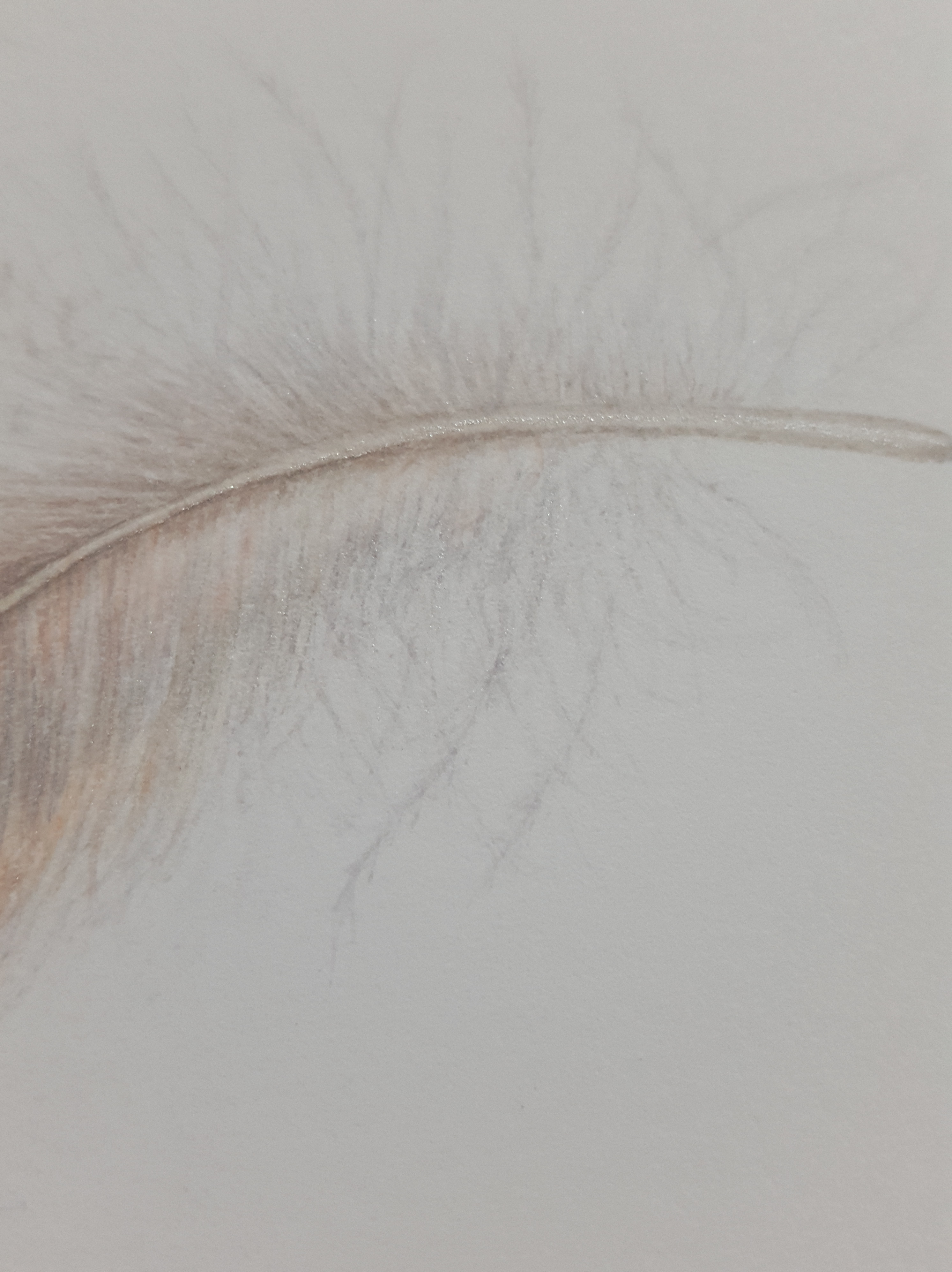
I saved painting this feather until last as it was my favourite one and the most striking in my composition. The top part has lots of furls and creases and the colour faded gradually down to almost white at the bottom. Plus, I thought to myself, how am I going to paint those tiny little strands!
I started with a very pale wash of my flamingo pink mix leaving the paler areas free of paint. I used a watery mix of the cooler grey and pink/grey to indicate shadows on the paler part of the feather. It took three layers to get the pigment up to the right strength at the top. I was now ready to add in the darker pink shadows on the folds and furls. To get the appearance of the tiny stands I used the same technique that I used in my Feathery Pursuits blog, the duller Flamingo pink was used to create the overlaps and shadow areas. The pink/grey and cool grey were used further down on the lighter areas. A little thin glaze of transparent yellow was also added along the right side near the rachis (midrib). Blog 5 contains a video showing you how to do this. See this link: https://jibotanicals.com/2016/10/01/blog-5-feathery-pursuits/
Painting the shiny white highlights
My paper was not white enough to show the shine on the rachis (midrib) and feathers so I turned to my Daniel Smith iridescent paints. Pearlescent White did the trick. If you shine a light onto the painting or turn it sideways you can see the glow of the pearlescent paint. I have yet to find a pure white that has such a good effect. The only time I use white or iridescent pigments is when it is absolutely necessary. On plants, there are sometimes very fine hairs which need a little white pigment to make them show up. White pigment is also opaque. I usually mix white pigment with a little colour as the hairs on a plant are never truly white. Well, I would just have to have a spotlight pointing down onto it if it’s ever framed and hung on a wall! This year, 2020, a good friend from USA purchased this painting and it is now framed and lit at her home in Conneticut.
Painting the after feathers – pale wispy bits
You have to approach this part with great care and start with a very, very pale colour. You can always add but you cannot take away! Pale watery mixes can be hard to work with but as long as you remove a little of the excess on your brush by wiping it on a cloth, you’ll be ok. They often dry darker than you think too, so test first. The grey and pink/greys are made with very strong pigments and would be almost impossible to erase out without damaging the paper’s surface. Using the cooler grey with a flicking motion, you can interpret the wispy feathers. Afterwards, I added a little pink/grey and very pale pink (see below) to define the thicker areas. Once I was happy with the result I added a few slightly darker strokes to imitate the shadows. It’s also good to add a few very fine chevron side hairs to some of the larger wisps. Not all of them or it would look too contrived! It’s hard to see on the image below but hopefully, you’ll see what I mean!
Now my painting was complete! Please excuse the greyness of the photos but these winter days are so dark and dreary in the UK!
I must apologise for no videos on this blog, however, I will be doing a blog in a few weeks about my Faded Magnolia Leaves painting and will try to video some things which will be of interest to you. I hope you enjoyed this blog and thank you for reading.
Until then happy painting and a very Merry Christmas & Happy New Year!
*All photos, content, text and videos are subject to copyright – Jackie Isard Botanicals 2017