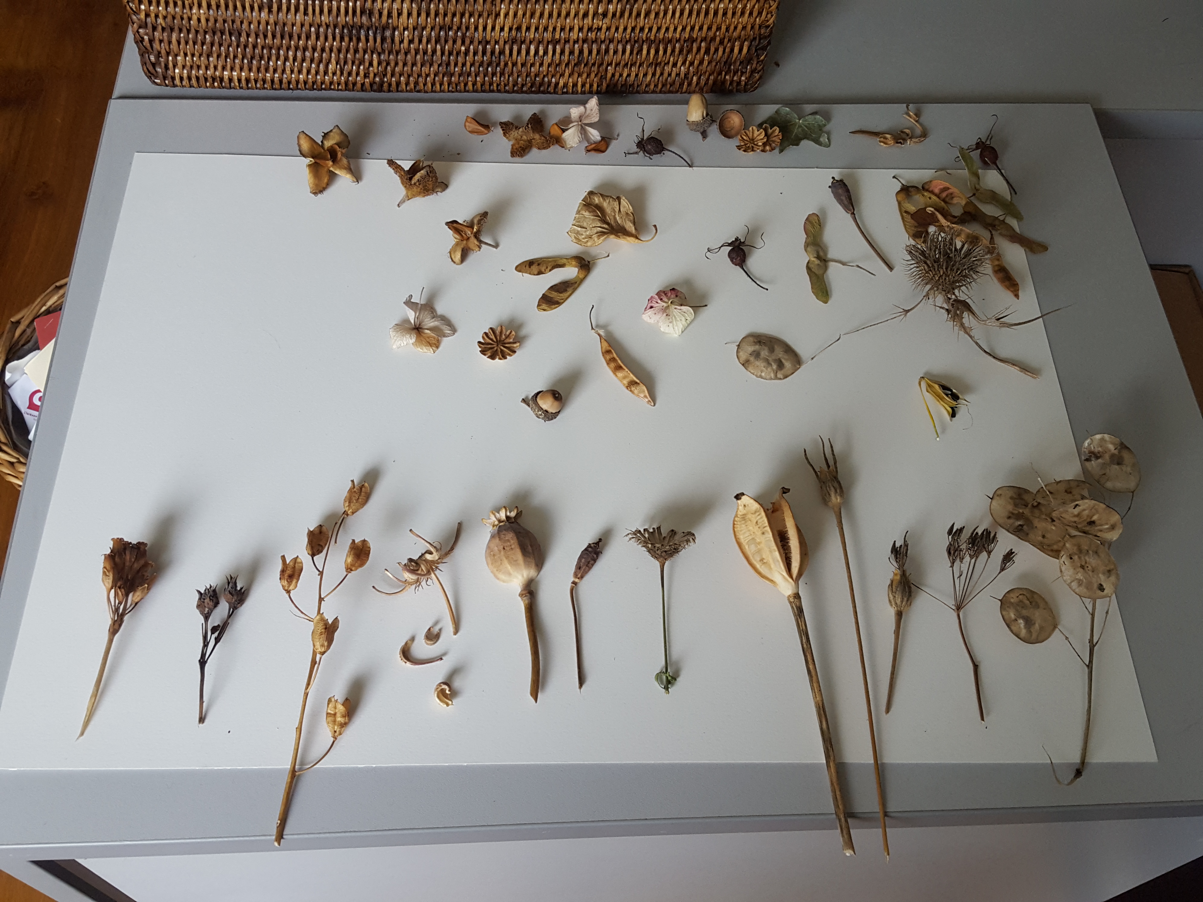
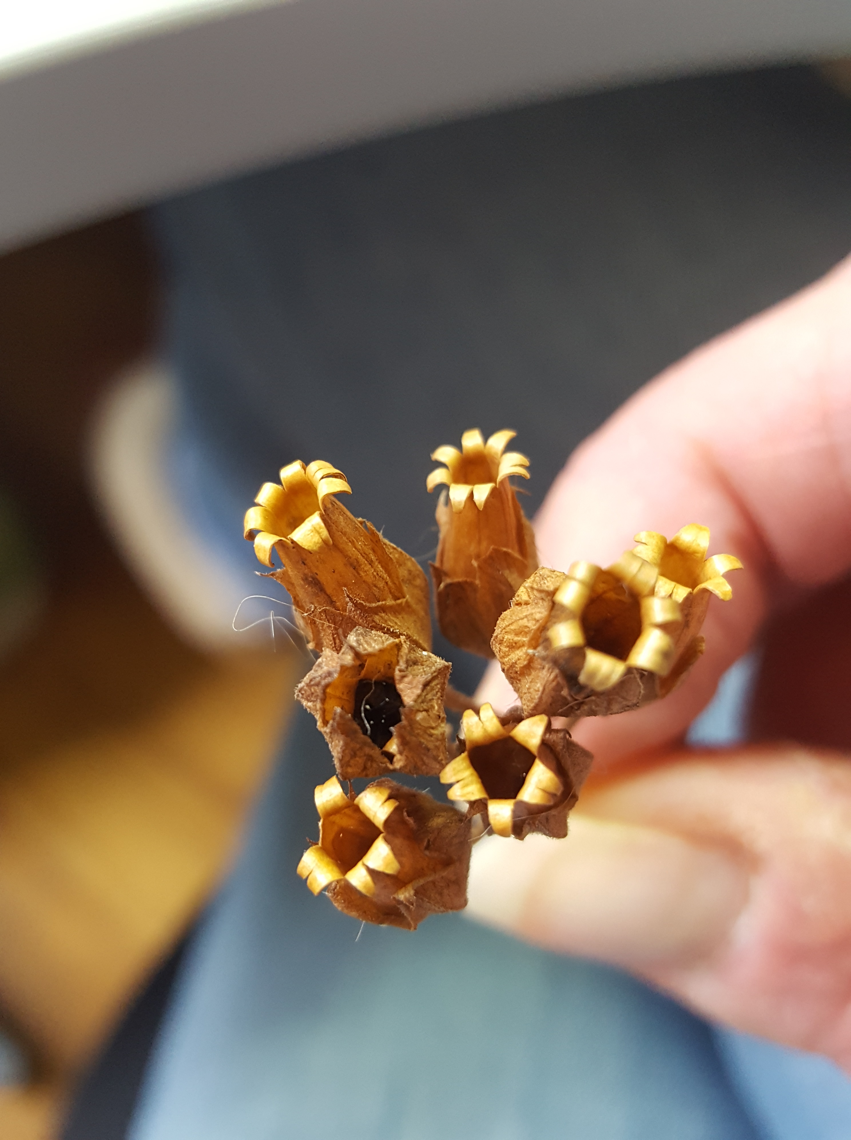
I have a passion for Autumn colours and all the bits and pieces you find on the ground at this time of year. I began collecting these seed heads around a year before I decided to make this painting. Like a lot of Botanical artists I soon found that I needed to invest in quite a few storage boxes!
I can’t believe the beautiful things nature throws down from the trees and plants in the Autumn. These little ‘vessels of life’ really are so very interesting. Firstly, I laid out my collection on the desk so I could decided which ones to use. Then I tried out different arrangements for possible compositions. This went on for about a week… I kept changing my mind! Please swipe the images below and on this blog from right to left. There is usually more than one!

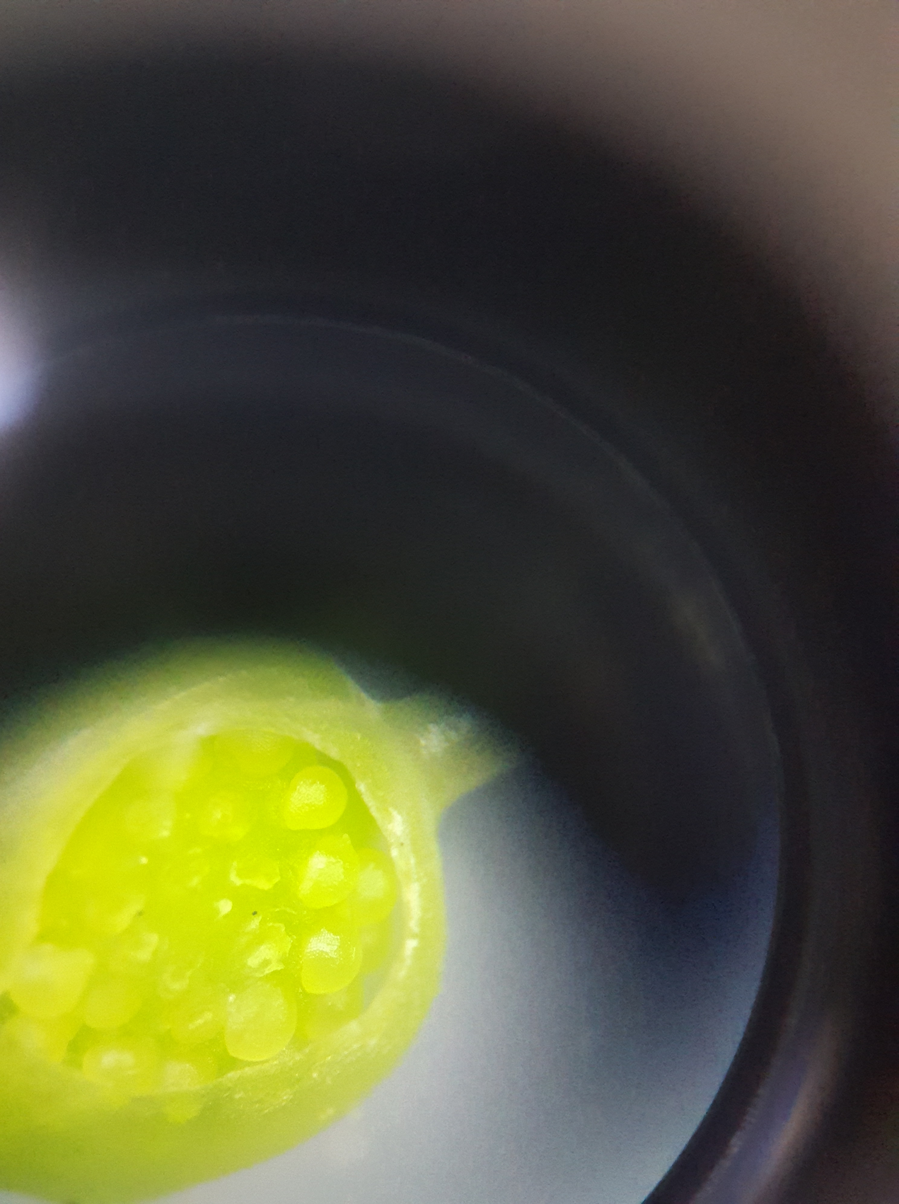
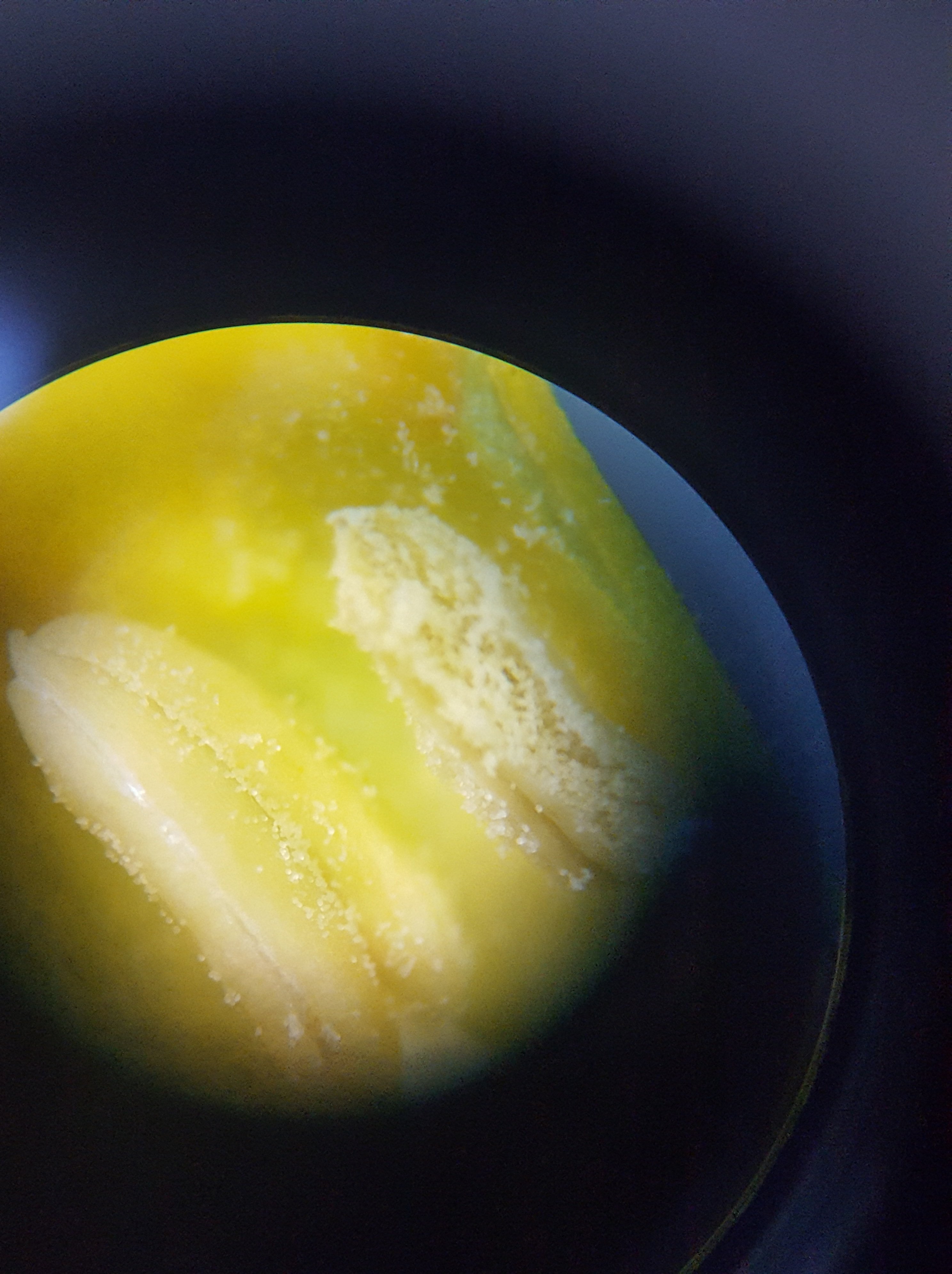
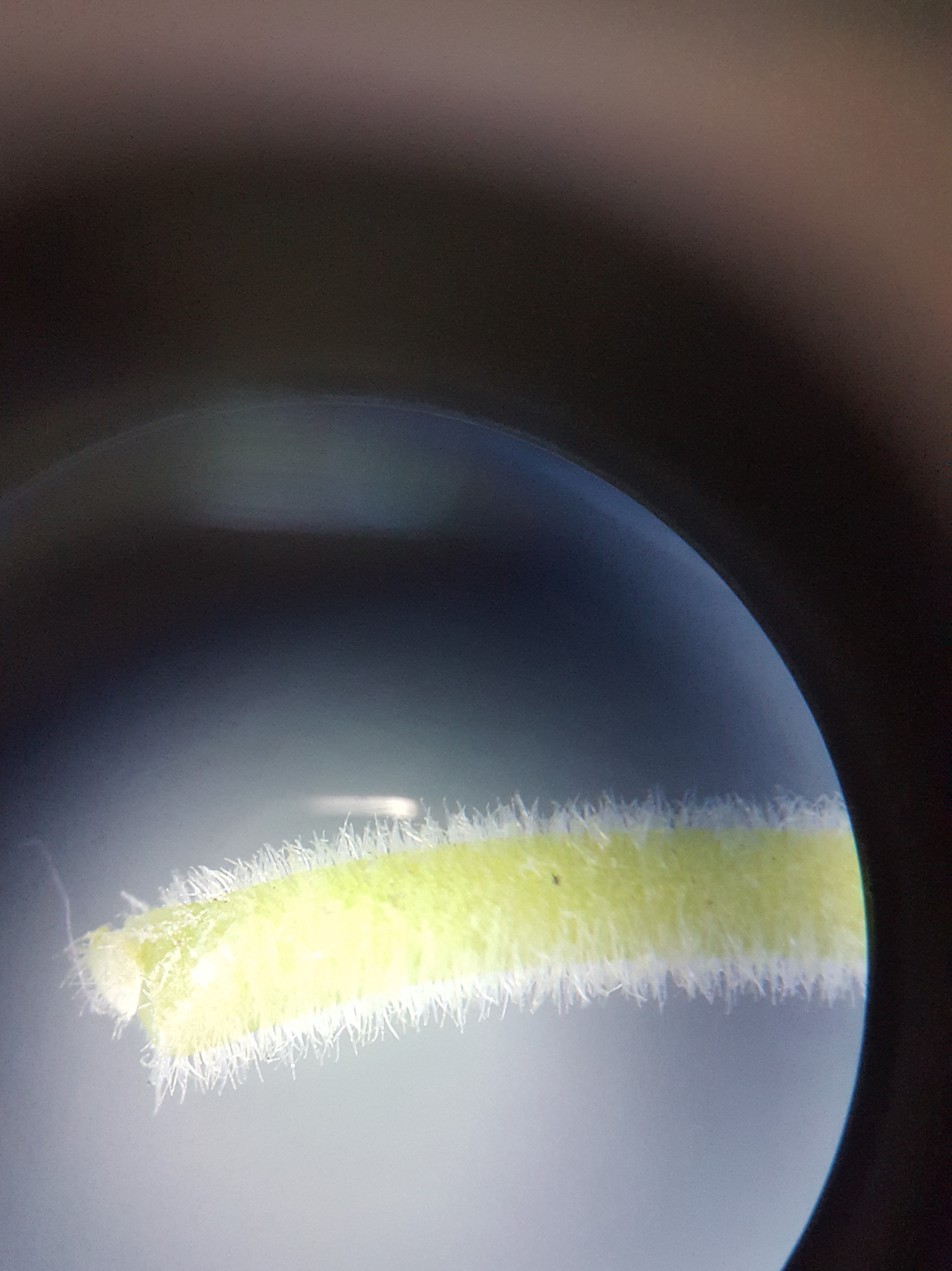
At Christmas I was lucky enough to receive a microscope from my better half. I decided to have a closer look at the little seeds falling out of my seed heads onto my desk. I don’t have a microscope camera but managed to take these with my Samsung 6 phone by resting it on top of the viewer. They proved very interesting indeed!

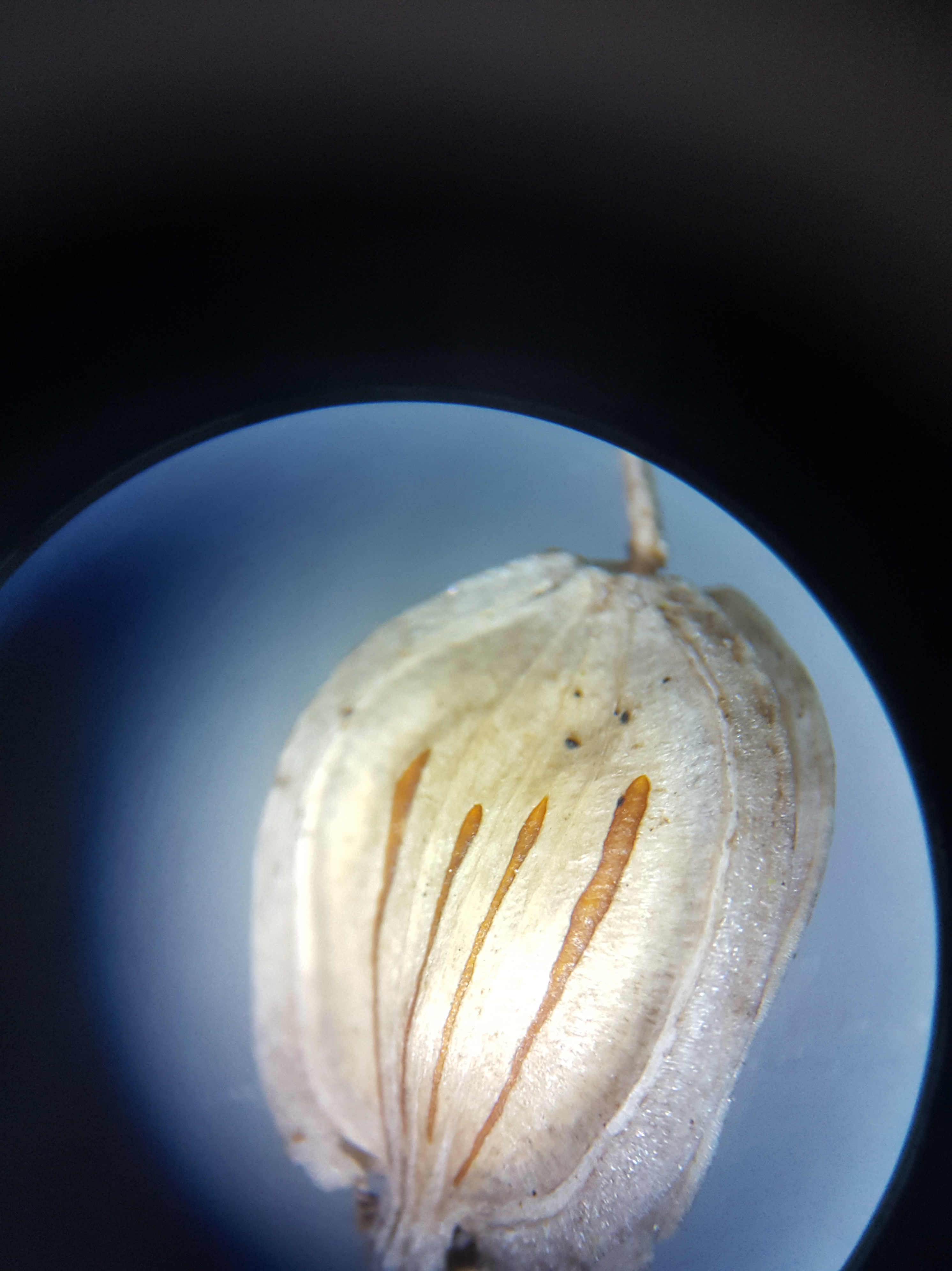


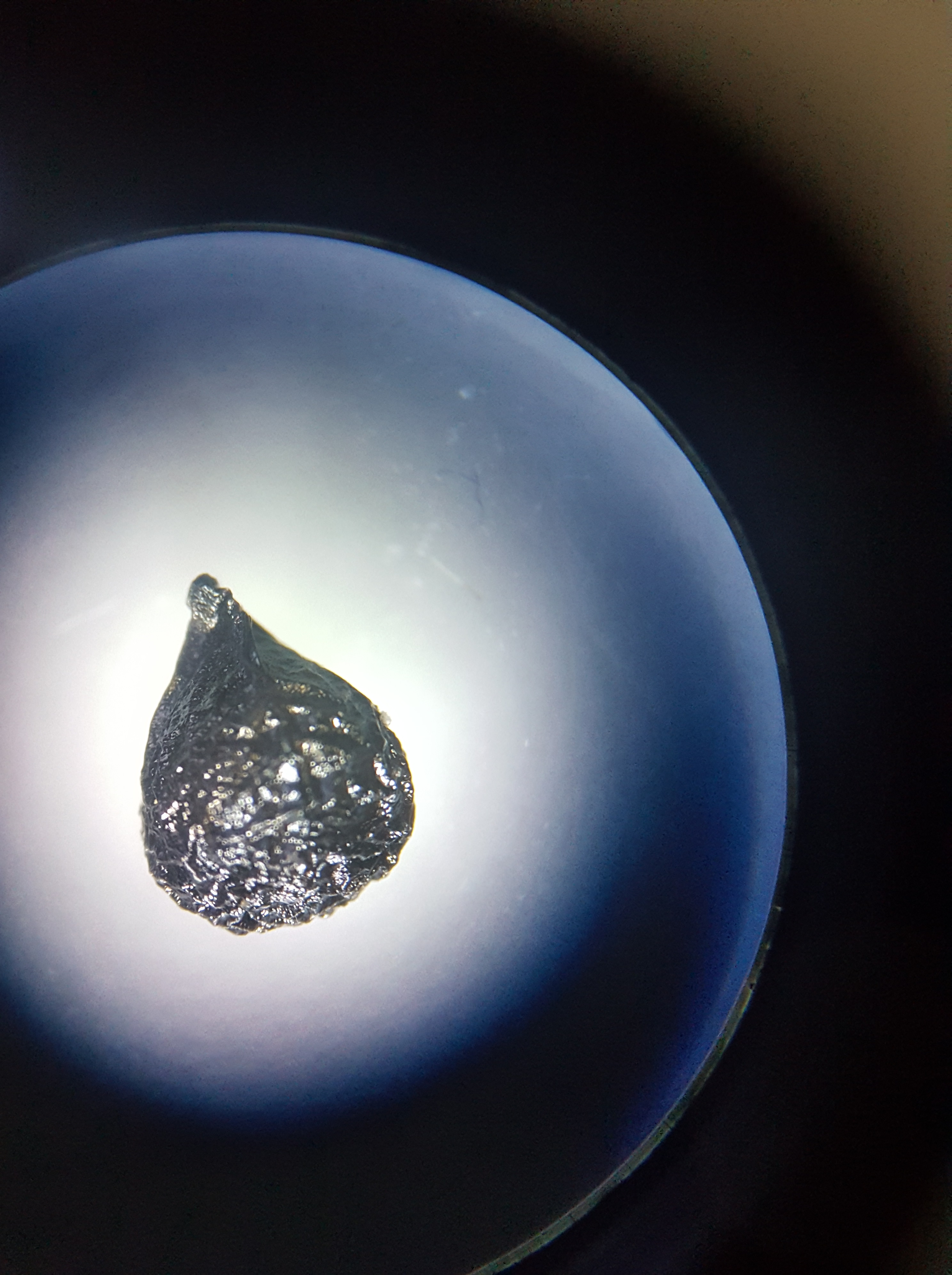
Recently, I find I am looking at almost everything under my microscope to discover what’s within. It really opens your eyes! I have found it a great tool for studying small flowers before I paint them. It gives me so much more information than with the naked eye.
Selecting my subject matter
So, I began by selecting the seed heads which I felt went best together and drew them all up on tracing paper. When I was totally happy with the drawings I outlined them in black fine liner and cut them all out….this was only the beginning! It then took me about another whole week of fiddling around and rearranging them in between painting before I finally decided on my final composition!
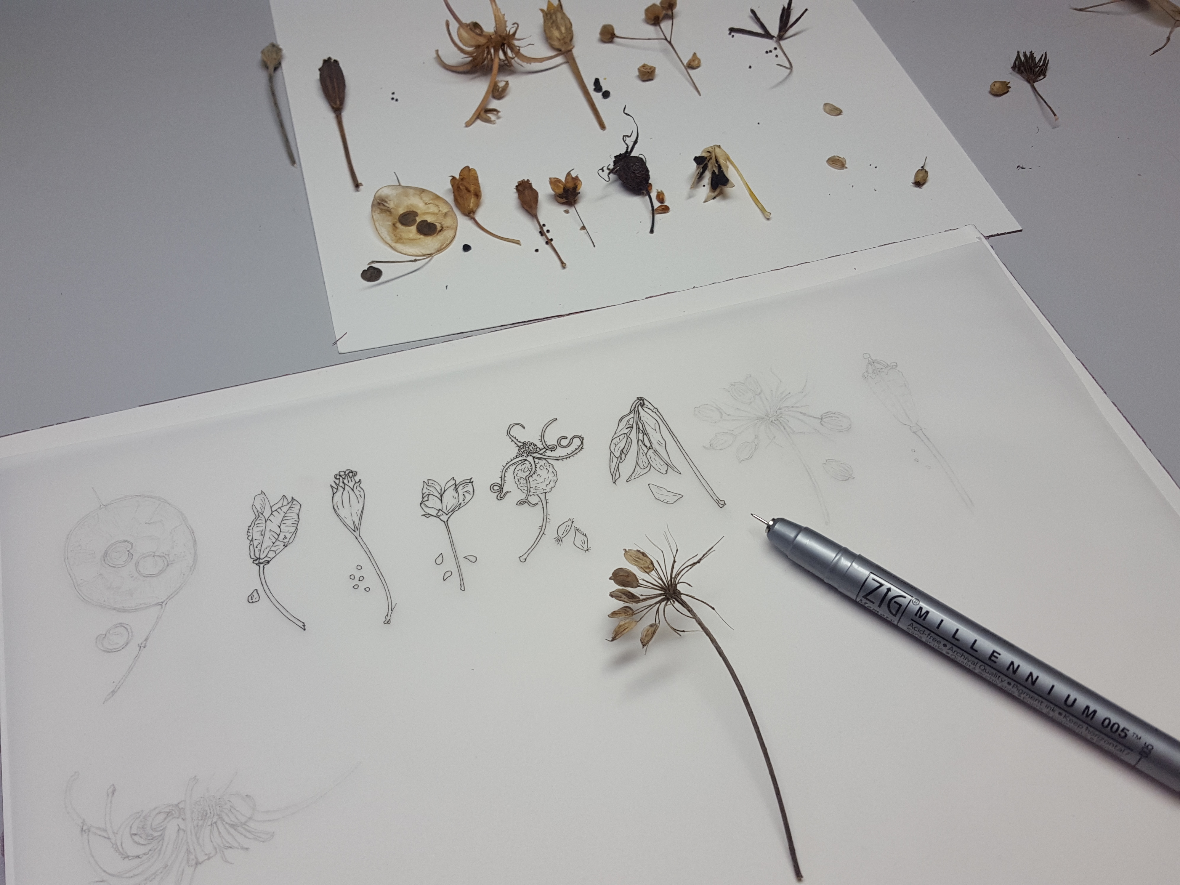

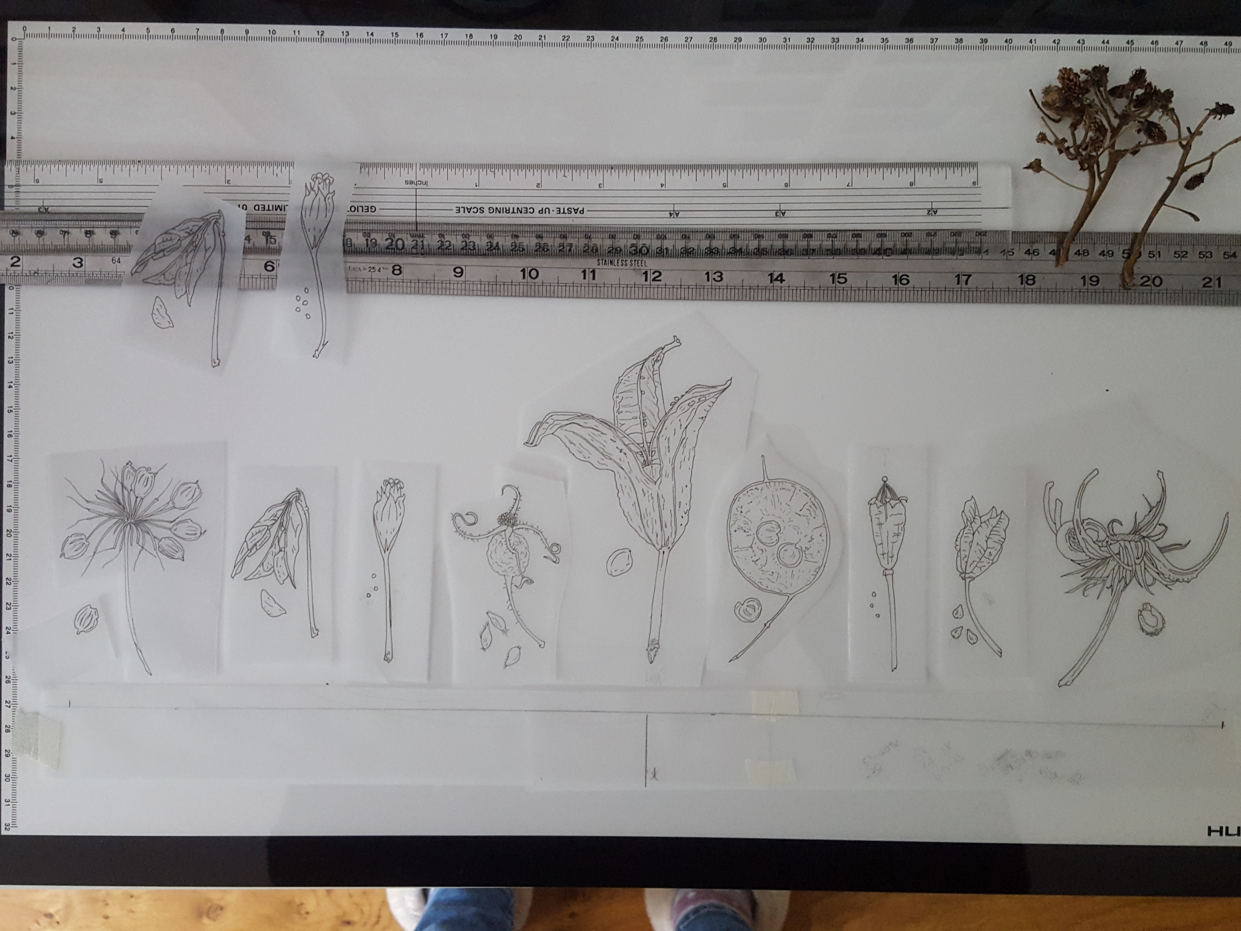
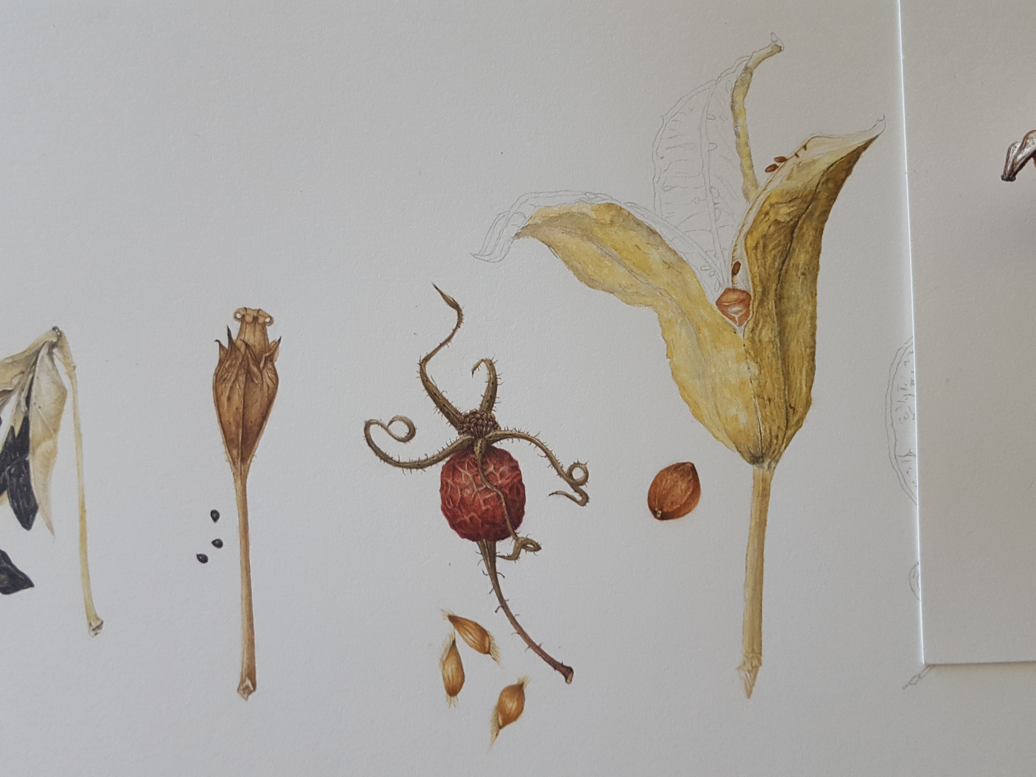
At last I was ready to transfer them to my watercolour paper using my light box. The ones I chose are as follows: Cow Parsley, Agapanthus, Cowslip, Rosa Glauca pourr. rosehip, Iris sanguinea, Honesty, Yellow poppy, Camassia and Marigold.
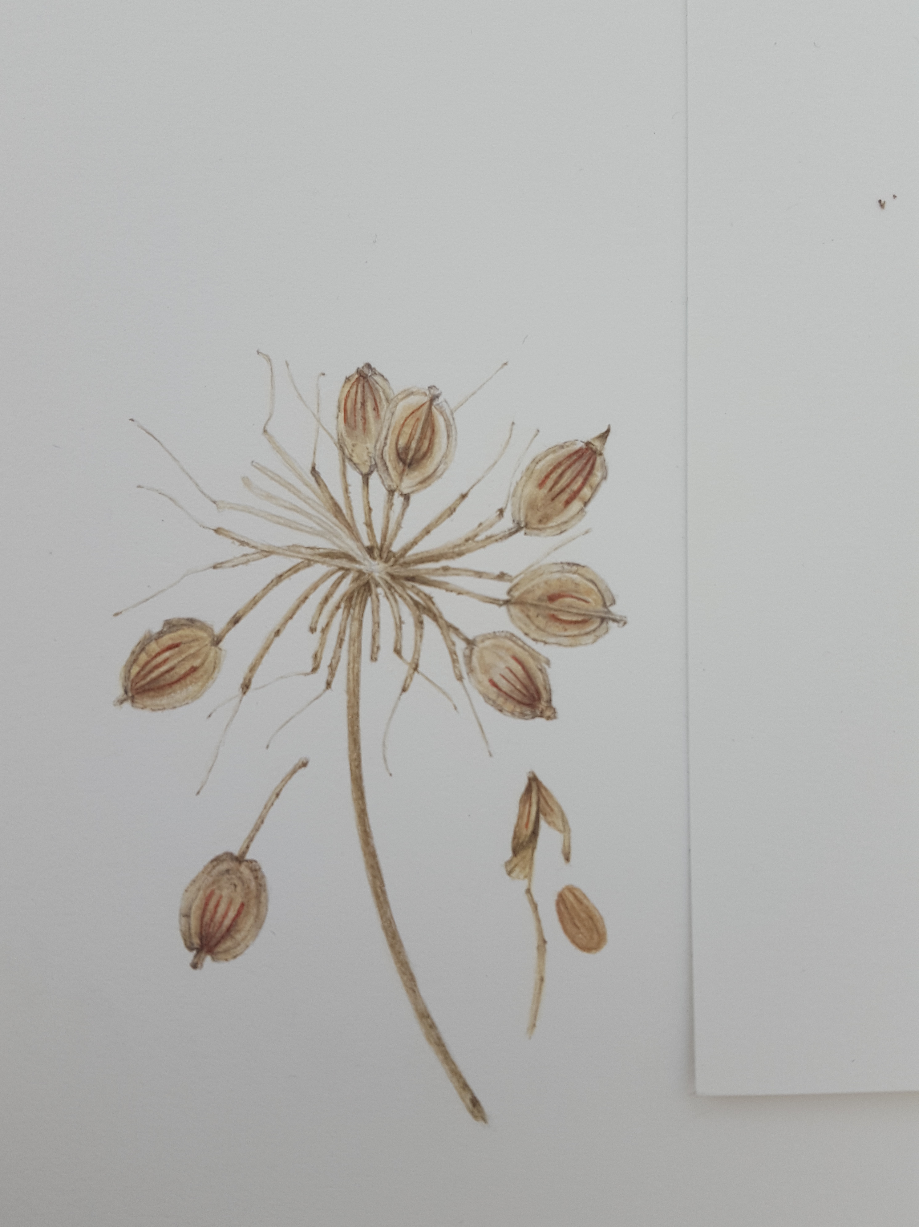
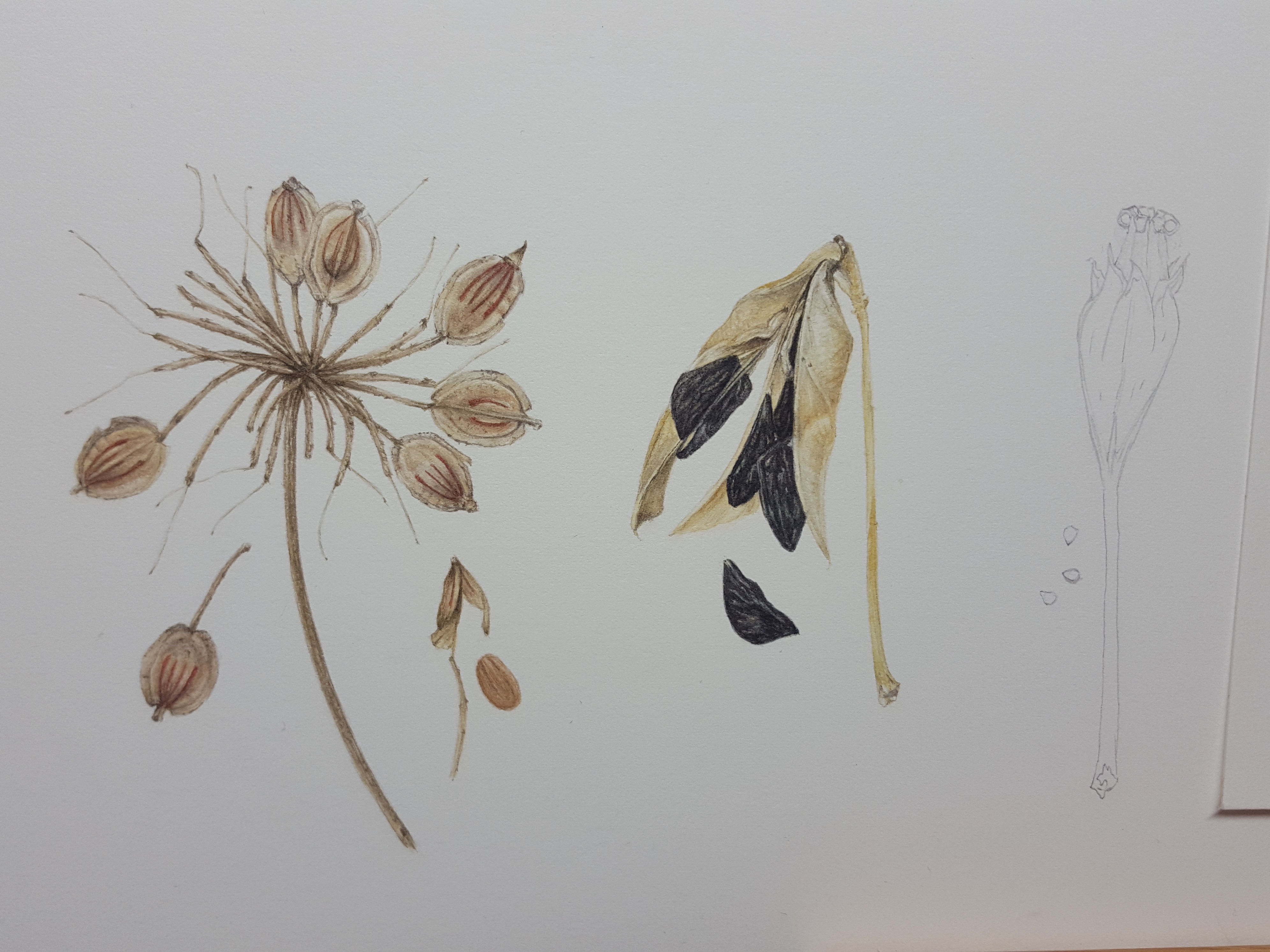
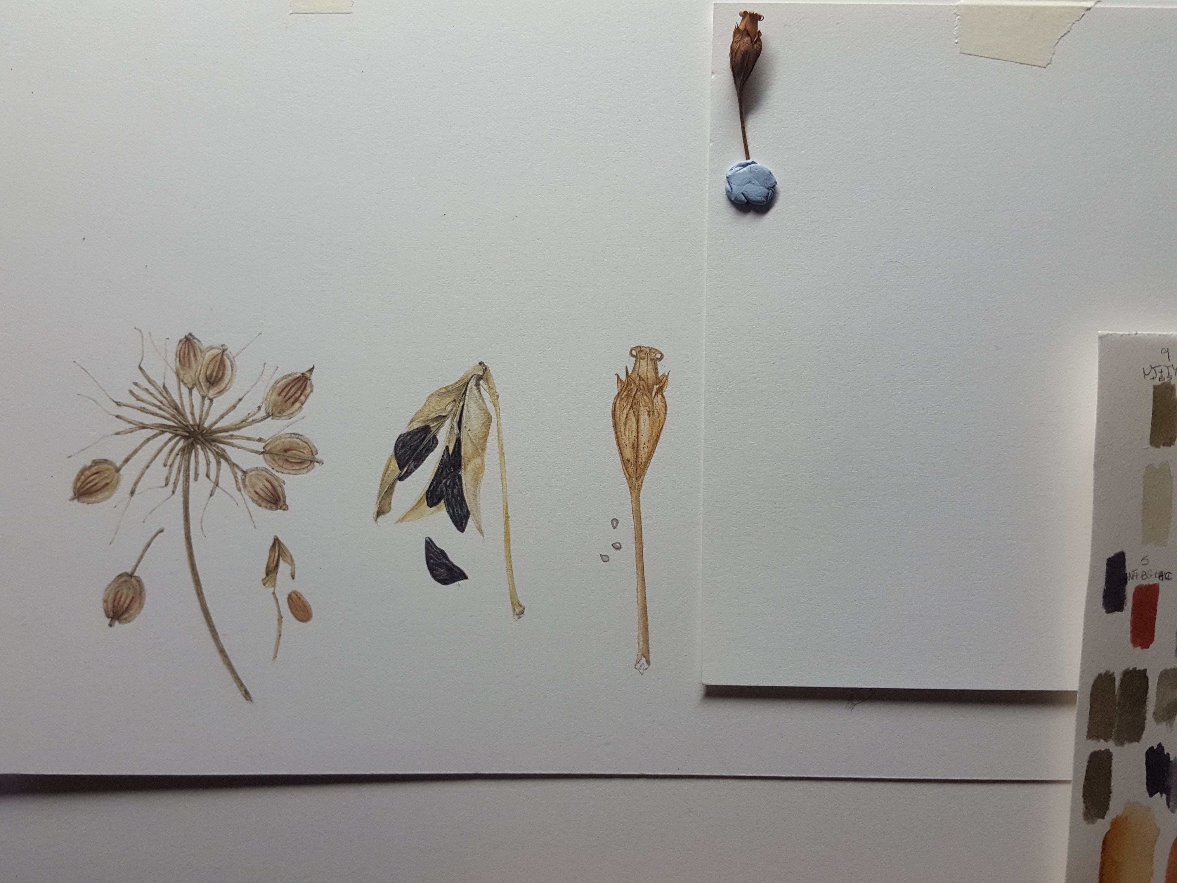
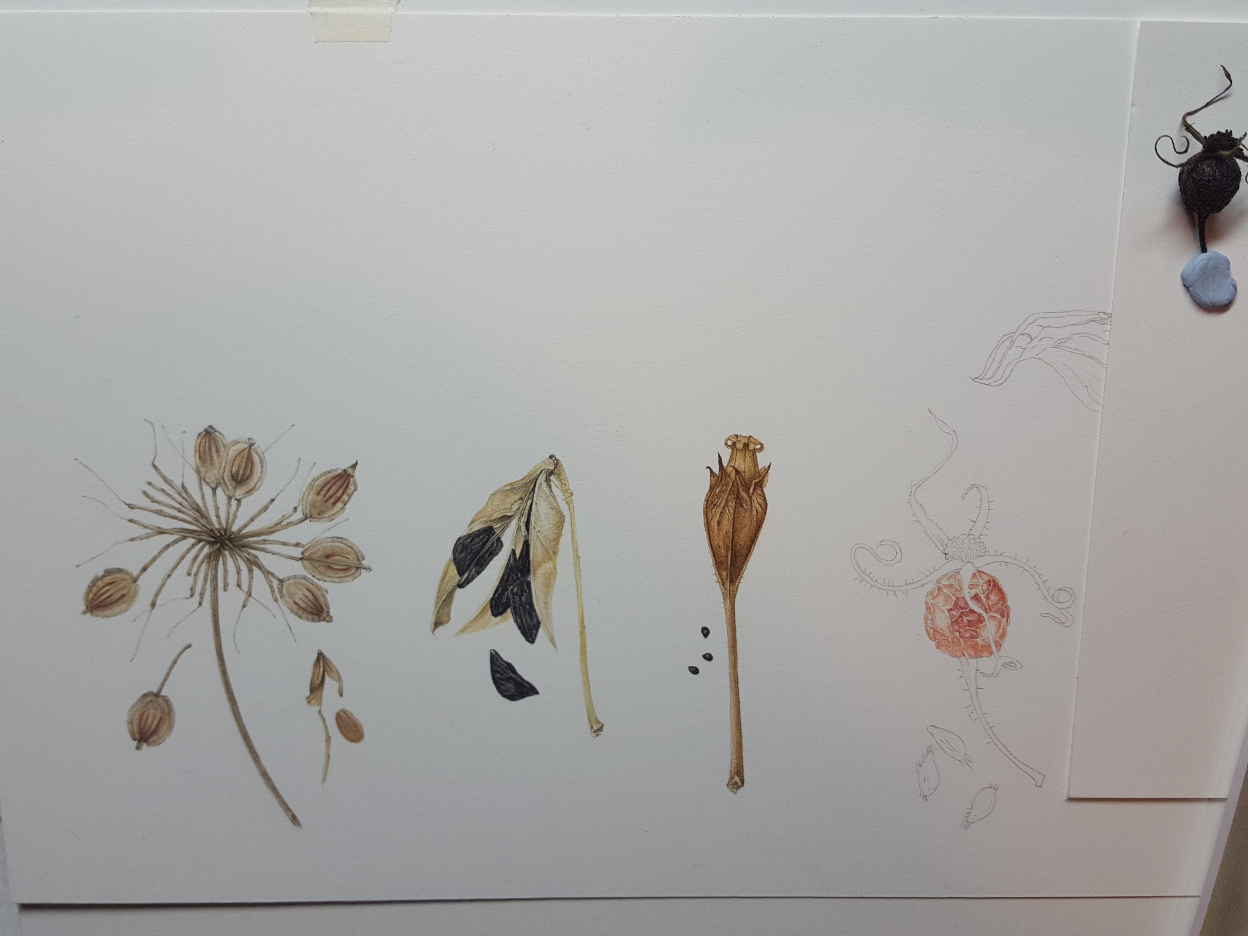
Cow Parsley seed head
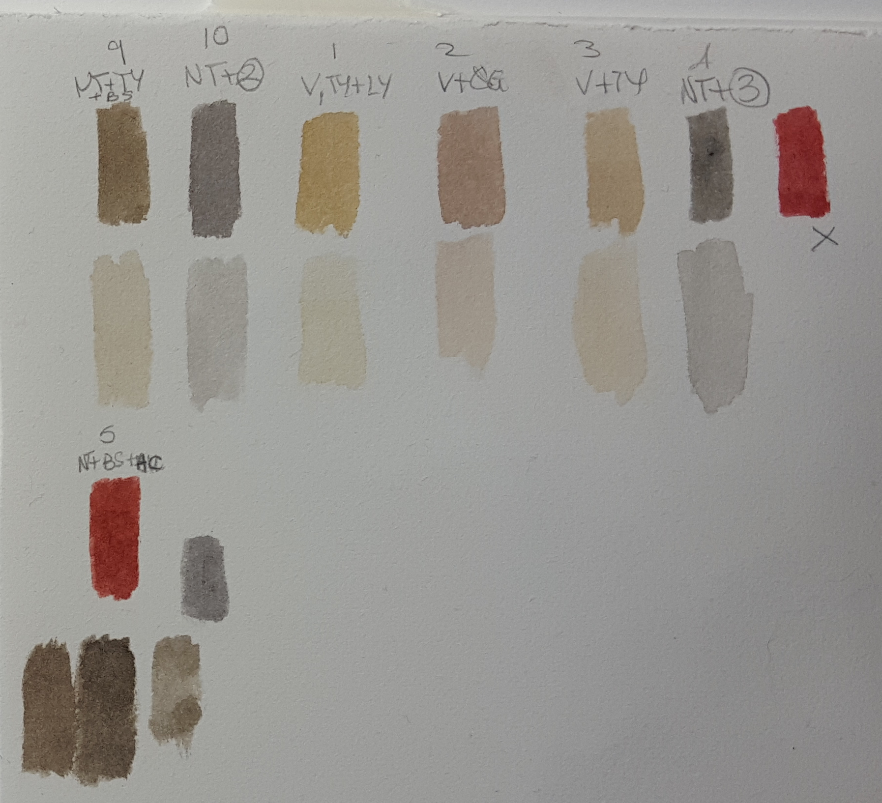
The first seed head on the composition was Cow Parsley. It has flat discs which pop open in the same way as Honesty seed heads and the seeds fall to the ground. They have little reddish brown stripes on them. For all my seed heads I have used very neutral tones of different beige, brown and grey mixes. Each one is very individual. Cow Parsley seeds are pale beige in colour but with a greyish tone, so I mixed up a range of colours and tints matching them against my subject as I went. It’s important to match your colours against your subject to get an accurate mix. Make sure the paint is absolutely dry though before you decide as these pale tones always dry darker than you think! I mostly used Winsor Violet (V), Neutral tint (NT), Quinacridone gold (QG), Winsor Lemon (LY), Transparent yellow (TY) and Burnt Sienna (BS) for this one. Please note here that I do not use Neutral tint any more as it is opaque. Opaque pigments will flatten your work. I only use transparent and semi-transparent pigments now. Thankfully very little of the mixes using NT were used in this painting.
And so I began painting the first seed on the sprig, firstly with a pale wash, then building up the shadow areas and tones to give it form. The stem was woody in appearance and the beige/grey tones worked well on this to give it that feel.


Here’s some little videos of me working on it.
I built up the individual seeds with my beige and grey tones to give the curved shape of the casing. This part holds the seed inside. I dissected a seed head to see what the inner seed was like inside and painted that too. It had an orangey/pink tone which I made with Burnt Sienna (BS), Quinacridone Gold (QG) and Winsor Violet (WV). Looking at the seed casing I noticed that the reddish brown lines were different on each side. There were 4 on the front and only two on the reverse. Some of the seeds were twisted on my sprig so the reverse showed. This was an important discovery! I studied all of my seed heads very closely before drawing them to ensure I understood all the detail which is needed to make them look as realistic as possible.
Agapanthus seed head
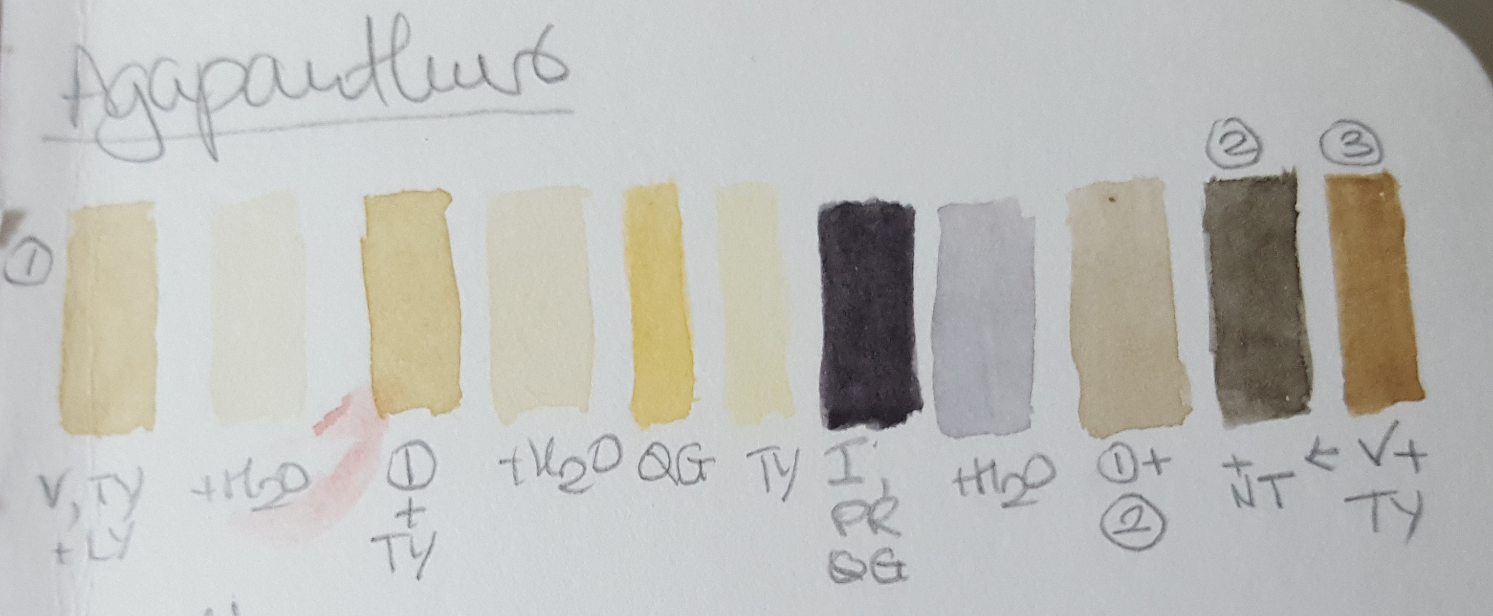
Next was the Agapanthus seed head. What amazing black, flat and crinkly seeds inside the pale yellow/cream casing! This one was tricky to draw as the seed casing twists open and curves exposing the seeds from within. These seed casings flick open and the seeds pop out, like sweet pea pods. The casing is a very pale and only has hints of colour so it is important not to overwork it and retain the highlights. I left paper white highlights and painted deeper shadow tones to create contrast. I used similar neutral mixes but Transparent Yellow instead of Quinacridone Gold as it is brighter. Quinacridone Gold would have dulled the mix. I mixed a selection of warm greys of different tones for the shadow areas. For the seeds I made a nice blue black out of Permanent Rose (PR), Quinacridone Gold and Indanthrene Blue (IB). I left paper white spaces between the strokes to achieve strong highlights and give the appearance of the crinkled surface on the seeds. At the end I added a little (very watered down) Winsor Blue tint over the seeds in some areas to enhance their blackness and shine.

Cowslip seed head
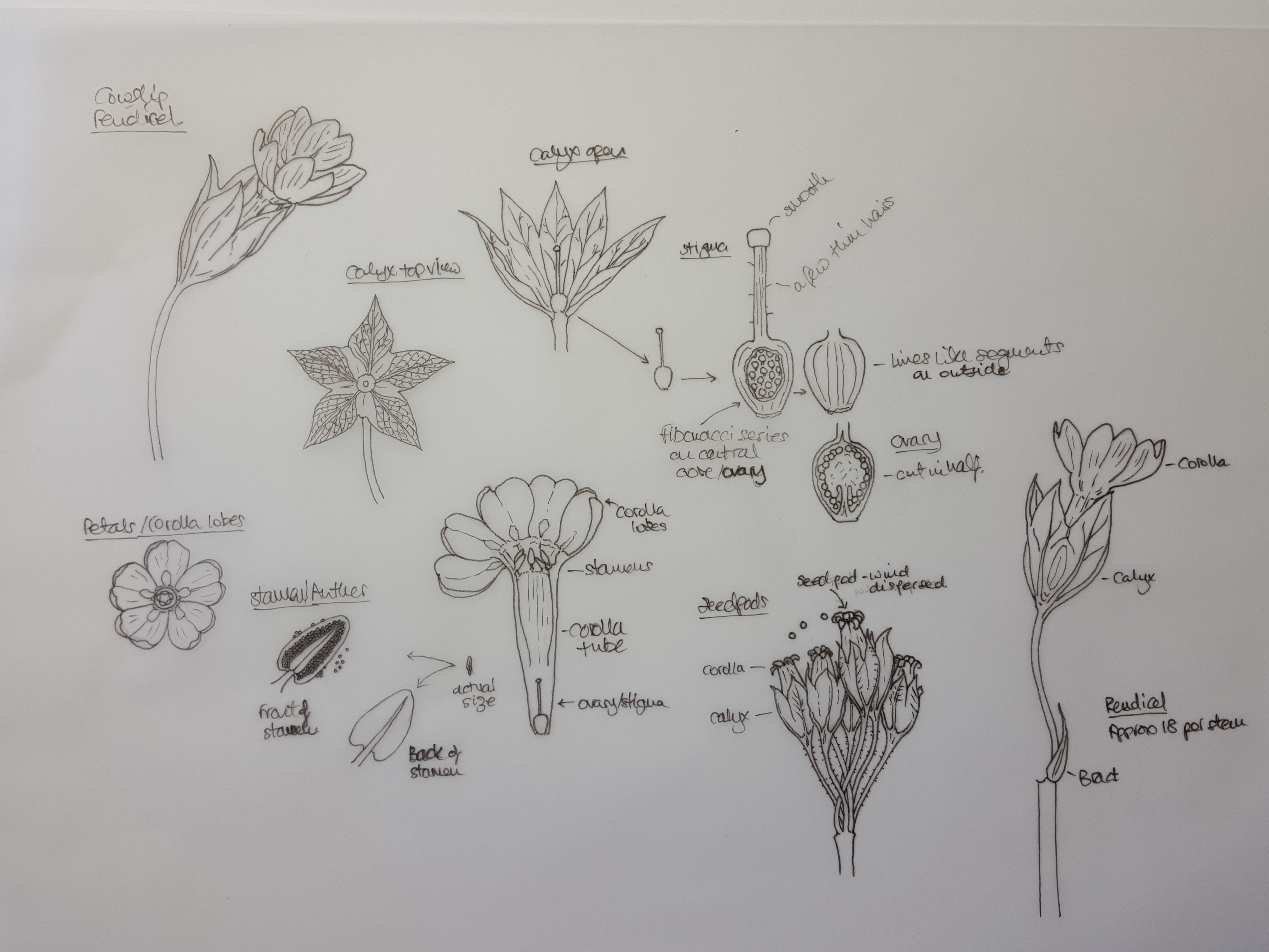
Next on the agenda was the Cowslip seed head. Cowslip flowers are really interesting as when they dry, the petals (corolla) curl back to form the top of a little ovary cup in which the seeds sit. The sepals (calyx) become the bottom part of this container. as the ovary swells inside it. The seeds are dispersed by the wind as they shake about. Below is a diagram drawing which I drew showing the flower parts and some microscope photos of the Cowslips’ ovary, stamen, stem and leaf detail. You may be familiar with the fibonacci series found in nature, well, in the ovary where the seeds are formed, the immature seeds sit inside their capsule forming the fibonacci spiral pattern.


For the seedcase I mixed some warm browns and some warm reddish browns using Winsor Violet (WV), Quin Gold (QG). In some of the mixes I added Burnt Sienna (BS) or Sennelier Rose Madder Lake (SRML) to enrich them. For the darker browns I used Indigo (I), Quin Gold and Burnt Sienna and a little Burnt umber (BU) to the darkest brown mix. For the very darkest brown I used Indigo, Permanent Rose and Quinacridone Gold, almost a black mix but with less blue. Please note: I do not use Indigo any more due to it being opaque. When mixing these colours years ago I thought I needed to use a very dark blue or grey to darken brown mixes. This is not so. Indanthrene Blue, Permanent Rose and Quinacridone Gold would make these mixes easily and they would not be opaque.

I started working on the first layer with pale tones and then added stronger colour for the detail and shadows. I had to work very carefully to get the shadows into the corolla curls at the top!


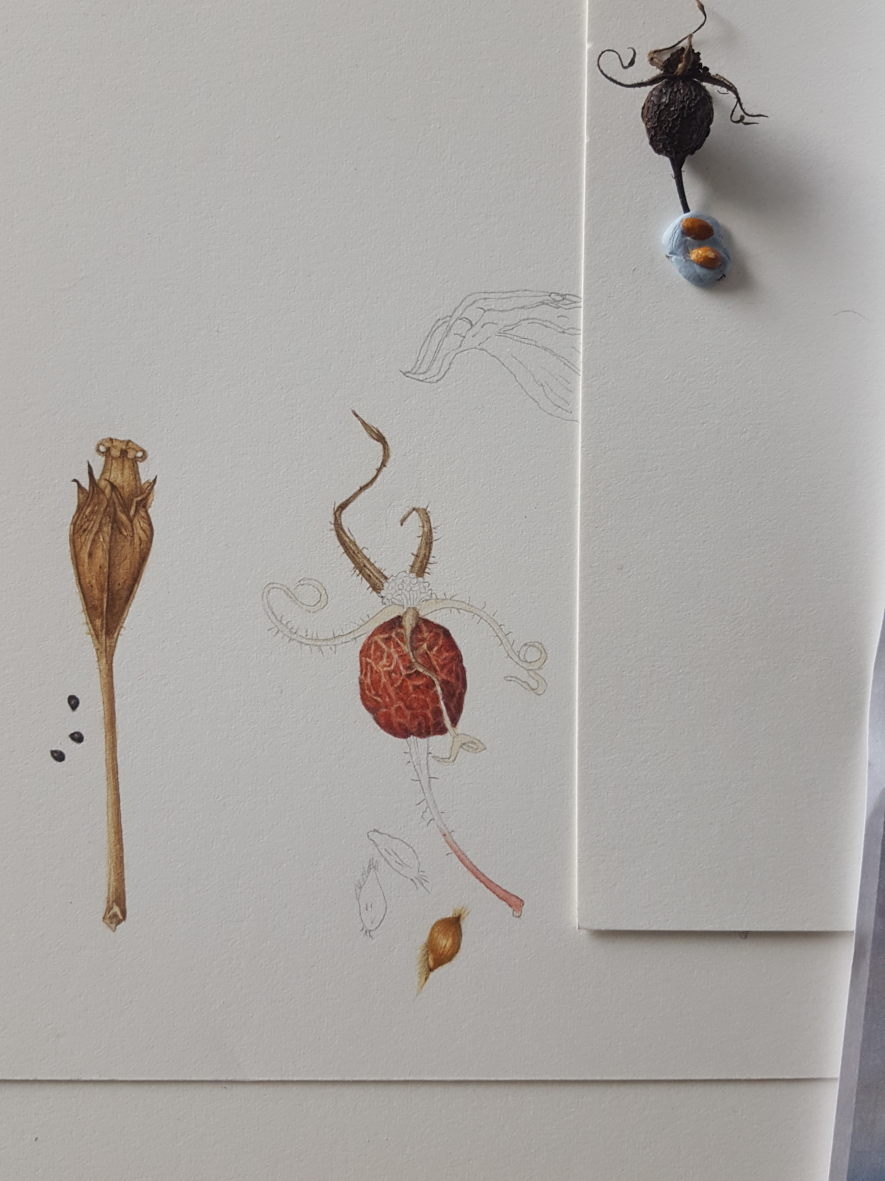
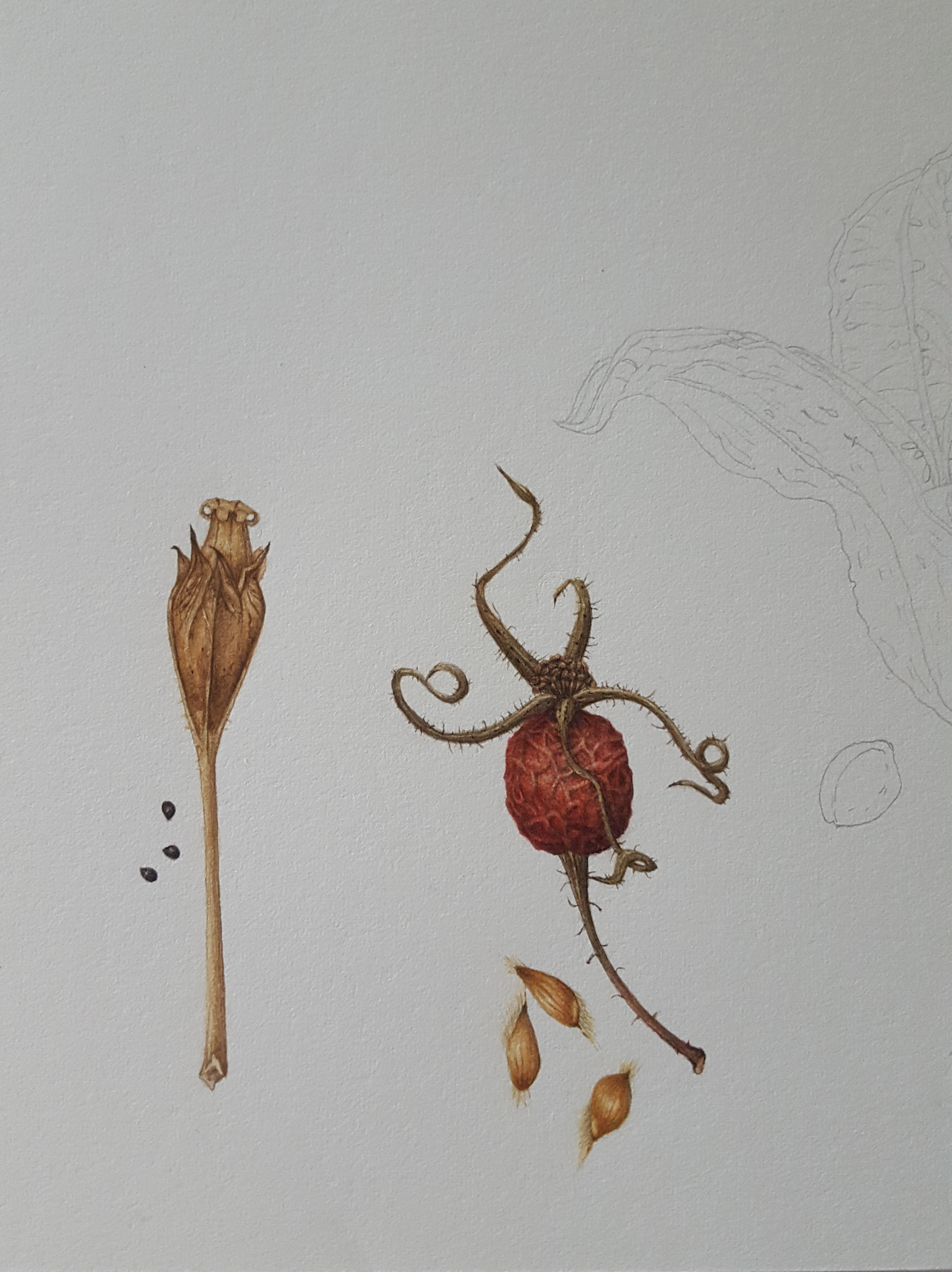
Rosa Glauca Pourr. Rosehip
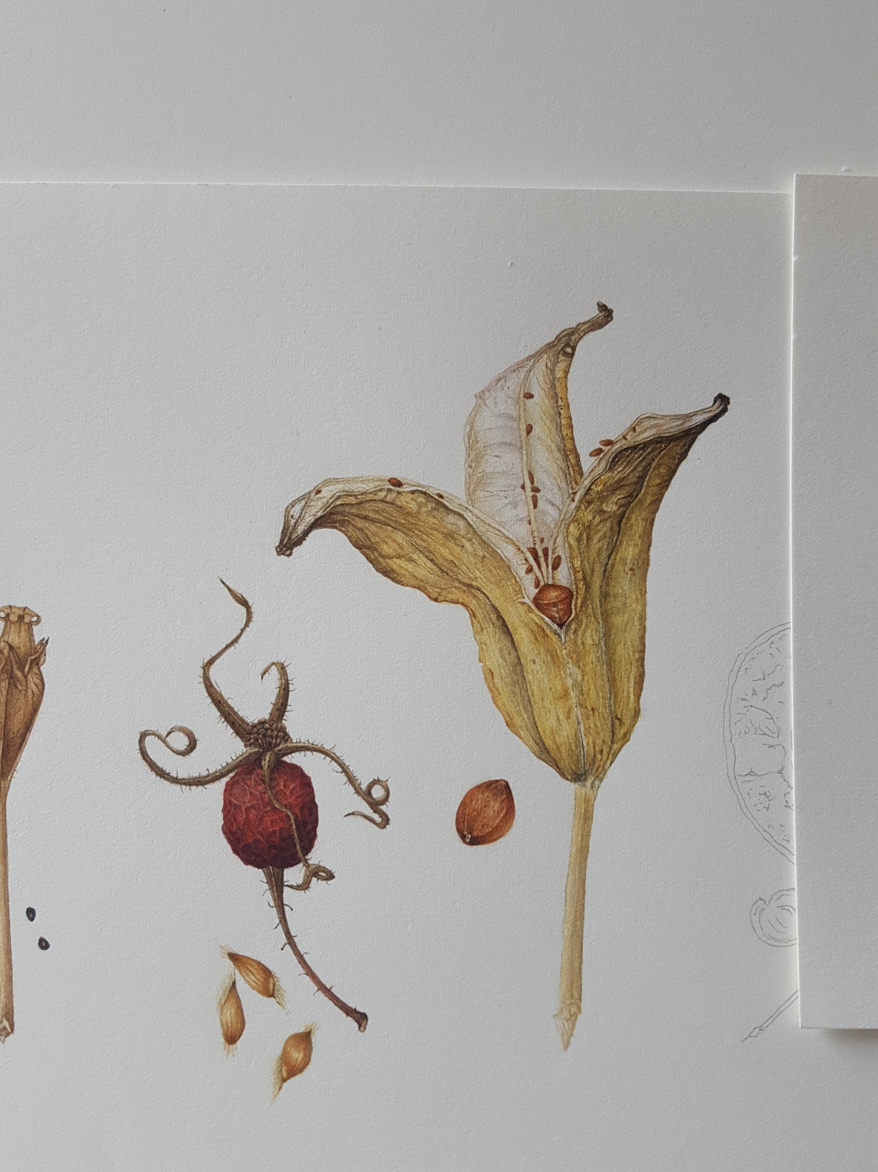
The next seed head was the Rosa Glauca Pourr. rosehip, …not a seed head I hear you say! Well it is a seed head but this time the seeds inside the rosehip are injested by birds or they rot on the plant and fall to the ground eventually. The hip contains quite a few seeds inside it’s skin. This rosehip was turning dark red and black and drying out hence the crinkled surface. It was hard to keep the highlights as the crinkled areas were very small. My favourite part were the sepals, wonderfully curly and spikey! I used a lot of colours and tones for this piece.

I started with a thin wash of my red mix leaving unpainted areas to create the highlights where I saw undulations on the surface. I then built this up slowly using shadow tones mixed using my original red and browns to achieve the round form. I will admit it was very hard to keep the highlights as this piece is very small. On reflection now (2021) I would have started the initial layer by painting in the shadow areas in a thin glaze of WV. Then I would paint thin layers of the red mixes afterwards gradually building up to the stronger red. This way I would have found it easier to retain those highlights on the creases. Once I finished the hip I used my brown and black mixes to develop the sepals and stalk. The seeds within the capsule have tiny hairs at both ends and almost look like waxy apple seeds.
Iris sanguinea seed head
The Iris sanguinea seed head was larger and more complex than previously painted ones. This would be more of a challenge! A friend gave me this seed head as a gift as I thought it so interesting! I loved the curves and colouring. I thought it would make a perfect focal point to my painting, right in the centre! This one was great to paint as it had immense detail. It is shaped like a cup and the seeds sit in rows. As the Iris cup curls open the seeds drop out. This seed head has very strong yellow tones on the outside mixed with shadow greys. It is very pale inside so I needed to mix some very watered down grey tones and take care not to over paint these. The seeds are a dull orange/brown. My colour mixes included my regular pigments, as previously on this blog, but I added SQG is Sennelier Quinacridone Gold deep, SI is Sennelier Indigo and SMRL is Sennelier Rose Madder Lake. Please note: Again the Indigo and Neutral Tint would be omitted and a 3-way blue, red and yellow mix used to make the browns and blacks.
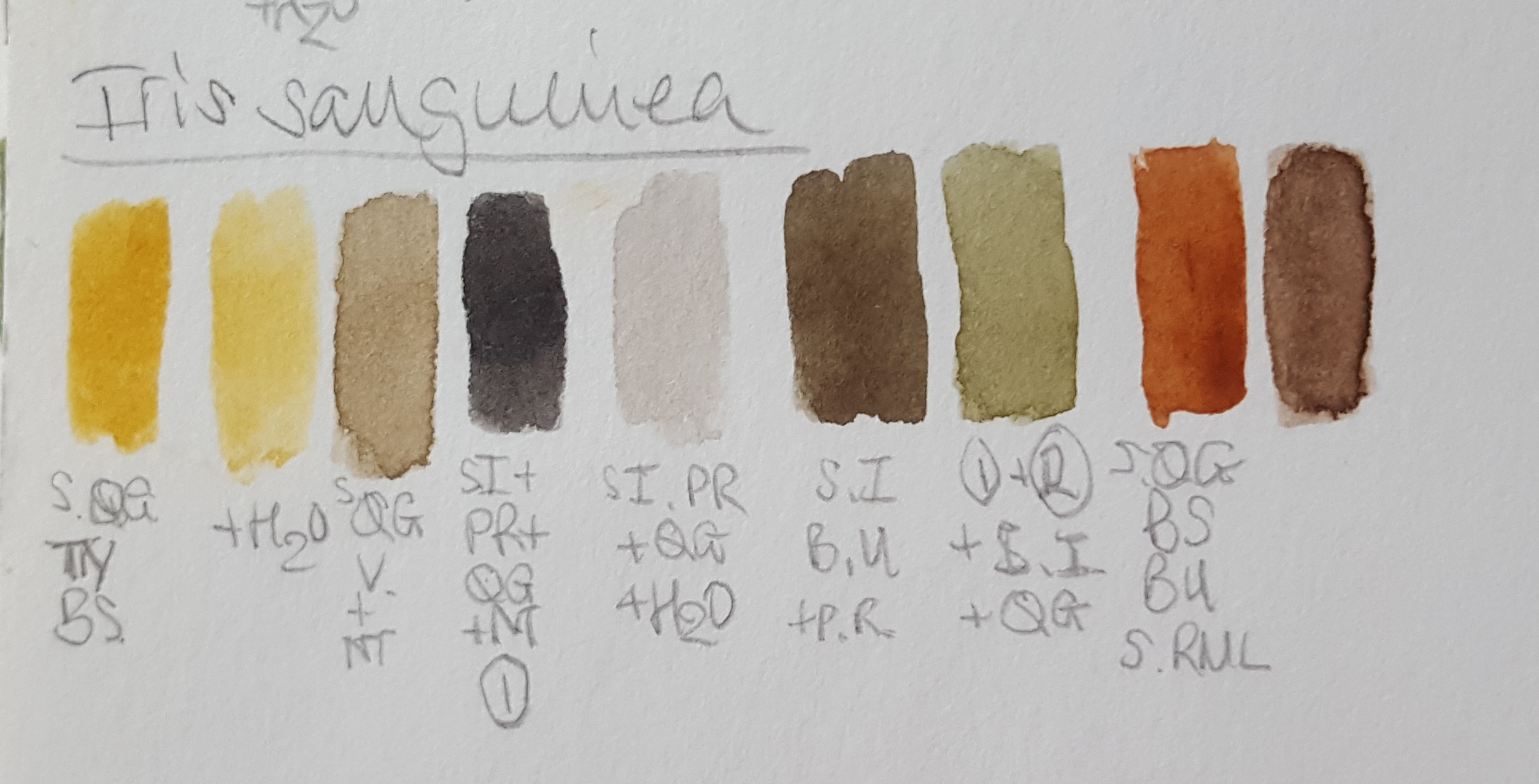


This was one of the hardest ones to paint and the finished piece looks like this, I spent a long time creating the wrinkles using cool and warm neutral tones and neutral greys to make the cup look three dimensional.
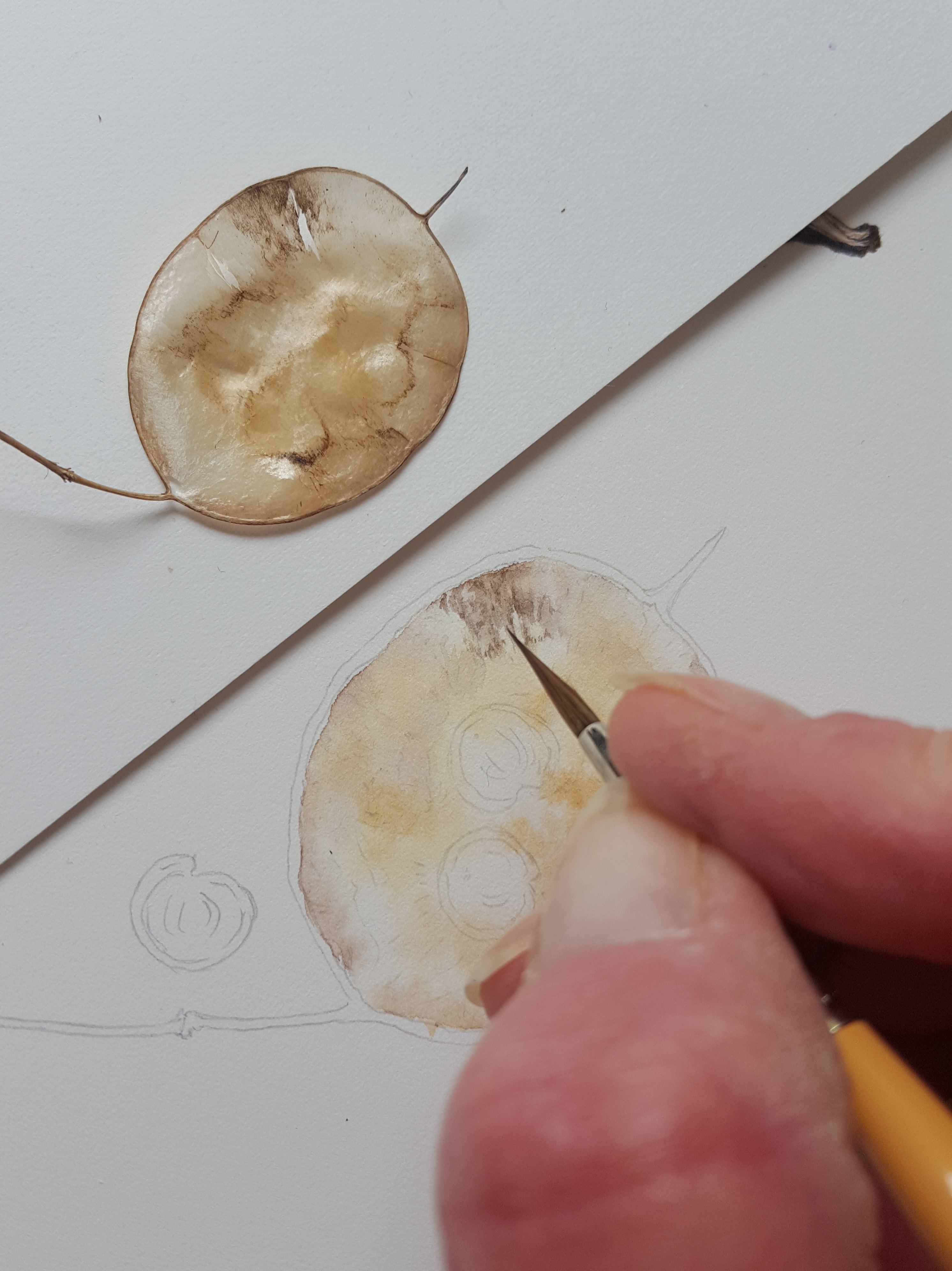
Honesty seed head
Honesty…. this is very tricky to paint! It has such subtle tones all over and needs perfect highlights to keep it looking shiny. Again I used the same colours to make my neutral tones which were very watered down, as below. An Honesty seed head is papery thin and made up of three layers. In between each layer sit the seeds and the whole thing pops open to let the seeds drop out.

I started by putting a thin blobbed wash of the cream/yellow mix over the areas which were darkest in the centre and the paler beige/grey tone around the sides. There were tints of a pink/orange around some of the edges too. It’s good to study your subject and look for all the tones before you start painting. There were many different shades and tones in this delightful little subject. It was hard to create a shiny feel which is so apparent in these seed heads but keeping the highlights very light helps.

Here’s a little video of the beginnings:
Once I had finished the background by building up colour to define the undulations, I then painted in the edges, stem and the pointed spike at the top, which brought together its shape and form. I decided to add 3 seeds to the painting. I was only going to do 2 seeds originally but decided 3 was a better balance. I used various shades of browns for the seeds and a very dark grey mix (PB, IB and QG) to define the shadows. I had collected a number of seeds and selected three that varied in their patterning to make them look more interesting. A little deepening of the central beige and cream/yellow tones added more depth.

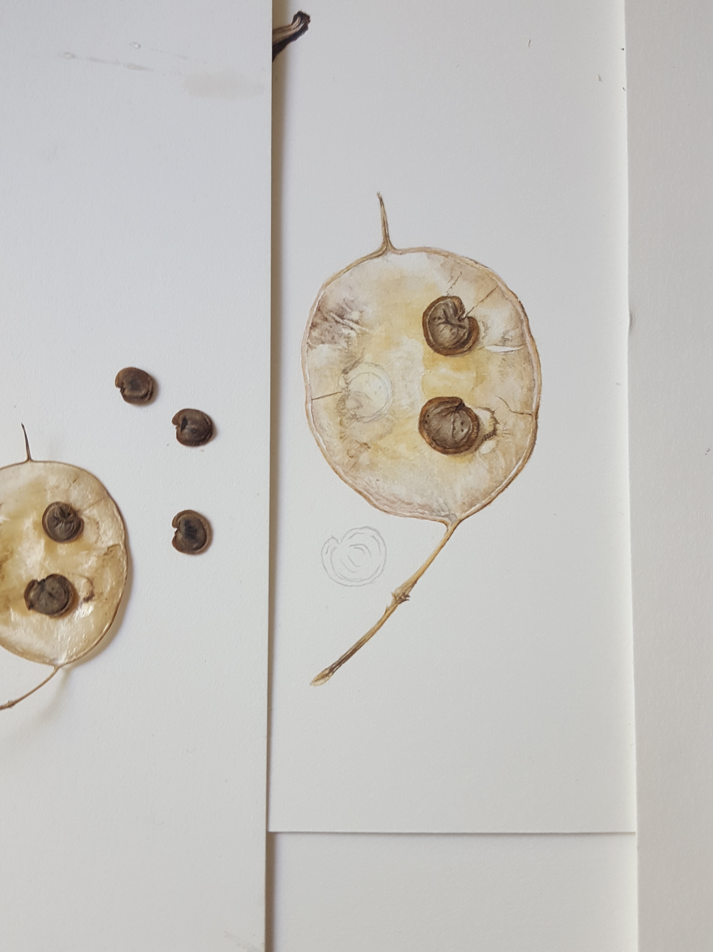
The finished Honesty seed head…

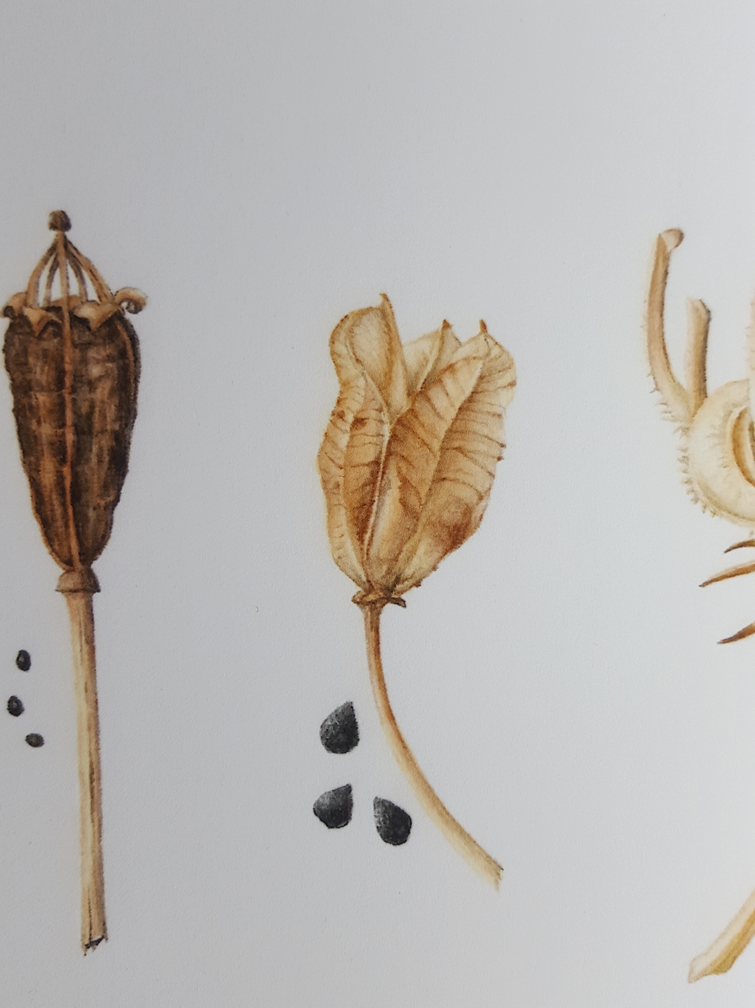
Yellow Poppy seed head
Next on the agenda was the Welsh Poppy seed head. I love the little crown at the top of this seed head! The seeds are contained in the cup below the crown, just like a regular poppy, and dispersed as it shakes in the wind. It’s colouring is quite dark so I mixed a few different browns for the base cup and some neutral beige tones for the crown top. I also mixed a warm reddish brown to add to the cup as some areas were a more rusty tone. It would have looked very drab without this additional warmth! I also mixed an ‘almost’ black colour to define the creases and shadows. It was especially important to add shadow tones to the top ‘crown’ where the pieces all join together to make it look real.


Camassia seed head
Next in my row of seed heads was the Camassia. It has a beautiful golden yellow tone so Quinacridone Gold (QG) and Transparent Yellow (TY) shouted out to me! I love this plant and it grows in my garden ‘wild’ area in the Spring. Here’s a photo of it in flower.


These seed heads are like cups and again the seeds disperse when the wind blows. I began by mixing up my colours. These were a series of warm beige and yellow tones, a reddish brown for blemishes and veins, a warm grey and brown for shadowing. Quinacridone gold featured highly as you can see below!

This seed head is also shiny and papery. To get this across I needed to ensure my highlighted areas were as light as they could be. You’ve probably noticed that I stick the seed heads onto my drawing board with Blutac. This is so I can see them close up and at eye level. I added pale cream/yellow washes first and then I worked into it adding a little of my reddish brown to define the detail and vein areas. I added a pale beige/grey tone into the shadow areas to define the undulations and inside of the cup.

Here’s a little video of me working on the camassia seed head:
Next to give it some depth I added more layers and some other warmer beige/yellow tones to create the lighter shaded areas. Now for the three seeds by the stalk. These seeds are quite black in tone with a blueish highlight. You can just see it showing through on the final painting below. To enhance this I laid down a wash of watered down Indanthrene blue first on the darker areas of each seed. After this I used my black mix to create the patterning and shadow areas. Highlight were left unpainted but the blue shows through from below.

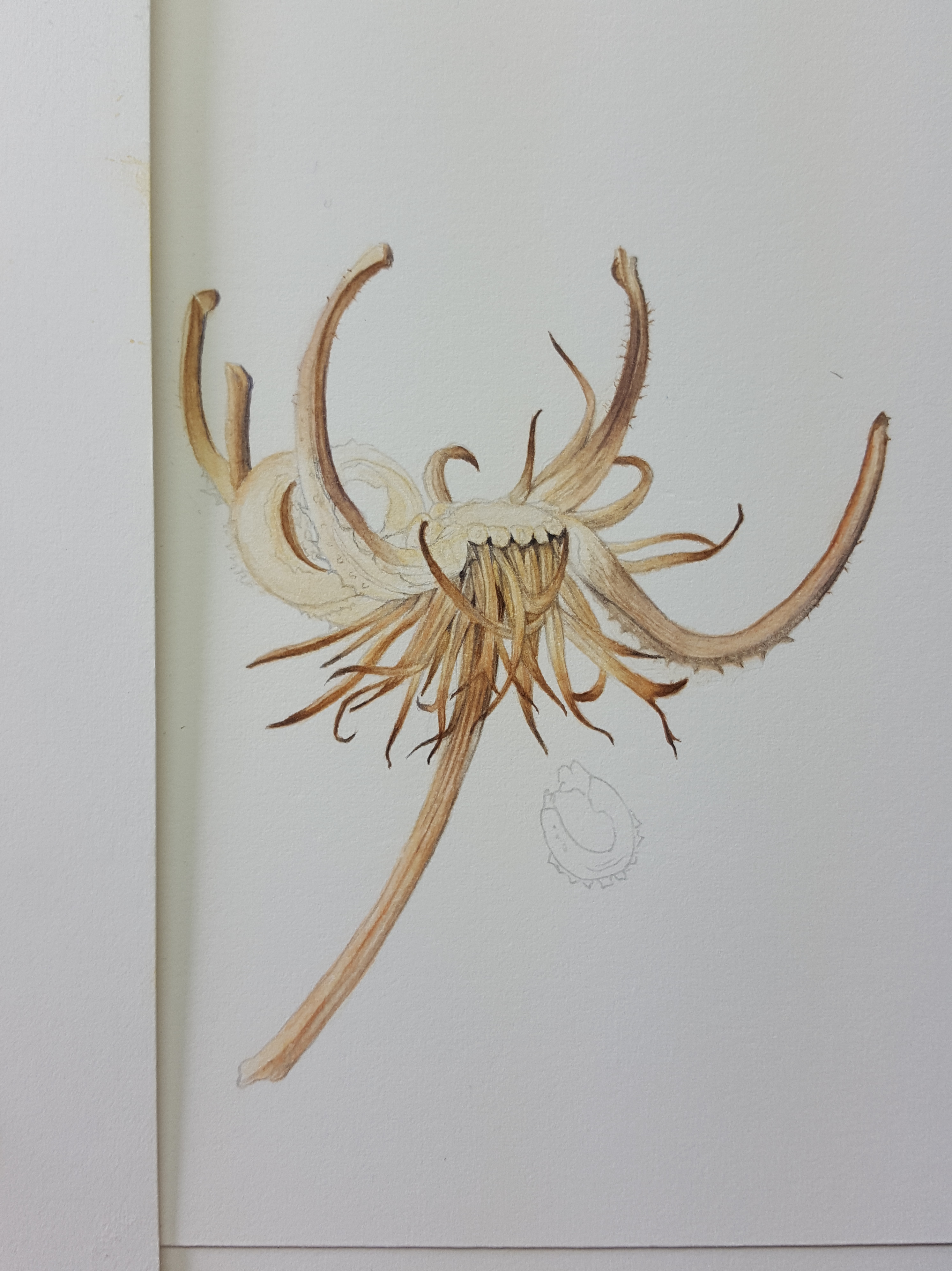
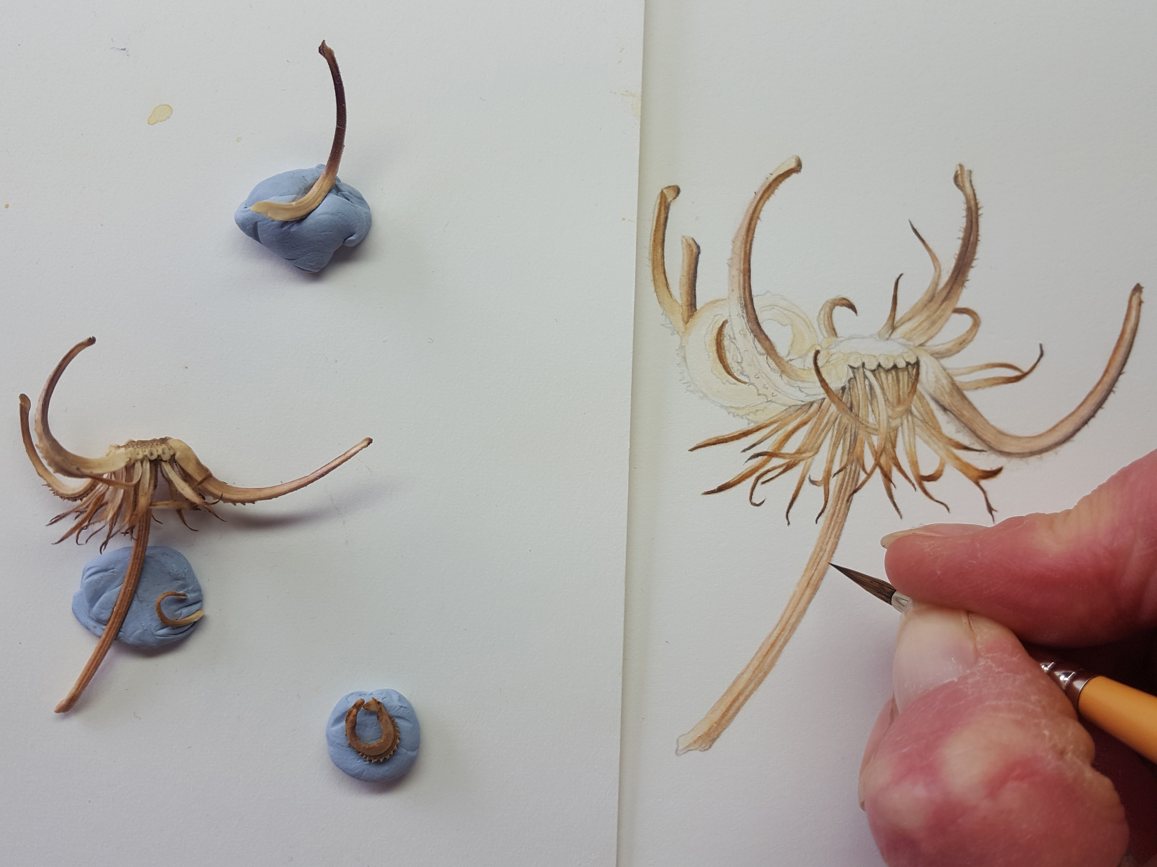
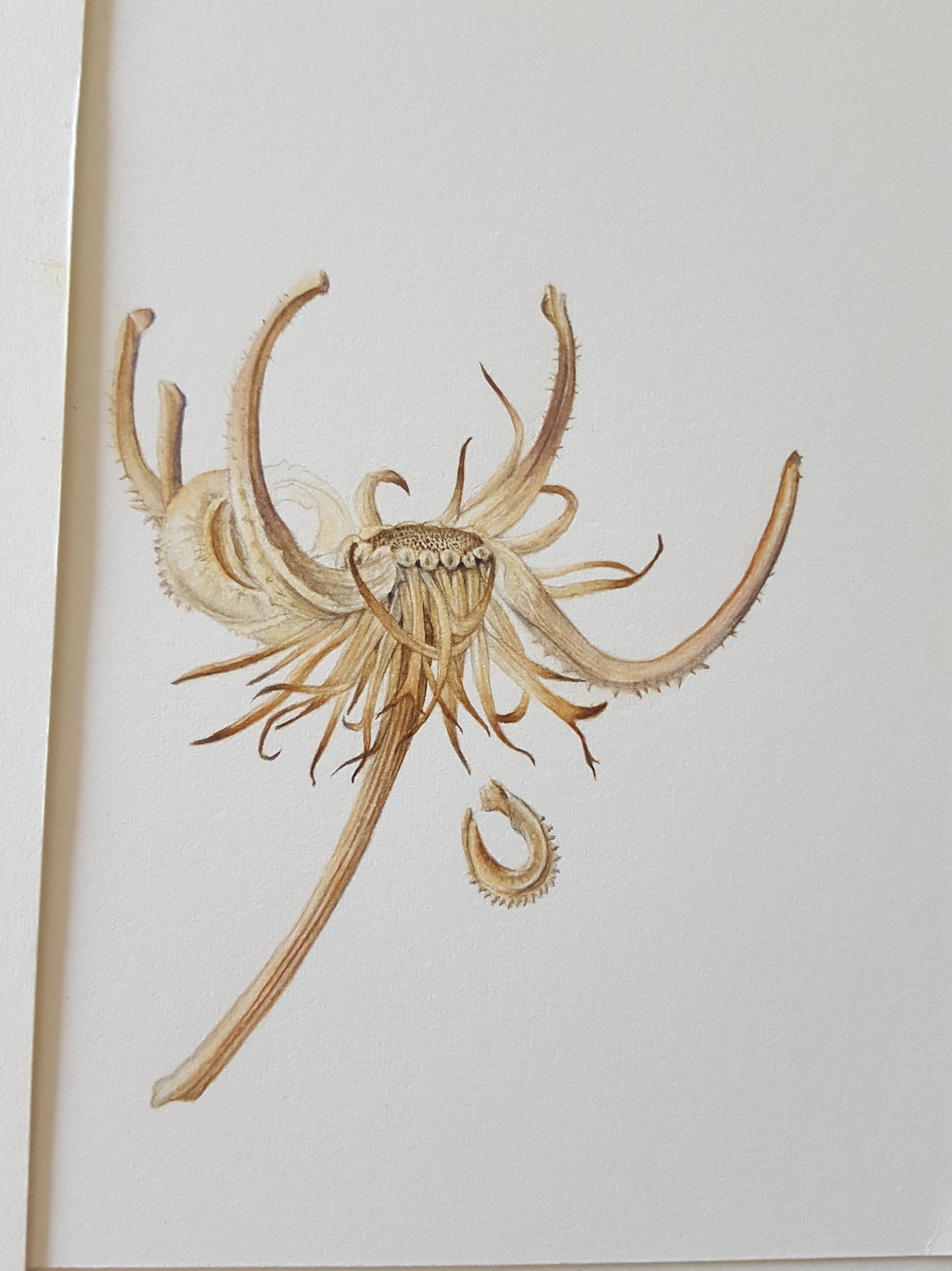
Marigold seed head
Last but not least, the Marigold seed head. What an amazing shape this is! The seeds on this seed head are curled up inside the head and snap off as the seed head dries. They are very sturdy and have spikes around them. The whole seed head is extremely interesting to look at and is made up of many different parts. I must look them all up one day! It was a huge task to get the drawing right but I really enjoyed it. I mixed very similar neutral tones once again, beiges, yellows, warm browns, greys and tans. One extra colour was added, Perylene Violet, to create the burgundy/brown tones on the long curved ‘arms’ of this seed head. This one was going to be a challenge!


I started again by laying down thin washes of my pale yellow/beige mix then began defining the wispy parts at the bottom with pale shadow tones and brown at their tips. I used the Perylene brown mix for the very tips of these. The rest was created using mostly dry brush and graduated washes. Finally with the very tip of my brush I added in the fibonacci series of dots on the flat centre part. I only added one falling seed to the side of this one as the painting was very detailed and more would distract. I felt it was enough to have just one to look at!


The finished piece…
And so the painting was complete… ‘Vessels of Life’ seemed an appropriate name.
I hope you enjoyed this blog and that it will have been of help to you.
Happy painting!!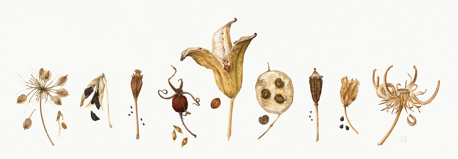
All photos, content, text and videos are subject to copyright – All rights reserved – Jackie Isard Botanicals 2017

Fabulous – what a wonderful study which you must have truly enjoyed creating!
LikeLike
So comprehensive, informative and full of enthusiasm! A great read. I love the marigold seed head the most !
LikeLike
Absolutely beautiful work. Thank you for the detailed post to go with it.
LikeLike
Thank you! Apologies for not replying sooner I’ve just found this in my spam folder
LikeLike