
Colours by the same name….part 2!
I’m back at last! I have decided to continue on from Blog 25 which discussed Quinacridone Gold across three brands and how very different they all were. It is very easy to make the mistake of thinking different brand pigments will be the same if they have the same name or a very similar name. Some even have the same pigment index number!
In this blog I will be looking at a number of pigment colours across the Daniel Smith and the Winsor & Newton range. All but one have identical names but as you will see many of them are quite different. One colour even shows a difference in temperature, one is warmer and the other cooler. Some are more intense than others, five are completely different!
I am a big fan of W&N as the colour selection, where primaries are concerned, suits me well. Don’t get me wrong I like DS pigments too. DS pigments are beautifully intense and I especially like their iridescent range. These are great for adding shine to butterfly wings. I just feel there is too much choice in the DS range as it is possible to mix every colour you need with 3 blues, 3 reds and 3 yellows. When you mix with primaries, I really don’t think you need 25 reds to choose from, do you? There are also 13 violets in the DS range and I only use 2 from the W&N range, Winsor Violet and Perylene Violet. Some pigment colours across both brands make you think, do you really need them? W&N Ultramarine Violet for instance, why not add a little Winsor Violet to French Ultramarine? Cobalt Violet….a little Quinacridone Magenta mixed with Cobalt Blue will do the trick! Anyway, it’s food for thought.
I have selected 25 W&N pigments for my palette and one DS, Lemon Yellow. The only reason this yellow is there is because it is very like cool Winsor Lemon but DS Lemon Yellow is transparent, not semi-transparent. I generally use 6-9 of my pigments at the most when painting, depending on the subject.
The colours with the same names (except one) that I have selected to compare across these two ranges are listed below:
New Gamboge
Indian Yellow
Quinacridone Gold
Quinacridone Red
Permanent Alizarin Crimson
Perylene Maroon
Burnt Sienna
Cobalt Blue
French Ultramarine
Indanthrene Blue (Indanthrone Blue)
Perylene Green
Perylene Violet
I have written an outline for each pigment below to show you the differences and qualities. As you will notice below there are four DS pigments which are semi-transparent. I prefer to use transparent or semi-transparent pigments. Some of the differences here are huge but some are actually quite favourable!
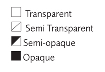
(Note: Some photographs are not always a true representation. The DS transparency symbols are different to W&N. Their semi-transparent symbol is a circle which is half black and half white. W&N uses a square which is half white and black but in this brand it means semi-opaque).


New Gamboge
DS – Transparent PY97, PY110
W&N – Transparent PR209, PY150
DS – very close to the primary yellow with a slight orange bias. A lovely pure pigment similar to W&N Indian Yellow but nearer to the yellow spectrum.
W&N – a muted yellow, similar to Transparent Yellow with a very slight brown bias when at full colour. A little warmer than Transparent Yellow. Makes a beautiful pale cream/yellow when watered down.

Indian Yellow
DS – Transparent PY97, PY110
W&N – Transparent PO62, PY139
DS – a cool yellow with translucency. Not what I would consider an Indian Yellow, more like W&N Transparent Yellow or Winsor Yellow Deep. This pigment could be used as a transparent yellow although Nckel Azo is closer.
W&N – a rich orange-yellow, flows smoothly and makes beautiful cream/apricot tones when watered down. Great for mixing bright oranges and muting green to an olive/green tone.

Quinacridone Gold
DS – Transparent PO48, PY150
W&N – Transparent PR206, PV19, PY150, Be aware W&N have run out of index colour PR206 so this will change. It will be replaced with PR179. The name is changing to Transparent Gold Deep. So, if you love Quinacridone Gold buy some now!
DS – a warmer, less muted version with a lovely golden glow. It has an orange bias.
W&N – a muted, duller QG with a strong warm yellow bias. Rich brown/gold when at full strength.
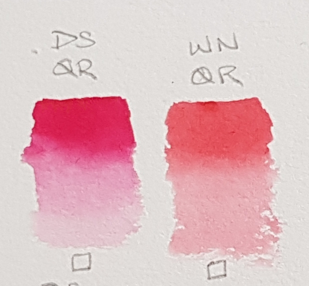
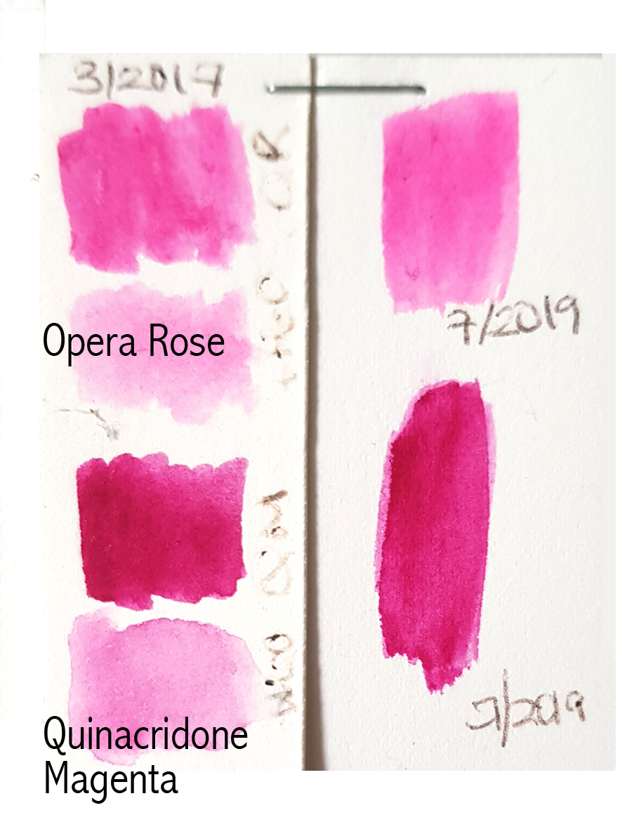
Quinacridone Red
DS – Transparent PV19
W&N – Transparent PR209
DS – a cool magenta/red resembling Permanent Rose (PV19). Quinacridone Red in the DS range is closest to Permanent Rose.
W&N – a warm primary red. The match for this red is Quinadridone Coral (PR209) in the DS range. It is quite a weak pigment in both ranges but a beautiful pink/red.

Permanent Alizarin Crimson
DS – Transparent PR177, PV19, PR149
W&N – Transparent PR206! Be aware W&N have run out of this index colour so this will change. So if you love Permanent Alizarin Crimson buy some now!
DS – a rich intense version of this colour but made with three index colours. It has a slightly warm red bias compared the W&N version which is cooler.
W&N – a cool not as intense version which can look a little flat when watered down on some watercolour papers.

Perylene Maroon
DS – Semi-Transparent PR179
W&N – Transparent PR179
DS – a rich intense version of this colour. It has a slightly warm red bias compared the W&N version which appears a little cooler.
W&N – Nicely intense too. Very slightly cooler than the DS version.

Burnt Sienna
DS – Semi-Transparent PBr7
W&N – Transparent PR101
DS – a very different Burnt Sienna to W&N and it appears to granulate. It is also semi-transparent.
W&N – one of my favourite reds. A much warmer version than DS. It is more like Pompeii Red (PBr7) in the DS range. I would add a tiny bit of Transparent Yellow (DS Indian Yellow) to Pompeii Red to make it a perfect match!
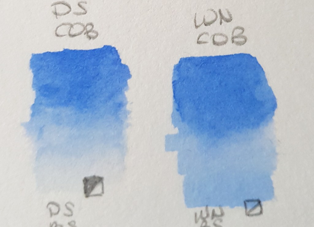
Cobalt Blue
DS – Semi-Transparent PB28
W&N – Semi-transparent PB28
DS – this appears to granulate a little more than the W&N version and is very, very slightly cooler despite having the same index number.
W&N – a lovely middle blue, granulating. There seems to be a very slight difference but it is minimal.
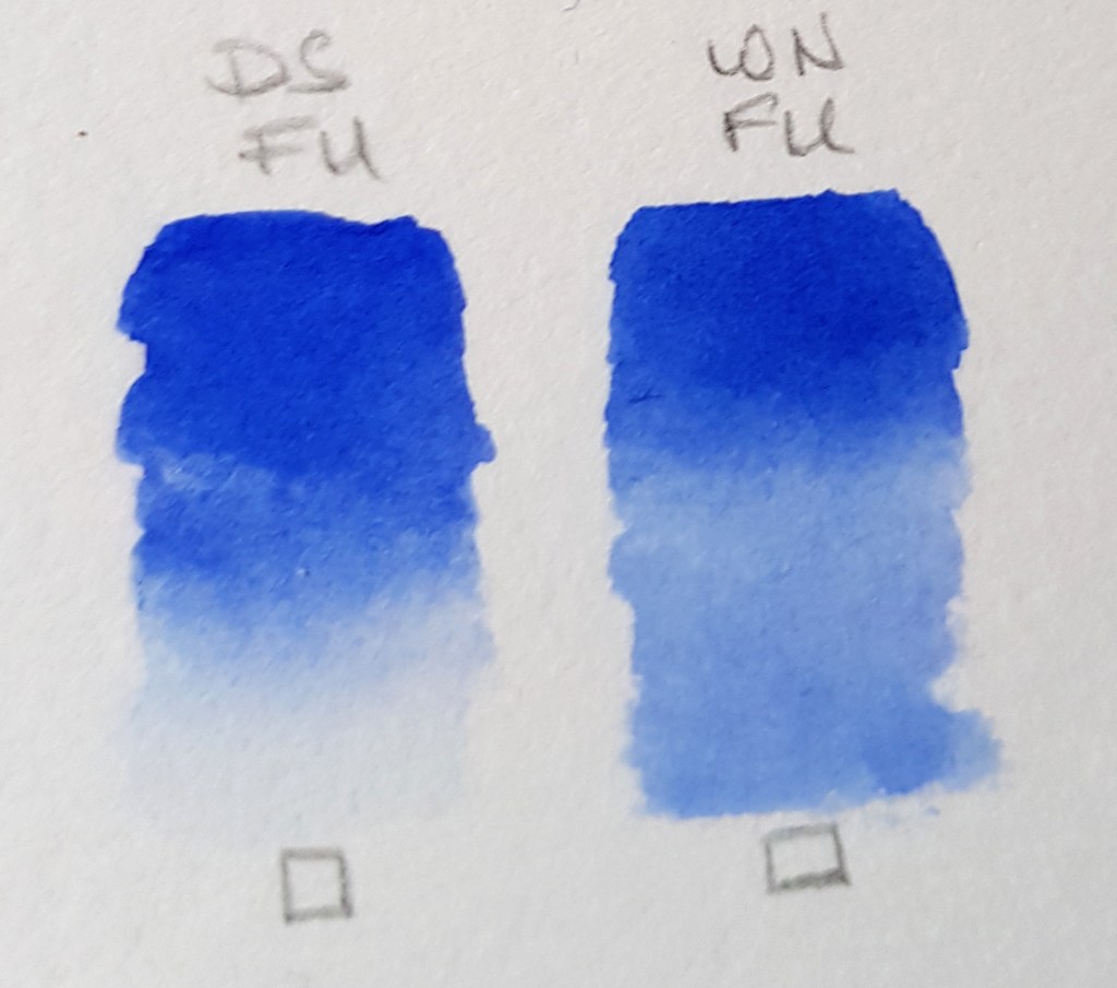
French Ultramarine
DS – Transparent PB29
W&N – Transparent PB29
DS – a pure primary blue slightly more intense than the W&N version. Granulates.
W&N – a vibrant primary blue with no bias. Granulates. The only difference here is the intensity of pigment is greater in DS.
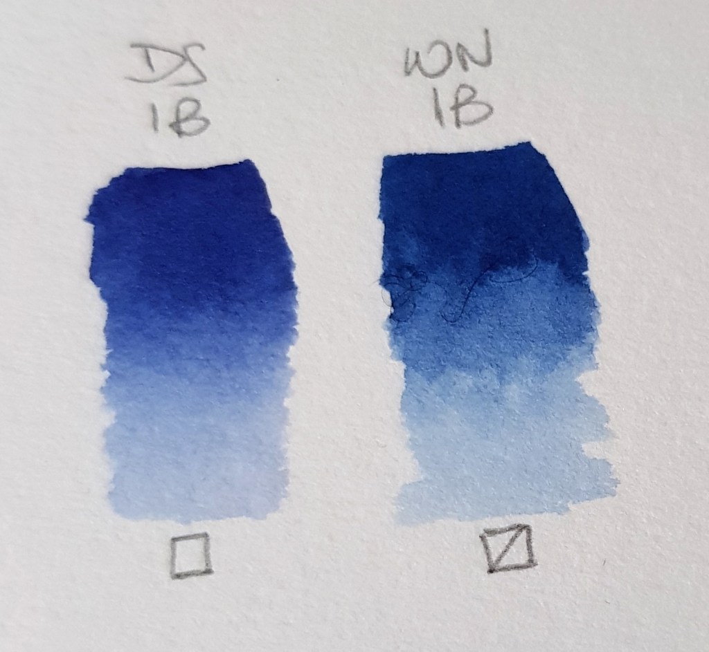
Indanthrene Blue & Indanthrone Blue
DS Indanthrone – Transparent PB60
W&N Indanthrene – Semi-transparent PB60
DS – Indanthrone Blue is more like royal blue compared to Indanthrene Blue. It has a very slight red bias.
W&N – this version is very different to the DS version. It is a deeper blue with a very slight green bias. They both have the same index number though! These are a nice option for a choice of warm or cool darker blues!
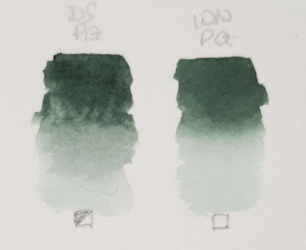
Perylene Green
DS – Semi-Transparent PBk31
W&N – Transparent PBk31
DS – very slightly warmer than W&N. It is semi-transparent. Mix it with a rich red like Pyrrol Crimson for a true black.
W&N – this version is very similar but it has a very slight blue bias. It is totally transparent. Add a rich red like Permanent Carmine for a true black mix.
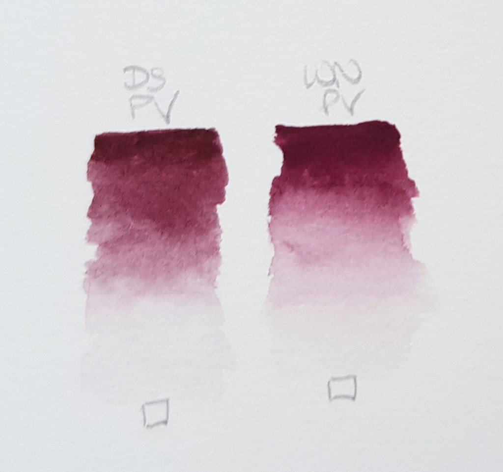
Perylene Violet
DS – Transparent PV29
W&N – Transparent PB29
DS – a rich pigment but it is more muted than the W&N version, that is, it has duller appearance.
W&N – slightly brighter and more intense. It veers more towards the violet spectrum and less towards the brown like DS. A favourite pigment of mine, seen so much in plants! Mix with different yellows for some wonderful muted ochre and brown tones.
As you have seen there are various differences for a number of pigments listed above. There are even slight differences with pigments that have the same index numbers. This variation will most likely be due to different production processes and binders. On one occasion above we saw that a comparison offered up warm and cool versions, W&N Indanthrene Blue and DS Indanthrone Blue. When mixing with these two pigments, the tones would be more muted with Indanthrene Blue and brighter with the DS version. A few DS and W&N pigments have the same name but another colour in the DS range matches more closely.
So, I hope you enjoyed this blog and that it proves useful to you. Thank you for reading and I’ll be back soon with more interesting colour matters.
For more information on colour mixing, theory and painting techniques, see below.
My book is selling well all over the world I am pleased to say! I have had some excellent reviews and people writing to me to tell me that it is their go-to reference book. Thank you for all your kind comments and reviews!
Watercolour Mixing Techniques for Botanical Artists
A practical guide to accurate watercolour mixing with primaries for botanical artists
Colour mixing is a key skill for the botanical artist. In this practical guide, Jackie Isard explains how to observe and use colour accurately. She shows artists how to make informed choices when selecting pigments, as well as how to learn about colour mixing and its application.
• Gives detailed instruction and advice on understanding colour and pigments
• Explains how to ‘see’ colour and tricky mixes, from greens and reds to the difficult botanical greys
• Includes advanced colour application techniques – colour enhancement, shadow colours and colour temperature transition
• Step-by-step guides illustrate how to paint with layers, how to use underlaying colours to enhance, and colour and fine detailing
Order online via major book shops or Amazon. Published by The Crowood Press Ltd
More information on my website www.jibotanicals.co.uk. E-books are available worldwide.
USA and Canada distributor: www.ipgbook.com
Otherwise, Europe or UK can order through www.crowood.com or as below:
Amazon link UK : https://www.amazon.co.uk/Watercolour-Mixing-Techniques-Botanical-Artists/dp/1785008285
Waterstones link UK :https://www.waterstones.com/book/watercolour-mixing-techniques-for-botanical-artists/jackie-isard//9781785008283
WHSmith link UK: https://www.whsmith.co.uk/products/watercolour-mixing-techniques-for-botanical-artists/jackie-isard/paperback/9781785008283.html
Also available as an e-book worldwide.
Email address:jackieisard@googlemail.com
Facebook:https://www.facebook.com/jackieisardbotanicalnaturepainting/
Instagram: @jackieisard
Blog: https://jibotanicals.com/
Web: https://www.jibotanicals.co.uk/
Etsy shop: https://www.etsy.com/uk/shop/jibotanicalsGifts


 Here I have split some of the W&N blues into categories. The permanency, lightfastness and transparency ratings are under each colour:
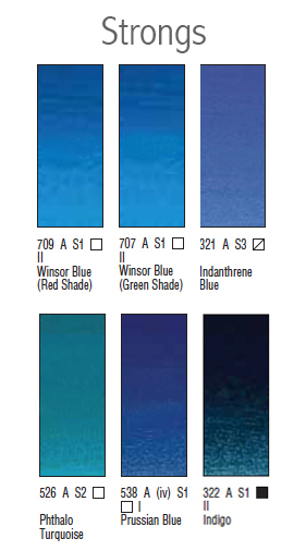 Strongs – those which have greater intensity of pigment, you’ll need less when mixing!
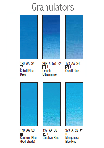 Granulators – those which granulate, not good for smooth rendering! Some of them will granulate more than others. Cobalt Blue isn’t as grainy as French Ultramarine. However, Ultramarine Green Shade shows very little granulation, but it does have a very slight green bias compared to French Ultramarine. I like the intensity of this pigment compared to French Ultramarine though.
Cerulean is a particularly granulating pigment and semi-opaque. If used as an underlayer, you will not achieve a smooth see-through effect with it. It is good for textured style painting though. See the image below for a comparison. Hopefully you can see it as this was quite hard to photograph! The difference is more obvious in real life. Try it out and see for yourself.
Granulators – those which granulate, not good for smooth rendering! Some of them will granulate more than others. Cobalt Blue isn’t as grainy as French Ultramarine. However, Ultramarine Green Shade shows very little granulation, but it does have a very slight green bias compared to French Ultramarine. I like the intensity of this pigment compared to French Ultramarine though.
Cerulean is a particularly granulating pigment and semi-opaque. If used as an underlayer, you will not achieve a smooth see-through effect with it. It is good for textured style painting though. See the image below for a comparison. Hopefully you can see it as this was quite hard to photograph! The difference is more obvious in real life. Try it out and see for yourself.
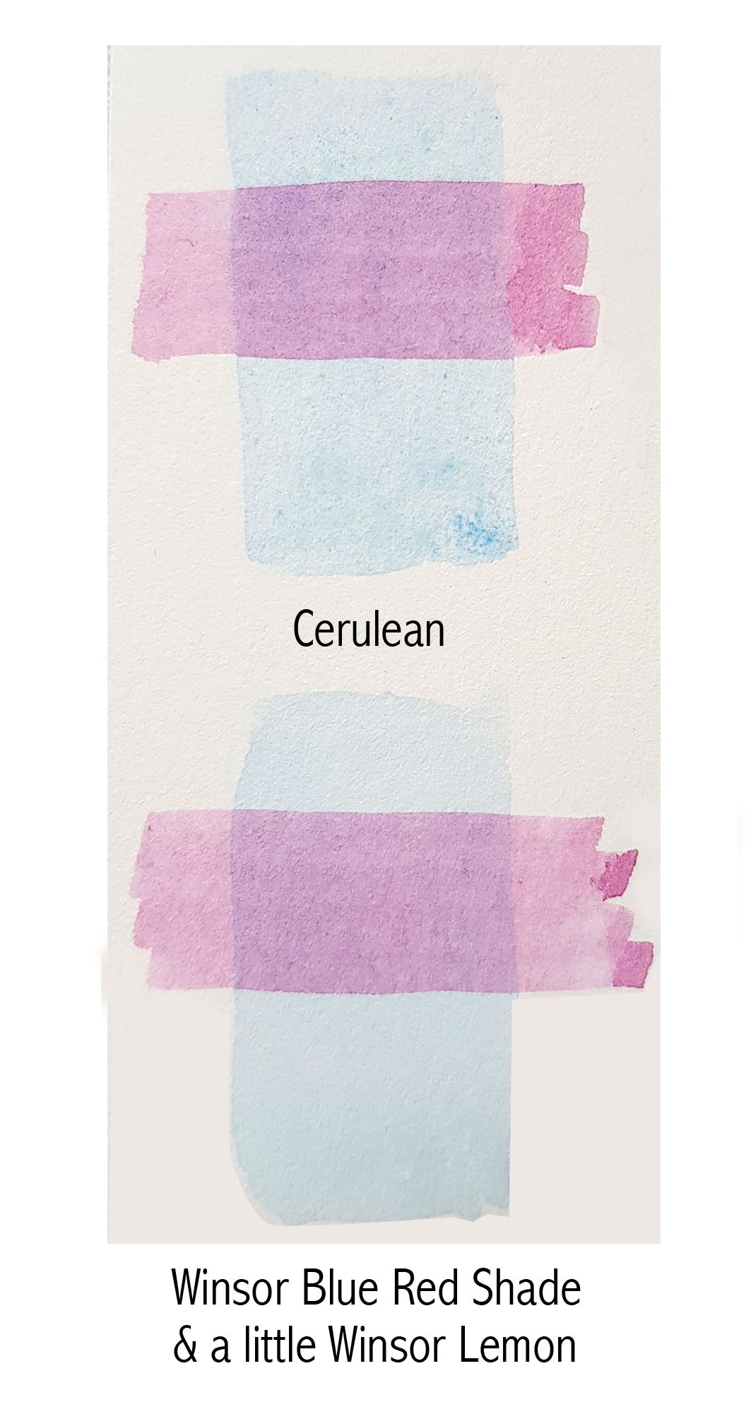 As seen above, a purple overlay was painted over base layers of Cerulean and Winsor Blue (Red Shade). The purple mix overlaid is a transparent mix. As you will see in the Cerulean example, it appears less crisp and quite mottled by the granulation. It also looks a little flatter where transparency is concerned. The Winsor Blue (Red Shade) underlay appears crisper and more see-through. So, if you are looking for a lighter blue underlay but with a slight yellow bias, just add a teensy bit of Winsor Lemon to Winsor Blue (Red Shade) and you will have a lovely smooth Cerulean look-alike!
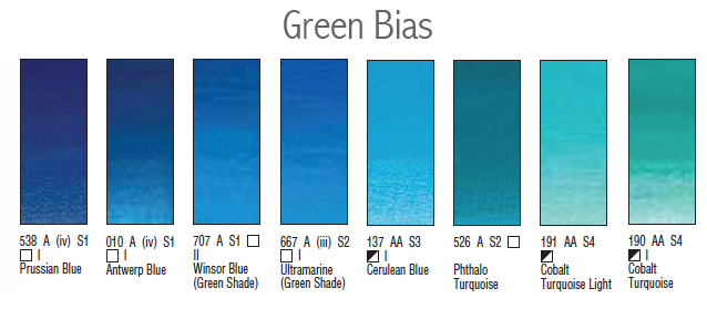 Green bias – those which will cool a mix or are more green in appearance. Further along the image above are the very green bias blues, turquoise. The greener a blue is, the more vivid it will be when mixing greens. It will need to be tamed by adding a tiny bit of red to make a more natural mix. Add Quinacridone Red (QR) to Phthalo Turquoise (PT) and you will make a muted purple/mauve/burgundy because of the green bias. Add QR to Ultramarine Green Shade (UGS), a less green biased blue, and you will make brighter purple and mauve. This is because the green bias adds more yellow to the mix muting it down. Yellow and blue make green (green/blue), plus red makes brown!
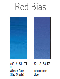 Red bias – those which will add warmth a mix. Add Transparent Yellow to a red bias blue and you will make more natural greens. Add it to Winsor Blue (Green Shade), a green bias blue, and you will make vibrant but less natural emerald greens. Red will need to be added to tame these mixes.
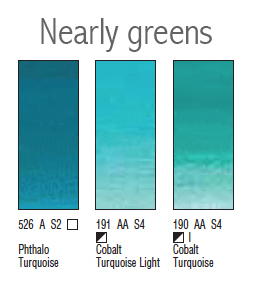 Nearly greens – those which have a definite green bias. You will notice above that Cobalt Turquoise and Cobalt Turquoise Light are semi-opaque. They also granulate. I would only use these for textured, looser style painting.
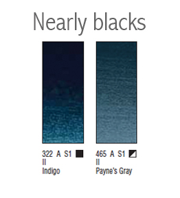 Nearly blacks – those blues which are very dark pigments with a blue bias. Notice also that both Indigo and Payne’s Grey are opaque and semi-opaque. These pigments contain black which gives them their opacity. Both have the same colour index numbers – PB15 • PBk6 • PV19 but in different proportions. The black colour index will make a mix dense and flat looking. These pigments are only useful in extremely dark areas although darkening a mix is much better using transparent or semi-transparent primaries. If done this way, it will still have a see-through feel despite being almost black.
My underlay blue choices
My favourite blues for underlaying are Winsor Blue (Red Shade), French Ultramarine and Cobalt Blue. Winsor Blue (Red Shade) is particularly good when watered down as it is really smooth. It is a lovely bright red biased blue. Make sure you paint it on very pale though as it is one of the stronger pigments. It is also one of my favourite blues to mix with. French Ultramarine, although it granulates, when used very thinly it adds a nice coolness. It is a blue with little to no bias. It is great for edging highlights on dark coloured leaves like holly. Cobalt is a lighter blue which also granulates a little. Again, used thinly, it adds a nice coolness to the layers above.
Well that’s it for this month! If you like, please do message me with any suggestions of which colours you’d like to discuss next.
Until the 24th of next month, I hope you all have a great August. Maybe even have a break and be able to spend a few days away from home!
Nearly blacks – those blues which are very dark pigments with a blue bias. Notice also that both Indigo and Payne’s Grey are opaque and semi-opaque. These pigments contain black which gives them their opacity. Both have the same colour index numbers – PB15 • PBk6 • PV19 but in different proportions. The black colour index will make a mix dense and flat looking. These pigments are only useful in extremely dark areas although darkening a mix is much better using transparent or semi-transparent primaries. If done this way, it will still have a see-through feel despite being almost black.
My underlay blue choices
My favourite blues for underlaying are Winsor Blue (Red Shade), French Ultramarine and Cobalt Blue. Winsor Blue (Red Shade) is particularly good when watered down as it is really smooth. It is a lovely bright red biased blue. Make sure you paint it on very pale though as it is one of the stronger pigments. It is also one of my favourite blues to mix with. French Ultramarine, although it granulates, when used very thinly it adds a nice coolness. It is a blue with little to no bias. It is great for edging highlights on dark coloured leaves like holly. Cobalt is a lighter blue which also granulates a little. Again, used thinly, it adds a nice coolness to the layers above.
Well that’s it for this month! If you like, please do message me with any suggestions of which colours you’d like to discuss next.
Until the 24th of next month, I hope you all have a great August. Maybe even have a break and be able to spend a few days away from home!


