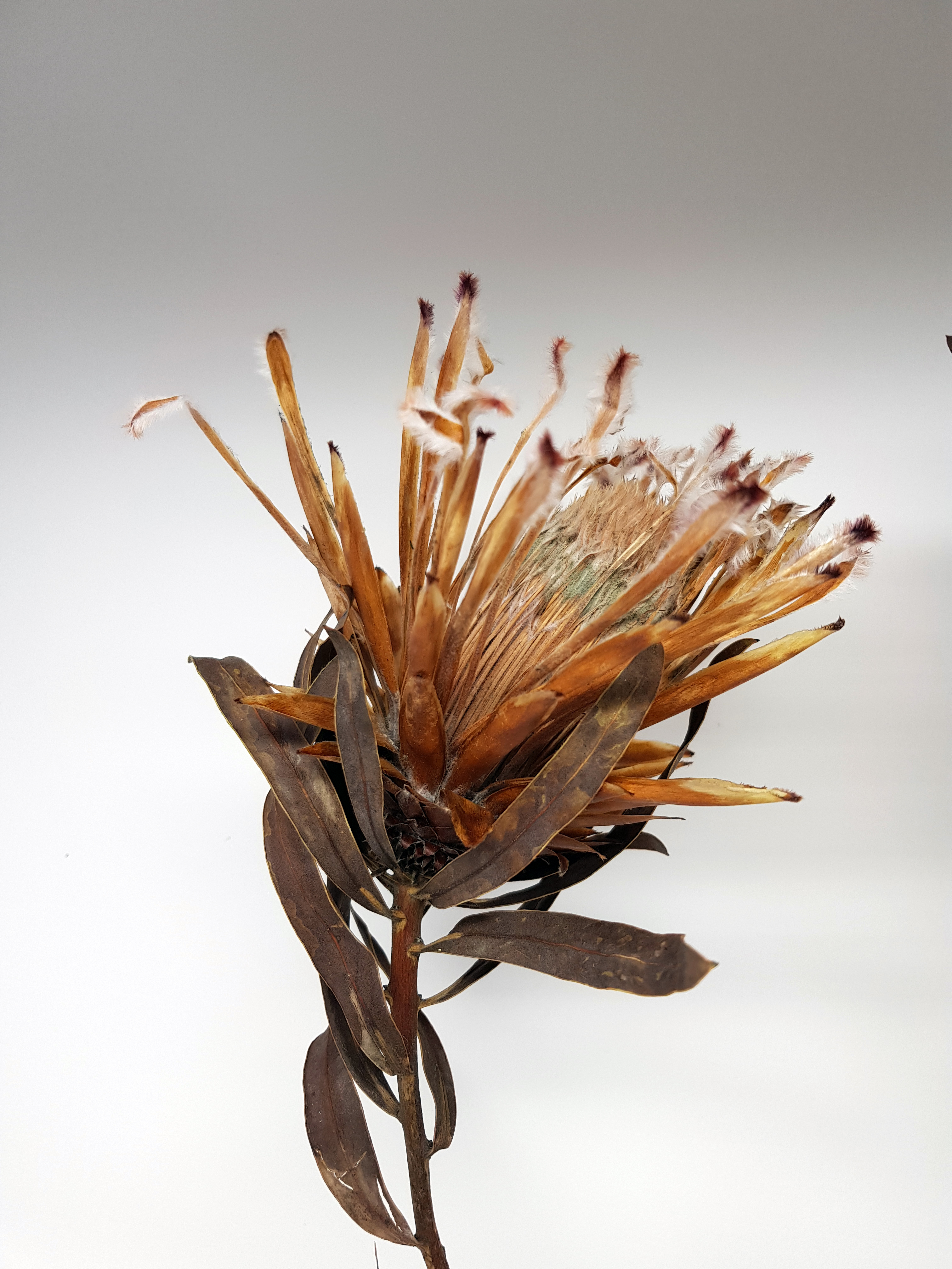
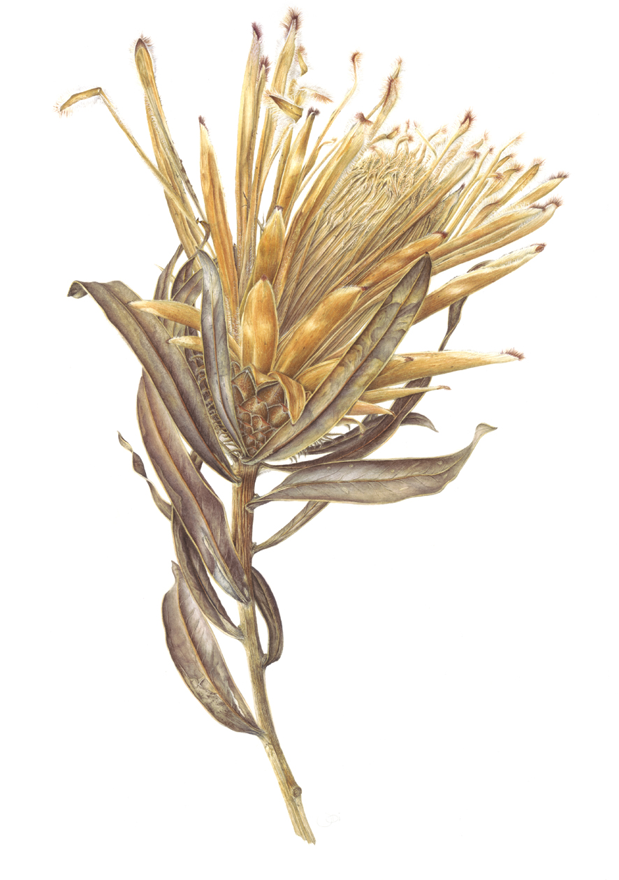
I thought I would share the process of how I made this painting with you all. I discovered this dying protea in the training room at the Bristol Botanic Gardens when I was teaching there. It had been discarded and left to go mouldy on the shelf. You can see the green mould on the inner stamens below. I rescued it and another one which I have yet to paint!
The whole thing began as an exciting new project. I plan to paint it for the SBA (Society of Botanical Artists) exhibition this year. It was the most mammoth painting I’ve ever made!
I started the process by studying my subject thoroughly so that I didn’t miss out any of those incredible details or colours. What looks like a flower to start with is actually a series of inner and outer bracts which protect the inner whorl of tepals containing the stamens and stigma inside. The feathery bits! The drawing took ages to complete but eventually it was all traced up onto watercolour paper (a piece of old stock Fabriano Artistico HP) and I was ready to go.
Firstly, I made a awatch of mixes to help me with the colours of my subject. I use this as a guide. My palette consisted of seven primaries (Winsor Blue (Red shade), Indanthrene Blue, Indian Yellow, Quinacridone Gold, Transparent Yellow, Permanent Carmine, Permanent Rose and two others Perylene Violet and Winsor Violet. These are all Winsor & Newton professional watercolour pigments. As you can see there are warm and cool mixes within each range below. See below drawing and practice pieces before I started the actual painting.


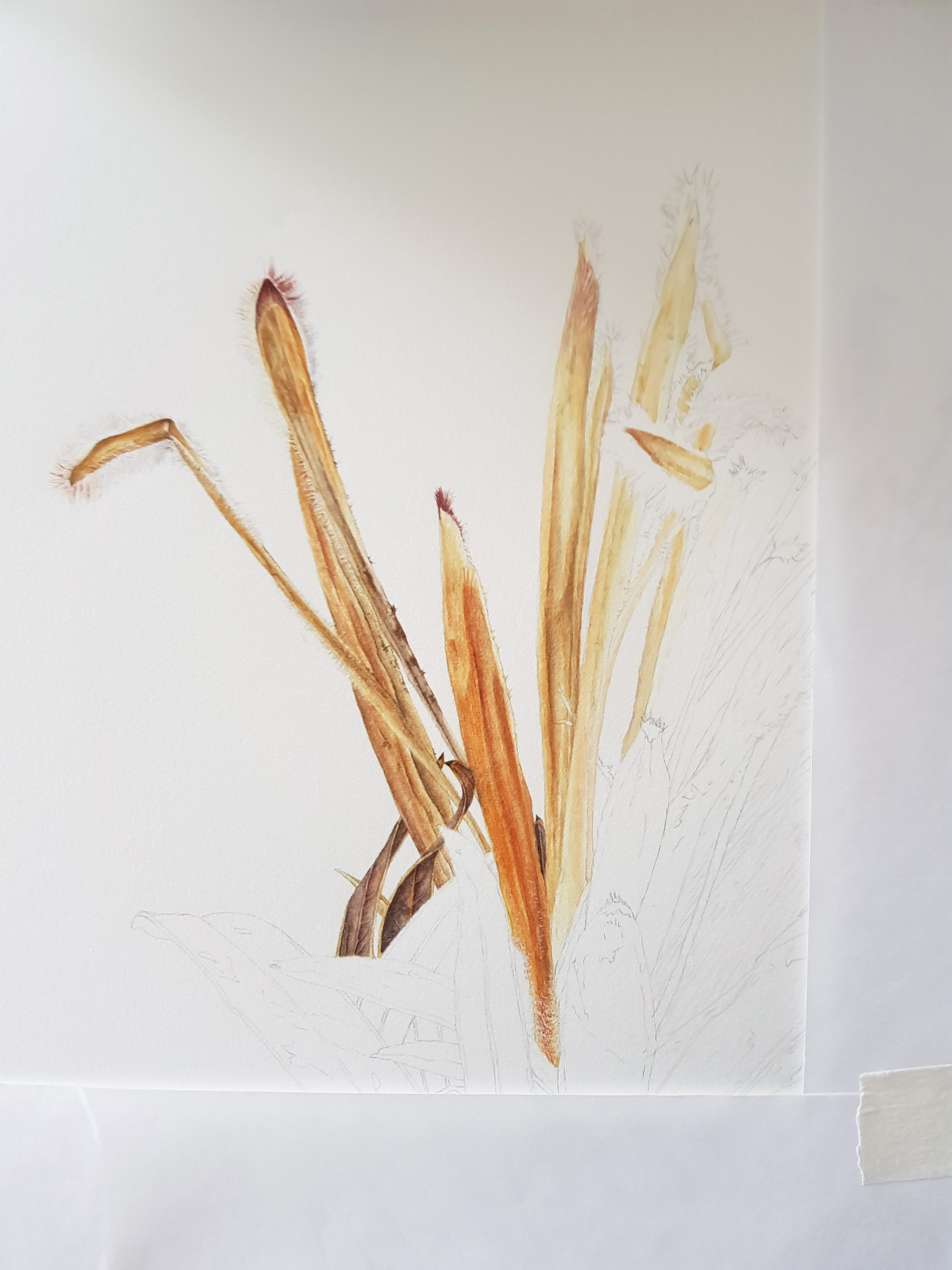
I practiced three tricky elements first. After this I was happy with the techniques I needed to use to achieve a good painting. The last photo above shows the beginning of the painting.
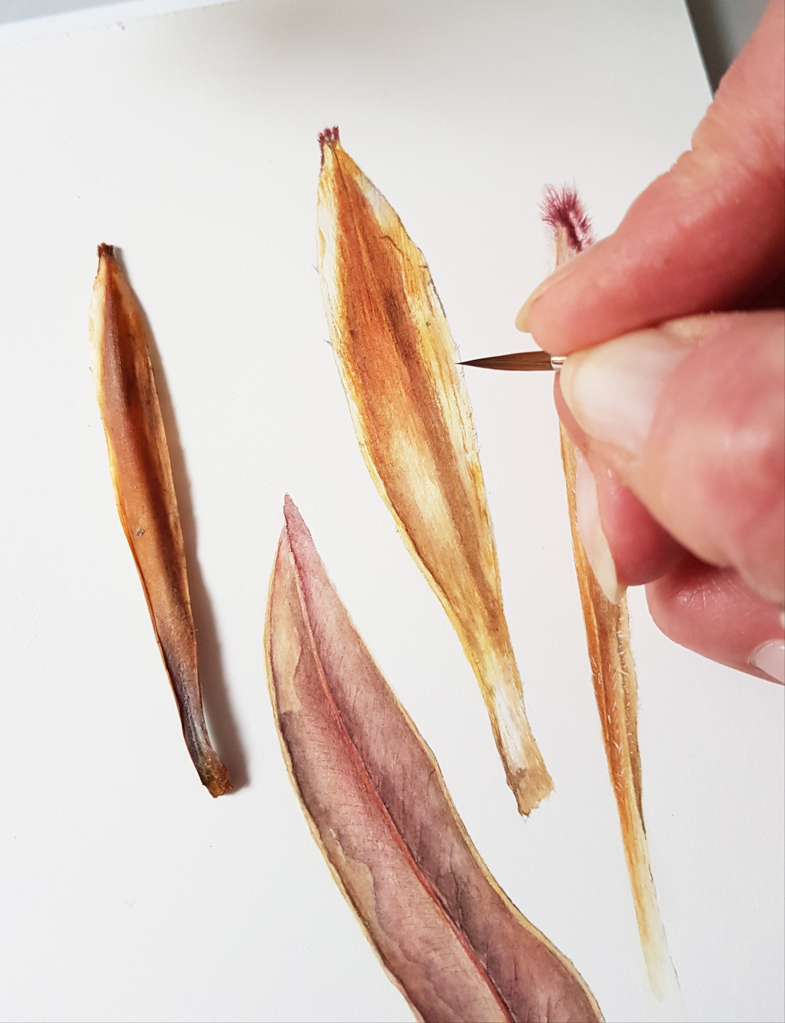
I used a fair bit of wet-in-wet technique on the first layers for the larger inner involucral bracts and the bottom leaves. The tepals, outer thin feathery ones, I did mainly in wet-on-dry and dry brush. The photo below shows a few individual tepals which sit outside the whorl (stigma and stamens) in the very centre. All are very tightly closed to start with but as they mature they spring open and spread out revealing the straight pointed stigmas. The centre part is then exposed. That’s the bit I love!
Next I had to decide where to start! I protected my painting with layout paper and moved around the painting from left to right and then down the middle, section by section. The centre section of stamens and stigma was a little scary and I often wondered how I would approach that area. I came to the conclusion that I would cross that bridge when I came to it!
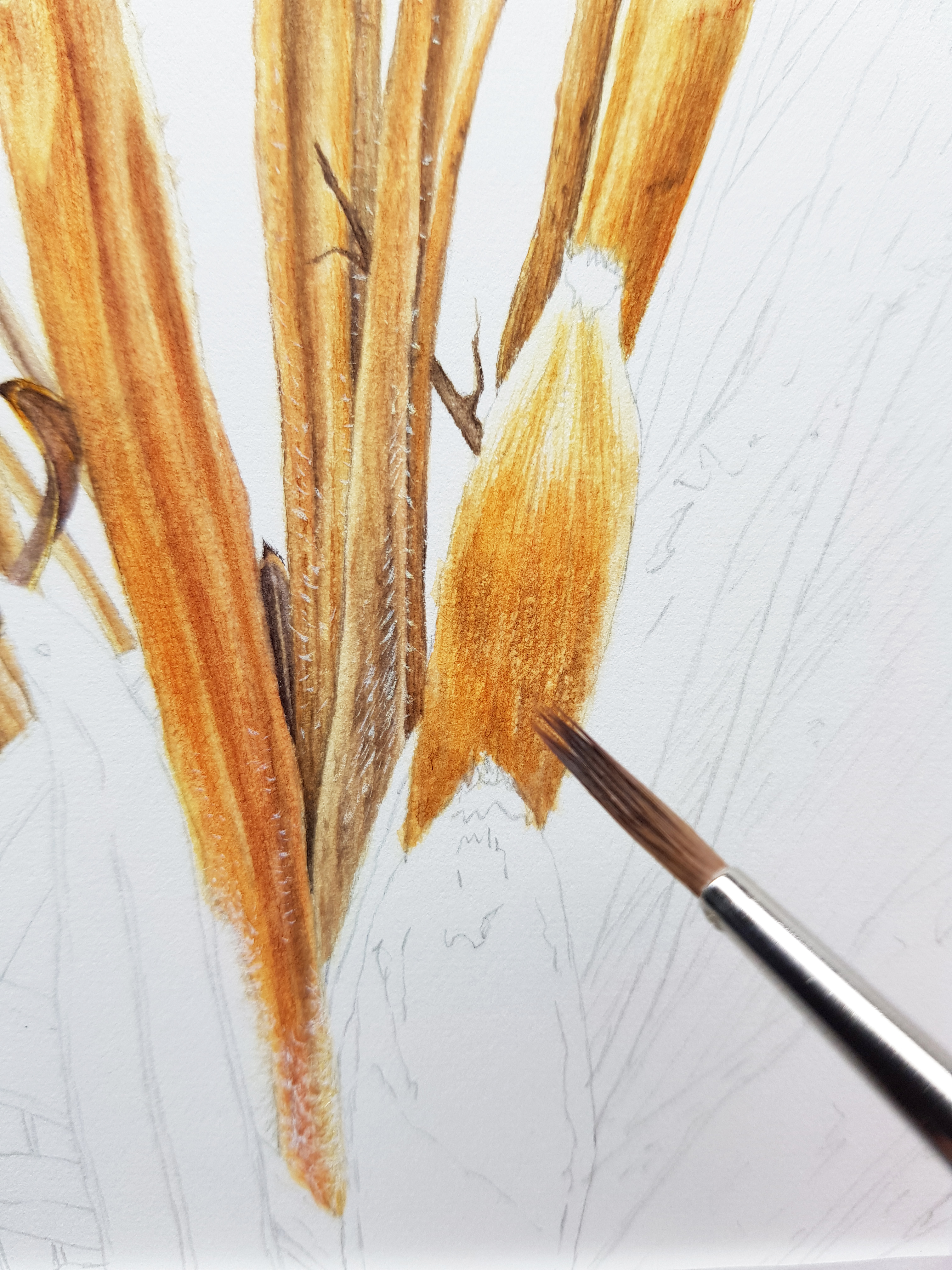
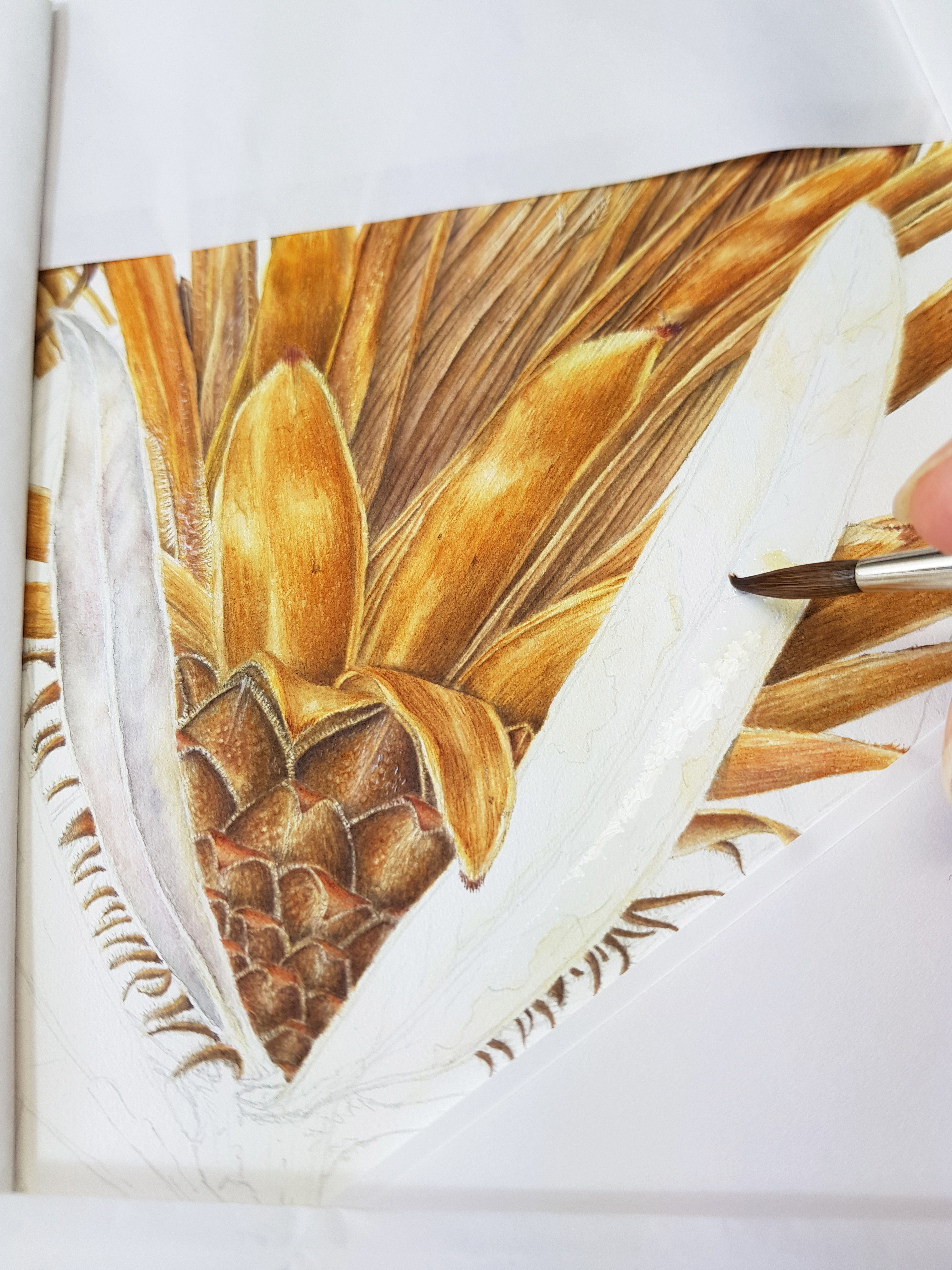
I thoroughly enjoyed painting the golden hues of the bracts and tepals with their hairy tops. Making them shine was essential too. This meant the highlights had to be prominent. The first layer of wet-in-wet was followed by graduated soft washes to build up colour. Once I had achieved this I could concentrate on the dry brush and fine detailing. This sometimes included splaying my brush into points to created rough textured lines. At times I needed to use my eradicator brush to bring up highlights and lighten the edges of the tepals where they touched another. The following photos show the techniques used.
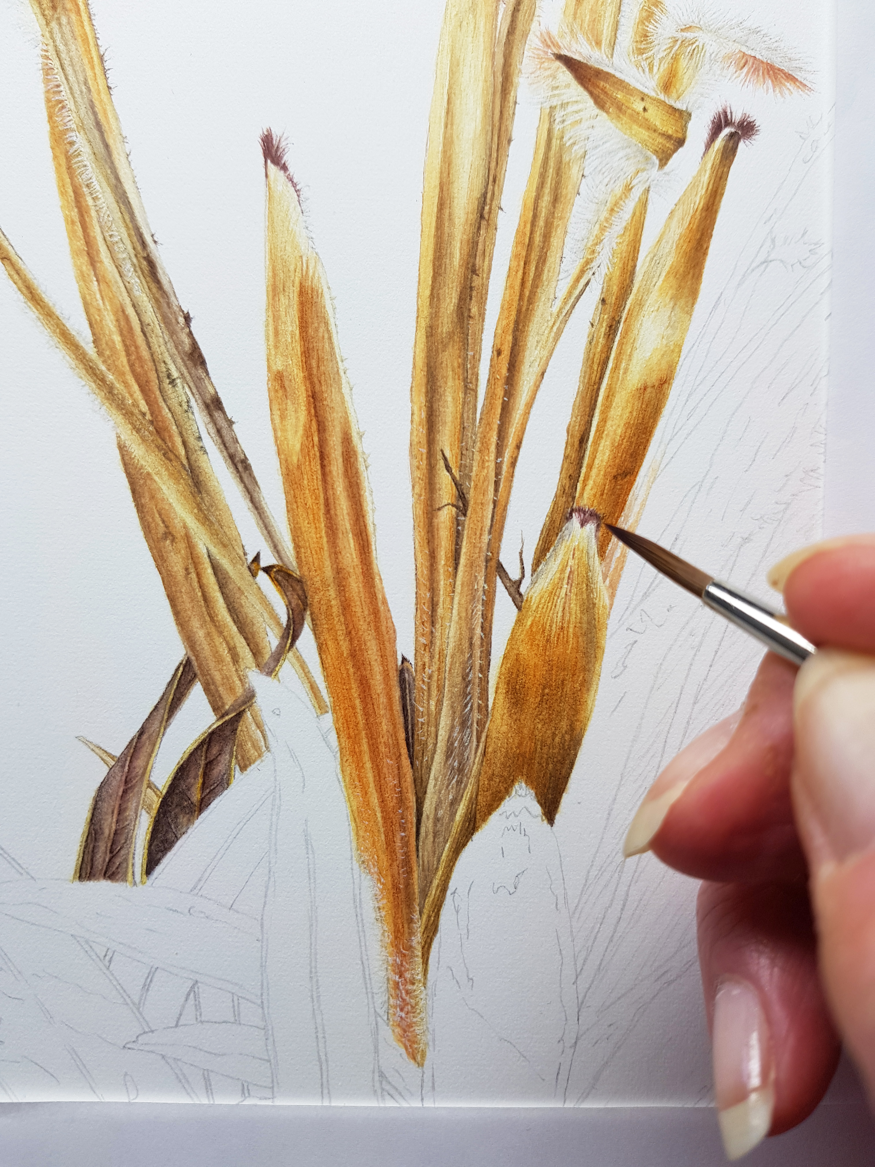

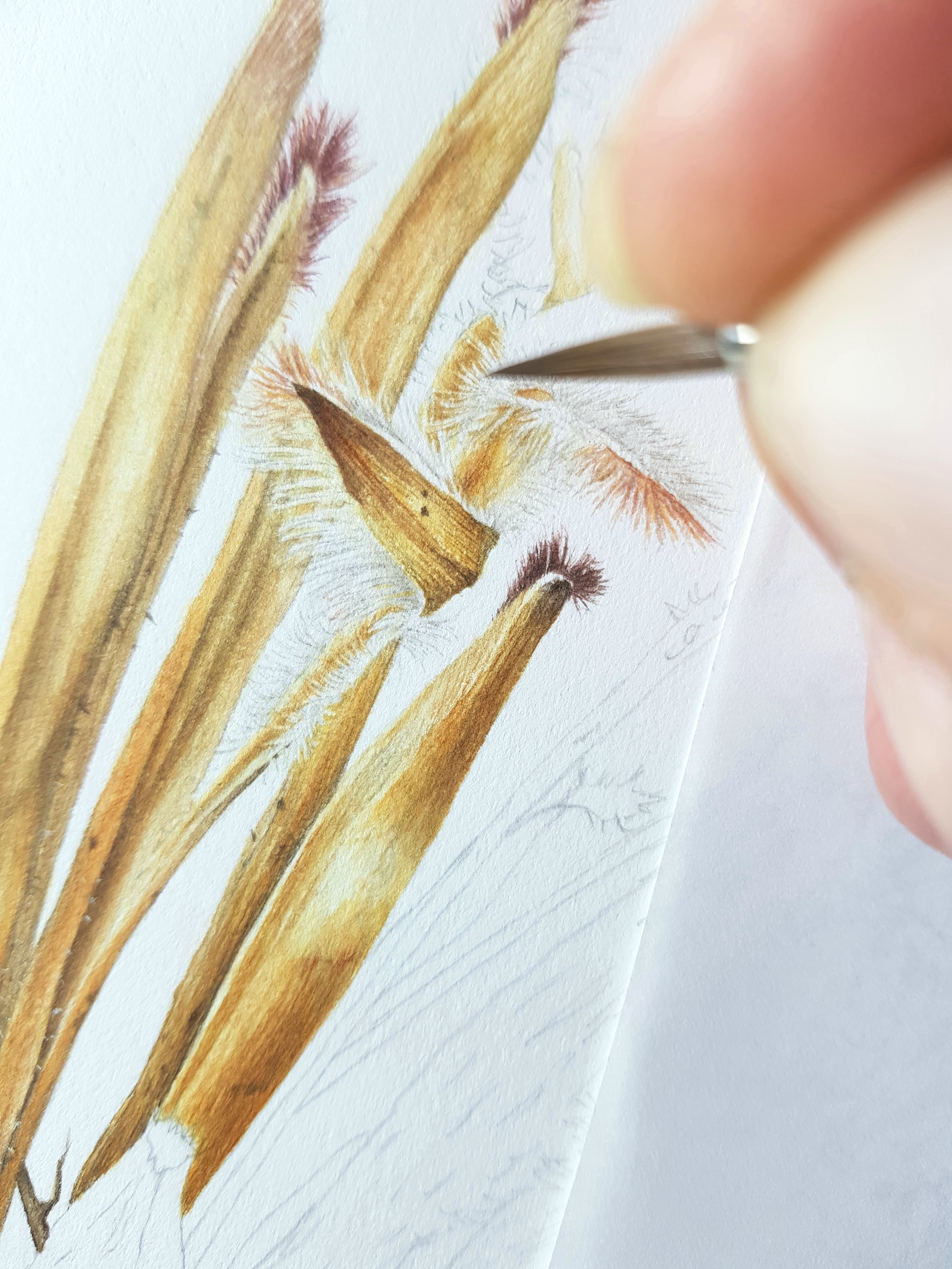
Painting the hairs…how do you paint white hairs on a white background I hear you say! Well, I used the very tip of my Billy Showell No. 2 brush and carefully painted in between the hairs (so painting the negative) where they overlapped another stamen in the background. For the ones that were loose with nothing behind them, I used a very pale warm grey colour and painted in the fine hairs. Of course, the red hairs were much easier. There were also little white hairs on the bracts which I painted in using a white paint……..sooooooo many hairs!
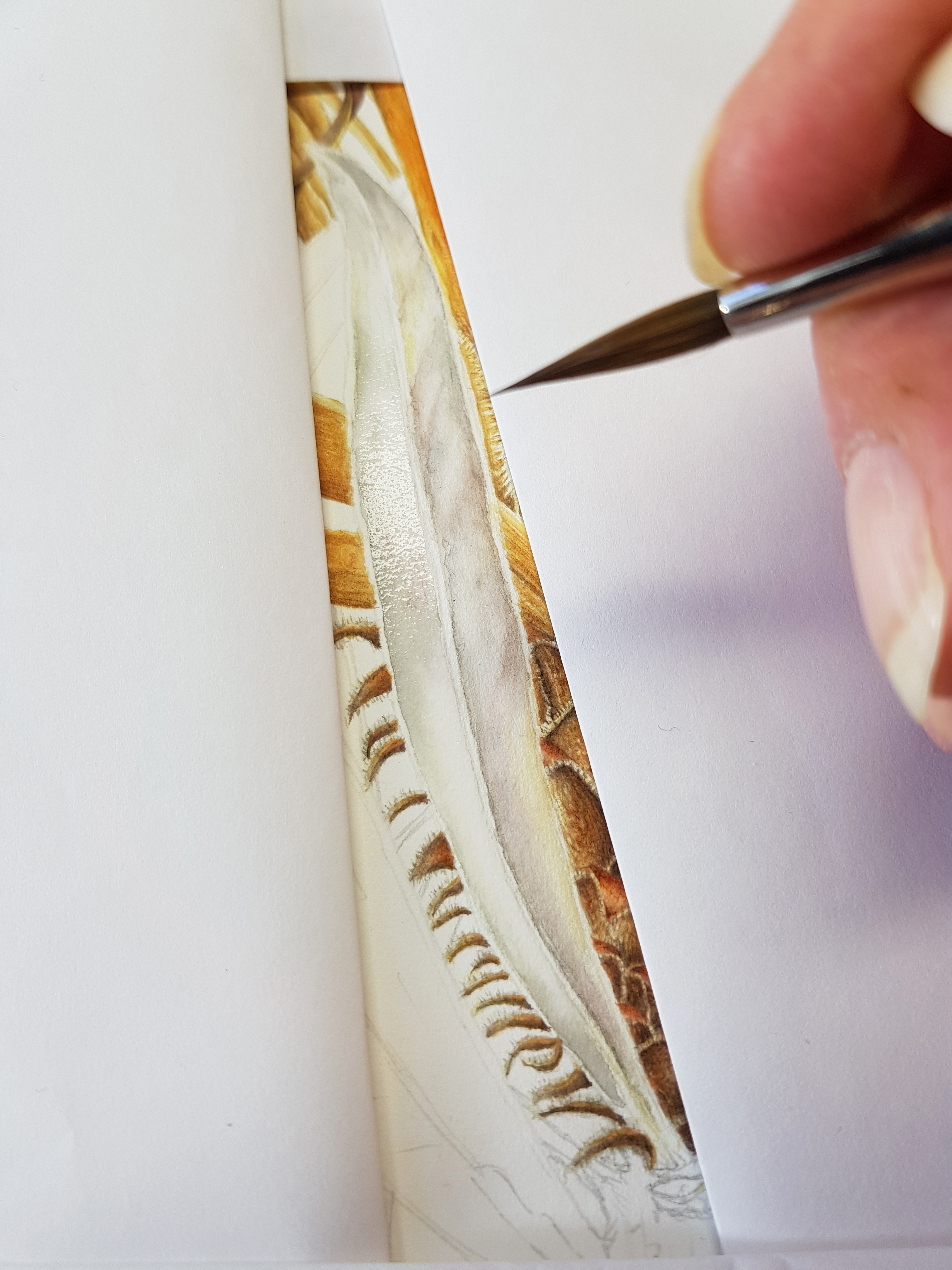
Suddenly, I realised I was reaching the centre section of stamens! Ugh….what to do? Taking a deep breath I checked the subject thoroughly to see how the colours changed over the stamens and where the warm/cool areas were. I had already drawn in fine lines to indicate where the stamens were and the little twirly hairy bits (anthers) which occasionally appeared within the mass. It was again a case of painting the negative and laying soft graduated washes down to create form. The anthers needed masking out before I started the fine detail work. I use a mapping pen for this but you must be careful not to scratch the paper as the nib is very sharp. It’s a great tool for small areas and fine lines though. See the first photo. I erased the masking fluid with a Tombow monochrome eraser pen. This has a small tip and is ideal for removing masking fluid. A soft rubber or a clean finger can also be used to do this. Make sure you do this gently to protect the surface sizing of the paper. The images below show these items.
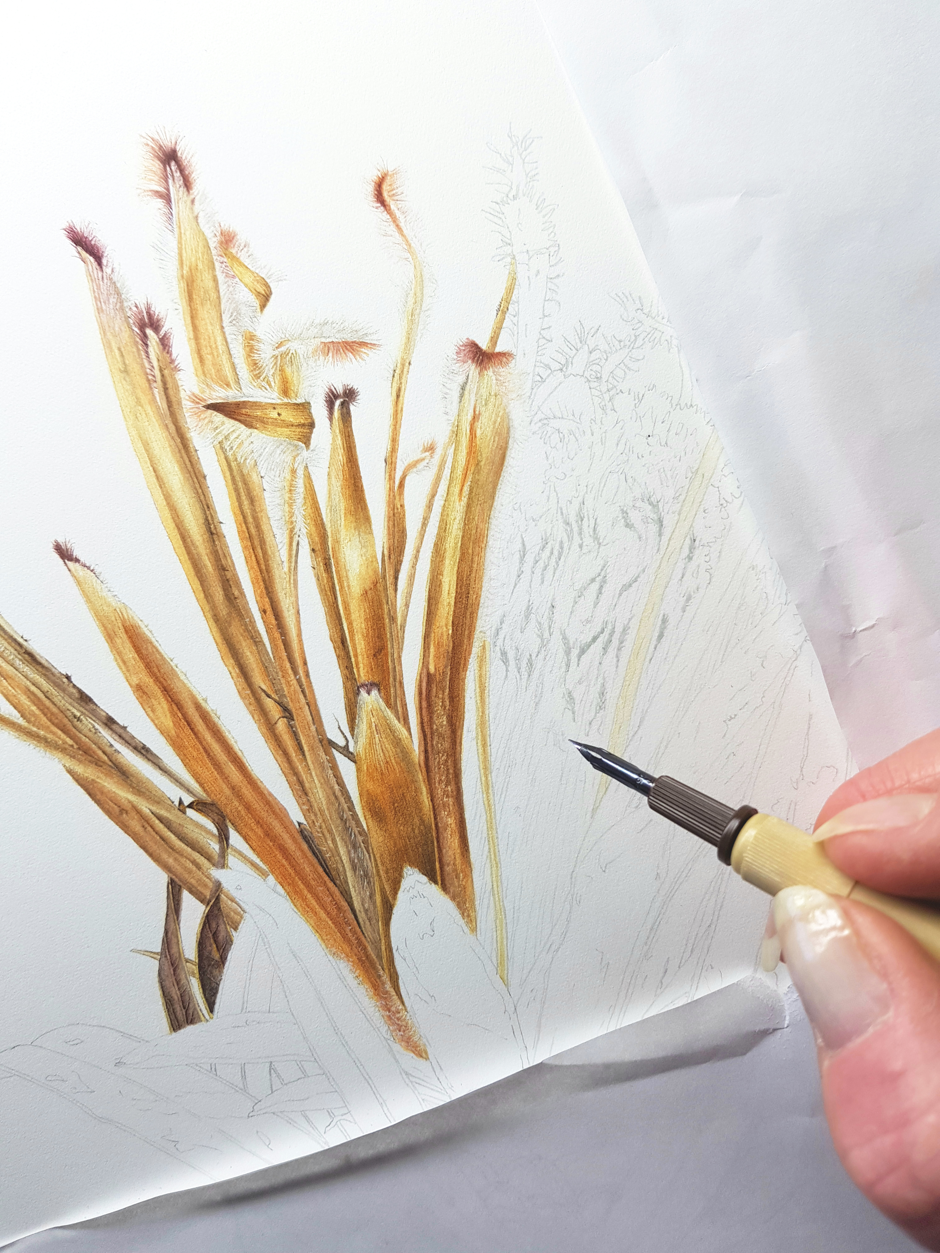


I started by adding a thin layer of colour to the central area. This was a creamy tone which was what I call the ‘base’ colour. From here I began painting into the negative to create the fine lines between each one. I used soft graduated washes of various beige tones to build up form on the individual stamens as well as across the whole area. Once I had built up the colour enough, I rubbed off the masking fluid. I was now ready to paint the anthers. Treating them like feathers, I detailed in the shadow tones between the hairs. This took a very long time! The whole painting took about 4-5 weeks to complete.
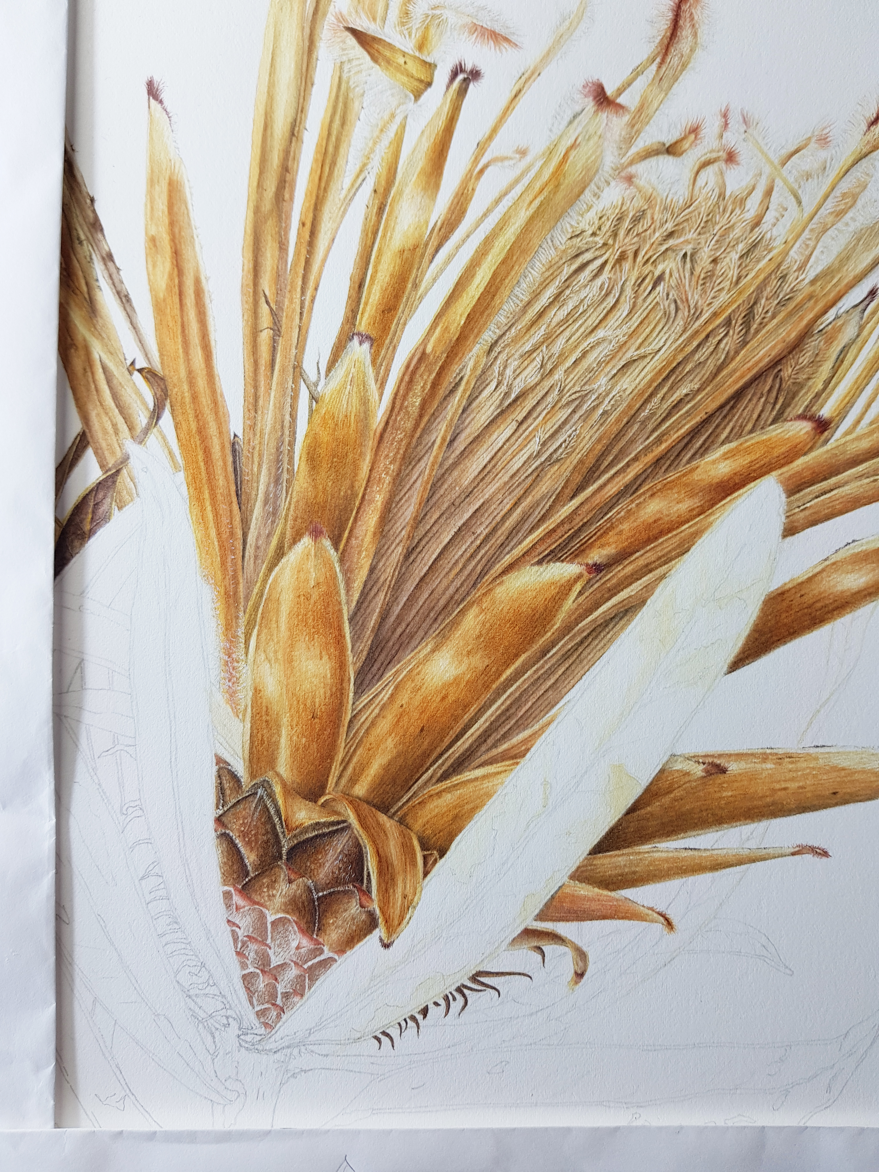
Now I had to finish off the top part with twiddly stamens and hairy anthers to create the rounded top. This was all done with intricate dry brush work. Painting the shadows was important here to create form and give the impression of lots and lots and lots of stamen hairs!

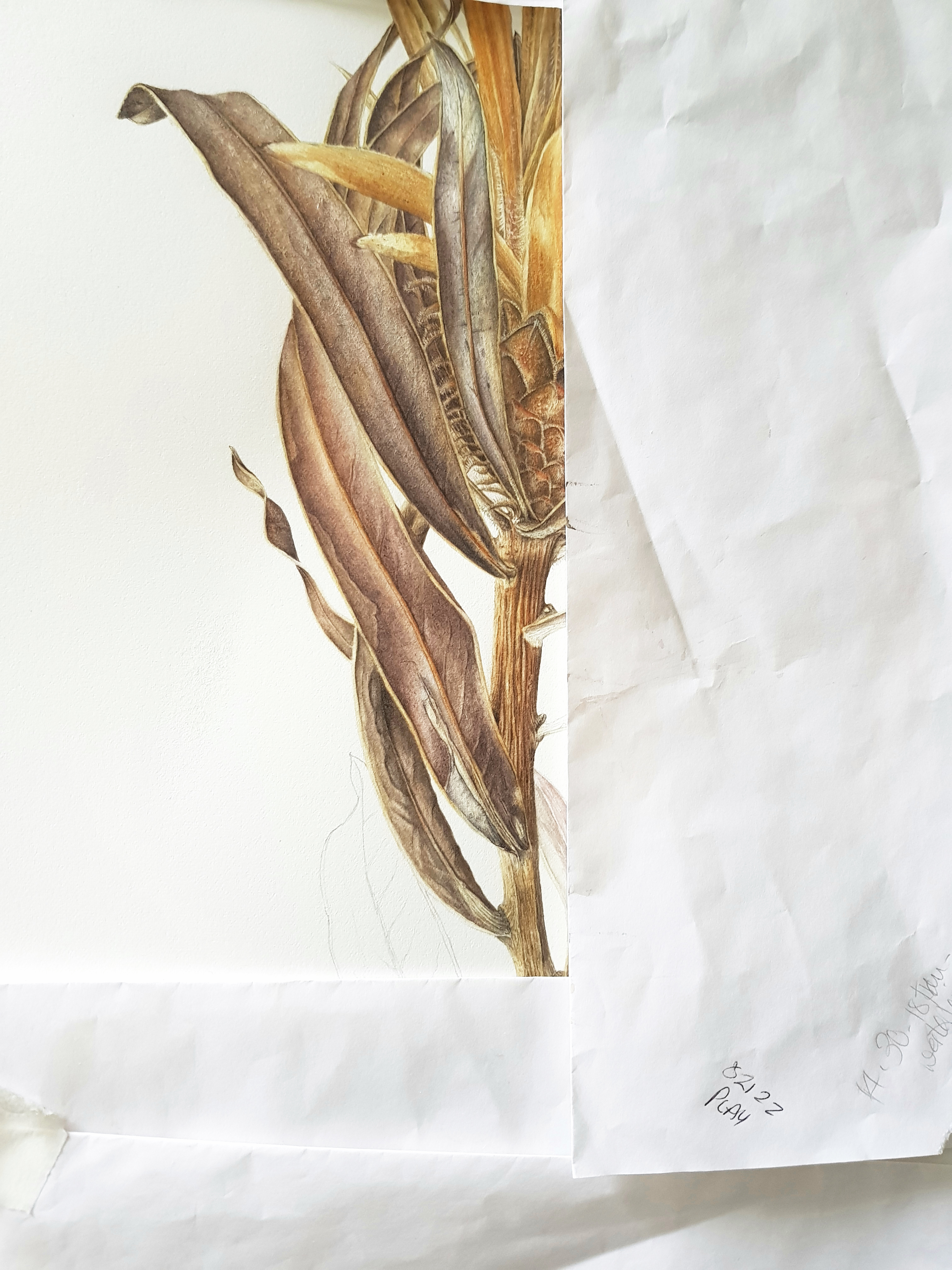
Mission accomplished! Next on the agenda was to finish off the right side and the rest of the inner bracts. Once complete I used wet-in-wet technique to apply a base layer to the leaves. They had really beautiful pattering and were very colourful. See the two images here.
Laying in the subtle colour tones was great fun! This was the first layer of wet-in-wet followed by soft graduated washes and much detailed dry brush work. The hardest part with the leaves was getting them to look like the reverse of the leaf. In most cases they were reversed. Much erasing happened as whatever I did they looked the other way round! It was an optical illusion because the more I stared at it, they kept changing! The reverse of the leaf needed very short shadows along the midrib to achieve this. Eventually it all came together. But if you stare a while longer…..you may still see it the other way! See progress photos below.


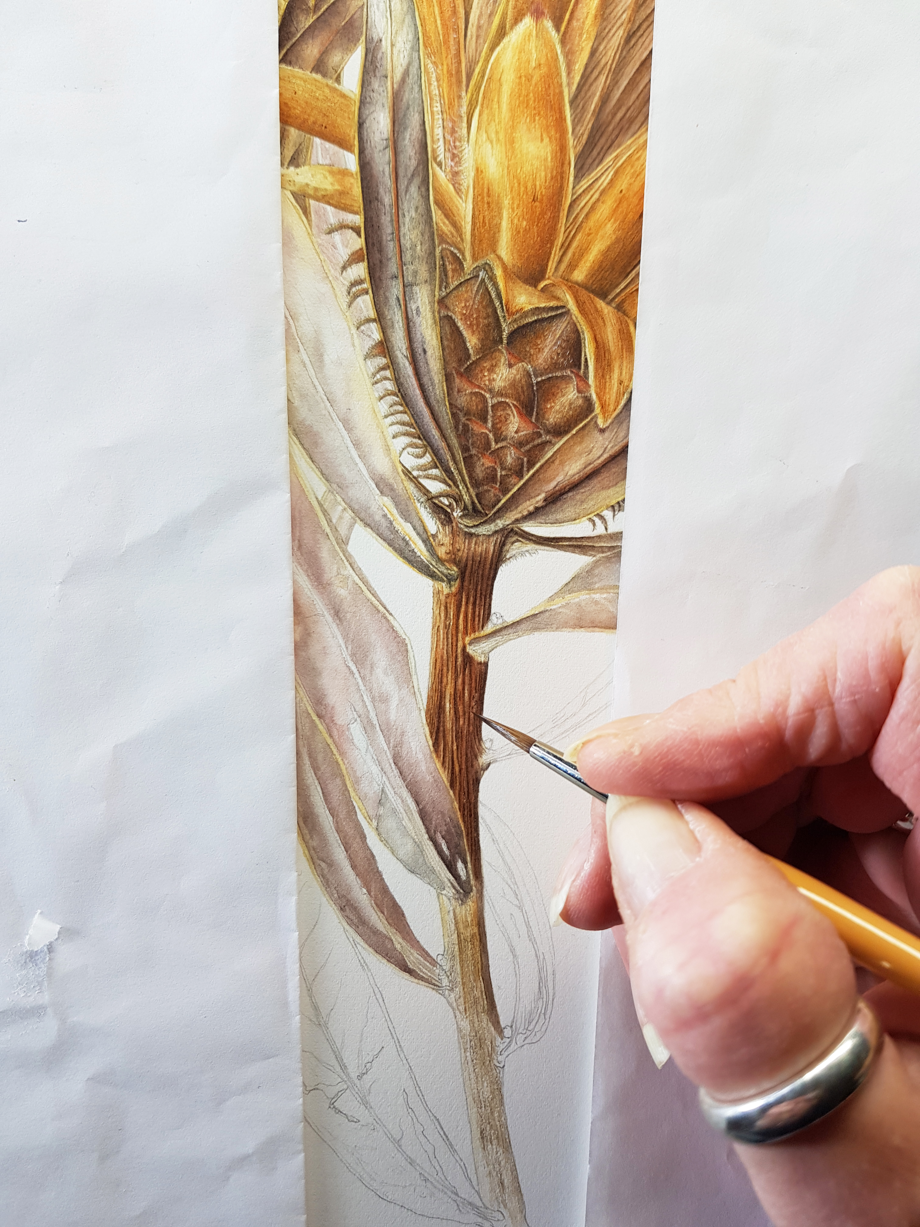
Next on the agenda was the stem, my favourite part. I just love painting woody stems. Essentially it’s a lot of wet-on-dry and dry brush work with very fine detailing. Adding every little detail in counts too! The more detail the more realistic it will look.
The top part of the stalk has lovely red/brown tones with deep grooves but faded below to a beige/grey texture. For the top I used dry brush for the fine detail and on the bottom, soft washes with a splayed brush to make the pattering as described above in this blog. See images here.

Finally, the finished painting emerged. What a journey but so worth it as it won the Margaret Granger Award at the SBA Mall Galleries exhibition! I am so delighted as this was a very ambitious project for me. I now have three awards on my wall. I feel very honoured! The photo below shows me receiving my award and my Fellow Membership from the President of the SBA, Billy Showell.


Thank you for reading my blog and I hope you enjoyed it!
Jackie 🙂
Email address:jackieisard@googlemail.com
Facebook:https://www.facebook.com/jackieisardbotanicalnaturepainting/
Instagram: @jackieisard
Blog: https://jibotanicals.com/
Web: https://www.jibotanicals.co.uk/
Etsy shop: https://www.etsy.com/uk/shop/jibotanicalsGifts

Oh, Jackie, I LOVE this post. It’s chock full of information, it looks great and the conversational tone is welcoming to the reader. Your award is well deserved.
LikeLike
Oh thank you so much Candice! So pleased you enjoyed it
LikeLike
I loved reading all of this! What a journey and what a beautiful result!x
LikeLike
Thank you so much Deedy! So pleased you enjoyed it🙂
LikeLike
Really great work with the blog ! Your painting is amazing and congratulations!
LikeLike
Thank you so much Vicki
LikeLike
Thank you so much Candice! I really appreciate your comment 🙂
LikeLike
Thank you so much for sharing your journey and process Jackie. Your work is beautiful and the two prints I purchased bring joy to my home.
Kind regards, Sandy Allen
Sent from my iPad
>
LikeLike
Thanks so much Sandy! Really appreciate you writing here and so pleased you love my prints x
LikeLike
Thank you so much Jackie for yet another valuable insight into your painting process!
After completing your colour mixing course last year I appreciate the colour information you have provided here and also the progress shots with explanations are so generously shared. I was able to visit the Mall and see your stunning painting during the exhibition, congratulations on your award!
Christine Drew x
LikeLike
Thank you so much Christine! So pleased you enjoyed it and my colour course. The Mall exhibition was the best yet and I’m so proud to have received an award x
LikeLike
Thank you Jackie for showing us your painting process it’s so informative and interesting. Well done with your award I managed to see it at the exhibition it was beautiful. Really looking forward to meeting up again in Scotland x
LikeLike
Thank you so much Lou. Not long now until August! X
LikeLike
Congratulations, the award was well deserved x
LikeLike
Thank you so much!
LikeLiked by 1 person
So pleased you enjoyed it and my colour course. The Mall exhibition was the best yet and I’m so proud to have received an award x
paint by numbers
LikeLike